Bullseye on a silver platter, or How the AppCode logo was created

Today we will look behind the scenes and tell you about how the logo was created for AppCode - one of the newest development environments from JetBrains.
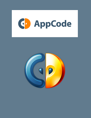
 We released AppCode about a year and a half ago as the development environment for Objective-C, and now the product has a user-recognizable logo. Not everyone knows that before the publication, AppCode had another code name: CIDR. We already had a language - C and the development environment - IDE , all that was missing was R at the end to get CIDER , i.e. "cider". It seemed to us a very good association, because cider is made from apples , and applications for Apple devices are written in Objective-C. The CIDR logo at the time looked like the one on the right. (We finally threw out the letter E, a la Flickr, RazR, etc.)
Do you know? In Germany, cider is called Apfelwein - “apple wine”. It is also very popular in Spain, Italy and France. However, in the United States and Canada, cider sometimes refers to a soft drink, that is, plain apple juice.
Alas, it did not work out with this codename. The guys from transgaming.com had previously created the Cider product, so they contacted us and asked to change the name. Well, rightly so.
In search of a new name, the team had to sort out a few ideas. Finally, we come to the correct "apple" concept. An apple ( apple ) grows from a seed that has a core ( core ), meanwhile, the core of a software application ( app ) is code ( code ). Developing this chain of associations, we turned the Apple Core into AppCore , and then got the idea to name the product AppCode . Voila! An interesting observation: the consumption of apples in the office at that time has increased markedly!
')
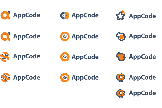
Here is a brief list of logo options that the development team has been struggling with in an attempt to determine the winner:
Dozens of people participated in the process, and once again we had to resort to our patented advanced voting mechanism “How the majority will decide”. :)
The first left the race options in the left column. These logos were either too faintly like apples, or too much associated with oranges or orange peels. As they do not confuse warm with soft, so we did not want to confuse apples with oranges.
The cartoon logos on the right looked cute, but did not pull on the final version. They were simply knocked out of a common collection of existing JetBrains logos. So it came to options in the middle column.
After the team chose the top two samples, it was necessary to determine the choice of color:
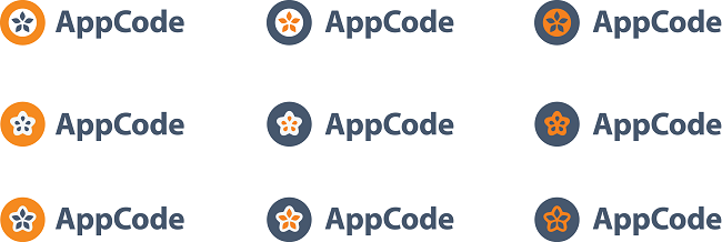
The design team tried two color combinations: orange, one of the official colors of the company, presented on the JetBrains logo itself, and blue or gray as the second color. That's what came out of it:

Making the final decision, the jury focused on the use of the basic letters "A" and "C," which seemed to say: "We write code for Apple." The logo options on the left lacked a C-element.
Finally, after a month of discussions, the team chose the winner - in the orange-gray color scheme. The logo is a slice of an apple with two seeds and the letter C, symbolizing the writing of the code:
We hope you enjoyed this little story. Eat apples and get ready for new stories!
JetBrains team
Source: https://habr.com/ru/post/154365/
All Articles