Mathematical approach to creating websites
"Math is beautiful." This may seem absurd, for people who flinch at the mere mention of mathematics. However, some of the most beautiful things in nature and our Universe are the projection of mathematical properties, from the smallest to the largest galaxies. One of the ancient philosophers, Aristotle, said: "it is common for mathematical sciences to build everything in order, in symmetry and constraints, they are the main forms of beauty."
Because of its natural beauty, mathematics is part of art and architecture. But it almost does not apply to the design of sites and applications. This is due to the fact that many do not match math with design. Although, on the contrary, mathematics can be a tool for the production of truly magical constructions. However, you should not rely on mathematics for each of your creations. The fact is that you should consider mathematics as your assistant. For clarity, we have created a couple of sites that represent the mathematical principles discussed in this article. We also created recommendations that can be used in design.
')
All recommendations data here, also used in the process of writing this article and its examples. In the process of writing, we made sure that all the design techniques shown in this article are of a mathematical nature, that is, they have symmetry. We also relied on the article Algorithm Web Design. In order not to complicate the approach, we tried to adhere to minimalist design, and also preferred single-page layouts. Obviously, the examples in this article should serve as the basis for your projects, not as ready-made solutions.
Golden section "and" Golden rectangle
The golden ratio, also known as divine proportion, is an irrational mathematical constant with a value of about 1.618033987. The golden ratio (the golden proportion, the division in the extreme and the average ratio) is the division of a continuous value into two parts in such a relation that the smaller part relates to the larger part as much as the whole quantity.

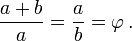
We have already published a very detailed article “Using the golden section in web design”, which explains how to use the golden section in web design. In today's article we will look at how to use golden rectangles in web design. A golden rectangle is such if its sides correspond to the proportions 1: (one-to-Phi), that is, 1: 1.618.
Build a golden rectangle is quite simple. First, you need to build a square. Then draw a line from the middle of one side to the opposite corner and use this line as the radius of the arc, which defines the height of the rectangle. Finally, complete the rectangle by completing the section where the angle at which the radius is drawn is the lower right corner of the section, and the upper left corner is limited by the arc.
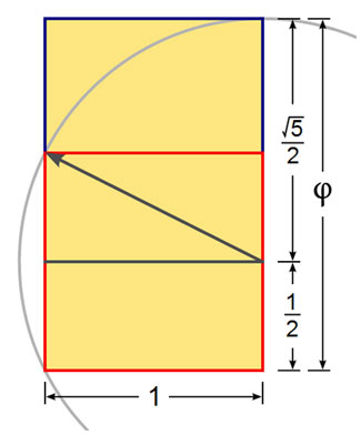
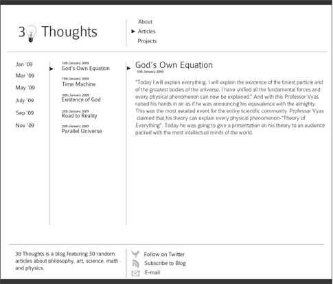
As an example, consider the minimalist design below. It has six golden rectangles, three rectangles in each row. The rectangles have dimensions of 299 x 185 pixels. Thus, the sides of these rectangles form the golden section, that is, 299/185 = 1.616. Please note that the large amount of free space surrounding the Golden Rectangle creates a calm and simple atmosphere in which each unit serves its purpose. Although only a few colors are used and all the blocks are very similar, navigation is obvious and simple.

However, it can be quite difficult to add a new block while maintaining the consistency of the design. Probably the only sensible solution is to add a block on the third line and use the rest of the horizontal space for other purposes. You can click on the picture below to see a larger version.
Such rectangles are well suited for photo galleries, presentation sites and product catalogs. They can also be used in a different sequence to produce beautiful designs. For example, this approach can be used to organize the side menu and display ads. Naturally, this approach is not used to create professional sites. You should also work on grids, consider alignment, block ratios and not lose focus on the main goal of your site. For example, CSS / Jquery-based rubber design will be an interesting design solution, but we do not consider this technique in this article.
We have prepared an archive with PSD layouts, which includes a template developed in accordance with the “golden section” and “Golden rectangle”. Feel free to use it.
As the name suggests, the Fibonacci design is based on a sequence of Fibonacci numbers. By definition, the first two Fibonacci numbers are 0 and 1, and each subsequent number is the sum of the two previous ones. Some sources omit 0, and begin the sequence with two units. So, the first two Fibonacci numbers are 0 and 1, and each subsequent number is the sum of the two previous ones. The more numbers in the Fibonacci sequence, the closer they are connected to each other in accordance with the "golden section". The Fibonacci sequence is as follows:
In music, Fibonacci numbers are sometimes used for tuning, and in art, to determine the length or size of the content or elements.
Jürgen Schmidhuber, in his blog, discusses the Fibonacci number methodology at the heart of the design . However, if you study the design that he created, you will probably find it hard and a little difficult to understand and navigate. Indeed, you should apply a creative approach to mathematics, and not blindly follow the rules - mathematics gives us opportunities that we can apply.
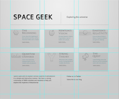
Approximate and true golden spirals. The green spiral is constructed from quarters of a circle tangent to the corners of each square, and the red spiral is constructed using a special type of logarithmic spiral. The overlap is colored in yellow.
The basic idea of this design is to use Fibonacci when deciding on the size and content of the main and lateral areas. Both Fibonacci and the Golden Section are equivalent in this context and let designers rely on what is more convenient for them.
In general, the layout is fairly easy to build using the Fibonacci sequence. You choose a specific width of the base of the first block - for example, 90px. Then, when determining the size of the container, you need to multiply the base width by the number of the block from the Fibonacci series (1,2,3,5,8 ...). Depending on the calculations, you get values that are the width of the blocks for your layout. Let's look at an example. Below is a minimalistic layout based on Fibonacci web design.
You can see that the page is divided into three columns. Each column corresponds to the Fibonacci number. For this design, we used a base width of 90 pixels. This base width is then multiplied by the Fibonacci number to get the total width of the column. For example, the first column is 180 pixels wide (90 x 2), the second column is 270 pixels wide (90 x 3), and the third column is 720 pixels wide (90 x 8). The font size also corresponds to the Fibonacci number. The page title is 55px; the title of the article is 34px; and the main text is 21px.
However, it is quite difficult to adapt the pattern, with a fixed width, to use the Fibonacci sequence. But this is only in the case of choosing the width, for example, 1000px. In this situation, it is easier to use the ratio of the golden section. Just multiply your 1000px width by 0.618 and get 618px which would be the ideal width for blocks of content. However, if you are trying to achieve the same result with the Fibonacci sequence, you must first find out the number closest to 1000.
According to the Fibonacci sequence calculator , the sequence will be
Fibonacci design is best suited for blogs and magazine layouts. You can arrange the layout in different ways according to Fibonacci numbers. The Nombre d'or article , suite de Fibonacci et autres grilles de mise en page pour design web (in French) explains the deeper use of Fibonacci numbers in web design. Again, it is worth noting that you should rely on a creative approach when using the Fibonacci sequence in your work, otherwise your layouts will seem too rigid and, therefore, difficult to use and navigate.
We have prepared an archive with PSD layouts, which includes a template designed in accordance with the Fibonacci sequence. Please feel free to use it in any way.
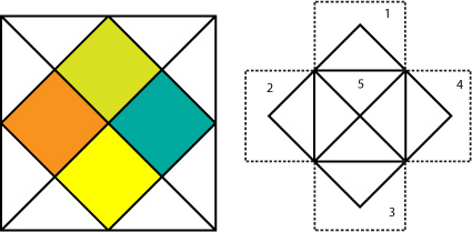
Another interesting technique for creating layouts comes from the Indian horoscopes, also called Kundli. In general, Kundli is a very simple figure that can be done in three steps. Draw a square. Cross it with two diagonals. Connect adjacent midpoints. And we get Kundli. We have four rectangular diamonds in the figure. They will be the basis for our design.

The design presented below is designed on the basis of a geometric Kundli layout. It is worth noting that the chakras also have mathematical properties (I have not found evidence for a comment.) .
This is a one-page layout. In addition, you can use some simple jQuery animations or a text hint to present our site in a more informative light. Another option would be to use a slide where the animation is used to display the different content of the blocks, you can also change the background of the image for each of the areas to make them different from each other.

In the following image, you can see that our design is quite simple: a header, three columns, and a footer.
This design is optimal for displaying product information or for displaying profiles. You can decorate a javascript animation template. For example, you can refer to the possibility of color conversion by changing the color of the chakras using the Raphael library, or you can add any other animation, for example using the jsAnim library. You can show a tree sprout when the user clicks on the element "Earth", or you can show the sea inhabitants, when you click on "Water". There is no limit when it comes to animation using these javascript libraries (but do not borsch approx. Lane) .
We have prepared an archive with PSD layouts, which includes a template developed in accordance with the Kundli design.
When it comes to mathematics, you don’t want to stick to the Golden Section or the Fibonacci sequence. You can experiment with formulas from physics, chemistry and other sciences or use general formulas in your projects.
For example, let's consider a sine wave, or a sine wave. This is a mathematical function that describes smooth repetitive vibrations. We used a simple sine wave layout as the basis for a simple and original design. Of course, you can use the same approach in other designs, and not just when creating websites, such as graphics or infographics.
The layout is again very simple, consisting of a header, five columns and a footer. You can use jQuery to make your design more interactive.

This wave pattern is often found in nature, including ocean waves, sound waves, and light waves. In addition, a roughly presented sinusoidal pattern can be seen when constructing the average daily temperature, although the graph may resemble an inverted wave — cosine. You can also use it to display the chronology of events. It will look great with horizontal navigation. You can make it more interactive with all the same jQuery .
We have prepared an archive with PSD layouts, which includes a template designed in accordance with the design of a sine wave.
Rule of thirds
This rule states that the image must be represented as nine equal parts. We build two equidistant horizontal lines and two vertical lines at equal distances, and what is important, the compositional elements should be located along these lines or their intersections. It can also be expressed in the form of a simplified mathematical approach that divides the layout into thirds, from left to right and from top to bottom.
Musical logic
The rhythmic or thematic structure of a musical composition can be used to determine the distances between elements in the layout, such as ABA, ABAC, etc. Learn more about music and math in this Wikipedia article.
Wikipedia articles
Articles
Books
We hope that you liked the article on mathematics in web design. We hope that now you see mathematics as an opportunity to improve your design decisions, and it will become your friend.
Original article in English
Because of its natural beauty, mathematics is part of art and architecture. But it almost does not apply to the design of sites and applications. This is due to the fact that many do not match math with design. Although, on the contrary, mathematics can be a tool for the production of truly magical constructions. However, you should not rely on mathematics for each of your creations. The fact is that you should consider mathematics as your assistant. For clarity, we have created a couple of sites that represent the mathematical principles discussed in this article. We also created recommendations that can be used in design.
')
All recommendations data here, also used in the process of writing this article and its examples. In the process of writing, we made sure that all the design techniques shown in this article are of a mathematical nature, that is, they have symmetry. We also relied on the article Algorithm Web Design. In order not to complicate the approach, we tried to adhere to minimalist design, and also preferred single-page layouts. Obviously, the examples in this article should serve as the basis for your projects, not as ready-made solutions.
Golden section "and" Golden rectangle
The golden ratio, also known as divine proportion, is an irrational mathematical constant with a value of about 1.618033987. The golden ratio (the golden proportion, the division in the extreme and the average ratio) is the division of a continuous value into two parts in such a relation that the smaller part relates to the larger part as much as the whole quantity.
We have already published a very detailed article “Using the golden section in web design”, which explains how to use the golden section in web design. In today's article we will look at how to use golden rectangles in web design. A golden rectangle is such if its sides correspond to the proportions 1: (one-to-Phi), that is, 1: 1.618.
Build a golden rectangle is quite simple. First, you need to build a square. Then draw a line from the middle of one side to the opposite corner and use this line as the radius of the arc, which defines the height of the rectangle. Finally, complete the rectangle by completing the section where the angle at which the radius is drawn is the lower right corner of the section, and the upper left corner is limited by the arc.
As an example, consider the minimalist design below. It has six golden rectangles, three rectangles in each row. The rectangles have dimensions of 299 x 185 pixels. Thus, the sides of these rectangles form the golden section, that is, 299/185 = 1.616. Please note that the large amount of free space surrounding the Golden Rectangle creates a calm and simple atmosphere in which each unit serves its purpose. Although only a few colors are used and all the blocks are very similar, navigation is obvious and simple.
However, it can be quite difficult to add a new block while maintaining the consistency of the design. Probably the only sensible solution is to add a block on the third line and use the rest of the horizontal space for other purposes. You can click on the picture below to see a larger version.
Possible use
Such rectangles are well suited for photo galleries, presentation sites and product catalogs. They can also be used in a different sequence to produce beautiful designs. For example, this approach can be used to organize the side menu and display ads. Naturally, this approach is not used to create professional sites. You should also work on grids, consider alignment, block ratios and not lose focus on the main goal of your site. For example, CSS / Jquery-based rubber design will be an interesting design solution, but we do not consider this technique in this article.
PSD layout
We have prepared an archive with PSD layouts, which includes a template developed in accordance with the “golden section” and “Golden rectangle”. Feel free to use it.
Fibonacci design
As the name suggests, the Fibonacci design is based on a sequence of Fibonacci numbers. By definition, the first two Fibonacci numbers are 0 and 1, and each subsequent number is the sum of the two previous ones. Some sources omit 0, and begin the sequence with two units. So, the first two Fibonacci numbers are 0 and 1, and each subsequent number is the sum of the two previous ones. The more numbers in the Fibonacci sequence, the closer they are connected to each other in accordance with the "golden section". The Fibonacci sequence is as follows:
0, 1, 1, 2, 3, 5, 8, 13, 21, 34, 55, 89, 144...In music, Fibonacci numbers are sometimes used for tuning, and in art, to determine the length or size of the content or elements.
Jürgen Schmidhuber, in his blog, discusses the Fibonacci number methodology at the heart of the design . However, if you study the design that he created, you will probably find it hard and a little difficult to understand and navigate. Indeed, you should apply a creative approach to mathematics, and not blindly follow the rules - mathematics gives us opportunities that we can apply.
Approximate and true golden spirals. The green spiral is constructed from quarters of a circle tangent to the corners of each square, and the red spiral is constructed using a special type of logarithmic spiral. The overlap is colored in yellow.
The basic idea of this design is to use Fibonacci when deciding on the size and content of the main and lateral areas. Both Fibonacci and the Golden Section are equivalent in this context and let designers rely on what is more convenient for them.
In general, the layout is fairly easy to build using the Fibonacci sequence. You choose a specific width of the base of the first block - for example, 90px. Then, when determining the size of the container, you need to multiply the base width by the number of the block from the Fibonacci series (1,2,3,5,8 ...). Depending on the calculations, you get values that are the width of the blocks for your layout. Let's look at an example. Below is a minimalistic layout based on Fibonacci web design.
You can see that the page is divided into three columns. Each column corresponds to the Fibonacci number. For this design, we used a base width of 90 pixels. This base width is then multiplied by the Fibonacci number to get the total width of the column. For example, the first column is 180 pixels wide (90 x 2), the second column is 270 pixels wide (90 x 3), and the third column is 720 pixels wide (90 x 8). The font size also corresponds to the Fibonacci number. The page title is 55px; the title of the article is 34px; and the main text is 21px.
However, it is quite difficult to adapt the pattern, with a fixed width, to use the Fibonacci sequence. But this is only in the case of choosing the width, for example, 1000px. In this situation, it is easier to use the ratio of the golden section. Just multiply your 1000px width by 0.618 and get 618px which would be the ideal width for blocks of content. However, if you are trying to achieve the same result with the Fibonacci sequence, you must first find out the number closest to 1000.
According to the Fibonacci sequence calculator , the sequence will be
...,610, 987, 1597... And, 987 is a good number that is closest to the selected number of 1000 and you can determine the width for other blocks using the previous numbers in the sequence. But if your fixed-width layout is smaller or larger in width, then you will need to use approximate values. The problem may occur in the rubber template but not in the fixed one, but using% you have much more freedom.Possible use
Fibonacci design is best suited for blogs and magazine layouts. You can arrange the layout in different ways according to Fibonacci numbers. The Nombre d'or article , suite de Fibonacci et autres grilles de mise en page pour design web (in French) explains the deeper use of Fibonacci numbers in web design. Again, it is worth noting that you should rely on a creative approach when using the Fibonacci sequence in your work, otherwise your layouts will seem too rigid and, therefore, difficult to use and navigate.
Psd layout
We have prepared an archive with PSD layouts, which includes a template designed in accordance with the Fibonacci sequence. Please feel free to use it in any way.
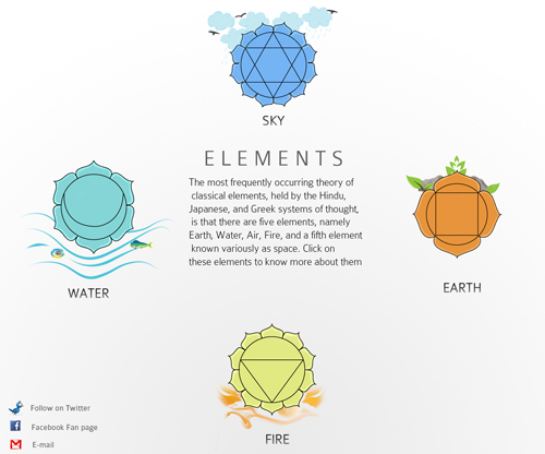
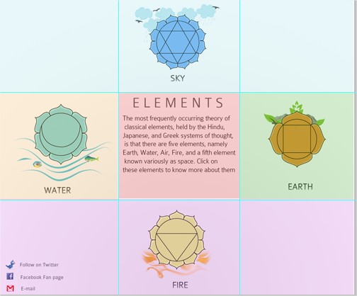
Five elements, or Kundli design
Another interesting technique for creating layouts comes from the Indian horoscopes, also called Kundli. In general, Kundli is a very simple figure that can be done in three steps. Draw a square. Cross it with two diagonals. Connect adjacent midpoints. And we get Kundli. We have four rectangular diamonds in the figure. They will be the basis for our design.
The design presented below is designed on the basis of a geometric Kundli layout. It is worth noting that the chakras also have mathematical properties (I have not found evidence for a comment.) .
This is a one-page layout. In addition, you can use some simple jQuery animations or a text hint to present our site in a more informative light. Another option would be to use a slide where the animation is used to display the different content of the blocks, you can also change the background of the image for each of the areas to make them different from each other.
In the following image, you can see that our design is quite simple: a header, three columns, and a footer.
Possible use
This design is optimal for displaying product information or for displaying profiles. You can decorate a javascript animation template. For example, you can refer to the possibility of color conversion by changing the color of the chakras using the Raphael library, or you can add any other animation, for example using the jsAnim library. You can show a tree sprout when the user clicks on the element "Earth", or you can show the sea inhabitants, when you click on "Water". There is no limit when it comes to animation using these javascript libraries (but do not borsch approx. Lane) .
PSD layout
We have prepared an archive with PSD layouts, which includes a template developed in accordance with the Kundli design.
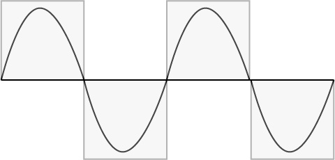
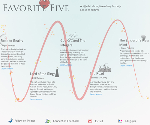
Sinusoidal design
When it comes to mathematics, you don’t want to stick to the Golden Section or the Fibonacci sequence. You can experiment with formulas from physics, chemistry and other sciences or use general formulas in your projects.
For example, let's consider a sine wave, or a sine wave. This is a mathematical function that describes smooth repetitive vibrations. We used a simple sine wave layout as the basis for a simple and original design. Of course, you can use the same approach in other designs, and not just when creating websites, such as graphics or infographics.
The layout is again very simple, consisting of a header, five columns and a footer. You can use jQuery to make your design more interactive.
Possible use
This wave pattern is often found in nature, including ocean waves, sound waves, and light waves. In addition, a roughly presented sinusoidal pattern can be seen when constructing the average daily temperature, although the graph may resemble an inverted wave — cosine. You can also use it to display the chronology of events. It will look great with horizontal navigation. You can make it more interactive with all the same jQuery .
PSD layout
We have prepared an archive with PSD layouts, which includes a template designed in accordance with the design of a sine wave.
Other methods
Rule of thirds
This rule states that the image must be represented as nine equal parts. We build two equidistant horizontal lines and two vertical lines at equal distances, and what is important, the compositional elements should be located along these lines or their intersections. It can also be expressed in the form of a simplified mathematical approach that divides the layout into thirds, from left to right and from top to bottom.
Musical logic
The rhythmic or thematic structure of a musical composition can be used to determine the distances between elements in the layout, such as ABA, ABAC, etc. Learn more about music and math in this Wikipedia article.
Useful Links and Resources
Wikipedia articles
Articles
- Mathematics in Art and Architecture
- Design and Divine Proportion
- Create Awesome Geometrical Designs , Myoats
- Photographer Loves Math, Graphs Her Images
- Typograph: Scale and Rhythm
- Michael Paunker - Art and Math
Books
We hope that you liked the article on mathematics in web design. We hope that now you see mathematics as an opportunity to improve your design decisions, and it will become your friend.
Original article in English
Source: https://habr.com/ru/post/154087/
All Articles