New in CSS3: multi-colouration, flexbox, grid markup
The web is evolving, all the new page layout features for web designers are appearing, including new properties in CSS that help. In this article I described some of them: multicolumnarity, flexbox and grid markup.
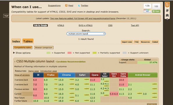
Browser support for new features can be checked at caniuse.com :
')
With the help of multi-column, you can easily split the text into several columns without using crutches in the form of positioning and floats. You can specify the width of each column, their number will be limited only by the width of the browser:
You can specify the number of columns:
Change the style of columns:
In fact, the main and most expected feature of this property is the ability to flow text from one column to another. It is not clear why it did not appear much earlier.
Flexbox allows you to conveniently manage children and parents on the page, placing them in the desired order. The official specification is here: CSS Flexible Box Layout Module
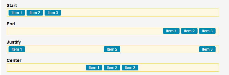
At tutplus.com there are simple, clear examples of flexbox applications. You can have child blocks with the desired alignment, horizontal:
or vertical:
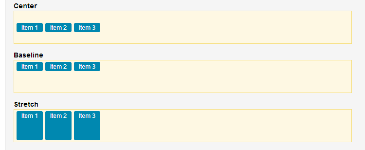
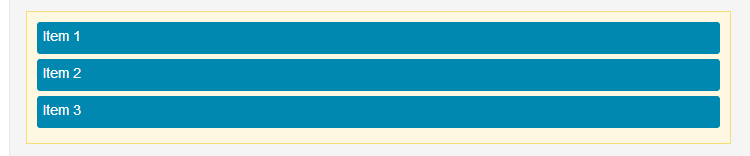
Stretch full width:
And much more. Calling flexbox is very simple:
The specification - CSS Grid Layout - is presented by Microsoft in April of this year, so the markup works so far only in Internet Explorer 10 . But given the fundamental nature of the work done, the support of the functionality by other browsers is a matter of time.
Grid marking allows you to place content separately from the layout, using lines and columns. First you need to declare the grid:
Decryption:
Add an item to the first row of the second column:
You can stretch the element to full width using grid-row-span :
Or add alignment with grid-row-align or grid-column-align :
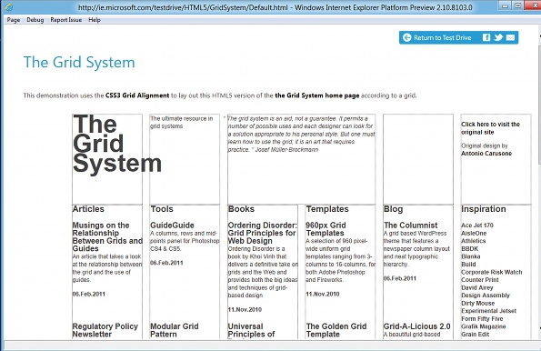
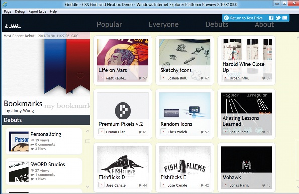
An example of using Columns, flexbox and grid marking can be found on the Microsoft Griddle website .
Browser support for new features can be checked at caniuse.com :
')
Multi-column
With the help of multi-column, you can easily split the text into several columns without using crutches in the form of positioning and floats. You can specify the width of each column, their number will be limited only by the width of the browser:
#mcexample { column-width: 13em; } You can specify the number of columns:
#mcexample { column-count: 3; } Change the style of columns:
#mcexample { columns: auto 13em; /* column-count, column-width */ column-gap: 1em; column-rule: 1em solid black; /* width, style, color */ } In fact, the main and most expected feature of this property is the ability to flow text from one column to another. It is not clear why it did not appear much earlier.
Flexbox
Flexbox allows you to conveniently manage children and parents on the page, placing them in the desired order. The official specification is here: CSS Flexible Box Layout Module
At tutplus.com there are simple, clear examples of flexbox applications. You can have child blocks with the desired alignment, horizontal:
or vertical:
Stretch full width:
And much more. Calling flexbox is very simple:
<ul> <li>An item</li> <li>Another item</li> <li>The last item</li> </ul> ul { /* Old Syntax */ display: -webkit-box; /* New Syntax */ display: -webkit-flexbox; } Grid marking
The specification - CSS Grid Layout - is presented by Microsoft in April of this year, so the markup works so far only in Internet Explorer 10 . But given the fundamental nature of the work done, the support of the functionality by other browsers is a matter of time.
Grid marking allows you to place content separately from the layout, using lines and columns. First you need to declare the grid:
#gridexample { display: -ms-grid; -ms-grid-rows: 30px 5em auto; -ms-grid-columns: auto 70px 2fr 1fr; } Decryption:
- First line - 30 px in height
- Second line - 5 em tall
- The size of the third line will depend on the amount of content.
- The size of the first column will depend on the amount of content.
- The second column is 70 px wide
- The third and fourth columns will occupy 2/3 and 1/3 of the width, respectively.
Add an item to the first row of the second column:
#griditem1 { -ms-grid-row: 1; -ms-grid-column: 2; } You can stretch the element to full width using grid-row-span :
#griditem1 { -ms-grid-row: 1; -ms-grid-column: 2; -ms-grid-row-span: 2; } Or add alignment with grid-row-align or grid-column-align :
#griditem1 { -ms-grid-row: 1; -ms-grid-column: 2; -ms-grid-column-align: center; } An example of using Columns, flexbox and grid marking can be found on the Microsoft Griddle website .
Materials on the topic
- An Introduction to the CSS Flexbox Module by Umar Hansa
- Master the new CSS layout properties by Thomas Lewis
- Quick hits with the flexible box model by Paul Irish
- Presentation of the IE 10 Platform Preview 1: The Future of Adaptive Web Design by Markus Mielke
Source: https://habr.com/ru/post/153925/
All Articles