Moscow will no longer be the same
If you do not do card design at all, it will look something like this. And this is just one layer of streets.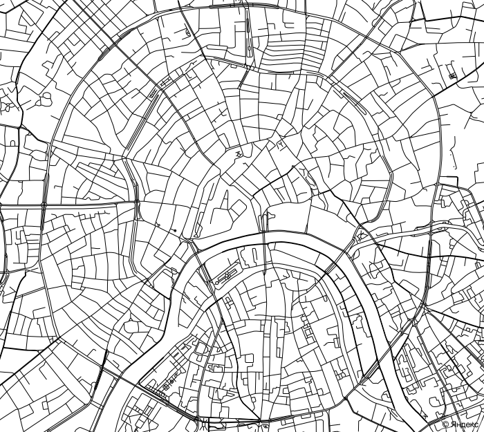
Conveniently? I think no.
')
For this reason, we are constantly engaged in the design of the map and with each update we make various changes. Today in the design of the map of Moscow there have been significant changes, we will tell about them in more detail.
In short, the purpose of the card design sounds very short:
Make the card more convenient to use.
Behind the brevity of this formulation lies a lot of interesting implementation details.
If we had a magic wand or a magic spell, after reading which the card would instantly become more comfortable with each stroke, this story would have ended immediately. Or would not start at all. However, this does not happen. The magic usually consists in hard work.
We studied feedback from users and experts in the field of design, systematized knowledge of the problems and, after a series of discussions, formulated the following requirements for a “handy map”:
- our map should provide maximum “readability” of objects on the map;
- the card must still be recognizable and familiar to Yandex users (it was a difficult requirement to change the design and at the same time try to keep what users are used to);
- on the map, the layers of the displayed objects should be well distinguished (for example, search results, traffic jams);
- when printing a card on a black and white printer, the card must be sufficiently contrast and objects of different types must be distinguishable;
- in some areas, it is necessary to foresee the possibility of bilingual object signatures (for the map of Kiev, we have already done this, for example);
- make the map so that the most important information for the user, taking into account his current task, was more noticeable, and less important information on the map faded into the background;
- A new design should include two use cases: just a map as an image that you can already navigate, and also as a tool for displaying any data (for example, search results). In this case, the design should be one;
- the map design will be used on Yandex.Maps both in the browser and in the mobile device; in addition, we provide the map to third-party sites and mobile applications using API and MapKit technologies
Throughout the project, we did not forget about people with visual limitations, different color rendering of monitors, sunny weather and mobile device screens, current user habits, technological limitations, design trends, timing, our own habits, preferences and about many other things.
It is important to note that both pedestrians and motorists use the map. For example, for Moscow motorists, the most important landmarks of the city are highways: the radial-ring structure should be easily readable on all scales of the map. For pedestrians, areas and subway stations are important (which sometimes turn out to be more important when navigating than areas). The challenge was to keep the balance of these two groups of users and maintain the usability of the card.
First and foremost, we streamlined the display styles for highways at the most popular scales. We tried to come to the conclusion that on one scale there would be no more than three styles of highways. At the same time, styles should have been chosen in such a way that they could be easily distinguished from each other. Secondly, we decided to stop distinguishing between industrial and residential areas on this map scale, this is not essential for orientation on this scale, but it made the map overloaded. Thirdly, the highways “made” thinner, so they became clearer, more space appeared between the neighboring highways.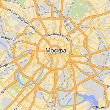
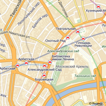
The signatures of the regions worked on this scale, and the stations identified more noticeable icons:

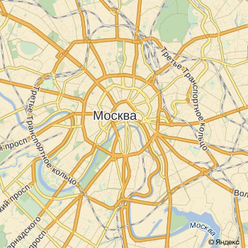
And on this scale, work with the styles of highways made the picture “cleaner”. Plus, signatures of metro stations appeared on this scale - for Moscow these are very important landmarks.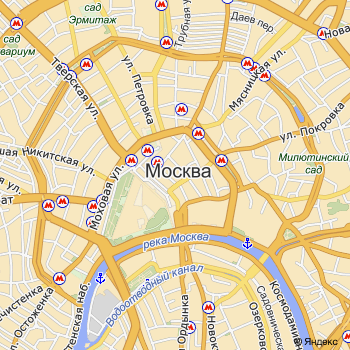

In one of the past updates of the map of Moscow, we removed the colored lines of the metro from the design of the map, considering that this could prevent motorists from watching traffic jams. We received a lot of letters from users asking them to return the metro lines. We realized that we were wrong and corrected the design. We have come up with a good style for metro lines, they are now smooth and do not interfere with watching traffic jams.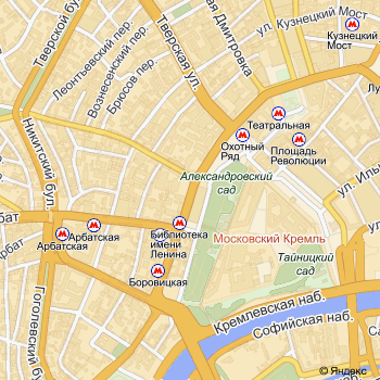
On the next scale, we made sure that the color of the line at the metro stations was not lost - this is very important for the orientation of pedestrians.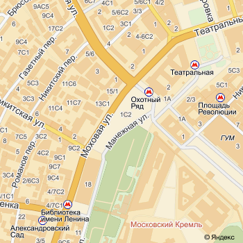
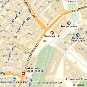
At the next level of scaling motorists waiting for a pleasant surprise. We added direction arrows; considering the many one-way streets in the center, the map has become more convenient. By the way, in the summer we have pleased motorists of St. Petersburg with this innovation.
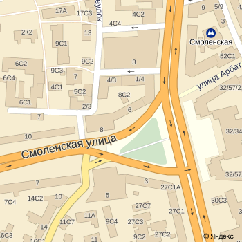
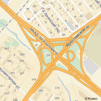
In addition, it will be even more convenient for motorists to focus on difficult interchanges. For example, this is how the interchange at the intersection of the Moscow Ring Road and the Yaroslavl Highway has changed on a map of crazy complexity:
As a result, we retained recognition, improved the readability of objects and the display of layers. The map is quite contrasting and easy to watch on mobile. The new style, of course, will be refined and introduced into the maps of other cities.
The design was created by the card design group in Yandex, with the active participation of the entire service team. At the same time, during the project we consulted with external experts, whom I would like to thank for the valuable advice and recommendations. For example, experience with the Stamen design team was useful for us: we received several valuable recommendations for improving the design and embodied them in this map.
Team Yandex.Maps
Source: https://habr.com/ru/post/153553/
All Articles