Interactive HTML5 rendering based on "Lost"
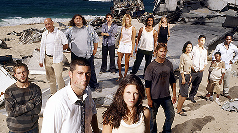
A fan of one of the best TV projects of the last ten years, "Lost" ("Lost", "Lost"), programmer Santiago Ortiz (Santiago Ortiz) created a great example of interactive visualization of the relationship between the main and secondary characters of the show using HTML5.
The series was created by more than 30 scriptwriters who had to work through the characters and relationships of the characters, creating a realistic atmosphere in terms of moving the characters through time, monitoring the coherence of events, and giving hints to all sorts of riddles (for example, why Kate saw in the jungle) dark horse); at the same time, a wiki project based on the show contains more than 7,000 articles.
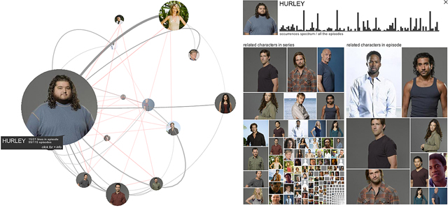
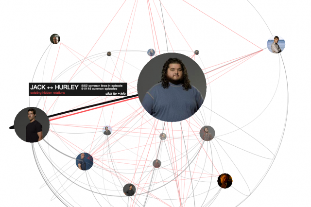
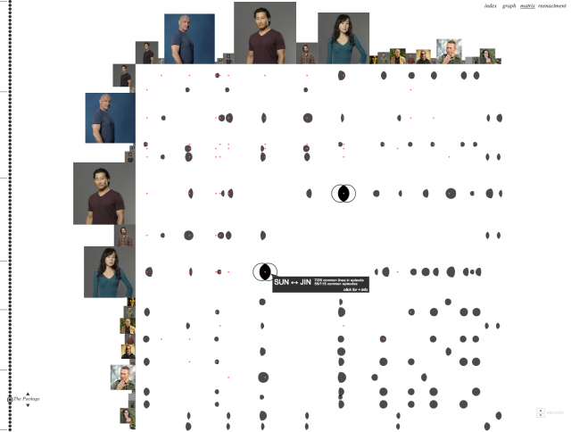
In other words, the complex interrelation of the heroes of the show was the motive for creating an interactive graph showing the relationship between them, taking into account the parsing data of all 7000 Lostpedia articles, 121 episodes of The Lost and one of the ready-made results of the community . The analysis was approximately as follows: a character was taken from the episode text (say, Jack Shepard, the initial episode of the series with the fall of the flight Oceanic 815) and was analyzed with which of the other characters he communicated. If Shepard's counterpart appeared later several times, the screen time of their interaction increased, then the weight of this character increased. Also, other reputational characteristics were added for pairs of characters, for three, etc., until a full-size “relationship matrix” was built.
')
Look at the visualization here . As a negative point, it can be noted that on a relatively non-weak laptop (Intel Core i5-3210M + 4 GB + Win8 + Chrome) page speed can hardly be called fast.
Fragments of visualization look like this:
Source: https://habr.com/ru/post/153529/
All Articles