Basket in online stores. A couple of blunders
Hello habrovchanam!
I work with sites for quite a long time, including with online stores, improving their usability and increasing the number of sales for customers. During this period of time I have worked with more than 150 different sites that somehow sell something. Recently clicked sites and wondered how many bad sites selling good products. Although, frankly, our online stores and ease of use go a step further in the Western world (do not take it from the eBay and Amazon iconostasis).
')

http://fotomag.com.ua
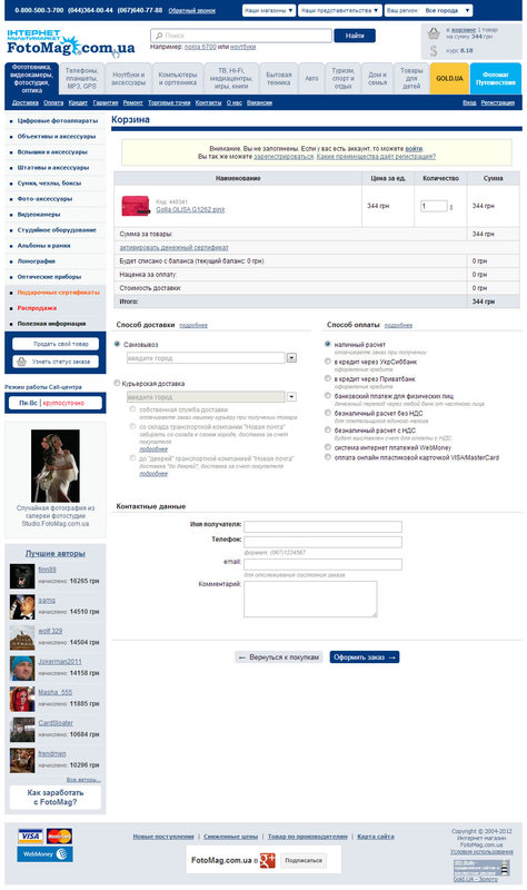
In this example, the product order page looks exactly the same as any other page on the site - the top and left menus are completely duplicated and the main information on the page is lost in the heap of garbage that is unnecessary for the buyer. When it comes to ordering, nothing should distract the valuable customer from the final goal. As a rule, the basket page does not even show recommendations, which can lead to additional purchases, removing recommendations from the product pages. Experience suggests that the less extra items on the cart page that are not related to the continuation of the purchase, the better.
Here is also an interesting example of a portable shop.

http://portativ.ua
Let us leave the same example of Fotomag for the second mistake, which is made much less often. As you can see from the screenshot, the entire order process is displayed on one page, here you can check the status of the basket by deleting or adding goods, choose the method of delivery and payment, as well as enter all the necessary information. The blocks are located and grouped in such a way that the cherished button for ordering goods goes far below the first screen (of course, it will still be visible on thirty-inch monsters), and the user is lost.

http://rozetka.com.ua/
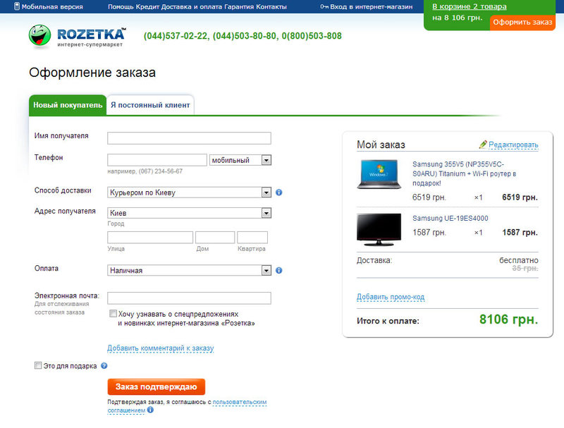
For comparison, the site of the equally popular Rosette also offers to enter all the information at once, however, all elements are grouped and arranged in such a way that it becomes much more convenient to use such a basket. Going back to the first error, note how many non-purchase items are located on the page (much less).
Total: looking at the statistics from client sites, the idea that the simpler the better is more often flashes.
And what do dear readers think?
I work with sites for quite a long time, including with online stores, improving their usability and increasing the number of sales for customers. During this period of time I have worked with more than 150 different sites that somehow sell something. Recently clicked sites and wondered how many bad sites selling good products. Although, frankly, our online stores and ease of use go a step further in the Western world (do not take it from the eBay and Amazon iconostasis).
')
1. Too much

http://fotomag.com.ua
In this example, the product order page looks exactly the same as any other page on the site - the top and left menus are completely duplicated and the main information on the page is lost in the heap of garbage that is unnecessary for the buyer. When it comes to ordering, nothing should distract the valuable customer from the final goal. As a rule, the basket page does not even show recommendations, which can lead to additional purchases, removing recommendations from the product pages. Experience suggests that the less extra items on the cart page that are not related to the continuation of the purchase, the better.
Here is also an interesting example of a portable shop.

http://portativ.ua
2. All inclusive
Let us leave the same example of Fotomag for the second mistake, which is made much less often. As you can see from the screenshot, the entire order process is displayed on one page, here you can check the status of the basket by deleting or adding goods, choose the method of delivery and payment, as well as enter all the necessary information. The blocks are located and grouped in such a way that the cherished button for ordering goods goes far below the first screen (of course, it will still be visible on thirty-inch monsters), and the user is lost.

http://rozetka.com.ua/
For comparison, the site of the equally popular Rosette also offers to enter all the information at once, however, all elements are grouped and arranged in such a way that it becomes much more convenient to use such a basket. Going back to the first error, note how many non-purchase items are located on the page (much less).
Total: looking at the statistics from client sites, the idea that the simpler the better is more often flashes.
And what do dear readers think?
Source: https://habr.com/ru/post/153501/
All Articles