Create responsive website navigation
One of the most difficult tasks in the layout of an adaptive site is navigation. This article describes in detail one of the ways to implement an adaptive menu.
Demo Download source
First of all, you need to add meta viewport to the HEAD tag to scale on any device:
')
Then we add menu items in the form of a regular list:
The menu has 6 main points, as well as an additional one, in order to reveal the navigation on small screens.
Basic CSS styles:
Menu items should follow each other, use float:
Use clearfix hack :
Each menu item is 100 pixels wide:
An additional item on large screens should be hidden:
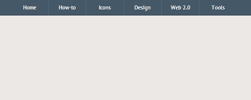
Now the menu is correctly displayed only on the big screen:
CSS3 media queries determine which styles will be used in each specific situation (for example, at different screen resolutions).

In our menu, with a resolution of less than 600 pixels wide, navigation points should appear in two columns:

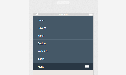
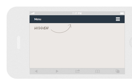
When the screen resolution is less than 480 pixels, an additional menu button should appear, which, when clicked, opens all navigation:
With a resolution of less than 320 pixels, the menu should appear in one column:
With slideToggle () we display all the menus on large screens and hide them on small ones:
Done! It turned out the navigation, which is convenient to use on devices with any screen resolution.
Demo Download source
Demo Download source
HTML
First of all, you need to add meta viewport to the HEAD tag to scale on any device:
')
<meta name="viewport" content="width=device-width, initial-scale=1, maximum-scale=1"> Then we add menu items in the form of a regular list:
<nav class="clearfix"> <ul class="clearfix"> <li><a href="#">Home</a></li> <li><a href="#">How-to</a></li> <li><a href="#">Icons</a></li> <li><a href="#">Design</a></li> <li><a href="#">Web 2.0</a></li> <li><a href="#">Tools</a></li> </ul> <a href="#" id="pull">Menu</a> </nav> The menu has 6 main points, as well as an additional one, in order to reveal the navigation on small screens.
CSS
Basic CSS styles:
body { background-color: #ece8e5; } nav { height: 40px; width: 100%; background: #455868; font-size: 11pt; font-family: 'PT Sans', Arial, sans-serif; font-weight: bold; position: relative; border-bottom: 2px solid #283744; } nav ul { padding: 0; margin: 0 auto; width: 600px; height: 40px; } Menu items should follow each other, use float:
nav li { display: inline; float: left; } Use clearfix hack :
.clearfix:before, .clearfix:after { content: " "; display: table; } .clearfix:after { clear: both; } .clearfix { *zoom: 1; } Each menu item is 100 pixels wide:
nav a { color: #fff; display: inline-block; width: 100px; text-align: center; text-decoration: none; line-height: 40px; text-shadow: 1px 1px 0px #283744; } nav li a { border-right: 1px solid #576979; box-sizing:border-box; -moz-box-sizing:border-box; -webkit-box-sizing:border-box; } nav li:last-child a { border-right: 0; } nav a:hover, nav a:active { background-color: #8c99a4; } An additional item on large screens should be hidden:
nav a#pull { display: none; } Now the menu is correctly displayed only on the big screen:
Media queries
CSS3 media queries determine which styles will be used in each specific situation (for example, at different screen resolutions).
In our menu, with a resolution of less than 600 pixels wide, navigation points should appear in two columns:
@media screen and (max-width: 600px) { nav { height: auto; } nav ul { width: 100%; display: block; height: auto; } nav li { width: 50%; float: left; position: relative; } nav li a { border-bottom: 1px solid #576979; border-right: 1px solid #576979; } nav a { text-align: left; width: 100%; text-indent: 25px; } } When the screen resolution is less than 480 pixels, an additional menu button should appear, which, when clicked, opens all navigation:
@media only screen and (max-width : 480px) { nav { border-bottom: 0; } nav ul { display: none; height: auto; } nav a#pull { display: block; background-color: #283744; width: 100%; position: relative; } nav a#pull:after { content:""; background: url('nav-icon.png') no-repeat; width: 30px; height: 30px; display: inline-block; position: absolute; rightright: 15px; top: 10px; } } With a resolution of less than 320 pixels, the menu should appear in one column:
@media only screen and (max-width : 320px) { nav li { display: block; float: none; width: 100%; } nav li a { border-bottom: 1px solid #576979; } } Navigation mapping
With slideToggle () we display all the menus on large screens and hide them on small ones:
$(function() { var pull = $('#pull'); menu = $('nav ul'); menuHeight = menu.height(); $(pull).on('click', function(e) { e.preventDefault(); menu.slideToggle(); }); $(window).resize(function(){ var w = $(window).width(); if(w > 320 && menu.is(':hidden')) { menu.removeAttr('style'); } }); }); Done! It turned out the navigation, which is convenient to use on devices with any screen resolution.
Demo Download source
Source: https://habr.com/ru/post/153103/
All Articles