Have the courage to do not like everything. 12 obsolete interface and technology solutions
In the first place should be the convenience of the user. Unfortunately, there are too many solutions on the Internet that have been borrowed over the years because “like everyone else”, but which had long been abandoned. Below is a series of such approaches from the personal collection. Written does not pretend to be true, all topics are debatable.
How often does it happen that a person misses, and types the wrong password when he carefully types it for the first time during registration? What happens if he registers in the password when registering? What emotions do you have when you are asked to enter a password confirmation? Was it ever that you didn’t copy the confirmation email from the first field, but typed it in by hand?

')
Password confirmation is not required. Registration errors are extremely rare, and the worst thing that can happen is the need to reset your password or register again. Failure to repeat the fields will save the number of curses pronounced by the user, and leave a good first impression from the service. Twitter has already figured it out, but you have to decide on that. Users will thank you.
To start using the service, confirm your account using the link from email. Why? What email service is really critical for? Let users immediately use the service, just hang up like a plate on top and disable the functionality tied to the email. Let the use of the service will be limited, but it will be. The need to close the page of the service where you just registered is nonsense. Let people play with your service. Do you have a social network? Let them quietly create a profile for themselves, do not send them email notifications for this time, everything else works fine without a confirmed email. And the gratitude of the user will return in the form of a joyful first impression of the service.
If you have just entered a password, why do you need to enter it again to log in? And if you came to the link from the validation email, do not you know what kind of user came to the service? So why do you force him to log in, if you know everything about him? Security? People save passwords in the browser, and most services are used without any login, access to the account has long ceased to be the first security priority. And if a person came to the link from the mail, then he has access to it, and he can recover the password by getting the same access to the account. Then why torture ordinary users with the requirement to enter the login-password again? Let them go to your service, they are eager to start using it, and you interfere.

How many times have you cursed reCAPTCHA without being able to read what is written on it? But the captcha is the most annoying to the user. A captcha on which it is impossible to read anything is a real test for the nerves. Maybe her this captcha, and it's time to close the registration page? I witnessed how my friend updated the recaptcha 5 times, until I could finally read it. In the fight against robots, too many civilians have suffered. Captcha should be first of all friendly to people. And instead of robots, you can already pay a penny to a thousand Asians who will gain a captcha with their hands. Use captcha, easily understood the first time. And forget about recaptcha!
first_and_last_warning = on

For your security, the password should be no shorter than 8, but not longer than 12 characters, contain at least one capital letter, number, and punctuation mark. At least once, each of us painfully invented a new password, because the old one did not fit the conditions invented by the developer. “For the sake of security,” you had to put this password in a text file on your desktop or mail, because it is impossible to remember what was freshly thought of for a single service. And in a couple of months, recovery of a forgotten password We care about your safety.
Leave the user to think about security. Password restrictions do not solve the problem, they only cause curses in living people. A password of 5 characters can be F; # z2, and of 9 - alexander

Why confirm the checkbox? Do you remember why confirmation at all? Few people rethink such basic questions, many simply copy it because they have it, and others probably have good reasons. Most often do not have. Confirmation saves from spontaneous clicks. Sometimes you really want to write something in the input field, poke buttons. Or maybe the cat walked on the keyboard? In order not to cancel painfully made out of curiosity, they make the button “save changes”. Painfully, here is the key word. What happens if we accidentally turn on the checkbox setting? We need to cancel it, right? And this is done in one click on the same checkbox. So is it not better to save the settings right by clicking on the checkbox? As in the case of a password, errors occur much less frequently than meaningful clicks, and are canceled in one click. Do not force users to save changes in the checkbox block each time. All major services already do that.
This is more of an advice than an often-inherited bad decision. After all, when there is no solution, there is nothing to inherit. But why is it not, because it’s just so trivially done, and so increases the convenience for the user? So just put the cursor in the box when you open the page with the text form. Habrahabr why on the page of creating a new post is not automatically put the cursor in the header or in the choice of the hub? And on the search page (habr.ru/search), because there is one single input field? I never cease to be surprised at how many insane services one has to make an extra click even if the main functionality of the page is in the same field (as often happens with the same search). Even Amazon does not put the focus in the search box on the main page (ebay puts).

The idea of a merry-go-round is good, but you should not copy it simply because it is cool. This is not always fun. How many times did you have to jewelly aim at the dots on the carousel to switch the picture? And how many times have you considered the picture sincerely, but it automatically switched to the next one, and because of the switching speed you did not have time to consider any? There are many roundabouts, but very few good ones. It's beautiful, but it should also be comfortable.

Social networks are great - the lively response of people raises the popularity of your service. In pursuit of social madness, services mold 100,500 social buttons so that users of all social networks will be comfortable. These buttons are knocked out of the site design, litter the visual perception, and lead to the opposite effect: the page turns into a New Year's garland, except it does not blink. Be careful with social buttons. One, two, you can three ... you should not hang up 10 sharing buttons at once, as many services do.

Not so often, but the Internet still has navigation pages, the essence of which is only to describe what link is located. It is this page that opens when you click on a section, instead of the section itself. Clicking on the "settings" - I want to see the settings immediately, and on the "friends" - a list of friends. Why not open the first, most important section at once, instead of the navigation page? Anyway, if sections need signatures, or there are too many of them, then your navigation and interface clarity needs to be rethought.

The size of the loaded photo can not be more than 100 kilobytes. Seriously? I took an avatar on a digital mirror, which gives 15 megabytes of output, and now in order to upload an avatar I need to install an editor or google photoshop online, and spend 10 minutes to compress a photo in size and size? And if I just change the service? It is unlikely that in 2012 you can splurge on disk space for uploading profile photos, which are then compressed on the server anyway. So why not just let me upload a photo? Even large services like formspring and foursquare still sin with such savings on matches. Many modern services do everything to register and create a profile as complex as possible. The most dedicated users who have passed through all the obstacles will not go anywhere. But will they all reach?

If you use a table, most likely you already have something wrong. Look at the giants: lists have long supplanted the tables. But if you left the table, do not paint it, pity the user's eyes. A properly arranged list is readable without visual line separation: look at gmail. A list of hundreds of letters does not hurt the eyes, you perfectly understand which line belongs to which date and subject. Or a list of VKontakte conversations. It is not colored, but the lines are perfectly readable. Now imagine if each even line in it was painted in a different color. Oh my eyes!
It takes determination to go against strong traditions. Grateful users will not forget you.

Confirm password or email during registration
How often does it happen that a person misses, and types the wrong password when he carefully types it for the first time during registration? What happens if he registers in the password when registering? What emotions do you have when you are asked to enter a password confirmation? Was it ever that you didn’t copy the confirmation email from the first field, but typed it in by hand?
')
Password confirmation is not required. Registration errors are extremely rare, and the worst thing that can happen is the need to reset your password or register again. Failure to repeat the fields will save the number of curses pronounced by the user, and leave a good first impression from the service. Twitter has already figured it out, but you have to decide on that. Users will thank you.
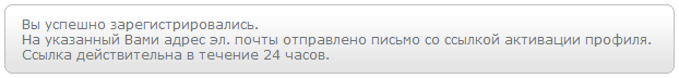
Inability to use the service before email validation
To start using the service, confirm your account using the link from email. Why? What email service is really critical for? Let users immediately use the service, just hang up like a plate on top and disable the functionality tied to the email. Let the use of the service will be limited, but it will be. The need to close the page of the service where you just registered is nonsense. Let people play with your service. Do you have a social network? Let them quietly create a profile for themselves, do not send them email notifications for this time, everything else works fine without a confirmed email. And the gratitude of the user will return in the form of a joyful first impression of the service.
The need to log in after registration or validation
If you have just entered a password, why do you need to enter it again to log in? And if you came to the link from the validation email, do not you know what kind of user came to the service? So why do you force him to log in, if you know everything about him? Security? People save passwords in the browser, and most services are used without any login, access to the account has long ceased to be the first security priority. And if a person came to the link from the mail, then he has access to it, and he can recover the password by getting the same access to the account. Then why torture ordinary users with the requirement to enter the login-password again? Let them go to your service, they are eager to start using it, and you interfere.
Captcha should be readable
How many times have you cursed reCAPTCHA without being able to read what is written on it? But the captcha is the most annoying to the user. A captcha on which it is impossible to read anything is a real test for the nerves. Maybe her this captcha, and it's time to close the registration page? I witnessed how my friend updated the recaptcha 5 times, until I could finally read it. In the fight against robots, too many civilians have suffered. Captcha should be first of all friendly to people. And instead of robots, you can already pay a penny to a thousand Asians who will gain a captcha with their hands. Use captcha, easily understood the first time. And forget about recaptcha!
first_and_last_warning = on
Input field restrictions
For your security, the password should be no shorter than 8, but not longer than 12 characters, contain at least one capital letter, number, and punctuation mark. At least once, each of us painfully invented a new password, because the old one did not fit the conditions invented by the developer. “For the sake of security,” you had to put this password in a text file on your desktop or mail, because it is impossible to remember what was freshly thought of for a single service. And in a couple of months, recovery of a forgotten password We care about your safety.
Leave the user to think about security. Password restrictions do not solve the problem, they only cause curses in living people. A password of 5 characters can be F; # z2, and of 9 - alexander
Confirmation of saving settings specified via checkbox and select
Why confirm the checkbox? Do you remember why confirmation at all? Few people rethink such basic questions, many simply copy it because they have it, and others probably have good reasons. Most often do not have. Confirmation saves from spontaneous clicks. Sometimes you really want to write something in the input field, poke buttons. Or maybe the cat walked on the keyboard? In order not to cancel painfully made out of curiosity, they make the button “save changes”. Painfully, here is the key word. What happens if we accidentally turn on the checkbox setting? We need to cancel it, right? And this is done in one click on the same checkbox. So is it not better to save the settings right by clicking on the checkbox? As in the case of a password, errors occur much less frequently than meaningful clicks, and are canceled in one click. Do not force users to save changes in the checkbox block each time. All major services already do that.
Put the focus in the input box. Select the field from which to copy
This is more of an advice than an often-inherited bad decision. After all, when there is no solution, there is nothing to inherit. But why is it not, because it’s just so trivially done, and so increases the convenience for the user? So just put the cursor in the box when you open the page with the text form. Habrahabr why on the page of creating a new post is not automatically put the cursor in the header or in the choice of the hub? And on the search page (habr.ru/search), because there is one single input field? I never cease to be surprised at how many insane services one has to make an extra click even if the main functionality of the page is in the same field (as often happens with the same search). Even Amazon does not put the focus in the search box on the main page (ebay puts).
The control "carousel"
The idea of a merry-go-round is good, but you should not copy it simply because it is cool. This is not always fun. How many times did you have to jewelly aim at the dots on the carousel to switch the picture? And how many times have you considered the picture sincerely, but it automatically switched to the next one, and because of the switching speed you did not have time to consider any? There are many roundabouts, but very few good ones. It's beautiful, but it should also be comfortable.
Social network buttons
Social networks are great - the lively response of people raises the popularity of your service. In pursuit of social madness, services mold 100,500 social buttons so that users of all social networks will be comfortable. These buttons are knocked out of the site design, litter the visual perception, and lead to the opposite effect: the page turns into a New Year's garland, except it does not blink. Be careful with social buttons. One, two, you can three ... you should not hang up 10 sharing buttons at once, as many services do.
By page on tab and separate navigation pages
Not so often, but the Internet still has navigation pages, the essence of which is only to describe what link is located. It is this page that opens when you click on a section, instead of the section itself. Clicking on the "settings" - I want to see the settings immediately, and on the "friends" - a list of friends. Why not open the first, most important section at once, instead of the navigation page? Anyway, if sections need signatures, or there are too many of them, then your navigation and interface clarity needs to be rethought.
Photo Size Restrictions
The size of the loaded photo can not be more than 100 kilobytes. Seriously? I took an avatar on a digital mirror, which gives 15 megabytes of output, and now in order to upload an avatar I need to install an editor or google photoshop online, and spend 10 minutes to compress a photo in size and size? And if I just change the service? It is unlikely that in 2012 you can splurge on disk space for uploading profile photos, which are then compressed on the server anyway. So why not just let me upload a photo? Even large services like formspring and foursquare still sin with such savings on matches. Many modern services do everything to register and create a profile as complex as possible. The most dedicated users who have passed through all the obstacles will not go anywhere. But will they all reach?
Zebra in the tables
If you use a table, most likely you already have something wrong. Look at the giants: lists have long supplanted the tables. But if you left the table, do not paint it, pity the user's eyes. A properly arranged list is readable without visual line separation: look at gmail. A list of hundreds of letters does not hurt the eyes, you perfectly understand which line belongs to which date and subject. Or a list of VKontakte conversations. It is not colored, but the lines are perfectly readable. Now imagine if each even line in it was painted in a different color. Oh my eyes!
It takes determination to go against strong traditions. Grateful users will not forget you.
Source: https://habr.com/ru/post/152967/
All Articles