Mobile applications from Surfingbird
Recently, we finally released an application for Android , and even earlier an application for iPad (and even earlier for the iPhone, but we will not talk about it, it is terrible).
And, in principle, I just want to brag a little.
The iPad application uses an interface that seems innovative to us :-) Navigating through logically nested concepts looks like interface layers overlapping one another. Slide to the right removes the current top layer, tap on the desired layer hides all the top (sometimes the top layers do not completely cover the bottom).
Navigation is convenient, we like it. It looks like this (about 500KB of traffic):
')

(By clicking full-size png, which shows that we are suckers and we only have iPad 2 64Gb 3G.)
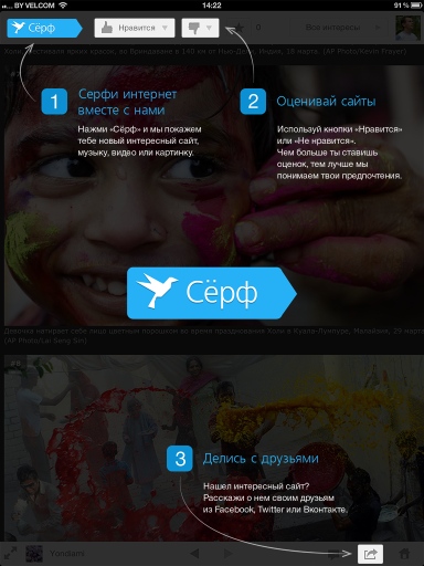
The application is friendly and when you first start it shows a hint:
And this is how the main page looks like (after login / registration):

Of course, in landscape mode it works too :-)
The Android version gave us a surprise - suddenly, among its users, the share of versions 4.0. * And 4.1 was more than 50%! For comparison, according to the same Google Play, the share of such systems on average in the Social category is less than 30%. By 4.1, the skew is generally five times.
Apparently, this confirms our theory that the target audience of our site is young successful businessmen who have either the Galaxy S III, or the iPhone 5, or the new iPad. Hooray!
Although, after sending out about new applications, a lot was asked for the version under Windows Phone (and twice more under Symbian and once under Blackberry) - apparently, the new Lumia made a good impression, and they are preparing for the platform change in advance.
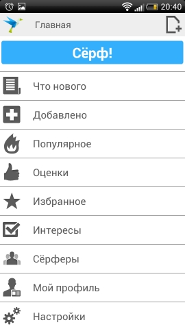
Now about the application itself. It is nude (and, of course, premium-exclusive). The iPhone version will probably be redone in a similar way. It looks simple, clean, functional:


By the screenshots, by the way, it is clear that using the application improves signal reception and charges the battery.
Applications are accepted by users warmly. The main problem is simple - users do not understand how the service is arranged, and complain about such things as a) slow loading pages (mobile Internet is to blame for everything), b) lack of website optimization for mobile platforms (if we load content to ourselves, we’re will kill).
What to do with this is not very clear. Well, except that in the information about the next update gave a link to the FAQ .
The second problem is pain to us already - that in the AppStore, that it is impossible to communicate with users on Google Play; The AppStore also does not provide information about the total number of installations - some kind of fascism.
Well, check for updates for three weeks in the same AppStore, but what really ...
Something like this.
At the end we will share the main planned features - we will make it possible to preload a few pages to read, which should partially solve the problems with the mobile Internet.
References:
play.google.com/store/apps/details?id=ru.surfingbird
itunes.apple.com/us/app/surfingbird-hd/id549111426
And, in principle, I just want to brag a little.
The iPad application uses an interface that seems innovative to us :-) Navigating through logically nested concepts looks like interface layers overlapping one another. Slide to the right removes the current top layer, tap on the desired layer hides all the top (sometimes the top layers do not completely cover the bottom).
Navigation is convenient, we like it. It looks like this (about 500KB of traffic):
')
(By clicking full-size png, which shows that we are suckers and we only have iPad 2 64Gb 3G.)
The application is friendly and when you first start it shows a hint:
And this is how the main page looks like (after login / registration):
Of course, in landscape mode it works too :-)
The Android version gave us a surprise - suddenly, among its users, the share of versions 4.0. * And 4.1 was more than 50%! For comparison, according to the same Google Play, the share of such systems on average in the Social category is less than 30%. By 4.1, the skew is generally five times.
Apparently, this confirms our theory that the target audience of our site is young successful businessmen who have either the Galaxy S III, or the iPhone 5, or the new iPad. Hooray!
Although, after sending out about new applications, a lot was asked for the version under Windows Phone (and twice more under Symbian and once under Blackberry) - apparently, the new Lumia made a good impression, and they are preparing for the platform change in advance.
Now about the application itself. It is nude (and, of course, premium-exclusive). The iPhone version will probably be redone in a similar way. It looks simple, clean, functional:
By the screenshots, by the way, it is clear that using the application improves signal reception and charges the battery.
Applications are accepted by users warmly. The main problem is simple - users do not understand how the service is arranged, and complain about such things as a) slow loading pages (mobile Internet is to blame for everything), b) lack of website optimization for mobile platforms (if we load content to ourselves, we’re will kill).
What to do with this is not very clear. Well, except that in the information about the next update gave a link to the FAQ .
The second problem is pain to us already - that in the AppStore, that it is impossible to communicate with users on Google Play; The AppStore also does not provide information about the total number of installations - some kind of fascism.
Well, check for updates for three weeks in the same AppStore, but what really ...
Something like this.
At the end we will share the main planned features - we will make it possible to preload a few pages to read, which should partially solve the problems with the mobile Internet.
References:
play.google.com/store/apps/details?id=ru.surfingbird
itunes.apple.com/us/app/surfingbird-hd/id549111426
Source: https://habr.com/ru/post/152567/
All Articles