Storyboard Design
Probably many of you have heard about storyboards. They are drawn in the first stages of creating a movie or cartoon. In the production of software, it is expensive to miss the design stage, and when shooting a film, this is not just expensive, but very, very expensive. Johnny Depp will not nibble stale sandwiches on the set, while the director decides that you need to add three more scenes with mermaids and insert into the plot of the adopted child and change your beloved. Therefore, in the films, all the scenes are drawn in advance and approved, sometimes even they are superimposed on music and scrolled in order to evaluate the film’s entertainment and plot even at the first stages.
In the design of such a role perform wireframes and other rapid prototypes. Storyboards, retaining the name and shape, as in the film industry, when designing interfaces perform slightly different tasks.
About storyboards I first heard on the course Human Computer Interaction

Course teacher Scott Klemmer draws a storyboard
')
I did not see anything similar in the reports of our designers, and Klemmer spoke of this as a widespread, well-known practice.
As it turned out, in the west, this tool is quite popular, if you are interested in who, how and why it is used, welcome under the cat.
I met several opinions on the tasks of storyboards. Some experts suggest using them inside the team to form a common vision for all members of the working group. Others advise using them to present their solutions to customers. Periodically, storyboards also appear as the design stage somewhere between the formation of characters and the drawing of the first prototype of the system.
It is clear that storyboards for all three tasks will be different. Those scrawl curves that you can draw for your team should be different from the tool that will present the solution to the client. Below, I will tell you more about how solutions for different audiences differ, but for now let's consider what they have in common.
In any case, a storyboard should answer questions (no matter the client or your colleagues):
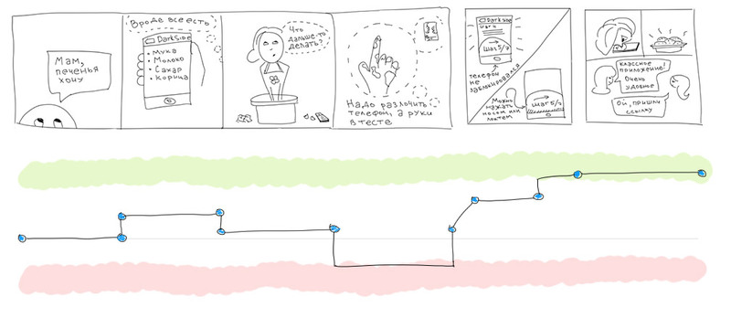
In order to somehow illustrate the text, I drew a storyboard for a fictional program with cookie recipes. Let it be called, for example, DarkSide.
Let's start with the answers to the questions:
It should be noted that all the answers depend on the wording of the original problem. If the initial need is to “make cookies from what is at home,” then all the following answers will be completely different.
In fact, one application may include several scenarios, and, accordingly, may be illustrated by several storyboards. But it seems to me that for presentations it should be limited to one storyboard, showing the prerequisites for the design and the decision made.
For example, let's draw a storyboard for DarkSide to show it to the customer, before the presentation of the interface prototype itself.
DarkSide usage scenario
The literature at the school taught the structure of the plot of any artwork. Storyboard - the same story, and it uses the same laws of composition.
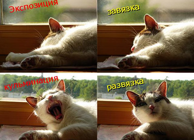
Story structure

Stages of the story about DarkSide
With the problem and solution, everything is more or less clear, let's talk about the benefits. The last frame must necessarily show the solution of the client’s business problem. Not a solution to the user's problem (it is in the previous frame), but a solution to the business problem.
Here is the distribution of the application between users and high ratings in the rating. It makes no sense to show the client how the girl prepared the cookie, his goal is to sell the application or sell advertising in a popular application.
Irrelevant. Storyboards should be as quick as tools on paper. You do not need to be able to draw to draw a stick-stick cucumber. People are very sensitive to everything even remotely similar to a person (evidence on sites where they lay out sockets in which everyone sees some face). If you really, really don't want to draw, you can generally use a set of troll interfaces (preferably, not for the presentation to the client).
Feelings are subjective. Many decision makers are more pleased to deal with numbers and measurable quantities than with emotions. For them, we can mark everything that our character goes through on the impression chart. This will give our ideas clarity and weight.
The graph of impressions is a curve showing the character's state throughout the entire history.
* In my personal opinion, the schedule is needed either for people with Asperger syndrome, or for serious businessmen with calibrated vision, sharpened on charts. Obviously, the construction of this pseudo-graphic is completely subjective and can only be used for illustrative purposes.
** Storyboard and the schedule of impressions below are taken from the article by Ben Crothers, more information about his research can be found on the link in the list of references.
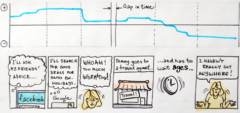
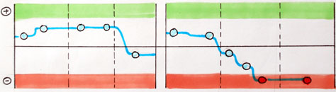
The picture below shows a simple storyboard about a girl who wants to book a trip for herself. The final of the story is as follows - all the means by which she used it have their flaws and did not help her realize her plans.

1. The graph in the figure depicts the storyboard of the storyboard from the previous figure. The gap in the line shows the excerpt left behind the storyboard brackets.
2. In a storyboard there must be clear key points in which decisions are made, expectations are exceeded or are not justified.
Service managers call these points service points. These points are important in measuring emotions, try to be divided into different episodes.
Mark the key points on the chart.
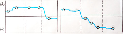
3. Areas of positive and negative mood highlight extremes for clarity.
People are very susceptible to stories: the innate sense of curiosity attracts them to any plot. They empathize with the heroes, empathy helps on an emotional level to convince them that otherwise they would have had to be explained for a long time by “logical” arguments. Storyboard, like any illustration, carries additional layers of meaning, intuitive and distorted not so much as words.
Storyboard will help make your arguments bright and memorable. The crooked man next to the predatory grinned sun will be remembered more than the statistical calculations that users would prefer a higher monitor brightness or a non-glare screen.
Impression graph for the application DarkSide
When I look at the design process in Western studios, I always have a strange feeling.
One studio makes prototype appliqués very nicely glued from colored cardboard. Somewhere I saw a prototype, stunningly painted either with pastel, or colored pencils, and up to the gradients on the buttons. Some studios shoot short videos on the phone about how the user behaves. Now also comics, as it turned out, there is.
I always thought it was such a fun entertainment. Well, glue the app with the whole group is cool. You can smear the manager with glue, or sprinkle the designer with scraps. Much more fun than layouts in indizayne draw.
Perhaps, initially, these were student practices, because the task is interesting, and it will entertain you, and instill interest, but the developers take it to real conditions, rather than forgetting after the prom.
In general, most of these techniques are very interesting, but I cannot overpower the skepticism towards them. If you have any thoughts on this, it will be interesting to discuss.
In the design of such a role perform wireframes and other rapid prototypes. Storyboards, retaining the name and shape, as in the film industry, when designing interfaces perform slightly different tasks.
About storyboards I first heard on the course Human Computer Interaction
Course teacher Scott Klemmer draws a storyboard
')
I did not see anything similar in the reports of our designers, and Klemmer spoke of this as a widespread, well-known practice.
As it turned out, in the west, this tool is quite popular, if you are interested in who, how and why it is used, welcome under the cat.
Tasks
I met several opinions on the tasks of storyboards. Some experts suggest using them inside the team to form a common vision for all members of the working group. Others advise using them to present their solutions to customers. Periodically, storyboards also appear as the design stage somewhere between the formation of characters and the drawing of the first prototype of the system.
It is clear that storyboards for all three tasks will be different. Those scrawl curves that you can draw for your team should be different from the tool that will present the solution to the client. Below, I will tell you more about how solutions for different audiences differ, but for now let's consider what they have in common.
In any case, a storyboard should answer questions (no matter the client or your colleagues):
- Who is your character?
- What need does the system satisfy?
- What task should be performed?
- What leads the user to use your system?
- In what conditions is it performed?
- What is the sequence of actions?
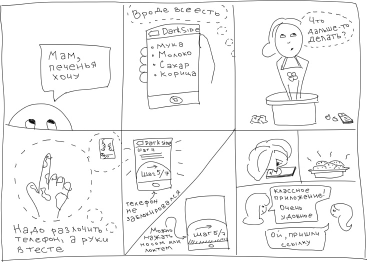
In order to somehow illustrate the text, I drew a storyboard for a fictional program with cookie recipes. Let it be called, for example, DarkSide.
Let's start with the answers to the questions:
- the character is a middle-aged woman
- need - cooking cookies
- the task is to select the necessary products and study the sequence of actions for cooking
- recipe ignorance leads to user application
- The first part of the task is performed either at home or, if there is a shortage of food, in the store, the second part is performed in the kitchen
- sequence - selection of a specific recipe, study of the list of necessary products, if necessary, the acquisition of the missing ones, following the instructions for preparing
It should be noted that all the answers depend on the wording of the original problem. If the initial need is to “make cookies from what is at home,” then all the following answers will be completely different.
In fact, one application may include several scenarios, and, accordingly, may be illustrated by several storyboards. But it seems to me that for presentations it should be limited to one storyboard, showing the prerequisites for the design and the decision made.
For example, let's draw a storyboard for DarkSide to show it to the customer, before the presentation of the interface prototype itself.
DarkSide usage scenario
Plot
The literature at the school taught the structure of the plot of any artwork. Storyboard - the same story, and it uses the same laws of composition.
Story structure
Stages of the story about DarkSide
With the problem and solution, everything is more or less clear, let's talk about the benefits. The last frame must necessarily show the solution of the client’s business problem. Not a solution to the user's problem (it is in the previous frame), but a solution to the business problem.
Here is the distribution of the application between users and high ratings in the rating. It makes no sense to show the client how the girl prepared the cookie, his goal is to sell the application or sell advertising in a popular application.
Drawing technique
Irrelevant. Storyboards should be as quick as tools on paper. You do not need to be able to draw to draw a stick-stick cucumber. People are very sensitive to everything even remotely similar to a person (evidence on sites where they lay out sockets in which everyone sees some face). If you really, really don't want to draw, you can generally use a set of troll interfaces (preferably, not for the presentation to the client).
Pseudoscientific approach
Feelings are subjective. Many decision makers are more pleased to deal with numbers and measurable quantities than with emotions. For them, we can mark everything that our character goes through on the impression chart. This will give our ideas clarity and weight.
The graph of impressions is a curve showing the character's state throughout the entire history.
* In my personal opinion, the schedule is needed either for people with Asperger syndrome, or for serious businessmen with calibrated vision, sharpened on charts. Obviously, the construction of this pseudo-graphic is completely subjective and can only be used for illustrative purposes.
** Storyboard and the schedule of impressions below are taken from the article by Ben Crothers, more information about his research can be found on the link in the list of references.
The picture below shows a simple storyboard about a girl who wants to book a trip for herself. The final of the story is as follows - all the means by which she used it have their flaws and did not help her realize her plans.
1. The graph in the figure depicts the storyboard of the storyboard from the previous figure. The gap in the line shows the excerpt left behind the storyboard brackets.
2. In a storyboard there must be clear key points in which decisions are made, expectations are exceeded or are not justified.
Service managers call these points service points. These points are important in measuring emotions, try to be divided into different episodes.
Mark the key points on the chart.
3. Areas of positive and negative mood highlight extremes for clarity.
People are very susceptible to stories: the innate sense of curiosity attracts them to any plot. They empathize with the heroes, empathy helps on an emotional level to convince them that otherwise they would have had to be explained for a long time by “logical” arguments. Storyboard, like any illustration, carries additional layers of meaning, intuitive and distorted not so much as words.
Storyboard will help make your arguments bright and memorable. The crooked man next to the predatory grinned sun will be remembered more than the statistical calculations that users would prefer a higher monitor brightness or a non-glare screen.
Impression graph for the application DarkSide
Final Exposing Comment
When I look at the design process in Western studios, I always have a strange feeling.
One studio makes prototype appliqués very nicely glued from colored cardboard. Somewhere I saw a prototype, stunningly painted either with pastel, or colored pencils, and up to the gradients on the buttons. Some studios shoot short videos on the phone about how the user behaves. Now also comics, as it turned out, there is.
I always thought it was such a fun entertainment. Well, glue the app with the whole group is cool. You can smear the manager with glue, or sprinkle the designer with scraps. Much more fun than layouts in indizayne draw.
Perhaps, initially, these were student practices, because the task is interesting, and it will entertain you, and instill interest, but the developers take it to real conditions, rather than forgetting after the prom.
In general, most of these techniques are very interesting, but I cannot overpower the skepticism towards them. If you have any thoughts on this, it will be interesting to discuss.
Bibliography
- Lecture HCI 3.1: Paper Prototypes and Mockups , registration required;
- UXmatters Using Storyboards and Sentiment Charts to Quantify Customer Experience (the article from which the schedule of impressions);
- A series of articles by Johnny Holland: 1 , 2 , 3 ;
- Storyboarding presentation;
- Presentation of Conserve code storyboard with customers first ;
Source: https://habr.com/ru/post/152375/
All Articles