Redesign Qt Creator do it yourself
Many of those who are engaged in development in C ++ / Qt are familiar with such an environment as Qt Creator, the creators of which worked on the design no less than on functionality. But I, as an amateur of dark color schemes and flat minimalism, were not always satisfied with the light background of the panels and the gradient headings.
It would seem that open source - take it and change it, but inexperience and laziness stopped me until I found out about such a thing as Qt Style Sheets, which allows to describe the appearance of widgets in css format.
')
I warn you in advance: Let me give you the following, but not very dirty, but hack . Of course, he will open a security hole, steal your passwords and send them to Prague hackers, but various artifacts in the interface are possible.
Environment preparation
UPD: Patching Nothing Nothing Instead, on the advice of cyberbobs, it is enough to run QtCreator with the -stylesheet = stylesheet.css parameter, so we immediately proceed to redraw, but if you really want
then continue
First we take the source code of the environment. Unpack and add to the and destroy :
lazy can take the modified file for the latest stable version 2.5.0
then
if everything went smoothly at the output we get
MainWindow::MainWindow() constructor located approximately ./src/plugins/coreplugin/mainwindow.cpp:199 your crutch, providing it with identifying marks, so that if something happens, you can quickly find //$$MARKER //HACK: Injecting css to change appearance // // Linux: /home/shed/.local/share/data/Nokia/QtCreator // Windows: C:\Document and Settings\user\Local Settings\Application Data QString csspath = QDesktopServices::storageLocation(QDesktopServices::DataLocation)+"/stylesheet.css"; QFile css(csspath); if (css.open(QIODevice::ReadOnly | QIODevice::Text)){ qDebug() << "NOTE: stylesheet loaded from" << csspath; QString style = QTextStream(&css).readAll(); qApp->setStyleSheet(style); } else { qDebug() << "NOTE: stylesheet not found in " << csspath; } //$$MARKEREND lazy can take the modified file for the latest stable version 2.5.0
then
qmake && make && ./bin/qtcreatorif everything went smoothly at the output we get
NOTE: stylesheet not found in <--->/stylesheet.cssNow we create this very stylesheet.css and write there for checking.
background: blue; color: red; restart qtcreator (to save nerves, you should set up the editor to launch qtcreator with one click) and see this extravaganza:
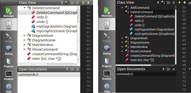
As it should, setStyle painted everything blue, but two dropouts appeared: a list of classes and methods of the current document and switches of output panels. I have two assumptions as to why: either these elements are not descendants of QWidget, which is unlikely, or they use their own way of drawing around the Qt style system, which is quite possible given their non-standard look.
Redrawing
As you know the style sheet is a set of records of the form:
<>[, <>, ...] { <>: <>; <>: <>; ... <>: <>; } If you have never written anything like this before, a few lessons from any tutor will give you an idea of what will happen below. Later you should read the Qt Style Sheet documentation and examples .
Selectors
In demonology, to call a daemon you need to know its name, in our case, to compose a selector, you need to know the class name, objectName, or the value of any property set using Q_PROPERTY () and setProperty ().
Qt supports all CSS2 selectors . Most useful according to the documentation:
| Universal selector | * | Matches all widgets. |
| Type selector | QPushButton | Corresponds to instances of the QPushButton class and its subclasses. |
| Property selector | QPushButton [flat = "false"] | Corresponds to QPushButton class instances that are not flat (flat). You can use this selector to test any Qt property specified using Q_PROPERTY (). Instead of = you can also use ~ = to check whether the Qt property of type QStringList contains the specified QString. |
| Class selector | .QPushButton | Corresponds to QPushButton class instances, but not to its subclasses. Equivalent to * [class ~ = "QPushButton"]. |
| ID selector | QPushButton # okButton | Matches all instances of the QPushButton class whose objectName is equal to okButton. |
| Descendant Selector | QDialog QPushButton | Corresponds to all QPushButton class instances that are descendants of the QDialog class (children, granddaughters, etc.). |
| Child selector | QDialog> QPushButton | Matches all instances of the QPushButton class that are direct descendants of a QDialog. |
We are only interested in the type selector, the use of properties would be more flexible and correct, but this requires intervention in the code.
Now let's play designers.
Let me remind you, we wanted to make a dark background at the panels. For this we need to select a selector. What do we usually see in these panels? Trees in “Projects”, “Classes Overview”, “Type Hierarchy” and “Contour” (nee “Outline”), lists in “File System”, “Open Documents” and “Bookmarks” and tables in debug panels, vol. e. standard QListView, QTreeView, and QTableVeiw are the name that QAbstractItemView .
Therefore we will write the following to our stylesheet.css:
QAbstractItemView { color: #EAEAEA; background: #232323; font-size: 9pt; } We start, reduce the window size to a minimum so that more items crawl out and see:

We got what we wanted, but our (albeit unloved) panels lost their appearance, and even without our team. If anyone has run over his eyes over MainWindow :: MainWindow (), he may have noticed an inconspicuous line
qApp->setStyle(new ManhattanStyle(baseName)); , especially persistent ones could click on the ManhattanStyle and notice that it is inherited from QProxyStyle i.e. It is he who redefines the panning in our panels. And it is he who goes backstage as soon as we set the style.In anticipation of a lot of small work to restore beauty in these faded buttons, I decided not to waste time on things, and besides QAbstractItemView I also added QMainWindow - the father of all widgets:
QAbstractItemView, QMainWindow { color: #EAEAEA; background: #232323; font-size: 9pt; } Run:

Almost what you need. It remains to darken the white spots of tabs, headers and scrolbars.
Sub elements and states
Like CS2, Qt Style Sheet supports sub-elements and states, i.e. selector record in the form:
<>::<>:<> For example,
QScrollBar::left-arrow:horizontal selects all the left arrows of horizontal scroll bars.Consider how it works on our white spots.
We make out QTreeView and QAbstractItemView
To begin, change the appearance of the selected item in QAbstractItemView to darker with:
QAbstractItemView::item:selected { color: #EAEAEA; background-color: #151515; } Compare:

Now let's deal with QTreeView .
Each line consists of one subitem :: item and one or several :: branch:

:: branch besides standard states supports 4 more:
* Blue - elements with the desired state
 |  |  |  |
:open | :adjoins-item | :has-children | :has-subling |
Thinking, I decided to forget about the annoying arrows and make a small gray point opposite the grouped elements. So we need
:closed:adjoins-item:has-children . Twitching the parameters we get something like: QTreeView::branch:closed:adjoins-item:has-children { background: solid #777777; margin: 6px; height: 6px; width: 6px; border-radius: 3px; } 
If you like arrows, you should like the url (filename) construction, which is transferred to image: or border-image: sets the image stored on the hard disk or in the Qt resource system as a background or border.
Change QScrollBar
In the eyes of Qt Style Sheets, the standard scroll bar consists of the following sub-elements:
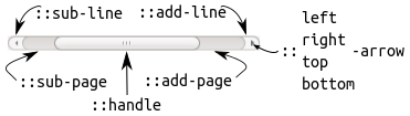
Cynically we transform this three-dimensional splendor into a dull gray-gray strip, and the buttons along with the arrows are sent to award the “Waste 2012” prize with the following lines:
QScrollBar { border: none; background: #494949; height: 6px; width: 6px; margin: 0px; } QScrollBar::handle { background: #DBDBDB; min-width: 20px; min-height: 20px; } QScrollBar::add-line, QScrollBar::sub-line { background: none; border: none; } QScrollBar::add-page, QScrollBar::sub-page { background: none; } We get:
Modify QTabBar
Without further ado, proceed to the alteration of
- Sub: :: tear (tab separator) and :: scroller (scroll button)
- A whole scattering of additional tab states:: only-one,: first,: last,: middle,: previous - selected,: next-selected,: selected, the purposes of which I hope are clear from the names.
- The pseudo-states: top,: left,: right,: bottom are dependent on the orientation of the panel.
- Negative fields that can be used to create overlaps
There is where to roam fantasy.
There is only one thing to remember, QTabBar lies on QTabWidget, so the background should be changed through the widget, and the properties of the tabs are already through the panel. But we are unpretentious people, besides, QMainWindow has taken care of the background, so we blur thin, inconspicuous tabs with strings:
QMainWindow, QAbstractItemView, QTreeView::branch, QTabBar::tab { ... QTabBar::tab:selected { font: bold; border-color: #9B9B9B; border-bottom-color: #C2C7CB; } QTabBar::tab:!selected { margin-top: 2px; } 
Modify QHeaderView
For those who did not know, all these table headers in Qt are QHeaderView. It has one :: section sub element which has the same states as QTabBar :: tab.
This time I decided to give up the tradition and make a gradient fill (yes, here, and so it is possible). For this, qlineargradient, qradialgradient, qconicalgradient constructions are used. Gradients are specified in Object Bounding Mode. Imagine a rectangle in which the gradient is visualized, the upper left corner of which is at (0, 0), and the lower right corner at (1, 1). The gradient parameters in this case are indicated as a fraction between 0 and 1. These values are extrapolated to the real coordinates of the rectangle at run time. It is possible to set values that lie outside the bounding box (for example, -0.6 or 1.8).
I used the following layout:
QHeaderView::section { background-color: qlineargradient(x1:0, y1:0, x2:0, y2:1, stop:0 #616161, stop: 0.5 #505050, stop: 0.6 #434343, stop:1 #656565); color: white; padding-left: 4px; border: 1px solid #6c6c6c; } 
That is what we wanted.
We persuade a stubborn socket
There is only one little problem left:
This left was absolutely indifferent to our efforts, moreover, he remained indifferent even when we indicated QWidget's great-grandfather as a selector. Despite this, I still went through different selectors. For the first time it was possible to get through its selectors with QComboBox and QLabel:
QComboBox, QComboBox::drop-down { color: #EAEAEA; background: #232323; font-size: 9pt; border: none; padding: 1px 18px 1px 3px; min-width: 6em; } QLabel { border-style: solid; color: #EAEAEA; background: #232323; font-size: 9pt; } 
Cons on the face. The border around the frayed out, inexorable, by any border-style, so also heavy inheritance leaked everywhere inappropriately.
Here, by the way, drops of common sense appeared. Children, what is thin, in the top of the window with buttons in a row? Of course, this is QToolBar!
We try:
QToolBar { border-style: solid; border-style: outset; color: #EAEAEA; background: #333333; font-size: 9pt; } 
Bingo! All traces of a serious illness disappeared and the renegade obediently joined the general view.
Results
stylesheet.css
TODO:
It would be more correct not to encode colors, but to take them from the palette, which at best could be filled according to the color scheme of the editor. In addition, you could arrange all this in the form of a correct addition and add your own settings page with a choice of style, and possibly an editor. Well, the most desirable is, of course, to lose weight in a comfortable but thick side panel. removing the text and getting access to its design from our css file, but it requires a deeper intervention in the code and indeed a completely different story.
Source: https://habr.com/ru/post/152367/
All Articles