Restyling a sign or logo is troublesome, delicate, but interesting
Three simple rules that remove many problems:
1) Habit is second nature. Every day a person puts soul and energy into his business.
The “old” sign is visible for many years (it happens that such a sign was made by a loved one in Word in five minutes and completely free of charge), and then the sales manager comes and says, “Viktor Sigismundovich, our sales have fallen because our Potential customers perceive our company as being old-fashioned and old-fashioned. And with our competitors, the logo looks not so hot. ”
By talking-talks, creaking from the heart, the director makes a decision: “We are changing the sign, but not much, and to be recognized. Because it is a story. ”
When a contractor is selected, everyone is waiting for the first presentation.
And then people come: "We have corrected this passion of yours, because we did not understand how such a thing could be done and live with it."
In other words, the client hears: “Everything that you had before is crap, your business is crap. But give me the money, and we'll fix everything. ”
In a similar situation, the client has a subconscious reaction: rejection of any options with motivation “We have lived for 15 years and will live the same amount”.
Always need to resty "think seven times, and then only talk."
2) Any person has expectations, any customer has expectations. And these expectations in the initial stages should be clarified.
If the customer does not like the “dark brown circle”, then you can spend a lot of effort, time and money (yes, money, for conducting surveys, focus groups, long and heavy presentations, correspondence), proving the opposite. The result will be one: "I do not like the circle and dark brown color."
Therefore, at the initial stage, it is necessary to get to know the preferences by shapes and colors as clearly as possible.
The argument "I do not like" is very significant. That's why I love to go to customers in offices: much becomes clear immediately. And it also happens that the client really likes some detail in the existing sign (but in your opinion this is some kind of rudiment). And the client agrees to restyling, but only with the preservation of this detail. Therefore, it is important to carefully find out the details in advance. You do not want to be asked the question: “Where is the tail, which is 20 years old with us?”
')
3) The contract was signed, the money was paid, the work is in full swing.
First show The customer asks the question: "Why so?" The designer begins to vaguely talk about "cosmic vibrations and the matrix of emotions." This is not true.
With such a delicate work, as restyling, you always need to explain to the customer (clearly and with pictures) why it was done this way and not otherwise. What is the justification for the thickness of the lines, why is this color exactly here and what is the new version that you developed better than the old one
Summary, so three simple rules:
1) Correctness.
2) Attention to detail.
3) Argumentation - thesis, arguments and demonstration.
And remember, no branding can replace simple and human relationships.
Examples:
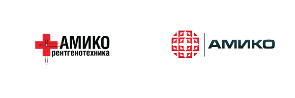
Amiko - the idea of the old sign is fully preserved. Medical cross. Since the company is engaged in X-ray technology in the new version of the mark, the idea of a layer-by-layer look inside and the “digitality” is added.

The key idea inherent in the "new" sign is the idea of cyclicity, movement, mixing and separation. (The company's field of activity is technologies and equipment for the production and separation of gaseous media.) The graphic form symbolizes the molecular structure, air flow, and the blades of the ventilation equipment.

The composition itself, remaining unchanged as a whole, has been completely reworked in detail. Preserving the old layout was a key aspect of the task, since it is precisely because of this that the continuity of the old and new logo appears. The viewer unmistakably identifies the foundation, but his perception will be more "fresh."
The complex structure is maximally relaxed and smoothed. The internal tension and understatement of the mark were removed and turned into positive dynamics - all lines became smooth, the viewer's eye no longer “clings” to the corners of the frame and sharp letters.
1) Habit is second nature. Every day a person puts soul and energy into his business.
The “old” sign is visible for many years (it happens that such a sign was made by a loved one in Word in five minutes and completely free of charge), and then the sales manager comes and says, “Viktor Sigismundovich, our sales have fallen because our Potential customers perceive our company as being old-fashioned and old-fashioned. And with our competitors, the logo looks not so hot. ”
By talking-talks, creaking from the heart, the director makes a decision: “We are changing the sign, but not much, and to be recognized. Because it is a story. ”
When a contractor is selected, everyone is waiting for the first presentation.
And then people come: "We have corrected this passion of yours, because we did not understand how such a thing could be done and live with it."
In other words, the client hears: “Everything that you had before is crap, your business is crap. But give me the money, and we'll fix everything. ”
In a similar situation, the client has a subconscious reaction: rejection of any options with motivation “We have lived for 15 years and will live the same amount”.
Always need to resty "think seven times, and then only talk."
2) Any person has expectations, any customer has expectations. And these expectations in the initial stages should be clarified.
If the customer does not like the “dark brown circle”, then you can spend a lot of effort, time and money (yes, money, for conducting surveys, focus groups, long and heavy presentations, correspondence), proving the opposite. The result will be one: "I do not like the circle and dark brown color."
Therefore, at the initial stage, it is necessary to get to know the preferences by shapes and colors as clearly as possible.
The argument "I do not like" is very significant. That's why I love to go to customers in offices: much becomes clear immediately. And it also happens that the client really likes some detail in the existing sign (but in your opinion this is some kind of rudiment). And the client agrees to restyling, but only with the preservation of this detail. Therefore, it is important to carefully find out the details in advance. You do not want to be asked the question: “Where is the tail, which is 20 years old with us?”
')
3) The contract was signed, the money was paid, the work is in full swing.
First show The customer asks the question: "Why so?" The designer begins to vaguely talk about "cosmic vibrations and the matrix of emotions." This is not true.
With such a delicate work, as restyling, you always need to explain to the customer (clearly and with pictures) why it was done this way and not otherwise. What is the justification for the thickness of the lines, why is this color exactly here and what is the new version that you developed better than the old one
Summary, so three simple rules:
1) Correctness.
2) Attention to detail.
3) Argumentation - thesis, arguments and demonstration.
And remember, no branding can replace simple and human relationships.
Examples:
Amiko - the idea of the old sign is fully preserved. Medical cross. Since the company is engaged in X-ray technology in the new version of the mark, the idea of a layer-by-layer look inside and the “digitality” is added.
The key idea inherent in the "new" sign is the idea of cyclicity, movement, mixing and separation. (The company's field of activity is technologies and equipment for the production and separation of gaseous media.) The graphic form symbolizes the molecular structure, air flow, and the blades of the ventilation equipment.
The composition itself, remaining unchanged as a whole, has been completely reworked in detail. Preserving the old layout was a key aspect of the task, since it is precisely because of this that the continuity of the old and new logo appears. The viewer unmistakably identifies the foundation, but his perception will be more "fresh."
The complex structure is maximally relaxed and smoothed. The internal tension and understatement of the mark were removed and turned into positive dynamics - all lines became smooth, the viewer's eye no longer “clings” to the corners of the frame and sharp letters.
Source: https://habr.com/ru/post/152045/
All Articles