Android UI. Making Twitter-style buttons Bootstrap
The following describes how to create Twitter Bootstrap-style buttons for an Android application. This style is taken as an example to understand the concept of creating your own styles. Sample code is posted on github . The repository will be updated with examples for other elements. So you can subscribe.
The Android SDK offers several options for creating your own styles.
Let's start with the simplest. Create a button based on several graphic files displaying individual button states. (default, selected, focused, pressed, etc.) .png, .jpg, or .gif formats are supported.
')
Add the activation code for the button.
In the res / drawable folder, create the file button_primary_selector.xml
This file makes routing graphs depending on the current button state.
Add graphics for each button state in the same folder. File extension is not required. The disadvantage of this example is the impossibility of dynamic scaling of buttons.
We solve the problem of scaling elements as follows. In the case of a button, at least two png files corresponding to the normal and pressed states are needed.
Original normal state graph for primary button

Conversion is done using the draw9patch utility. It can be found in ANDROID_SDK_HOME / tools /.
After starting, drag the graph into the opened window. And on the edge of the picture we mark the pixels included in the scaled content. Like that
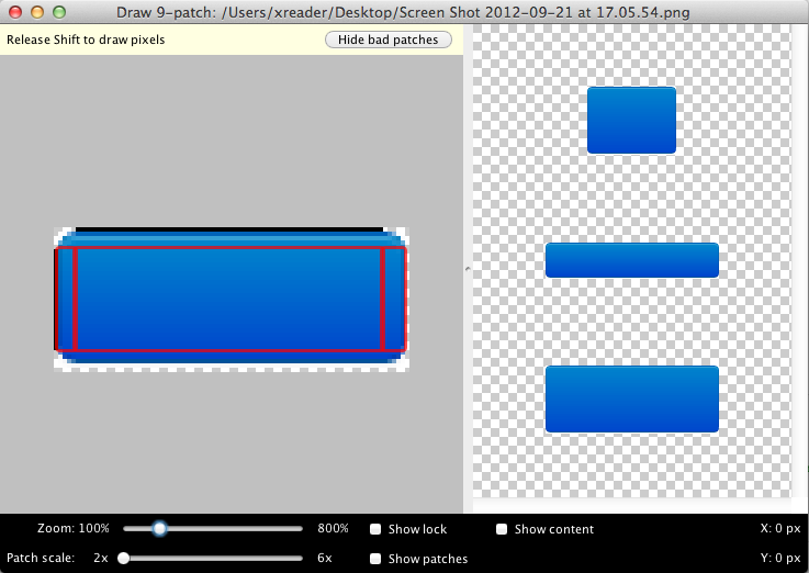
On the right is a preview. If the result is satisfactory. Through the menu, save the file to the drawable folder. Repeat the procedure for graphs of all button states.
Connecting the button is the same as in the previous example.
Instead of graphs, you can describe elements using XML.
An example of a selector for two states:
When the status changes, the file is read from top to bottom and the first item with the appropriate status will be executed.
The last element in this example will be executed if the state of the previous elements does not match the state of the button.
This example can be extended to display other states by adding item elements with the corresponding attribute.
For example for selected
Description of the states can also be rendered in separate files. For example, the pressed button will be described in the button_primary_pressed.xml file
The extension (.xml) is also not specified in the selector.
You can also use a LayerList instead of a StateList. This approach differs from the previous one in that elements do not have a state attribute. All items will be processed. The last element is drawn on top.
Example:
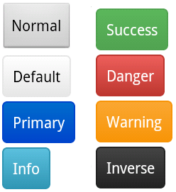
The result is

Code samples for creating button styles using StateList and Shape Drawable can be viewed here android-custom-style-ui .
Additional information and sources can be found here.
The Android SDK offers several options for creating your own styles.
Let's start with the simplest. Create a button based on several graphic files displaying individual button states. (default, selected, focused, pressed, etc.) .png, .jpg, or .gif formats are supported.
')
Add the activation code for the button.
<Button android:id="@+id/button_primary" android:layout_width="wrap_content" android:layout_height="wrap_content" android:layout_margin="@dimen/default_margin" android:background="@drawable/button_primary_selector" android:text="Button" android:textColor="@android:color/white" /> In the res / drawable folder, create the file button_primary_selector.xml
<?xml version="1.0" encoding="utf-8"?> <selector xmlns:android="http://schemas.android.com/apk/res/android"> <item android:state_selected="true" android:drawable="@drawable/button_primary_selected"/> <item android:state_pressed="true" android:drawable="@drawable/button_primary_pressed"/> <item android:state_focused="true" android:drawable="@drawable/button_primary_focused"/> <item android:drawable="@drawable/button_primary_normal"/> </selector> This file makes routing graphs depending on the current button state.
Add graphics for each button state in the same folder. File extension is not required. The disadvantage of this example is the impossibility of dynamic scaling of buttons.
Using the Nine-Patch File Format
We solve the problem of scaling elements as follows. In the case of a button, at least two png files corresponding to the normal and pressed states are needed.
Original normal state graph for primary button
Conversion is done using the draw9patch utility. It can be found in ANDROID_SDK_HOME / tools /.
After starting, drag the graph into the opened window. And on the edge of the picture we mark the pixels included in the scaled content. Like that
On the right is a preview. If the result is satisfactory. Through the menu, save the file to the drawable folder. Repeat the procedure for graphs of all button states.
Connecting the button is the same as in the previous example.
Shape drawable
Instead of graphs, you can describe elements using XML.
An example of a selector for two states:
<?xml version="1.0" encoding="utf-8"?> <selector xmlns:android="http://schemas.android.com/apk/res/android"> <item android:state_pressed="true"> <shape> <gradient android:startColor="#002A80" android:endColor="#04C" android:angle="270" /> <stroke android:width="1dp" android:color="#04C" /> <corners android:radius="4dp" /> <padding android:left="10dp" android:top="10dp" android:right="10dp" android:bottom="10dp" /> </shape> </item> <item> <shape> <gradient android:startColor="#006DCC" android:endColor="#04C" android:angle="270" /> <stroke android:width="1dp" android:color="#04C" /> <corners android:radius="4dp" /> <padding android:left="10dp" android:top="10dp" android:right="10dp" android:bottom="10dp" /> </shape> </item> </selector> When the status changes, the file is read from top to bottom and the first item with the appropriate status will be executed.
The last element in this example will be executed if the state of the previous elements does not match the state of the button.
This example can be extended to display other states by adding item elements with the corresponding attribute.
For example for selected
... android:state_selected="true" ... Description of the states can also be rendered in separate files. For example, the pressed button will be described in the button_primary_pressed.xml file
<?xml version="1.0" encoding="utf-8"?> <selector xmlns:android="http://schemas.android.com/apk/res/android"> <item> <shape> <gradient android:startColor="#04C" android:endColor="#006DCC" android:angle="270" /> <stroke android:width="1dp" android:color="#04C" /> <corners android:radius="4dp" /> <padding android:left="10dp" android:top="10dp" android:right="10dp" android:bottom="10dp" /> </shape> </item> </selector> The extension (.xml) is also not specified in the selector.
You can also use a LayerList instead of a StateList. This approach differs from the previous one in that elements do not have a state attribute. All items will be processed. The last element is drawn on top.
Example:
<?xml version="1.0" encoding="utf-8"?> <layer-list xmlns:android="http://schemas.android.com/apk/res/android"> <item> <bitmap android:src="@drawable/android_red" android:gravity="center" /> </item> <item android:top="10dp" android:left="10dp"> <bitmap android:src="@drawable/android_green" android:gravity="center" /> </item> <item android:top="20dp" android:left="20dp"> <bitmap android:src="@drawable/android_blue" android:gravity="center" /> </item> </layer-list> The result is
Code samples for creating button styles using StateList and Shape Drawable can be viewed here android-custom-style-ui .
Additional information and sources can be found here.
Source: https://habr.com/ru/post/151963/
All Articles