We consider the width of the screens of site visitors
Introduction
I recently discussed with a girl designer, under what screen sizes it’s worthwhile to draw websites. Our arguments were, to put it mildly, unfounded:
- My website on my home computer is too wide, I need to do it under a wide screen.
- It is necessary to do under small screens. A bunch of people are surfing the Internet from mobile devices. Almost no one has large monitors.
- Yes, a lot of people with such monitors! All my friends have big monitors.
- Yes, you have friends - designers and photographers. And the people do not have such monitors!
It is clear that more weighty arguments were needed - it is time to turn to statistics.
Count
')
There are a number of sites that provide access to collected data about their visitors. One of these sites is the former SpyLog, and now Openstat, the issuing and report on the resolution of screens . The data there, at first glance, is not very useful: the knowledge that the most popular resolution - 1366 × 768 - occurs in 19 percent of visitors, will not help me much. But we can get this data as a separate file that we can process. Available in 4 formats - PDF, XLS and two text: CSV and Tab separated, here called tsv, which we take.
Most of the file is view strings.
1366x768 4097016,19 18,43 % 263923118 1147661296 wget 'https://www.openstat.ru/rest/v0.3/ct:openstat:trends/display/columns/20120820-20120920?column=0%0Dvisitors_sum_average&column=0%0Dvisitors_sum_average_verticalpercent&column=0%0Dsessions_sum&column=0%0Dpageviews_sum&primary_column=0&view_id=1810&format=tsv' -O - \ | perl -nlaF'\t' -MList::Util=max \ -e '$F[0]=~s/x.*//||next;$sum{$F[0]}+=$F[4];END{for$k(0..max(keys%sum)){print"$k\t$sum{$k}"}}' We obtain such a list of pairs of width and total number of visitors:
  0
 1 445931
 2
 3
 four
 five
 6
 7
 eight
 9
 10 29183
 eleven
 ...
It is clear that it makes no sense to take into account all possible values of the width - it is necessary to evaluate the ranges of values. We calculate the sum of the number of visitors who have a certain width of the screen, with the number of visitors who have screens of smaller width. You can do this in any office suite (in my case, LibreOffice), in it you can immediately build a graph. The resulting table with the schedule is ge.tt/9iHIH8O (110 kilobytes).
Slightly embellish the graph - add labels of popular values:
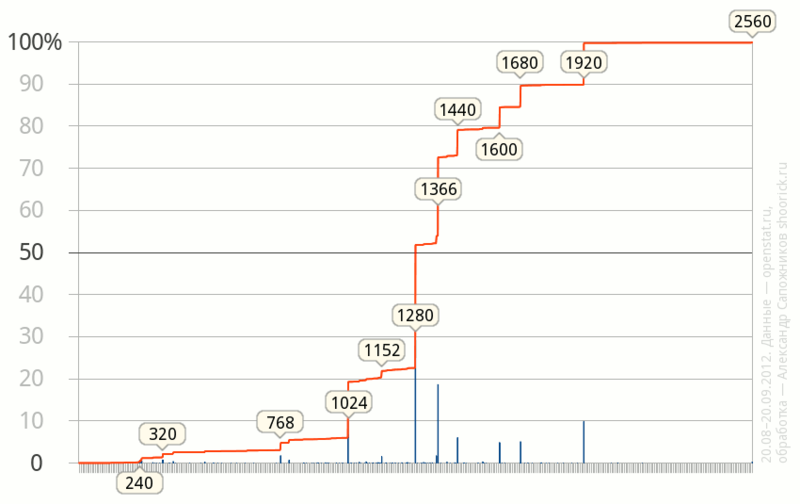
Some conclusions
- As of September 2012, the most popular (29%) width is 1280 points, in addition, just over half of visitors have monitors with a width not exceeding 1280 points. On the other hand, the number of people with large monitors, wider than 1280 points, is also very large and is approaching half.
- Other common values are 1366 (19%), 1024 (13%), 1920 (10%).
- More than 80% of site visitors have screens up to 1600 points wide. Screens wider than 1920 points are still very rare - their share is about a quarter of a percent.
- The width of “almost 800 points”, which was popular with web designers 10–15 years ago, is now found in about five percent of cases, and most of them are mobile devices.
- Based on the fact that the share of Opera Mini by some counters (for example, liveinternet.ru ) is estimated at more than 12 percent (openstat estimates it much more modest - 3.75%), we can assume that the share of mobile devices and, as a result, small screens , still higher than on this chart. It seems that devices with Mini Opera just do not fall into the statistics - a few years ago there was no JavaScript.
Source: https://habr.com/ru/post/151930/
All Articles