A look at the Modern (Metro) Windows interface (Phone / RT) 8
Instead of intro
 I am not a designer, I do not have the slightest idea about the rules, subtleties and nuances of the UI, and certainly I do not pretend to an authoritative opinion on this issue. Being a user of the phone on Android and having a wealth of experience in communicating with iOS devices, starting from the iPhone 2G, I have at my disposal, as one of the installed OS - Windows 8 RTM. Actually, it, or rather the thoughts inspired by the work with the new type of user interface from Microsoft, led me to write this article. I want to focus my attention on the features of the interface on tablet computers, but since I don’t have one on hand, these will be only theoretical considerations that may be different from the sensations gained in practice.
Anyone interested is asking for a cat.
New ideas, new direction
In fact, the new interface in Windows 8 is not so new. The corporation experimented with it on Windows Phone 7, but then it seemed to me something angular, raw, incomprehensible, not similar to the products from Google and Apple, which bore and seemed to be UI standards. Well, really, what could be useful from these tiles in the floor of the screen? Where are a bunch of identical icons, exactly and at the front of meekly standing in a row? And representatives of Microsoft itself on Student Day 2.0 told that designers of the 50s of the last century, who “invented” an angular interface based on rectangles, inspired them.
')
After that, for a long time I did not see this “something” and could not touch these living tiles and tiles. But finally, the rtm version of this wonderful (stress can be put depending on the preferences of each) system comes out, which finally works without glitches (all previous versions, up to release preview, were called on my freeze laptop system). From the very first moments after installation, I began to study the features of the Modern interface of the new system. The natural reaction was the thought “everything is optimized for tablets”. Navigation and mouse control work without problems, everything is quite intuitive, but at the same intuitive level I want to “poke” into these tiles, I want to scroll through the list of applications with my finger, zoom in and out.
This thought, that all this would look gorgeous on tablets, did not leave me and I decided to compare existing solutions with a new proposal from Microsoft.
Some pictures and comparisons.
It’s quite logical to compare interfaces, I’ll be using tablet adaptations of iOS and Android interfaces. The key word here is adaptation. Corporations decided not to break the existing stereotypes and paradigms of their products, they decided not to retrain or scare users, so the tablet versions of their operating systems are only an adaptation of existing mobile solutions. This is their main, in my opinion, problem. They cannot introduce a new jet, they are trying to go further by inertia on their interfaces (well, also on their brands and practically no alternatives).
Let's look at typical Android and iOS screens in their tablet versions.
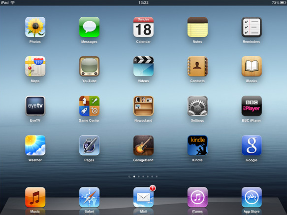
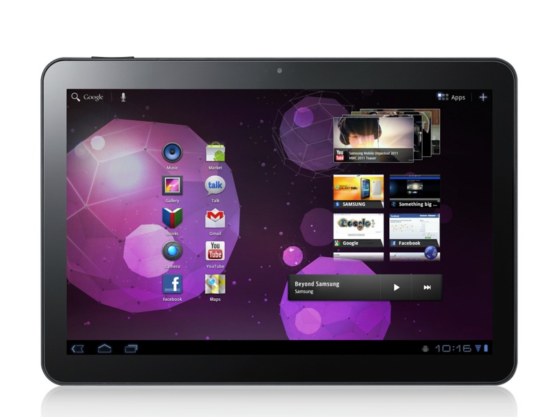
First, an iPad with iOS, then a Samsung Galaxy Tab 10.1 with Android
What do we see? We see dead, static, identical, same type application icons. Standard sizes, arranged in one row, with pretty little rounded corners, but still dead. The maximum of what interactivity we can get from them is the number in the upper right, indicating the number of some events. And what, from whom, why, why - we will not be told until we open and look for ourselves.
Android certainly saves the fact that it still has widgets that add some interactivity, and thus partially solve the problem of static content of the entire content, but these are only half measures.
The interface does not live, it is already outdated, it is static. We live in a world with a huge flow of information, and the interface should also dynamically represent it to us, it should be interactive, it should stand out.
Recently, as you know, the presentation of new products from Nokia, together with Microsoft, took place. I liked 2 theses on it, regarding this issue:
- phone for people
- as each person is unique, so is his telephone.
If you look at the new design of Windows (Phone / RT) 8, then we will see that these theses absolutely justify themselves.
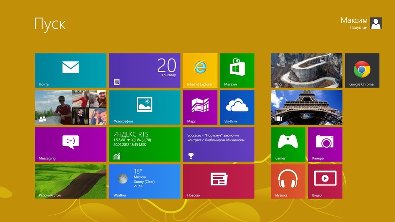
This is my initial screen of the Windows 8 interface.
Here they are, these living tiles, here it is the dynamics, here it is the uniqueness and originality of each laptop, tablet, phone, emphasizing the feature of their owner. When I go to my home screen, I can see unread messages on an email inbox or in a windows message or facebook chat. I see not just the number of new events, I see the content, I see the information, I can understand what is inside and what they want from me. I see the latest posts on Twitter, see the pages and avatars of all my friends on social networks, I see the weather, I see the news, in the end I see even every day a new picture from Bing.
I understand that no one will have exactly the same content, because my information is unique. Everything is tied to my accounts. I can find out all updates right from the start screen, reply to messages, update my information. My device lives with me and does not force me to open my application for each service in order to update all the information, read something new, write to friends.
I am also pleased with the opportunity (if I am not confusing) to write these metro applications based on html + css + js, which is not the case with competitors. This, in my opinion, is the right step in the right direction, which I saw only in KDE. To this you can add full support in the recently launched Visual Studio 2012 and the opening of the Windows Store, and the integration of the entire system with the cloud, so that you can easily transfer your information, and develop high-quality and beautiful, and most importantly, live and tightly integrated applications into the system .
Instead of output
In my opinion, Microsoft has guessed the direction. They abandoned the cloning of existing solutions and thereby won. They have an original system with an original friendly user-friendly interface. Why clutter up the tablet screen with dozens of similar-type icons or half-dead motley widgets? The screen dimensions should be used rationally, to allow information to be placed on it, and not icons, dynamics, and not statics.
In my opinion Modern design performs the task for all 100.
The new operating system may well win its place under the sun, Microsoft has created a new direction, but will it become a trend? The company loses much, entering this market so late. Whether they will be able to break through and change the current situation, both in the world of interfaces and in the world of dominant operating systems, will show the upcoming start of sales of devices and the OS itself. Personally, I would like Microsoft with its Windows 8 to succeed, as I, as an end user, am very pleased with the work done and the result presented, and would happily play with the tablet to confirm my assumptions about the convenience of the interface, but would funds - students at all times did not live in prosperity :)
In the end, I would like to repeat that this is only my subjective opinion, not supported by any professional knowledge in the field of interfaces, and also add that unfortunately it is clear that Google and Apple are overtaking Microsoft in the development of functionality and bringing innovations to the OS functionality, for example , in the form of voice dialing, voice assistants, semantic “robots”, prompting the user based on his preferences, etc. etc., so in this direction I would like to wish the Redmond company good luck, catch up with competitors and more releases. With honing the ideology of their interface and improving the functionality of the system.
Thanks for attention.
Source: https://habr.com/ru/post/151898/
All Articles