Metro in web interfaces
A month and a half ago, we released a new version of our product, the NetCat content management system. One of the most notable (although not the most important) product innovations was the restyling of the interface in the MetroUI philosophy. About why we chose Metro, what problems we faced and what this experience taught us, and will be discussed in this article.
Since the previous restyling of our interface, more than five years have passed. In the world of interface design, a lot of things happened during this time, and the first role in this mass, in my opinion, was played by Apple. The magnificent concept of iPhone / iPad interfaces has had a significant, if not the main influence on the explosive nature of the popularity of these products. No joke: the same company with a difference of two years, first completely reformatted the smartphone market, and then created a new segment of tablet computers. It seemed (and it still seems to many) that everything Apple does is simply doomed to success.
Microsoft, with its Metro concept, was harder. The corporation, which was in the eighties the locomotive of IT, by the end of zero gave Apple and Google the title of chief innovator of the industry. And although Microsoft, in my opinion, has every chance of a rematch, now it has to spend much more effort to promote its decisions and ideas. And Metro is no exception: compared to Apple, the evangelicals of Microsoft are more actively carrying the company's philosophy to the masses.
')
By the way, since I mentioned Google. This company follows a similar path to Microsoft in terms of maximally simplifying interfaces. I could not find on the Internet information about whether Google’s views influenced Microsoft or vice versa, or companies came to this independently, but the similarity of the graphical implementation of the products / services interfaces of the two companies is obvious.
What is the difference between the approaches of Apple and Microsoft? On the Internet you can find many articles on similar topics, on the same Habré this issue was discussed more than once . In terms of graphics only, the differences can be briefly described as follows: Apple tries to implement the controls so that they look like similar elements in the real world (roundness, volume illusion, visual texture, shadows), and Microsoft ruthlessly simplifies the elements, erecting minimalism to the rank of indisputable dogma. Apple style is called iconographic, and Microsoft - infographic.
In fairness it should be noted that the representatives of Microsoft themselves consider minimalism not to be the dogma of Metro, but only a consequence arising from the principles of this concept.
I will quote User Experience Specialist Arturo Toledo (the translation of his article was published in Habré):
“For example, imagine that we are creating an application for selling books so that we have to put the covers of books for the user in the menu. A specific design style, such as in the iPhone, will create a metaphor from the physical world (for example, a bookshelf) to solve this problem. The bookshelf fits perfectly, it fits well with the task, the covers of books on it look nice and even use wood texture to make it more “real” [...] In the digital world, a tree is not a tree, but a set of pixels is “ fake". If you take “books” from this “bookshelf”, they will not even fall due to the lack of gravity. So there is no need for a wooden shelf. Instead, remove the shell - completely unnecessary, taking into account the fact that we are talking about pixels. "
In other words, when drawing an interface for a computer program, it is not necessary to pretend that we are creating some real thing; Our product will not have any attributes of a physical thing (surface texture, smell, sound, weight), except for visual similarity with real objects. Why enter into the virtual environment elements alien to the real world that do not carry any functionality?
I find this opinion controversial. I believe that the counter-arguments in favor of realistic interfaces are obvious and there is no point in making philosophizing on this topic. Nevertheless, we thought that for our case (the interface of the site management system) and our main audience (site developers), the Metro principles fit perfectly. Interface only: sites pre-installed on the system, incl. mobile, quite voluminous and "rounded".
I will be honest: when I just started reading about Metro, thinking about its application to our product, it seemed to me that there would be not so much work: decide on the designer, let him redraw the existing admin admin types, draw icons, turn over page templates - and that’s it . The reality, as usual, turned out to be more cruel.
First, finding an artist for this project was not easy. From the designers we know, we were able to find only one , who at that time (January of the current year) had a good experience in this style, and he didn’t connect his style with the concept of Metro. As a result, we agreed with the Nizhny Novgorod web studio X-Design ; like us, they had no experience in Metro-design, and we stuffed all the bumps together.
Secondly, the minimalistic interface is much more exacting to trifles. Did an extra pixel appear indented from the edge of the region to the element? Are the headers at different levels of hierarchy not sufficiently different in size? Is the active item highlighted in different lists in different ways? The picture immediately collapses, hurts the eyes. In the “volumetric” interface, such small problems are much less noticeable behind the “visual noise”. As a result, one screen could be redrawn up to ten times, and all the work took three times longer than we had planned at the beginning.
Thirdly, the Metro philosophy implies the simplification of not only the appearance of the elements. In the course of our work, we had to eliminate some duplicate ways of accomplishing tasks (for example, moving to the list of components); remove part of the confirmation screens of the operation and an extra level of hierarchy of developer tools; reformulate the rules for placing control buttons on screens (now the buttons that initiate an action — for example, adding — are placed strictly to the left, and the completing action — saving, canceling — to the right); come up with color coding of icons, etc.
And finally, in four. Metro principles were originally developed for the Windows Phone platform. Microsoft itself does not explicitly call to completely transfer them to the web. We encountered problems with the Metro implementation for the web at the stages of debugging cross-browsering and adapting the interface for tablet computers. In some cases, the complete reduction of all interface elements to a single view (by guideline) in all browsers and devices was unjustified, and we had to move away from the guideline.
What we have, you can see on our website ( demo site , screenshots , demo version ). I definitely think that the interface has become much simpler and more convenient, but, to be honest, we didn’t manage to fully comply with the principles of Metro. In some cases, for objective reasons (limitations of HTML capabilities, unwillingness to abruptly change the paradigm to create discomfort for users accustomed to the previous management principles), some problems with compliance surfaced already at the testing stage, and we will have a “second series” of work on the interface. By the way, while this article was being written, our new interface appeared in the Business-Lynch Studio of Lebedev; The reviewer came to a similar conclusion.
So is it worth creating a Metro style web application? I think it is worth it if:
I would add that in itself the desire for minimalism in the interfaces is not a new thing, and even it goes without saying. Therefore, it cannot be said that Microsoft has discovered some kind of terra incognita. But her absolute merit is that she built a whole philosophy around the principle of simplification: with concepts, argumentation, reasoning, accompanying multimedia materials, associations. If you are interested in designing interfaces, it is worth spending time learning this philosophy, even if you are skeptical about the use of Metro in your current work.
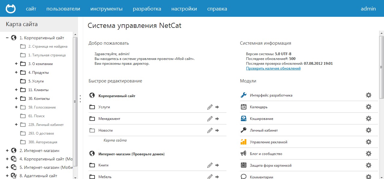
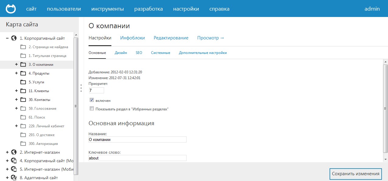
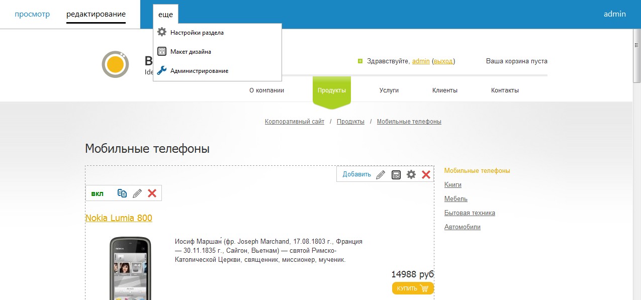
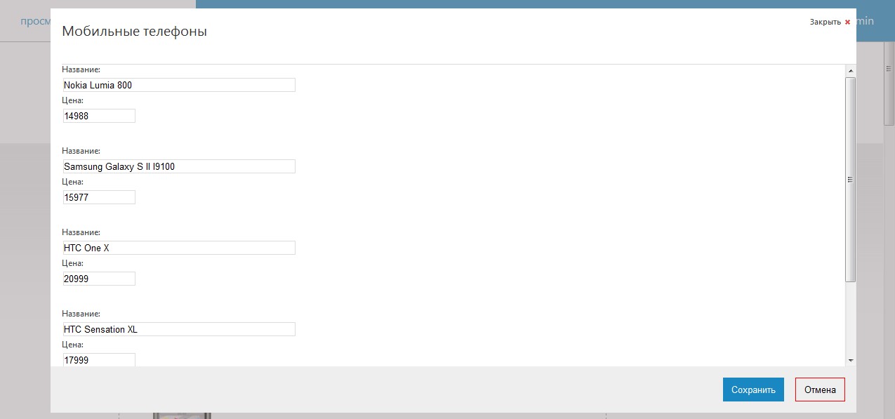
UPD: Because in the comments they express dissatisfaction with the lack of pictures, I post several screenshots from the corresponding section of the site:
iOS-style or Metro-style?
Since the previous restyling of our interface, more than five years have passed. In the world of interface design, a lot of things happened during this time, and the first role in this mass, in my opinion, was played by Apple. The magnificent concept of iPhone / iPad interfaces has had a significant, if not the main influence on the explosive nature of the popularity of these products. No joke: the same company with a difference of two years, first completely reformatted the smartphone market, and then created a new segment of tablet computers. It seemed (and it still seems to many) that everything Apple does is simply doomed to success.
Microsoft, with its Metro concept, was harder. The corporation, which was in the eighties the locomotive of IT, by the end of zero gave Apple and Google the title of chief innovator of the industry. And although Microsoft, in my opinion, has every chance of a rematch, now it has to spend much more effort to promote its decisions and ideas. And Metro is no exception: compared to Apple, the evangelicals of Microsoft are more actively carrying the company's philosophy to the masses.
')
By the way, since I mentioned Google. This company follows a similar path to Microsoft in terms of maximally simplifying interfaces. I could not find on the Internet information about whether Google’s views influenced Microsoft or vice versa, or companies came to this independently, but the similarity of the graphical implementation of the products / services interfaces of the two companies is obvious.
What is the difference between the approaches of Apple and Microsoft? On the Internet you can find many articles on similar topics, on the same Habré this issue was discussed more than once . In terms of graphics only, the differences can be briefly described as follows: Apple tries to implement the controls so that they look like similar elements in the real world (roundness, volume illusion, visual texture, shadows), and Microsoft ruthlessly simplifies the elements, erecting minimalism to the rank of indisputable dogma. Apple style is called iconographic, and Microsoft - infographic.
In fairness it should be noted that the representatives of Microsoft themselves consider minimalism not to be the dogma of Metro, but only a consequence arising from the principles of this concept.
I will quote User Experience Specialist Arturo Toledo (the translation of his article was published in Habré):
“For example, imagine that we are creating an application for selling books so that we have to put the covers of books for the user in the menu. A specific design style, such as in the iPhone, will create a metaphor from the physical world (for example, a bookshelf) to solve this problem. The bookshelf fits perfectly, it fits well with the task, the covers of books on it look nice and even use wood texture to make it more “real” [...] In the digital world, a tree is not a tree, but a set of pixels is “ fake". If you take “books” from this “bookshelf”, they will not even fall due to the lack of gravity. So there is no need for a wooden shelf. Instead, remove the shell - completely unnecessary, taking into account the fact that we are talking about pixels. "
In other words, when drawing an interface for a computer program, it is not necessary to pretend that we are creating some real thing; Our product will not have any attributes of a physical thing (surface texture, smell, sound, weight), except for visual similarity with real objects. Why enter into the virtual environment elements alien to the real world that do not carry any functionality?
I find this opinion controversial. I believe that the counter-arguments in favor of realistic interfaces are obvious and there is no point in making philosophizing on this topic. Nevertheless, we thought that for our case (the interface of the site management system) and our main audience (site developers), the Metro principles fit perfectly. Interface only: sites pre-installed on the system, incl. mobile, quite voluminous and "rounded".
Restyling process
I will be honest: when I just started reading about Metro, thinking about its application to our product, it seemed to me that there would be not so much work: decide on the designer, let him redraw the existing admin admin types, draw icons, turn over page templates - and that’s it . The reality, as usual, turned out to be more cruel.
First, finding an artist for this project was not easy. From the designers we know, we were able to find only one , who at that time (January of the current year) had a good experience in this style, and he didn’t connect his style with the concept of Metro. As a result, we agreed with the Nizhny Novgorod web studio X-Design ; like us, they had no experience in Metro-design, and we stuffed all the bumps together.
Secondly, the minimalistic interface is much more exacting to trifles. Did an extra pixel appear indented from the edge of the region to the element? Are the headers at different levels of hierarchy not sufficiently different in size? Is the active item highlighted in different lists in different ways? The picture immediately collapses, hurts the eyes. In the “volumetric” interface, such small problems are much less noticeable behind the “visual noise”. As a result, one screen could be redrawn up to ten times, and all the work took three times longer than we had planned at the beginning.
Thirdly, the Metro philosophy implies the simplification of not only the appearance of the elements. In the course of our work, we had to eliminate some duplicate ways of accomplishing tasks (for example, moving to the list of components); remove part of the confirmation screens of the operation and an extra level of hierarchy of developer tools; reformulate the rules for placing control buttons on screens (now the buttons that initiate an action — for example, adding — are placed strictly to the left, and the completing action — saving, canceling — to the right); come up with color coding of icons, etc.
And finally, in four. Metro principles were originally developed for the Windows Phone platform. Microsoft itself does not explicitly call to completely transfer them to the web. We encountered problems with the Metro implementation for the web at the stages of debugging cross-browsering and adapting the interface for tablet computers. In some cases, the complete reduction of all interface elements to a single view (by guideline) in all browsers and devices was unjustified, and we had to move away from the guideline.
What we have, you can see on our website ( demo site , screenshots , demo version ). I definitely think that the interface has become much simpler and more convenient, but, to be honest, we didn’t manage to fully comply with the principles of Metro. In some cases, for objective reasons (limitations of HTML capabilities, unwillingness to abruptly change the paradigm to create discomfort for users accustomed to the previous management principles), some problems with compliance surfaced already at the testing stage, and we will have a “second series” of work on the interface. By the way, while this article was being written, our new interface appeared in the Business-Lynch Studio of Lebedev; The reviewer came to a similar conclusion.
Summary
So is it worth creating a Metro style web application? I think it is worth it if:
- you are not afraid that your audience will not accept an unusual style; the interface is the main thing that, according to UX guru Alan Cooper, buyers pay attention when choosing a program
- designer who will implement the project, has experience in a similar style or wants to get this experience
- you are ready for the fact that the size of each indent, title, color will need to be adjusted and justified.
- You understand that following the principles of Metro will affect not only the appearance, but also the functionality of the application, navigation through it, the content of the screens
I would add that in itself the desire for minimalism in the interfaces is not a new thing, and even it goes without saying. Therefore, it cannot be said that Microsoft has discovered some kind of terra incognita. But her absolute merit is that she built a whole philosophy around the principle of simplification: with concepts, argumentation, reasoning, accompanying multimedia materials, associations. If you are interested in designing interfaces, it is worth spending time learning this philosophy, even if you are skeptical about the use of Metro in your current work.
UPD: Because in the comments they express dissatisfaction with the lack of pictures, I post several screenshots from the corresponding section of the site:
Source: https://habr.com/ru/post/151601/
All Articles