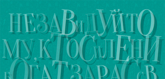
Creative use of web fonts

With CSS magic, we can create beautiful typographic effects and forget about using images in most cases. In this article, we will create a series of cute web typography examples using the jQuery plugin - lettering.js, as well as various CSS tricks. In some examples, we will also add transitions when the mouse is hovered to make them a bit more interactive.
Please note: the examples will only work in browsers that support the appropriate CSS properties.
Also, we will not include browser prefixes in the code samples in the article, but you can find them in the source code. In most cases, we will use the lettering.js plugin.
So, let's go over to the examples, there will be a total of eight.
Example 1

The idea of the first example is to split or cut a word when you hover the cursor and at the same time show the second word that is hidden. For this we need the following html markup:
<h2 class="cs-text"> <span class="cs-text-cut"></span> <span class="cs-text-mid"></span> <span class="cs-text-cut"></span> </h2> The word that will be displayed at the beginning will be duplicated. (Note that all these examples are intended more for decorative purposes).
')
We will use the lettering.js plugin for words, i.e. we will have another span tag around the first and last word (duplicates):
$(".cs-text-cut").lettering('words'); Now let's take a look at the styles. First of all, we will set a fixed width for the block with the text:
.cs-text { width: 645px; margin: 120px auto 30px; cursor: default; } First-level span tags will be displayed as block elements:
.cs-text > span { display: block; } Two span-a with the class ".cs-text-cut" will have a height of 90px and we will set overflow: hidden. The idea is that the height of this span is half the size of its real height, so we will cut the text in half. Also add a transition for these elements:
.cs-text-cut { width: 100%; height: 90px; overflow: hidden; transition: all 0.4s ease-in-out; } Now add the top and bottom borders:
.cs-text-cut:first-child { border-top: 1px solid rgba(255,255,255,0.5); } .cs-text-cut:last-child { border-bottom: 1px solid rgba(255,255,255,0.5); } Then set the font size and line height of the internal span tag to 180px, which is exactly twice the height of its parent, also add some styles for the text:
.cs-text-cut span { display: block; line-height: 180px; color: rgba(255,255,255,1); font-size: 180px; font-weight: 400; text-transform: uppercase; text-align: center; margin-top: 6px; font-family: 'Sancreek', cursive; text-shadow: 7px 2px 0 rgba(255,255,255,0.3); } The second duplicate word, which is the last child in our structure, will be slightly raised. Thus, we will see only the lower part of the word:
.cs-text-cut:last-child span { margin-top: -84px; } The text in the middle, which we want to appear when the mouse cursor hovers, will be positioned absolutely, and we will set the transparency for it to 0. It will also be halved:
.cs-text-mid { font-family: 'Raleway', sans-serif; font-weight: 100; text-transform: uppercase; font-size: 50px; letter-spacing: 50px; line-height: 50px; text-indent: 20px; position: absolute; top: 50%; margin-top: -25px; color: rgba(255,255,255,0.3); text-shadow: 0 0 0 rgba(255,255,255,0.9); opacity: 0; transform: scale(0.5); transition: all 0.4s ease-in-out 0s; } When we mouse over a word, we want the upper half to move up, so we will move it along the Y-axis and reduce its transparency:
.cs-text:hover .cs-text-cut:first-child { transform: translateY(-25px); opacity: 0.5; } And the bottom half will be moved down:
.cs-text:hover .cs-text-cut:last-child { transform: translateY(25px); opacity: 0.5; } And finally, we will change the transparency for the average text and increase it. Note that we added a transition with a delay of 0.3 seconds. This will give us time to first move the halves of the source word up and down:
.cs-text:hover .cs-text-mid { transition-delay: 0.3s; opacity: 1; transform: scale(1); } So with the first example we are done. Let's move on to the second.
Example 2

In the second example, we will play a little with the transformation and create translucent panels with letters.
<h2 class="cs-text" id="cs-text"></h2> We use lettering to wrap each letter in a span:
$("#cs-text").lettering(); Then we set the main shell to a fixed width and add a clearfix hack from Nicolas Gallagher , because our span tags will be floating (left):
.cs-text { width: 600px; margin: 70px auto 30px; } /* Micro clearfix hack by Nicolas Gallagher http://nicolasgallagher.com/micro-clearfix-hack/ */ .cs-text:before, .cs-text:after { content: " "; display: table; } .cs-text:after { clear: both; } /* end clearfix hack */ Each span will have a wrap to the left and we will also add a translucent background and a box-shadow property that will create a wide border. Then we tilt the element (transform: skewY (8deg)) and add a transition:
.cs-text span { float: left; width: 120px; font-size: 120px; line-height: 230px; font-weight: 400; text-transform: uppercase; text-align: center; cursor: default; font-family: 'Medula One', cursive; display: block; z-index: 1; position: relative; color: rgba(255,255,255,0.7); text-shadow: 5px 5px 2px rgba(0,0,0,0.5); background: rgba(0,0,0,0.05) url(../images/scratch-texture.png); box-shadow: -6px 2px 10px rgba(0,0,0,0.5), inset 0 0 0 20px rgba(255, 255, 255, 0.4); border-radius: 5px; transform: skewY(8deg); transition: all 0.5s ease-in-out; } We will use the: before pseudo-class to create an inner shadow effect. There are other ways to do this, but let's fantasize a little :)
.cs-text span:before { content: ''; position: absolute; left: 20px; right: 20px; top: 20px; bottom: 20px; box-shadow: 1px 1px 1px rgba(255,255,255,0.4), inset 1px 1px 1px rgba(0,0,0,0.1); } Using the: after pseudo-class, add a small dot to the top of the element:
.cs-text span:after { content: ''; position: absolute; left: 50%; top: 5px; margin-left: -5px; width: 10px; height: 10px; border-radius: 50%; box-shadow: inset 1px 1px rgba(0, 0, 0, 0.4); background: rgba(255, 255, 255, 0.2); } And finally, when you hover the mouse cursor, we will rotate the element and increase it slightly, also change the shadows and increase the transparency value:
.cs-text span:hover { transform: translateY(-10px) scale(1.1); color: rgba(255,255,255,1); text-shadow: 2px 2px 2px rgba(0,0,0,0.2); } Example 3

The third example is completely based on the lesson about creating scratched tiles in Photoshop from textuts.com. And we will try to create the exact same effect using CSS.
<h2 class="cs-text"> : ♥ , , , , .</h2> <h3 class="cs-text"> </h3> We will again apply lettering.js to words and letters:
$(".cs-text").lettering('words').children('span').lettering() This will allow us to wrap each word in a span tag with a class starting with the word “word” and each letter in a word in the span with a class starting with the word char.
Center the text:
.cs-text { text-align: center; margin-top: 70px; } The words will be displayed as inline-blocks and we will give them side indents:
.cs-text span[class^="word"] { display: inline-block; margin: 0 15px; } For each character we will define the background color, width and height. The shadow text will create the effect of embedded letters, and a few box-shadow shadows will add volume to the tile:
.cs-text span[class^="char"] { width: 90px; height: 100px; display: inline-block; background: #e4d095; color: #2a1f1b; border-radius: 4px; font-size: 60px; font-weight: 400; line-height: 100px; margin: 10px 3px; text-align: center; cursor: default; font-family: "Spinnaker", Arial, sans-serif; text-shadow: 1px 1px 1px rgba(255, 255, 255, 0.9), 0 -1px 1px rgba(255,255,255,0.2); text-transform: uppercase; box-shadow: 1px 7px 15px rgba(0,0,0,0.8), inset 3px 0 2px rgba(255,255,255,0.4), inset 0 3px 0px rgba(255,255,255,0.5), inset -2px -3px 0px rgba(143,128,82,0.6); } Now add a bit of “randomness”, slightly turning every odd and every third tile:
.cs-text span[class^="char"]:nth-child(odd) { transform: rotate(2deg); } .cs-text span[class^="char"]:nth-child(3n) { transform: rotate(-3deg); } The fifth word and the last heading will have red letters, and the heading will be slightly smaller than the rest of the text:
.cs-text > span:nth-child(5) span, h3.cs-text span[class^="char"] { color: #a62a19; } h3.cs-text span[class^="char"] { font-size: 40px; width: 50px; height: 60px; line-height: 60px; } All is ready!
Example 4
In the fourth example, we use text as a background with a typographical effect. We will make the letters large and translucent, add shadows for the text and rotate some letters in a “random” way.
<h2 class="cs-text" id="cs-text"> , . . , , .</h2> We wrap each letter in a span tag, using all the same lettering.js:
$("#cs-text").lettering(); Align the text in the center and set it to 100% width:
.cs-text { width: 100%; text-align: center; margin-top: 80px; } Letters will be translucent, for this we define the color RGBA with a low value of transparency. We will also add a shadow for the text with a large offset:
.cs-text span { font-family: 'Cantata One', 'Trebuchet MS', sans-serif; font-size: 180px; line-height: 150px; font-weight: 400; color: rgba(255,255,255,0.3); display: inline-block; text-transform: uppercase; text-shadow: 15px 15px 0 rgba(0,0,0,0.2); cursor: default; pointer-events: none; } Since we want to use this as a background, we add the pointer-events property: none. This avoids text selection with the mouse.
Now, let's randomly rotate and change some letters. For this we will use the selector: nth-child:
.cs-text span:nth-child(2n) { transform: rotate(-6deg); color: rgba(255,255,255,0.4); ; } .cs-text span:nth-child(3n) { transform: translateY(20px); } .cs-text span:nth-child(4n) { color: rgba(255,255,255,0.2); } .cs-text span:nth-child(3n+3) { transform: scale(1.4) rotate(5deg); } .cs-text span:nth-child(7n) { font-size: 110px; } .cs-text span:nth-child(12n) { font-size: 200px; } That's it, very simple, but impressive text effect.
Example 5
In example 5, create a 3D effect.
<h2 class="cs-text" id="cs-text"></h2> Here we want each letter to be wrapped with two span tags, so we first apply lettering.js and then wrap the created span tags into another one:
$("#cs-text").lettering().children('span').wrap('<span>'); Define the width / height and padding for the main container:
.cs-text { position: relative; width: 960px; height: 100px; margin: 100px auto; cursor: default; } The first layer of the span tags will have the perspective and float properties:
.cs-text > span { perspective: 200px; float: left; position: relative; } Since we will rotate and move the internal span tags, we need to arrange the containers in a certain order (from the center to the edges):
.cs-text > span:first-child, .cs-text > span:last-child { z-index: 1; } .cs-text > span:nth-child(2), .cs-text > span:nth-child(7){ z-index: 2; } .cs-text > span:nth-child(3), .cs-text > span:nth-child(6){ z-index: 3; } .cs-text > span:nth-child(4) { z-index: 5; } .cs-text > span:nth-child(5){ z-index: 4; } Internal spans will have multiple backgrounds: gradient and translucent textures. We will also apply box-shadow, which will give some depth to the elements:
.cs-text span span { display: block; background: url(../images/scratch-texture.png), linear-gradient(to right, #00b7ea 0%,#009ec3 100%); box-shadow: -1px 0 2px rgba(255,255,255,0.4), -2px 0 0 #00adda, -2px 7px 9px rgba(0, 0, 0, 0.5); color: #fff; text-shadow: -1px -1px 2px rgba(0,0,0,0.6); width: 120px; height: 150px; font-weight: 700; line-height: 150px; font-size: 140px; text-align: center; text-transform: uppercase; } The last four letters will have a reverse gradient, box-shadow and text-shadow:
.cs-text > span:nth-child(n+5) span { background: url(../images/scratch-texture.png), linear-gradient(to right, #009ec3 0%,#00b7ea 100%); box-shadow: 1px 0 2px rgba(255,255,255,0.4), 2px 0 0 #00adda, -2px 7px 9px rgba(0, 0, 0, 0.5); text-shadow: 1px 1px 2px rgba(0,0,0,0.6); } Now we will move the internal spans on the Z-index and rotate them to create the desired effect. Each of them will have different values, so we will use the selector: nth-child:
.cs-text > span:nth-child(4) span{ transform: translateZ(40px) rotateY(40deg); } .cs-text > span:nth-child(5) span{ transform: translateZ(40px) rotateY(-40deg); } .cs-text > span:nth-child(3) span{ transform: translateZ(30px) rotateY(30deg); } .cs-text > span:nth-child(6) span{ transform: translateZ(30px) rotateY(-30deg); } .cs-text > span:nth-child(2) span{ transform: translateZ(20px) rotateY(20deg); } .cs-text > span:nth-child(7) span{ transform: translateZ(20px) rotateY(-20deg); } .cs-text > span:first-child span{ transform: translateZ(10px) rotateY(10deg); } .cs-text > span:last-child span{ transform: translateZ(10px) rotateY(-10deg); } Also move the span a little along the X axis:
.cs-text > span:nth-child(-n+4) { transform: translateX(14px); } .cs-text > span:nth-child(n+5) { transform: translateX(-14px); } Done, now we have neat 3D text!
Example 6

This example was inspired by Origami. For each letter we will have several translucent spans, which we will rotate and “tilt”. When you mouse over all conversions will be deleted.
<h2 class="cs-text" id="cs-text"></h2> We need to wrap each letter with a span tag, in front of which there will be three empty span tags, and all this will be wrapped with another span tag (yes, you can break the brain):
$("#cs-text").lettering().children('span').wrap('<span>').parent().prepend('<span></span><span></span><span></span>'); Add width and some padding for the main container:
.cs-text { width: 600px; margin: 70px auto 30px; } /* Micro clearfix hack by Nicolas Gallagher http://nicolasgallagher.com/micro-clearfix-hack/ */ .cs-text:before, .cs-text:after { content: " "; display: table; } .cs-text:after { clear: both; } /* end clearfix hack */ All span tags will be block elements:
.cs-text span{ cursor: default; display: block; position: relative; } The first layer of the span will have a height and width of 130 pixels and some indents:
.cs-text > span { float: left; width: 130px; height: 130px; margin: 10px; } All internal span will have an RGBA background that will make them translucent. We will also add a transition for them:
.cs-text span span { position: absolute; width: 100%; height: 100%; top: 0; left: 0; background: rgba(255,255,255,0.3); box-shadow: 1px 1px 2px rgba(0,0,0,0.2); transition: all 0.3s ease-in-out; } The last child internal span contains a letter, specify the size for it and add some color shadows for the text. It will also have a background gradient that will simulate a subtle bend:
.cs-text span span:last-child{ font-size: 70px; line-height: 130px; font-weight: 400; text-transform: uppercase; text-align: center; color: rgba(255,255,255,0.8); font-family: 'Michroma', sans-serif; text-shadow: 1px 1px 1px rgba(0,0,0,0.1), -1px -1px 1px rgba(0,0,0,0.1), 5px 5px 0 rgba(216,65,40,0.6), -5px -5px 0 rgba(37,166,164,0.6); background: linear-gradient( 45deg, rgba(249,249,249,0.08) 0%, rgba(234,234,234,0.5) 49%, rgba(255,255,255,0.51) 50%, rgba(244,244,244,0.94) 100% ); } Now add some arbitrary turns and tilts for the span-s:
.cs-text > span:nth-child(odd) span:first-child { transform: rotate(5deg) skewY(-14deg); } .cs-text > span:nth-child(even) span:first-child { transform: rotate(-35deg) skewY(-5deg); } .cs-text > span:nth-child(odd) span:nth-child(2) { transform: rotate(45deg) skewY(-10deg); } .cs-text > span:nth-child(even) span:nth-child(2) { transform: rotate(27deg) skewY(-12deg); } .cs-text > span:nth-child(odd) span:nth-child(3) { transform: rotate(45deg); } .cs-text > span:nth-child(even) span:nth-child(3) { transform: rotate(30deg); } When you hover the mouse, we will remove all the transformations for the blocks:
#cs-text > span:hover span { transform: rotate(0deg) skewY(0deg); text-shadow: 1px 1px 0 rgba(216,65,40,0.1), -1px -1px 0 rgba(37,166,164,0.1); } The sixth example is ready! There are many more variations of this example, just try to play around with the transformations to create interesting effects.
Example 7

In this example, we initially show the logo, and then, when you hover the mouse, we show all the other letters. We will not use the lettering plugin here, we will simply create the following structure:
<h2 class="cs-text"> <span>C</span> <span>o</span> <span>d</span> <span>r</span> <span>o</span> <span>p</span> <span>s</span> <span></span> </h2> First we define some text properties:
.cs-text { font-size: 50px; text-transform: uppercase; margin: 80px auto 0 auto; width: 580px; height: 100px; padding-left: 20px; font-family: 'McLaren', Arial; font-weight: 400; position: relative; } /* Micro clearfix hack by Nicolas Gallagher http://nicolasgallagher.com/micro-clearfix-hack/ */ .cs-text:before, .cs-text:after { content: " "; display: table; } .cs-text:after { clear: both; } /* end clearfix hack */ The span tags will have a float: left property, and we will make them round. We will also add a transition.
.cs-text span { cursor: default; display: block; float: left; border-radius: 50%; width: 100px; height: 100px; line-height: 100px; text-align: center; margin: 0 0 0 -20px; color: rgba(255,255,255,0.95); text-shadow: 0 -1px 1px rgba(0,0,0,0.1); transition: all 0.4s ease-in-out; } For even and odd tags, the span will have a different background color and we will add a subtle texture for them:
.cs-text span:nth-child(odd) { background: rgba(118,176,204, 0.8) url(../images/noise.png); } .cs-text span:nth-child(even) { background: rgba(58,126,162, 0.8) url(../images/noise.png); } All spans will be moved to the center. We will apply the transformation twice: for the first time in percent, for example, the first span should be moved to 3 positions, i.e. by 300%, and the second conversion to compensate for indents:
.cs-text span:nth-child(1) { transform: translate(300%) translate(-60px); } .cs-text span:nth-child(2) { transform: translate(200%) translate(-40px); } .cs-text span:nth-child(3) { transform: translate(100%) translate(-20px); } .cs-text span:nth-child(5) { transform: translate(-100%) translate(20px); } .cs-text span:nth-child(6) { transform: translate(-200%) translate(40px); } .cs-text span:nth-child(7) { transform: translate(-300%) translate(60px); } All spans except the last will have a transparency of 0:
.cs-text span:not(:last-child) { opacity: 0; pointer-events: none; } The last span will contain a logo. We will give it another background and place it in the center of the main container:
.cs-text span:last-child{ position: absolute; top: 0; left: 50%; margin-left: -50px; z-index: 100; background: url(../images/codrops_logo.jpg) no-repeat center center; } When you hover the mouse, all the spans will return to their natural position, and we will increase the transparency value to 1:
.cs-text:hover span:not(:last-child){ transform: translate(0%); opacity: 1; } The logo will be slightly enlarged and then disappear:
.cs-text:hover span:last-child { opacity: 0; transform: scale(1.4); } Example 8
In the last example, we'll just play a little with a few shadows for the text.
<h2 class="cs-text"> </ h2> We again use lettering.js to wrap all words in span tags:
$(".cs-text").lettering('words'); Add a width for the main header and center it. We will also tilt it a bit:
.cs-text { width: 660px; margin: 120px auto 30px; cursor: default; transform: skewY(-12deg); text-align: center; } We make span tags as block elements and add the top field:
.cs-text span { display: block; color: #fff; font-weight: 400; text-transform: uppercase; margin-top: 6px; font-family: 'Stint Ultra Expanded', cursive; } The first word will have a font size of 100 pixels and a large spacing between letters:
.cs-text span:first-child { font-size: 100px; letter-spacing: 96px; text-shadow: 6px 6px 0px rgba(255,255,255,0.3); } The second word will be in italic serif type, and we will give it a dark color:
.cs-text span:nth-child(2) { font-family: Georgia, serif; font-weight: 400; text-transform: none; font-style: italic; line-height: 60px; font-size: 67px; color: #392f2c; text-shadow: 1px 1px 1px rgba(255,255,255,0.3); position: relative; } We use the: before and: after pseudo-classes to create two lines left and right:
.cs-text span:nth-child(2):before, .cs-text span:nth-child(2):after { content: ''; width: 240px; height: 2px; background: #392f2c; position: absolute; top: 50%; margin-top: -1px; box-shadow: 0 1px 0 rgba(255,255,255,0.2); } .cs-text span:nth-child(2):before { left: 0px; } .cs-text span:nth-child(2):after { right: 0px; } The last word will have several shadows for the text to create the effect of a stack of letters. The trick is in alternating the text color and the background color, which in our case is dark brown:
.cs-text span:nth-child(3) { font-size: 130px; text-shadow: 2px 2px 0 #645f59, 4px 4px 0 #fff, 6px 6px 0 #645f59, 8px 8px 0 #fff, 10px 10px 0 #645f59, 12px 12px 0 #fff, 14px 14px 0 #645f59, 16px 16px 0 #fff, 18px 18px 0 #645f59, 20px 20px 0 #fff, 22px 22px 0 #645f59, 24px 24px 0 #fff; } And that's it! I hope you enjoyed these examples and find them useful! You can experiment a lot with them, so try it out!
Demonstration
Download source files
Source: https://habr.com/ru/post/151453/
All Articles