3D transformations using CSS
After seeing a couple of impressive examples of 3D transformations on the network in CSS, I became interested, decided to understand the topic, read several articles, seemed to understand something. But, as you know, a theory without practice — like a zombie — is dead, although it can eat the brain.
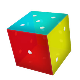
For the assimilation of the material you need to do something curious with the use of what you read. Which 3D object is easiest to do? Perhaps the cube. And to make the result more interesting and more beautiful, let it be a dice cube with dots on the edges. Go.
For the impatient and those who watch Habr for the sake of funny pictures - the end result . Works in Chrome, the latest versions of Firefox, Safari. Opera 12.01 - yet nothing, but about IE you yourself know everything.
')
Building materials
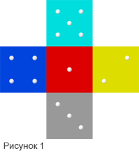 To begin, we will do the workpiece. A block container to center everything on the page, a block cube in which we will put all the components of our sculpture, and a “scan” of five (sixth, add later) future edges of the cube.
“Edges” are banal square divs, which are absolutely positioned in the cube block: we leave “one” at the center, it will serve as the front side, and we will dock all the rest with it, as in Figure 1 . Paint them for fun and clarity in different colors, add an inner shadow - and that's enough.
The points on the edges are also blocks with position, absolute, border-radius: 50% and an internal shadow ( box-shadow: inset ...) to give an illusion of volume.
Finally - two not so banal moment.
For the cube itself, you need to specify
transform-style: preserve-3d; otherwise, the default value - flat will be used, the three-dimensional world will again become flat and only one facet will remain from our cube, which will be “facing” the user.
Small remark: here and further css-properties for transformations are specified without prefixes, but in real code, for the time being, you need to use them.
Also add a cubic property
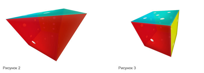
transform: perspective(900px); which will determine how much it will be distorted because of the perspective. The larger the value, the farther is the point of the “line convergence”, the less pronounced the distortion effect. Values below 200 lead to wild results (for example, Figure 2 ), about 300 - to noticeable distortion ( Figure 3 ), we restrict ourselves to a modest 900, giving a very moderate effect.
With the routine finished, the fun begins.
Bend and glue
 In order to turn our scan into a similarity of a cube, we need to “bend” it along the lines of junction of the extreme faces to face-1. For this we need to do two things.
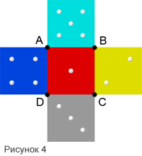
First, to establish for each face an axis around which it will rotate. The fact is that by default, the blocks rotate around their center, and we need a slightly different behavior - in Figure 4, we can see that face-5 should rotate around segment AB, face-2 around BC, and so on.
We use the property
transform-origin: yx; which shifts the axis of rotation for the object. For example, for face-5, you need to move the X axis (horizontal) to the bottom edge, respectively, the second transform-origin value should be 100% ( transform-origin: 0 100%; ). The value of Y in this case is not important, since we will rotate this face exclusively around the horizontal axis. For face 2, the opposite is true - the value of X is unimportant, and Y should be set to 0, i.e. the value of transform-origin is 0: 0 .
Secondly, and, for this article, “main”, for the direct rotation of elements we use
transform: rotate3d(x, y, z, deg); The first three parameters determine which of the coordinate axes will rotate the object, and the last - by how many degrees. X, Y and Z are not set as absolute values, but as a ratio of angles. For example, the code transform: rotate3d (2, 1, 0, 90deg); will make the object rotate 90 degrees around the X axis and 45 (90 * 1/2) degrees around Y. The transform line will do the same : rotate3d (90, 45, 0, 90deg) .
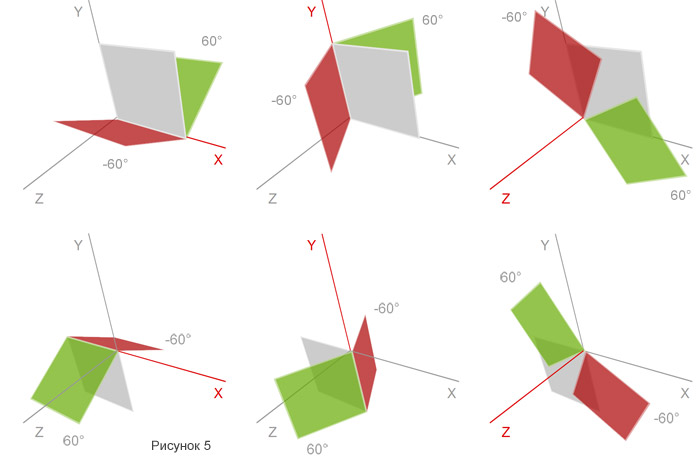
In Figure 5, I tried to illustrate the rotation of the blocks around the axes: the gray rectangle is the initial position of the block, the axis around which rotation rotates is highlighted in red, and the red and green rectangles are the position of the block when rotated by -60 and 60 degrees respectively.
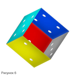
Rotate the edges from second to fifth by 90 degrees around the respective axes, after which, for clarity, we turn the cube itself, adding the transform: rotate3d (1,2,0, -150deg) property to the .cube, which will result in something shown in Figure 6 .
The cube is almost ready, it remains only to "close" it.
Close the lid and serve.
The last face must be placed in the same place, where it is “one”, but “deeper” into the screen by 200px (the size of the faces of the cube). We do this using the property
transform: translate3d(x, y, z); which allows you to move the block along any of the three axes. In our case, the motion along the Z axis is minus 200 pixels (negative values “remove” the block, positive values “approximate”). At the same time, we rotate the face 180 degrees along the X axis - although, with the default values, the “points” will be displayed on both its sides, it would be more correct to put the face to the viewer, and not inside the cube. As a result, the transform property for our “cover” will look like this: transform: translate3d (0,0, -200px) rotate3d (1,0,0,180deg) .
Finally, using the banal opacity: 0.9 , we add a little transparency (in Firefox, for some reason unknown to me, it only works to add this property for individual faces, but not for the whole cube block at once) - so our cube becomes a bit like glass, looks like more presentable and, frankly, causes the author an attack of warm nostalgia for those times when the “computer” was an incomprehensible machine for the pope at work, and a similar dice made a pseudo-random number generator in many games.
Let's rock
The cube is ready, but to look at it from the other side, you need to climb and edit CSS - not the most user-friendly option, frankly. We proceed differently.
At the beginning of the container block (up to the cube) add four buttons:
<button class="arrow a-top"></button> <button class="arrow a-bottom"></button> <button class="arrow a-left"></button> <button class="arrow a-right"></button> Again, using absolute positioning, we place them on all four sides of the container, after which we make the cube rotate with the help of something like this magic:
.a-top:hover ~ .cube { transform: perspective(900px) rotate3d(180,-45,0,-135deg); } The selector “~”, in contrast to “+”, extends not only to the immediate neighbor, but also to those “separated” further, so long as they are at the same level in the DOM tree, which we use. When you hover the mouse over the .a-top button, we will rotate the next .cube block in the way we want.
At the same time, we will change the perspective distortion with the help of perspective (900px) . As you remember (remember, really?), We set the same value for the cube at the beginning of work, but if you do not declare this property again after the cube becomes backwards and the forest (on the desktop wallpaper) is in front, then and this distortion will be turned out together with the cube - the part closest to the viewer will be reduced, and the distant part will be expanded. It looks implausible, so we will assign the perspective again at each turn.
Well, so that our cube does not jump from one position to another, but rotates smoothly - we will add a line to it
transition: all 1s ease; Translated into Russian - let's say the cube smoothly changes all properties ( all ) that will change for one second ( 1s ) and do it according to the function ease , i.e. at the beginning of the animation smoothly accelerate it, and at the end - smoothly stop. Fans of uniformity instead of ease can indicate linear - in this case, the cube will move tedious and soulless.
However, Houston, we have another problem. The rotation goes around the center of the face-1, and not the center of the cube itself - which, in general, is logical, because it is our name that is inscribed in the block cube, and all the others are “bent” or rendered “in depth”. However, this is solved quite simply: you just need to “move” all faces closer to the observer with the help of the same translate3d (0,0,100px) so that the center of rotation coincides with the center of the cube.
Now it turned out well. You can write an article on Habr, to consolidate the material, to share what was learned with colleagues and just show off.
Demo link
Archive for the most inquisitive
PS While writing an article and making my way into the sandbox, a similar article has already appeared on Habré, but I think they will complement each other well.
Update:
Important additions from zapimir
- 3DTransform is only a draft so far, not a standard, changes are possible.
- IE10 supports this technology ( corrected demo, added -ms- prefixes )
- It’s convenient to follow the progress of the progress across the planet on caniuse.com - in particular, here
Source: https://habr.com/ru/post/151300/
All Articles