About practical uses of the float property

Every good designer will say that only perfect knowledge of his own work can bring positive results. My own observations led me to the conclusion that not only beginner-makers do not quite understand the essence of the use of the float property. On Habré I looked through available publications on this topic. There was a desire to share some comments and practical applications of this property. The following explanations for the most part can be useful for a novice typesetter.
- The values left, right determine which side the element will be aligned to;
- elements that have left, right values become block (having a higher priority over the values of the display property);
- the floating element is wrapped around the following element (and other elements nested in it), the next adjacent elements of the parent, as well as the previous adjacent lower-case elements;
- a floating element occupies the width of the content except if the internal elements are non-floating (this was discussed in the Float article : try not to “float” in the specification so as not to drown in the stream );
- the height of the father does not depend on the height of the child floating element; for the following non-floating elements, the outer spaces from the floating elements will not act;
- an element for which the previous neighboring element is floating will wrap around it, if the width of the father allows, otherwise, it wraps around the previous floating element;
- the elements will not float unless the width of the father allows it;
- the absolute and fixed values of the position property override the float property.
It is known that the block element is located on a separate line, but the floated element is wrapped around the previous adjacent lower-case elements.
Example:
<span>2</span> <div style=”float: left;”>1</div> ')
Result:
12
As for me, the above example has no practical application. But the conclusion can be drawn as follows: it is not necessary to place lower and block elements to each other. I will not dwell on the way the floated elements behave among themselves, since it was well demonstrated in the article Details on the float property .
But I would like to cite some additional practical applications.
1. What styles to write for such markup
<dl> <dt>:</dt> <dd>Apple</dd> <dt> :</dt> <dd>10</dd> <dt> :<dt> <dd>- FaceTime HD </dd> </dl> to look like this:
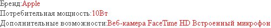
It's simple:
dt{ float: left; } A if sizes are limited:
dl{ width: 500px; } Result:

microphone fell under Additional Features:
In this case, it is worth adding
dd{ overflow: hidden; } Result:
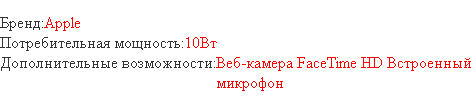
The result is a small code:
dl{ width: 500px; } dt{ float: left; } dd{ overflow: hidden; } 2. As mentioned above, a floated element occupies the width of the content, and if we need to impose such a menu:
This feature will help us.
With the condition that the background color should be set to the li element:
Rosette:
<ul> <li><a href="#"></a></li> <li><a href="#"></a></li> <li><a href="#"></a></li> </ul> Basic styles:
ul > li { float: left; background-color: #eee; margin: 4px 0; padding: 4px; } float: left - needed to limit the width of the content.
But it is not necessary to be a professional of layout to notice: if ul width allows elements to flow around each other, the following will be obtained:

Then a bunch of float and clear properties come to our aid. It is necessary for the selector ul> li to prescribe clear: left, and everything will fall into place.
Not everything is so simple with the clear property - the use of this property from the value left or right results in the purification of the entire stream of floating elements of a given type. Let me give you a vivid example:
We have the following markup:
<div class="leftColumn">lorem ispum</div> <div class="rightColumn"> <p class="block1">lorem ispum</p> <p class="block2">lorem ispum</p> <div class="block3">lorem ispum</div> </div> and styles:
.leftColumn { width: 200px; height: 200px; float: left; background: #f55; } .rightColumn { margin-left: 220px; background: #5ff; } .rightColumn .block1, .rightColumn .block2 { float: left; width: 200px; margin-right: 20px; background: #ebde05; } .rightColumn .block3 { background: #9e9; clear: both; } Note: for the idea, the element with the block3 class (green) should be located after the elements with the classes block1, block2 (yellow) and begin with a new row.
As a result:
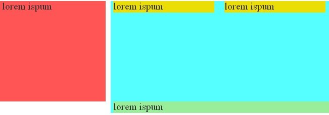
What happened here? Element with block3 class (green), clear: both rule action; cleared the stream including the red block.
There are many ways out of this situation. It all depends on the task:
- set the element with the class rightColumn overflow: hidden rule;
result: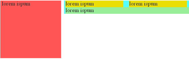
- set the element with the class rightColumn rule float: left; but then you have to remove margin-left: 220px; and now the element with the class rightColumn will not occupy the rest of the width of the browser window;
- wrap the elements with the classes block1, block2 in the element, setting it overflow: hidden; or display: table-cell; (for ie7 - zoom: 1;)
The familiar method of clearing the flow and determining the height of an element called clearfix does not apply here.
4. Armed with the knowledge of the properties of float and overflow, we lay out the following menu:

Markup:
<ul> <li><a href="#"></a></li> <li><a href="#"></a></li> <li><a href="#"></a></li> </ul> There will be no problem if you use additional selectors. But, for example, we do not know the number of points (for using the selector of neighboring elements), we do not have cross-browser support: first-child,: last-child, and the use of any expressions, especially scripts for IE, is a ban;
styles:
ul li { float: left; border-width: 0 3px; border-style: solid; border-left-color: #5FF; border-right-color: red; padding: 0 5px; } The result is:

Using negative inner padding for li and the float and overflow properties for ul, we get additional styles:
ul{ overflow: hidden; float: left; } ul li { margin: 0 -3px; } 
As you can see, the border is not in its place, all that remains is to change the color values of the left and right border, the code is as follows:
ul { overflow: hidden; float: left; } ul li{ float: left; border-width: 0 3px; border-style: solid; border-left-color: red; border-right-color: #5ff; padding: 0 5px; margin: 0 -3px; } 
Of course, the internal margins have decreased by 3px, so you need to increase them by 3px:
ul { overflow: hidden; float: left; } ul li{ float: left; border-width: 0 3px; border-style: solid; border-left-color: red; border-right-color: #5ff; padding: 0 8px; margin: 0 -3px; } We get the finished menu:
I did not mention everything related to the specifics and practical examples of the float property, but I will give some more links to useful articles:
ImageCMS blog section “Improving - CSS !” In the article on educational materials about effective web page layout.
In conclusion, I want to add that it is necessary to apply the float property where necessary. The famous bootstrap framework uses the special helper classes .pull-left and .pull-right. I use .f_l, .f_r, this allows not only to reduce the css code, but also gives greater flexibility in building the structure.
I would like to add only one thing to all the above-mentioned ones: Happy Programmer's Day, friends and colleagues! Easy coding, double payment in the eighth degree to you and us!
Source: https://habr.com/ru/post/151287/
All Articles