How to write call-to-action that will increase the conversion (with examples)
The text that you use in your call-to-action (call to action, further CTA) ( wiki ) is just as important as the shape, size, and color of the button itself.
Even small changes can significantly affect your conversion rate.
This guide, compiled with case studies, with examples and simple optimization principles, will teach you how to write CTAs that will increase conversion.
Additional inspiration will be given by the article When CTA's Attack: 10 Real-World Call To Action Examples .
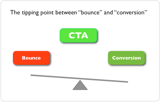
Your CTAs are a turning point between care and conversion. When you ask someone to do something online, they have to go through your CTA - regardless of whether you ask them to download pdf, fill out a form, buy a product or just go to another page.
The shape and color are important visual cues, they help draw attention to the button layout. But at that last critical moment when the client must make a decision, he will interact with the text of the button.
')
A slight improvement in button text is a minor change on the page as a whole. However, it has a significant influence on the decision-making process of your potential customers and, therefore, affects the conversion.
Here is an example from a case study where changing a single word in a CTA on a B2B ( wiki ) site resulted in a 38.26% conversion increase.

The customer had a portal through which businessmen found offices for rent. The site provided thousands of offices that potential buyers could see. When customers found a suitable office, they had to click on the main CTA (located on all pages) in order to receive more information about the rental offer by e-mail.
This means that clicking on a CTA is a critical goal for conversion and each additional click potentially means more money in the account.
In the example above, we saw how one word had a strong effect on conversion. The question is, “Why does such a small change create such an impact?”
The answer is in the message button. "Order" ("Order") emphasizes what you need to do - and not what you are going to get. In this case, “Get” (“Get”) emphasizes what you are going to get, rather than what you need to do for this. In other words, the interpretation of the text reflects the meaning.
But reflection of meaning is not always enough. To achieve the full effect, the text of your button must also be justified by the specifics of the conversion script the client will be in if he presses the button.
To show this, look at an example where a CTA that reflects only a meaning works much worse than a button that reflects both the meaning and its relevance.
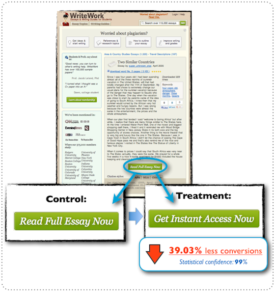
Here the customer is a popular essay site. Their landing pages ( wiki ) include an essay announcement, and their goal is to get potential customers to go to the subscription page.
Despite the fact that “Get Instant Access Now” conveys meaning (one could say “Buy access”), it is not comparable to “Read full essay now” (“Read Full Essay Now” ).
This CTA is hosted on 120.000+ landing pages, so its correct use is essential for the overall conversion of the site.
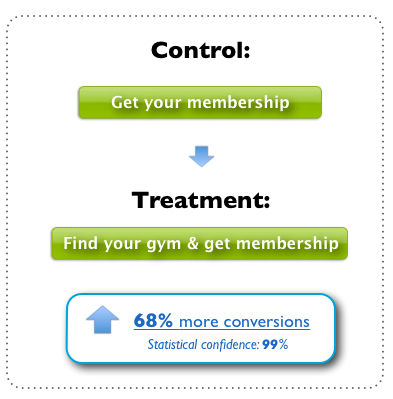
The above is another example that shows how adding relevance to CTA has an impressive effect on conversion - in this case, an increase of 68%.
The customer wished to remain anonymous, but I can say that this is a large network of gyms in Scandinavia. An example is taken from the PPC ( wiki ) landing page, where the goal is to get a potential client to click on the checkout process, in which they can choose a gym and sign up for membership.
The control version is already quite good, because it reflects the meaning and focuses on what you are going to receive - and not what you need to do for this. However, it is very generalized, “Get membership” can be applied to any situation where membership is implied.
I did a little research and found that location is a very important factor influencing the decision to join something. Therefore, in this case, you can make the CTA more relevant in a specific conversion scenario and increase the conversion by adding “Find gym” (The first step in the design process includes a complete list of gym locations).
The examples in this topic are only a part of the many tests of buttons that I have conducted over the past 4 years. However, they very well reflect the results that I saw again and again.
All the research that I have done can be compressed into one simple optimization principle:
Sense + Relevance = More Conversion
It is really very simple. The more meaning and relevance you can transfer through your CTA, the more conversion you are likely to receive. Of course, it is important not to disappoint your potential customers with making outrageous statements that you cannot confirm. So make your writing relevant and focus on the benefits of pressing - but don't exaggerate it.
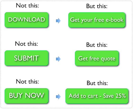
Review your sites and look for CTAs that contain the typical text “Download” and “Send” or something negative, like “Buy Now”, which mean what you need to do instead of what you would like to receive.
When you find the CTA that you want to optimize, ask yourself two questions:
- What is the client's motivation to press this button?
- What will the client get if he clicks it?
Answers to these two questions will be the basis of the new button text. Of course, you will spend time improving and honing it before it is ready for the tests, but these questions are a great way to start.
Take the example of a club membership:
- Customer motivation - to become a member of the local gym.
“When he presses a button, he will be able to find a gym and join it.”
Button text: “Find a room and get a membership”
Here are a few examples of typical CTAs that need to be avoided and some alternative text ideas:
Now you have a full guide to writing CTA, which increase conversion, now is the time to start optimizing. But pomonite - always test. This is the only way to make sure that you get positive results from your changes.
original (Michael Aagaard)
Even small changes can significantly affect your conversion rate.
This guide, compiled with case studies, with examples and simple optimization principles, will teach you how to write CTAs that will increase conversion.
Additional inspiration will be given by the article When CTA's Attack: 10 Real-World Call To Action Examples .
What you need to understand about CTA
Your CTAs are a turning point between care and conversion. When you ask someone to do something online, they have to go through your CTA - regardless of whether you ask them to download pdf, fill out a form, buy a product or just go to another page.
The shape and color are important visual cues, they help draw attention to the button layout. But at that last critical moment when the client must make a decision, he will interact with the text of the button.
')
Slight change on page = Significant impact on conversion percentage
A slight improvement in button text is a minor change on the page as a whole. However, it has a significant influence on the decision-making process of your potential customers and, therefore, affects the conversion.
Here is an example from a case study where changing a single word in a CTA on a B2B ( wiki ) site resulted in a 38.26% conversion increase.
The customer had a portal through which businessmen found offices for rent. The site provided thousands of offices that potential buyers could see. When customers found a suitable office, they had to click on the main CTA (located on all pages) in order to receive more information about the rental offer by e-mail.
This means that clicking on a CTA is a critical goal for conversion and each additional click potentially means more money in the account.
It's all about value and relevance.
In the example above, we saw how one word had a strong effect on conversion. The question is, “Why does such a small change create such an impact?”
The answer is in the message button. "Order" ("Order") emphasizes what you need to do - and not what you are going to get. In this case, “Get” (“Get”) emphasizes what you are going to get, rather than what you need to do for this. In other words, the interpretation of the text reflects the meaning.
But reflection of meaning is not always enough. To achieve the full effect, the text of your button must also be justified by the specifics of the conversion script the client will be in if he presses the button.
To show this, look at an example where a CTA that reflects only a meaning works much worse than a button that reflects both the meaning and its relevance.
Here the customer is a popular essay site. Their landing pages ( wiki ) include an essay announcement, and their goal is to get potential customers to go to the subscription page.
Despite the fact that “Get Instant Access Now” conveys meaning (one could say “Buy access”), it is not comparable to “Read full essay now” (“Read Full Essay Now” ).
This CTA is hosted on 120.000+ landing pages, so its correct use is essential for the overall conversion of the site.
The above is another example that shows how adding relevance to CTA has an impressive effect on conversion - in this case, an increase of 68%.
The customer wished to remain anonymous, but I can say that this is a large network of gyms in Scandinavia. An example is taken from the PPC ( wiki ) landing page, where the goal is to get a potential client to click on the checkout process, in which they can choose a gym and sign up for membership.
The control version is already quite good, because it reflects the meaning and focuses on what you are going to receive - and not what you need to do for this. However, it is very generalized, “Get membership” can be applied to any situation where membership is implied.
I did a little research and found that location is a very important factor influencing the decision to join something. Therefore, in this case, you can make the CTA more relevant in a specific conversion scenario and increase the conversion by adding “Find gym” (The first step in the design process includes a complete list of gym locations).
Conclusions from the analyzes: 4 years of research resulted in one simple optimization principle
The examples in this topic are only a part of the many tests of buttons that I have conducted over the past 4 years. However, they very well reflect the results that I saw again and again.
All the research that I have done can be compressed into one simple optimization principle:
Sense + Relevance = More Conversion
It is really very simple. The more meaning and relevance you can transfer through your CTA, the more conversion you are likely to receive. Of course, it is important not to disappoint your potential customers with making outrageous statements that you cannot confirm. So make your writing relevant and focus on the benefits of pressing - but don't exaggerate it.
What do you do now?
Review your sites and look for CTAs that contain the typical text “Download” and “Send” or something negative, like “Buy Now”, which mean what you need to do instead of what you would like to receive.
When you find the CTA that you want to optimize, ask yourself two questions:
- What is the client's motivation to press this button?
- What will the client get if he clicks it?
Answers to these two questions will be the basis of the new button text. Of course, you will spend time improving and honing it before it is ready for the tests, but these questions are a great way to start.
Take the example of a club membership:
- Customer motivation - to become a member of the local gym.
“When he presses a button, he will be able to find a gym and join it.”
Button text: “Find a room and get a membership”
A bit of inspiration for the next CTA
Here are a few examples of typical CTAs that need to be avoided and some alternative text ideas:
Time to start optimizing!
Now you have a full guide to writing CTA, which increase conversion, now is the time to start optimizing. But pomonite - always test. This is the only way to make sure that you get positive results from your changes.
original (Michael Aagaard)
Source: https://habr.com/ru/post/151052/
All Articles