Combing "Similar posts"
Today a block of "Similar posts" appeared on the site, immediately after the article, before the comments. Its format is distinguished by stylistic “untidyness”, if you look through the ZenComment users , so you wanted to “ennoble” it. Immediately, an additional interesting fact emerged: in fact, there are not 4 in them, but 12 links, the other 8 are simply hidden. Further, it turned out that this block was simply transferred from the right panel, pobtesav a little.
If in the standard layout this block looks relatively normal and even gives a long-awaited separator between the article and the comments (not very noticeable though), then in ZenComment styles that value compactness, it looks foreign and violates the overall style. Decision? Get down to business and fix the presentation style, at the same time opening temporarily hidden similar posts.
But even without ZenComment styles, the article has something to offer the site, in order to show not 4, but all 12 links to similar articles.
In the ZenComment styles, the 3 elements of randomly popular articles (above the footer) appearing below were “ennobled” (so that they looked decent and did not take up much space), therefore these “Similar” were decorated in a similar style. But there are additional elements - dates; and long article titles are more critical than the same titles below, out of attention.
')
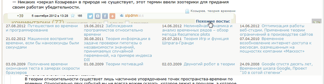
Let's look at an example of the display of "similar articles", taken as the source.

Let's do the following transformations:
1) the year in the date is deleted (if you work together with user scripts) if the current or less than 8 months have passed;
2) everything is written in 1 line, date and link;
3) the name is allocated no more than 3 lines;
4) styles - similar to the block of popular articles below;
5) open all 12 links.
So far, userscript and the first item are not included in the review. (For scripts, the solution is even simpler - just return the block to its place, and nothing will suffer.)
Such a solution turns out to be unsuccessful - if you open the names by hovering the mouse, the height of the block jumps, and only scripts can help. Therefore, we are looking for a slightly different solution for pure styles. Remove point 3, do not expand the name of the 3 lines to several. It turns out:
It is rather cumbersome to see this among the article, although the height is relatively less than the original one. So ... Why do we need to see the names of similar articles all the time?
It turned out that it is better if only 1 name will remain from the link block, on hover on which the whole block will open. Then you do not have to save on height and solve the problems of deploying links.
Minimized state:

Expanded:
In this case, the lower blocks are not shifted, and the title, as was intended on the site (but not prompted), has a link to "All related articles." The “plus” is that we can use the entire width of the window. This solution completely suits even without moving the script to its original place.
1.a) There is a proposal to show in the same way either all 12, or 8 hidden references to similar posts. Make a pseudo-link “More” below with a dotted underscore, and hover the rest 8.
1.b) Option - on targeting the heading "Related posts" - show all 12 absolutely positioned links.
2) In any case, when prompting a link to suggest (title) where it leads - to guess an appointment by reference like habrahabr.ru/post/150944/#show_all - of course, it increases confidence in the own intellect of the majority of visitors, but by the rules of usability hint would not hurt.
PS We remind you that if you install the ZenComment user style without the HabrAjax user script , you can work with it in all 4 browsers, but the settings will require a small general edit: in the line
This is due to the fact that the styles are more convenient to use in conjunction with the HabrAjax script, and this line would be very disturbing to him. At the same time, without it, the names of the authors in the comments without HabrAjax look inexpressive.
In addition, installation in 2 browsers - Opera and Chrome, has its own characteristics. In Opera, you need to install it not by a button on the page of the site, but manually (this is indicated in the instructions on the page). And for Chrome, you need to uncomment a few lines at the very bottom of the styles in order to qualitatively see the “arrows” of the ratings in the comments. Such is the (small) fee for the complexity and versatility of styles.
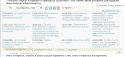
UPD 12.09.2012: “similar posts” are updated. Now they look like this:

If in the standard layout this block looks relatively normal and even gives a long-awaited separator between the article and the comments (not very noticeable though), then in ZenComment styles that value compactness, it looks foreign and violates the overall style. Decision? Get down to business and fix the presentation style, at the same time opening temporarily hidden similar posts.
But even without ZenComment styles, the article has something to offer the site, in order to show not 4, but all 12 links to similar articles.
Random popular articles over the footer
In the ZenComment styles, the 3 elements of randomly popular articles (above the footer) appearing below were “ennobled” (so that they looked decent and did not take up much space), therefore these “Similar” were decorated in a similar style. But there are additional elements - dates; and long article titles are more critical than the same titles below, out of attention.
')
Sample page and options for displaying similar articles
Let's look at an example of the display of "similar articles", taken as the source.
Let's do the following transformations:
1) the year in the date is deleted (if you work together with user scripts) if the current or less than 8 months have passed;
2) everything is written in 1 line, date and link;
3) the name is allocated no more than 3 lines;
4) styles - similar to the block of popular articles below;
5) open all 12 links.
So far, userscript and the first item are not included in the review. (For scripts, the solution is even simpler - just return the block to its place, and nothing will suffer.)
Such a solution turns out to be unsuccessful - if you open the names by hovering the mouse, the height of the block jumps, and only scripts can help. Therefore, we are looking for a slightly different solution for pure styles. Remove point 3, do not expand the name of the 3 lines to several. It turns out:
It is rather cumbersome to see this among the article, although the height is relatively less than the original one. So ... Why do we need to see the names of similar articles all the time?
It turned out that it is better if only 1 name will remain from the link block, on hover on which the whole block will open. Then you do not have to save on height and solve the problems of deploying links.
The solution with the opening list
Minimized state:
Expanded:
In this case, the lower blocks are not shifted, and the title, as was intended on the site (but not prompted), has a link to "All related articles." The “plus” is that we can use the entire width of the window. This solution completely suits even without moving the script to its original place.
What to offer a standard site?
1.a) There is a proposal to show in the same way either all 12, or 8 hidden references to similar posts. Make a pseudo-link “More” below with a dotted underscore, and hover the rest 8.
1.b) Option - on targeting the heading "Related posts" - show all 12 absolutely positioned links.
2) In any case, when prompting a link to suggest (title) where it leads - to guess an appointment by reference like habrahabr.ru/post/150944/#show_all - of course, it increases confidence in the own intellect of the majority of visitors, but by the rules of usability hint would not hurt.
PS We remind you that if you install the ZenComment user style without the HabrAjax user script , you can work with it in all 4 browsers, but the settings will require a small general edit: in the line
/* HabrAjax - * /.info a.username{color:#59d!important}/* */ /* HabrAjax - */.info a.username{color:#59d!important}/* */ This is due to the fact that the styles are more convenient to use in conjunction with the HabrAjax script, and this line would be very disturbing to him. At the same time, without it, the names of the authors in the comments without HabrAjax look inexpressive.
In addition, installation in 2 browsers - Opera and Chrome, has its own characteristics. In Opera, you need to install it not by a button on the page of the site, but manually (this is indicated in the instructions on the page). And for Chrome, you need to uncomment a few lines at the very bottom of the styles in order to qualitatively see the “arrows” of the ratings in the comments. Such is the (small) fee for the complexity and versatility of styles.
UPD 12.09.2012: “similar posts” are updated. Now they look like this:
Source: https://habr.com/ru/post/150954/
All Articles