Android Tabs Tips
Tabs are one of the most frequently used and useful components of mobile user interfaces. Tabs provide quick and easy access to various parts of the application. In Android applications, tabs are used in various forms. In some cases, the tab design is copied from other platforms, and in some cases, the outdated design of older versions of Android is used. This is understandable, because There are so many different implementations of tabs due to the fact that the design of Android was not defined at the very beginning. Now this situation has changed, and there is a guide for tabbed user interface design.
In this article I would like to take a look at the current state of tabbed interfaces and give some tips on how to maintain a uniform platform style.
A year ago there was a discussion - where should the tabs be: top or bottom. I think this discussion is over. Tabs up. There are several reasons for this:
')
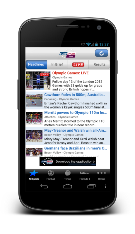
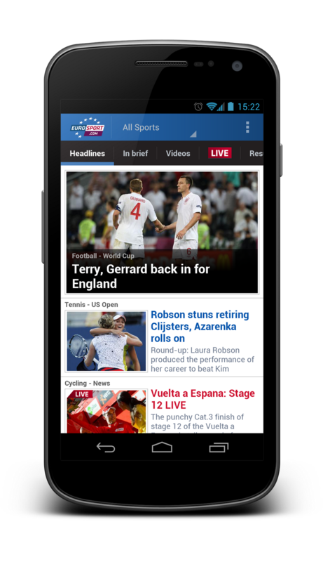
The newly updated Eurosport app gives us a great example of the points listed above. Take a look at the screenshots below. The first is an old application, below is a screenshot of the new version. Navigating the hierarchy in the old application caused more confusion. Firstly, it looked wrong (more about the tab style below), it is also very difficult to understand how the two tab panels are related to each other. In the new version there are no places that can cause misunderstanding of the structure of the application.
The style of tabs in Android is very different from other platforms. This design was first introduced into the platform in version 3.0, but even in later versions of the OS, the tab style seems outdated.
Here are a few thoughts on styling Android tabs:
Check out these two examples of tabbed Android styles. At first, one of the rare cases where tabs contain icons. This is the default Android phone application on 4.1. In general, I would advise you to avoid using icons if you are not sure that your icons will undoubtedly depict functionality.
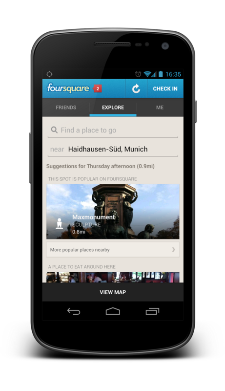
Below you can see the Foursquare app, in which the tabs contain text.
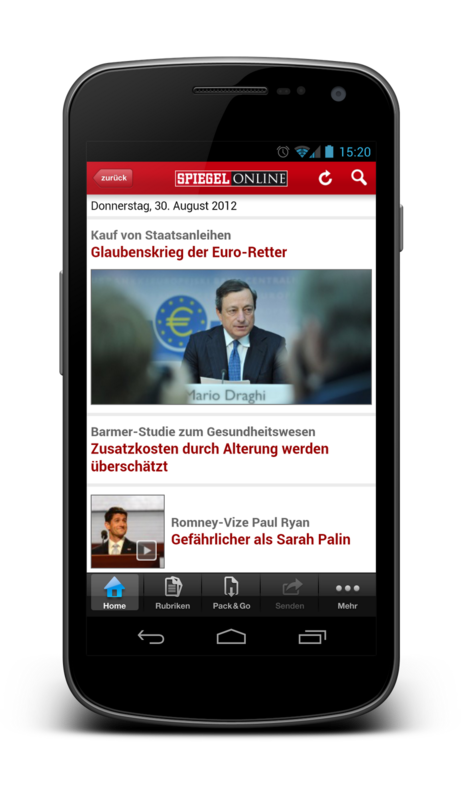
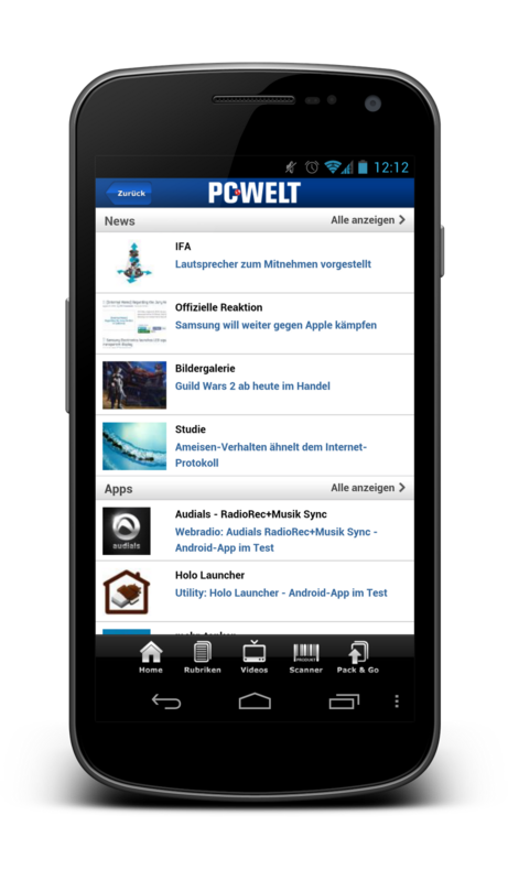
The easiest way to spoil the look of your application is to simulate the glossy square tabs of iOS. The following applications need an interface update (Spiegel Online and PC-Welt).
The choice of color for tabs on Android is limitless. In no case all tabs should have a black background and blue backlight. You can use the brand of your application when choosing a color tab!
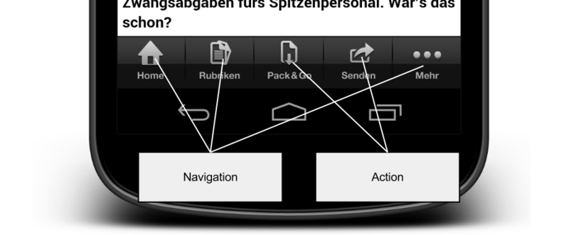
Tabs are designed to be used when navigating between screens in your application. Do not use them to trigger actions. For actions, use the action bar. Here is another example of bad design in Spiegel Online. Some of the tabs are actually actions (for example, sharing) that are no longer used in the application. This is confusing and incorrectly using the tab component.
Unfortunately, in the Spiegel Online application, everything that was wrong with tabs was largely done incorrectly. Not only do they look wrong, are in the wrong place and contain both navigation and actions, they are also not activated correctly.
If your application uses tabs, then one of the tabs should always be highlighted when the tabs are visible. There can not be a situation when tabs are displayed to the user, but their use does not lead to the required functionality! When the user goes deeper in the application, you must hide the tab bar. A tab bar without a highlighted tab will make your users feel lost.
On Android, we must always be careful with the work of the stack stack and the function of the Back button. Moving between tabs is not considered a page change. Most applications that use tabs do not add changes to the stack.
There is a good reason why changing tabs does not cause changes to the stack. Users do not feel that they have closed the screen when they switch between tabs.
To realize that all tabs are on one screen, you should not use animated default transitions of activations between tabs (users associate this animation with a deeper movement in the application). The tabs next to and any animations should reflect this. The best animation is sliding. This encourages users to use gestures to move between tabs.
The tabbed interface is excellent if moving between tabs is effortless. While clicking tabs works great, the slide between them looks even better. For a slide gesture, users do not need to get to the top of the interface. This method is also more convenient and natural for us. The page behaves as we intuitively expect. All tab interfaces should always support the slide gesture!
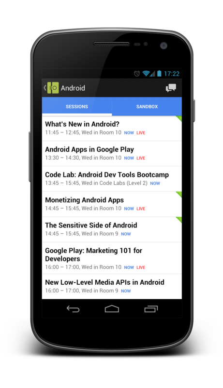
Tabs are very nicely scaled under the tablet interface. If you use tabs in combination with the action bar, the API will take care of scaling for you. If there is enough space on the action bar, then the tabs move there to save space on the screen. The Google I // O app is a great example.

Tabs are delicious if used correctly. This is a relatively simple user interface component, but it is very easy to use them incorrectly. Follow the instructions and your application will look and function perfectly. Your users will instinctively know how to navigate in your application.
In this article I would like to take a look at the current state of tabbed interfaces and give some tips on how to maintain a uniform platform style.
Tabs up
A year ago there was a discussion - where should the tabs be: top or bottom. I think this discussion is over. Tabs up. There are several reasons for this:
')
- The natural hierarchy of things comes from the top down. Tabs are headings and higher in the hierarchy of information than content on the screen.
- More complex programs need more than one level of navigation. The tabs on the bottom will cause confusion for users when it comes to navigation hierarchies.
- Users scan the new screen from top to bottom. They will better understand your hierarchy on the screen when the tabs are located on top.
The newly updated Eurosport app gives us a great example of the points listed above. Take a look at the screenshots below. The first is an old application, below is a screenshot of the new version. Navigating the hierarchy in the old application caused more confusion. Firstly, it looked wrong (more about the tab style below), it is also very difficult to understand how the two tab panels are related to each other. In the new version there are no places that can cause misunderstanding of the structure of the application.
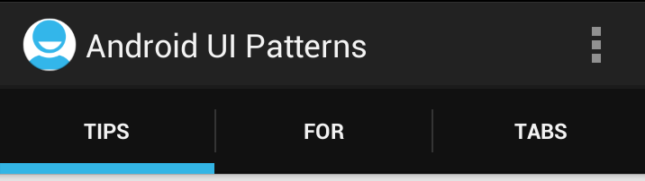
Tab Style
The style of tabs in Android is very different from other platforms. This design was first introduced into the platform in version 3.0, but even in later versions of the OS, the tab style seems outdated.
Here are a few thoughts on styling Android tabs:
- Android tabs rarely contain icons. They are most often presented as text. There is a good reason for this. It’s hard to come up with descriptive icons for all possible navigation options. Often the text is much better.
- Android tabs are not square buttons. Because they mostly contain text, you can save a lot of screen space by slightly compressing them.
- The Android style of tabs is smooth. It should not be glossy or reflective.
Check out these two examples of tabbed Android styles. At first, one of the rare cases where tabs contain icons. This is the default Android phone application on 4.1. In general, I would advise you to avoid using icons if you are not sure that your icons will undoubtedly depict functionality.
Below you can see the Foursquare app, in which the tabs contain text.
The easiest way to spoil the look of your application is to simulate the glossy square tabs of iOS. The following applications need an interface update (Spiegel Online and PC-Welt).
The choice of color for tabs on Android is limitless. In no case all tabs should have a black background and blue backlight. You can use the brand of your application when choosing a color tab!
Tabs for navigation, not for action!
Tabs are designed to be used when navigating between screens in your application. Do not use them to trigger actions. For actions, use the action bar. Here is another example of bad design in Spiegel Online. Some of the tabs are actually actions (for example, sharing) that are no longer used in the application. This is confusing and incorrectly using the tab component.
The tab should always be selected.
Unfortunately, in the Spiegel Online application, everything that was wrong with tabs was largely done incorrectly. Not only do they look wrong, are in the wrong place and contain both navigation and actions, they are also not activated correctly.
If your application uses tabs, then one of the tabs should always be highlighted when the tabs are visible. There can not be a situation when tabs are displayed to the user, but their use does not lead to the required functionality! When the user goes deeper in the application, you must hide the tab bar. A tab bar without a highlighted tab will make your users feel lost.
Tabs and go back
On Android, we must always be careful with the work of the stack stack and the function of the Back button. Moving between tabs is not considered a page change. Most applications that use tabs do not add changes to the stack.
There is a good reason why changing tabs does not cause changes to the stack. Users do not feel that they have closed the screen when they switch between tabs.
To realize that all tabs are on one screen, you should not use animated default transitions of activations between tabs (users associate this animation with a deeper movement in the application). The tabs next to and any animations should reflect this. The best animation is sliding. This encourages users to use gestures to move between tabs.
Swipe!
The tabbed interface is excellent if moving between tabs is effortless. While clicking tabs works great, the slide between them looks even better. For a slide gesture, users do not need to get to the top of the interface. This method is also more convenient and natural for us. The page behaves as we intuitively expect. All tab interfaces should always support the slide gesture!
Scalability
Tabs are very nicely scaled under the tablet interface. If you use tabs in combination with the action bar, the API will take care of scaling for you. If there is enough space on the action bar, then the tabs move there to save space on the screen. The Google I // O app is a great example.
Conclusion
Tabs are delicious if used correctly. This is a relatively simple user interface component, but it is very easy to use them incorrectly. Follow the instructions and your application will look and function perfectly. Your users will instinctively know how to navigate in your application.
Source: https://habr.com/ru/post/150817/
All Articles