Five steps to create a corporate letter template
Letters write everything. Especially if you are a company and you have customers (partners, contractors, customers). In this case, the need to create a corporate letter template usually arises immediately after the development of design business cards and site alteration. And often the question arises - how to do it, where to start. In this review, we will tell you about five simple steps that UniSender experts recommend to follow when developing a corporate newsletter template.

Image for "template"
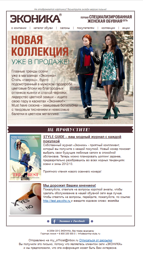
The first step is simplicity. Immediately remove the extra frills and use the most simple and clean code. Because otherwise, your newsletter will not open in all browsers or it will “pop up”. To check the newsletter for the presence of such a bug, you can use special software, and also - manually view the letter on the maximum number of browsers and devices - send a test to your team and let everyone look. If it is important for you to bring your newsletter to a large number of clients, clean up your design as much as possible:
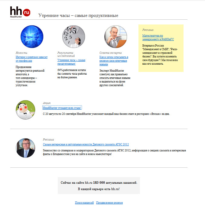
')
Placing the blocks in this simple, at first glance, letter was not taken from the ceiling - we will discuss this later.
The second step is to place the elements of the letter. To do this, it is useful to know how the eyes of the client move along the letter. For research of this phenomenon, whole eye tracking systems (tracking the movement of the eye while looking at the product label or promotional material) were developed. This is what the “map of views” looks like - similarly to the “map of clicks,” the most “heated” places are those that readers have most often watched:
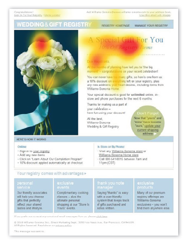
Eye tracking techniques found out that the client’s eye movements follow a letter in a hopping manner, respectively, the layout of the letter can be justified, divided into several columns: the figure shows that the columns go vertically, while the client’s eyes will “jump” from one column to another more attention to the left side of the letter. The start of the “scan” of the letter will start from the upper left corner of the message - so there is placed the material that you need to convey to the client at any cost. The logo is placed on the upper left and at the same time it is separated from the main body of the letter, so it does not “eat up” the main message.
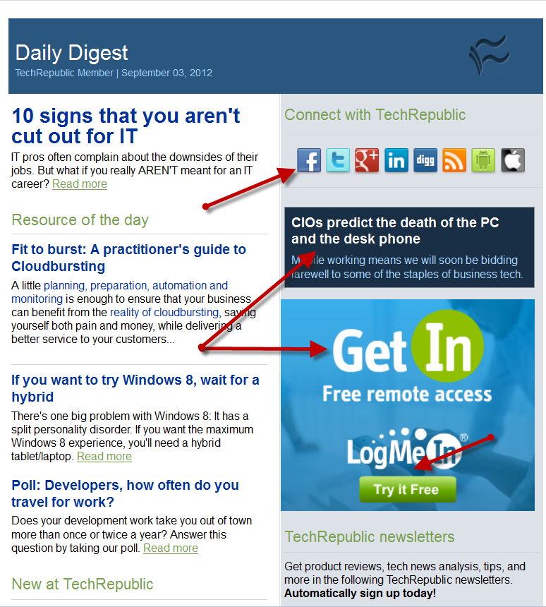
The third step is functionality. You have already removed all unnecessary, placed the main news on the left above. Add a top menu leading to your site. Then add a button that leads to the grounding page. Even use the picture in order to attract attention and sell. Post social network buttons at the top, if they are critically important to you (as techrepublic does - it’s understandable, the community needs new “likes”) and put them down if they aren’t as relevant (for example, you have a store mailing list that’s sell).
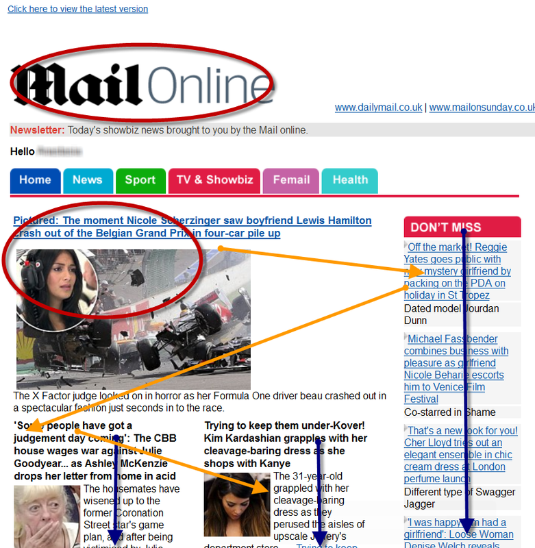
You already understand why the text in this letter is placed on the left, and the banners bought by sponsors on the right: correct, because the reader’s eyes first scan the letter on the right. At the bottom of the letter, place the necessary lines about the reply and - if you are sending to countries where the relevant legislation is in force - the address of your office. Here is the same example of a footer (or basement) letter from Techrepublic:

The fourth step - it is preferable to place everything within one pitch of the scroll wheel. This rule is violated by print publications - because they are what they read, and they try to push as many topics into one letter as possible: the letters are very long, as in the previous example. A store that has to attract customers on the occasion of a new collection or sales traditionally places advertisements in a small space - they are not read into such letters, so you need to make the most of 1 scroll wheel step, catchy buttons and the corresponding images:
As you can see in this example, clients most likely will not go beyond the main banner. The lack of an example is that there is no button, even if it is even “to see the catalog now”. The text placed on the picture may contribute to the care of spam, because Spam filters do not like a large number of pictures - they confuse them: the spam filter cannot read the text in the picture, which means that it is better to discard a suspicious letter as a whole. In the last example, it is clearly seen that the store placed the button for the social network at the bottom: for him, gathering supporters online is not a goal, but the purpose of the newsletter is sales. And for the store it is very correct.
A separate question is whether to use personalization or not: foreign studies indicate that the recipients of the mailing list are tired of them. It looks too artificial, insincere, and therefore more annoying than “catchy.” In contrast, practicing marketers in the Russian market believe that audience personalization is like - letters open more often and click on links in them.
The fifth step is testing. For this there are a number of special services . Check that everything works: click on all links, check all buttons. Send out a test email again and again, open it in all browsers and on all devices. If you have already checked everything, check again, test your template in all incredible ways, because it should be perfect: it is the face of your company, the flagship of communication with your customers.
By the way, UniSender has its own set of templates , which you can use to create optimal mailing lists. This is a very simple designer, in blocks of which you can add a logo, images and text. Try it yourself - it is convenient.
Image for "template"
The first step is simplicity. Immediately remove the extra frills and use the most simple and clean code. Because otherwise, your newsletter will not open in all browsers or it will “pop up”. To check the newsletter for the presence of such a bug, you can use special software, and also - manually view the letter on the maximum number of browsers and devices - send a test to your team and let everyone look. If it is important for you to bring your newsletter to a large number of clients, clean up your design as much as possible:
')
Placing the blocks in this simple, at first glance, letter was not taken from the ceiling - we will discuss this later.
The second step is to place the elements of the letter. To do this, it is useful to know how the eyes of the client move along the letter. For research of this phenomenon, whole eye tracking systems (tracking the movement of the eye while looking at the product label or promotional material) were developed. This is what the “map of views” looks like - similarly to the “map of clicks,” the most “heated” places are those that readers have most often watched:
Eye tracking techniques found out that the client’s eye movements follow a letter in a hopping manner, respectively, the layout of the letter can be justified, divided into several columns: the figure shows that the columns go vertically, while the client’s eyes will “jump” from one column to another more attention to the left side of the letter. The start of the “scan” of the letter will start from the upper left corner of the message - so there is placed the material that you need to convey to the client at any cost. The logo is placed on the upper left and at the same time it is separated from the main body of the letter, so it does not “eat up” the main message.
The third step is functionality. You have already removed all unnecessary, placed the main news on the left above. Add a top menu leading to your site. Then add a button that leads to the grounding page. Even use the picture in order to attract attention and sell. Post social network buttons at the top, if they are critically important to you (as techrepublic does - it’s understandable, the community needs new “likes”) and put them down if they aren’t as relevant (for example, you have a store mailing list that’s sell).
You already understand why the text in this letter is placed on the left, and the banners bought by sponsors on the right: correct, because the reader’s eyes first scan the letter on the right. At the bottom of the letter, place the necessary lines about the reply and - if you are sending to countries where the relevant legislation is in force - the address of your office. Here is the same example of a footer (or basement) letter from Techrepublic:
The fourth step - it is preferable to place everything within one pitch of the scroll wheel. This rule is violated by print publications - because they are what they read, and they try to push as many topics into one letter as possible: the letters are very long, as in the previous example. A store that has to attract customers on the occasion of a new collection or sales traditionally places advertisements in a small space - they are not read into such letters, so you need to make the most of 1 scroll wheel step, catchy buttons and the corresponding images:
As you can see in this example, clients most likely will not go beyond the main banner. The lack of an example is that there is no button, even if it is even “to see the catalog now”. The text placed on the picture may contribute to the care of spam, because Spam filters do not like a large number of pictures - they confuse them: the spam filter cannot read the text in the picture, which means that it is better to discard a suspicious letter as a whole. In the last example, it is clearly seen that the store placed the button for the social network at the bottom: for him, gathering supporters online is not a goal, but the purpose of the newsletter is sales. And for the store it is very correct.
A separate question is whether to use personalization or not: foreign studies indicate that the recipients of the mailing list are tired of them. It looks too artificial, insincere, and therefore more annoying than “catchy.” In contrast, practicing marketers in the Russian market believe that audience personalization is like - letters open more often and click on links in them.
The fifth step is testing. For this there are a number of special services . Check that everything works: click on all links, check all buttons. Send out a test email again and again, open it in all browsers and on all devices. If you have already checked everything, check again, test your template in all incredible ways, because it should be perfect: it is the face of your company, the flagship of communication with your customers.
By the way, UniSender has its own set of templates , which you can use to create optimal mailing lists. This is a very simple designer, in blocks of which you can add a logo, images and text. Try it yourself - it is convenient.
Source: https://habr.com/ru/post/150794/
All Articles