Chomp-style iOS 6 App Store redesign can significantly affect mobile app developers
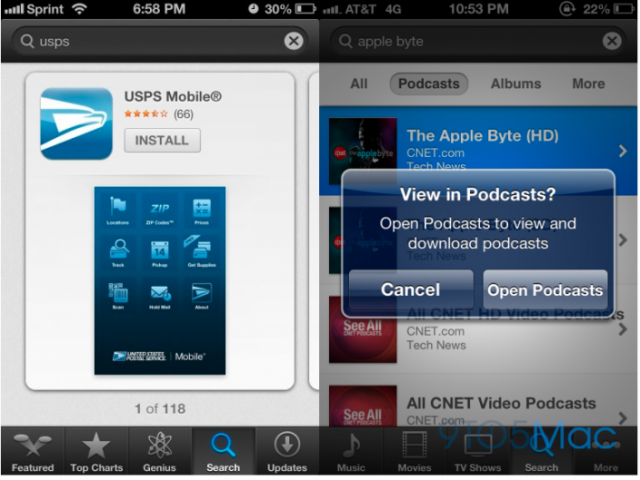
It seems that at least some of the innovative companies acquired by Apple in early 2012, namely Chomp, a mobile application search and advisory service, contributed to the new iOS 6 App Store. Screenshots from the beta version of Apple's mobile operating system were posted to 9to5Mac.com and now scattered across the web. The most characteristic innovation in the style of Chomp are the “cards”, scrolled through the swipe, instead of the traditional list with small icons and text.
In the original Chomp for iOS application, the application search is divided into several sections, such as free applications, program trends, new programs, discounted programs, etc., in addition to more traditional top-level categories (games, music, social networks and etc.) However, in the updated version of the App Store app iOS 6, it seems that Apple’s own application management system has remained largely intact. This means that Apple continues to offer programs separately to the relevant sections, such as Recommended lists, Top Charts (free, paid, cash), etc. Another change is the Genius button now appears at the bottom of the App Store application, instead of the category button. This, of course, increases the importance of search (SEO) and store (ASO - App Store Optimization) optimization.
')

Do not forget, of course: this is a pre-release software, and still may change. But it's worth noting how this upgrade could potentially affect the long tail of application developers. A report earlier this summer claimed that as many as 60% of iOS apps were never downloaded. These numbers may be a little overstated, but the overall picture is clear (!) - many applications that do not fall into the charts, almost never occur, are not installed and are not used by users. Long tail very, very long ago: more than 650,000 iOS applications in the last 3 years.
If you look at this, at this glance, insignificant changes at first glance in the mobile Apple App Store, they can potentially have an extraordinary effect in the iOS developer community. On the one hand, the large iPad screen contributes to scrolling cards. iPhone users cannot “flip through” deeper to find other applications below in the search results, even if they were presented in the traditional list. This can be bad for smaller and less popular applications if the lists disappear completely.
But on the other hand, by directing the user to find programs using various mechanisms — search, Genius helper, social sharing, focusing on the visual design of the application instead of the icon — Apple could help developers who linger on the bottom lines of the charts to promote and sell their applications. We will be watching this.
In the original Chomp for iOS application, the application search is divided into several sections, such as free applications, program trends, new programs, discounted programs, etc., in addition to more traditional top-level categories (games, music, social networks and etc.) However, in the updated version of the App Store app iOS 6, it seems that Apple’s own application management system has remained largely intact. This means that Apple continues to offer programs separately to the relevant sections, such as Recommended lists, Top Charts (free, paid, cash), etc. Another change is the Genius button now appears at the bottom of the App Store application, instead of the category button. This, of course, increases the importance of search (SEO) and store (ASO - App Store Optimization) optimization.
')

Do not forget, of course: this is a pre-release software, and still may change. But it's worth noting how this upgrade could potentially affect the long tail of application developers. A report earlier this summer claimed that as many as 60% of iOS apps were never downloaded. These numbers may be a little overstated, but the overall picture is clear (!) - many applications that do not fall into the charts, almost never occur, are not installed and are not used by users. Long tail very, very long ago: more than 650,000 iOS applications in the last 3 years.
If you look at this, at this glance, insignificant changes at first glance in the mobile Apple App Store, they can potentially have an extraordinary effect in the iOS developer community. On the one hand, the large iPad screen contributes to scrolling cards. iPhone users cannot “flip through” deeper to find other applications below in the search results, even if they were presented in the traditional list. This can be bad for smaller and less popular applications if the lists disappear completely.
But on the other hand, by directing the user to find programs using various mechanisms — search, Genius helper, social sharing, focusing on the visual design of the application instead of the icon — Apple could help developers who linger on the bottom lines of the charts to promote and sell their applications. We will be watching this.
Source: https://habr.com/ru/post/150681/
All Articles