Hard prioritization, or the first 5 steps to an excellent application for Windows 8. Functionality

In the first and second parts of the article, we reviewed the four first steps in the design of an application:
- Target audience determination
- Formulation of the purpose of the application
- Selection of key scenarios
- Navigation planning
In the third part we will talk about how the intended functionality of the application should be forwarded through the application interface: where it should be tied to system solutions, where to use special controls, and where it should be integrated into the content.
')
5. Think over the functionality
First and foremost, you must accept and remember: content must come first .
Content is the most, the most important thing! Content is exactly what users come for and use your application (for definiteness: in games, content is a gaming experience, the game itself).
The total priority of content over everything else concerns both visual design things that we will not touch on in this article, as well as the implemented functionality and the ways of its implementation, which we will talk about.
Rule one . If the functionality can be integrated into the content, do it.
In particular, for organizing navigation, the main tool is the content itself. To dive into the content do not need any additional solutions, except for the use of the content itself. No "read more", arrows to continue, etc .:

Remove:

The same applies to various revolutions like "read more" or "more." The user should not think, press him entirely on the whole plate (correctly) or only on the arrow and, possibly, the signature to it.
With the content should and should interact directly. This also contributes to the proper planning of navigation, which we discussed in the previous step.
The second rule . If the commands are contextual, they should be available only in context.
This position in a sense continues the idea of integrating functionality into content. The key message is to demonstrate additional possible actions only when one or another content element is activated:

In the example above, the pop-up menu for managing your account appears only after clicking on my account. Pay attention to two things:
- The block with the account already represents part of the information (user name and avatar), that is, it is content.
- The menu appears at the user's request, and is not constantly present on the screen, as it plays a secondary role.
The same idea applies to any other secondary (even if important) elements: they must appear on demand, or at lower levels of the application hierarchy.
Another frequent need is to attach a certain amount of actions to regular (or not very regular) content elements. You probably know this idea from websites and desktop applications — this is a recent example from the Lenovo website that I encountered when downloading drivers for a laptop:

Here such regular actions are adding to the list of downloads and direct downloads. You can also easily imagine other actions like likes, tweets and add to favorites.
As a first approximation, when porting to Windows 8, this might look like this:
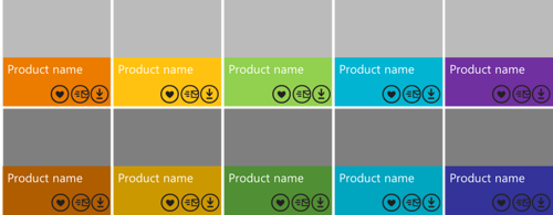
Awful, isn't it? There are at least two problems here: contradiction with direct interaction with the content (first of all, for immersion into it) and large clutter.
In practice, almost certainly, these buttons are not needed in such numbers - and it is more correct to make them contextual. There are two special solutions for this in Windows 8:
- selection element + commands on the application panel,
- context menu.
If you put the actions associated with individual elements in the application panel, we get something like the following solution:

It is important that with this approach, not only actions are explicitly tied to a specific context - and appear only at the user's request, but also the fact that in parallel we acquire the method of organizing multiple actions (applicable to several elements at once).
By the way, the selection of elements with fingers is perpendicular to the direction of scrolling, from the keyboard with a space, and with the mouse - just by pressing the right button.
Speaking of context, I also want to note that there can be two contexts on each current screen: the entire screen as a collection of everything (usually the screen also has a name) and, possibly, one or several elements highlighted. Accordingly, actions (commands) can make sense both within the entire “screen” and only with respect to the current selection.
Rule three . If the functionality can be implemented through charms, contracts or extensions, this should be done.
In the previous section, I talked a little about what it is and how the presence of miracle buttons affects the design of navigation. With regard to planning functionality, I will emphasize this again:
- If you want to give an opportunity to search by the content of your application , use the search contract - Search (except in the case of inline-search, equivalent to the contextual search among the information on the screen - for example, in an open document).
- If you want to give the opportunity to share information , for example, share it on social networks or save it in another application, use the sharing contract - Share. (The second part of this contract works to receive information from other applications, if that makes sense in your case.)
- If you have settings , use the settings contract - Settings. It should be noted here that any application from Windows Store has a settings panel with quick access to ratings and reviews, and there can also be a settings panel with access permissions to certain services (for example, geolocation and alerts).
- If you need to output to external devices , use the appropriate contracts for working with them (for example, for printing) - all this functionality will be assembled in the “Devices” wonder-button.
Similar considerations apply to various other contracts and extensions, for example, the choice of files or contacts.
As a result: do not duplicate the system functionality and do not arrange additional buttons to access it. For example, do not use the “share on Twitter” buttons in the context of the application.
Rule Four . Prioritize actions (commands) and distribute them between the screen itself, the application panel and the basket.
Some commands are valid if they are very important and are attached to a proportionate in importance (most likely one) element (including the entire document, for example, the order being sent) can be placed directly on the screen in the form of corresponding buttons.
For example, in the Mail application there is one large main content element - an open letter. For this open letter, there are two of the most important actions: answer and delete. The commands for these actions are placed directly on the screen (along with a similar and more global command to create a new letter):
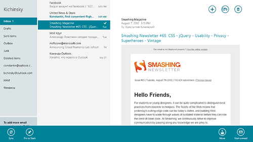
The secondary actions applicable to the letter (mark unread and move), or the mailbox (synchronize), or the folder (pinned on the Start screen) are moved to the application pane.
The remaining actions are not here, although they may seem important. Prioritization is a harsh thing. Try to adhere to the following proportion (0 is a good number, which you should strive for):

If something does not fit and the team becomes too much, this is an obvious reason to think:
- Do you need these commands at all?
- Do you need these commands on this screen?
In the latter case, the correct solution may be the transfer of "extra" commands to the internal screen that appears when immersed in the content.
Fifth Rule Divide and conquer - use the application panel correctly.
There are two special guides on this score:
They need to pay attention to the recommendations on the placement of buttons on the panel, their separation into different corners, dividers and methods of folding several similar buttons into one with the drop-down menu. Also note that the buttons (or sets of buttons) of the application panel can act as view / sort / filter switches, etc.
The practical exercise that you need to do, armed with these rules, is as follows:
- Understand what functionality (actions), in addition to navigating through content and demonstrating content, do you need to implement?
- What applies to the entire application?
- What applies to a particular current screen?
- What applies to a specific selected item on a particular screen?
- What is covered by system commands, do through system commands.
- Prioritize the remaining commands for each screen in accordance with the table above.
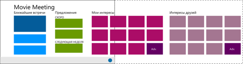
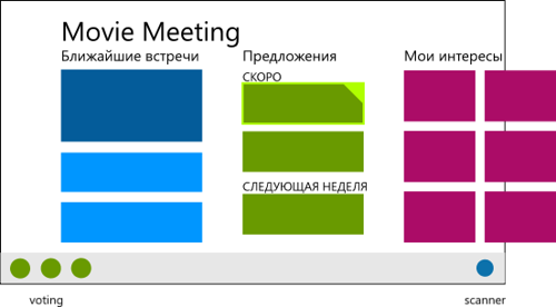
An example . We return to the virtual application Movie Meeting. We will begin to consistently answer questions.
What applies to the whole application or is it some global functionality? Obviously a search. Search is a system functionality, so it will not be called directly in the application itself, although the corresponding screen must be implemented.
What applies to specific screens (whole)? I will give a couple of examples:
- Start Screen:
- Data synchronization
- Calling a scanner (analyzing images from a webcam)
- Screen viewing offers:
- Call someone else who is not on the list
- Vote (go, not go)
- Suggest another time / place
- Expand meeting friends
- Speak out the film
What applies to selected items (and what can be highlighted)? For the same screens:
- Start Screen:
- Upcoming meeting - add reminder
- Proposal - immediately vote
- An interesting film from a friend - add to yourself
- Interesting movie in your place - remove from the list
- Interesting movie - share description with friends
- Screen viewing offers:
- Member - wink and call the doubter
Immediately it can be noted that everything related to sharing can be implemented through the system function Share. Therefore, a special solution in the interface is not required.
Next, it is important to prioritize the remaining additional actions.
Let's start with the start screen:
- None of the actions seem super-important to be immediately placed on the screen.
- The scanner is important, so we place it in the application panel (on the right, as something close to a new application and global).
- Data synchronization - should be done automatically, so we send it to the basket.
Highlighted items on the start screen:
- Highlighted meeting - ok, we add contextual buttons for setting reminders in the panel on the left.
- Highlighted proposal - ok, we add contextual buttons for quick voting in the panel on the left.
- Highlighted movies - ok, add contextual buttons for adding to or removing from your list in the panel on the left. We try to duplicate the context menu.
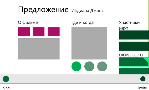
Movie viewing offer screen:
- Voting for a proposal is the most important thing, why do you need this screen, so the buttons should be placed directly on the screen.
- Call someone else - a faster and more specific action than simply sharing, and can be tied to using the Contacts Picker - we place the button for adding participants (invite +) in the application bar on the right.
- Offer another place / time - requires a separate analysis. For example, this may lead to a revision of the implementation of the vote and the general planning of the meeting. Testing is needed, so you need to start without this functionality and see if users will ask for its implementation.
- Speak out the film - no, it should be on the screen of the film itself. And there is nothing to influence the preferences of others in such a brutal way.
Highlighted movie offer screen items:
- Dedicated participant - to force a decision seems like good ideas, we place a contextual button on the left in the application panel.
Similar work needs to be done for all screens of the application. Of course, we should not forget about the principal prioritization of functionality in terms of importance, timing and complexity of implementation, which may impose their limitations.Results
From a design point of view, by this point you should have a clear idea of how and what your application does, how it is arranged from the user's point of view, what scenarios and screens it will have to go through to solve its problems and in general who is the key user your application.
Let me remind you again the key steps and results on each of them that you need to get:
- Know your user.
- Describe 2-3 key characters covering the target audience enough.
- You can not make an application for all at once - so you need to prioritize users and their key characteristics.
- What is your application better than others?
- Formulate “best at statement”.
- You can’t just be the very best - specify what exactly you are better than competitors in your niche.
- Highlight key scenarios
- Select 3-4 key scenarios specific to your application.
- You cannot be able to do everything at once and best of all - prioritize those scenarios that will help you to open up and best satisfy user requests.
- Plan your navigation
- Draw an application information card.
- Decide which content blocks are most important and how they relate to key scenarios. From small fragments, move to a holistic navigation scheme, making sure that access to key scenarios is always at hand, and the very course of solving them is as linear and obvious as possible.
- Think over the functionality
- Content comes first.
- Decide what actions you need on each of the screens, including actions that apply contextually to the selected elements. Do not duplicate the system commands, prioritize the rest and boldly throw out the excess. The easier it is to use, the easier it is for the user (too large a range of possibilities, by the way, rather confuses and slows down the choice).

Ready to move on?
Create applications and come to the autumn laboratory work .
Key resources
Source: https://habr.com/ru/post/150118/
All Articles