Graphics Optimization for Retina Screens
After the recent release of the Retina MacBook Pro and The new iPad, screens with increased pixel density began to actively enter our lives. What does this mean for web developers?
First, let's look at the terminology.
')
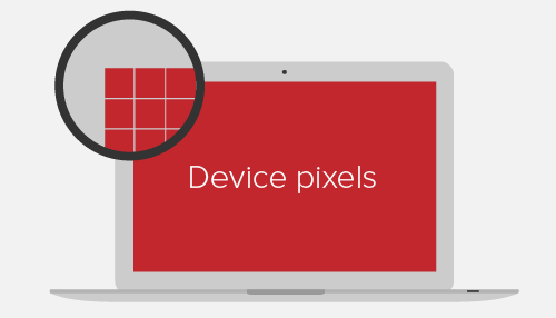
Physical pixels (device pixel or physical pixel) are familiar pixels: the smallest elements of any display, each of which has its own color and brightness.
Screen density is the number of physical pixels of the display. Usually measured in pixels per inch (PPI: pixels per inch). Apple, having developed dual pixel density Retina screens, argues that the human eye is not able to distinguish between greater density.
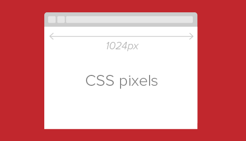
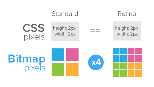
CSS pixels (CSS pixels) - an abstract value used by browsers to accurately display content on pages, regardless of screen (DIPs: device-independent pixels). Example:
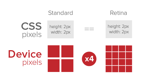
Such a block on conventional screens will occupy an area of 200x300 pixels, and on Retina-screens the same block will receive 400x600 pixels. Thus, on Retina-screens, the pixel density is 4 times greater than on conventional ones:
The ratio between physical and CSS pixels can be set as follows:
Or so:
In javascript this can be achieved using
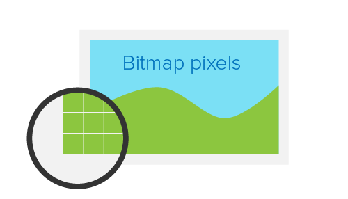
Bitmap pixels - the smallest parts that make up the bitmap image (PNG, JPF, GIF, etc.) Each pixel contains information about the color and location in the image coordinate system. In some formats, a pixel may contain additional information, such as transparency.
In addition to raster resolution, images on the Internet have abstract dimensions in CSS pixels. The browser compresses or stretches the image in accordance with its CSS width and length. When displayed on a regular screen, one raster pixel corresponds to one CSS pixel. On Retina screens, each raster pixel is multiplied 4 times:
There are several ways to optimize graphics for displaying on Retina screens. Each has both advantages and disadvantages. It is necessary in each particular case to choose which has a higher priority: performance, ease of implementation, browser support, or some other parameters.
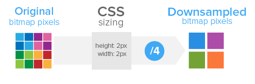
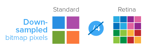
The easiest way to prepare graphics for the Retina display is to simply divide the physical dimensions of the image in half. For example, to show a photo of 200x300 pixels on a screen with increased pixel density, you need to upload a photo of 400x600 pixels and reduce it using CSS attributes or HTML parameters. This will display on a normal screen:
And so on Retina:
There are several ways to implement HTML and CSS scaling:
The easiest way is to simply set the width and height parameters to the img tag:
Where to use: on single-page sites with multiple images.
The same result can be achieved using Javascript in order to halve the size of images for Retina screens. Using the jQuery library, it looks like this:
Where to use: on sites with multiple images in the content.
You can also use an image as a background with the necessary dimensions (background-size) of a particular div. The background-size parameter is not supported in IE 7 and 8.
You can use the pseudo-elements: before or: after
The technique works when using sprites:
Where to use: on sites with a limited number of background images (for example, one as a sprite).

Perhaps this is the most popular way to optimize graphics for Retina displays. Used CSS or Javascript.
This method uses device-pixel-ratio to set the desired ratio between physical and CSS pixels:
Where to use: on websites or in applications that use background-image for design elements. Not suitable for images inside content.
The same result can be achieved using window.devicePixelRatio:
There is a special Javascript plugin Retina.js , which can do all of the above, but with additional features, such as skipping external images and skipping internal, but not having retina copies.
Where to use: on any sites with images in the content.

Regardless of the method used, raster images by their nature remain limited in scaling. Here we can help vector graphics. The SVG (Scalable Vector Graphics) XML-based format is supported by most browsers. The easiest way to use SVG images is in the img tag or with the background-image and content: url () CSS parameters.
In this example, a simple SVG image can be scaled as desired:
The same thing happens with CSS:
Support for IE 7 or 8 and Android 2.x will require the use of replacement PNG images. This can be easily done using Modernizr :
For better cross-browser compatibility, to avoid rasterization problems in Firefox and Opera, you should make each SVG image corresponding to its parent HTML element.
In HTML, you can implement the same using the desired data in the a tag:
Using jQuery and Modernizr:
Where to use: on any sites, suitable for icons, logos and simple vector illustrations.

Popular with Twitter, the Botstrap method is to replace the letters in the font with the desired characters and then display them on the page using CSS. There are many icon fonts with symbols for every taste, but you can also create your own using Fontello , Font Builder or even Inkscape .
The most common way to use icon fonts is to apply the desired class to a specific page element:
And in the styles indicated the desired font:
You can also use the: before pseudo-element and the content parameter with a unique class for each icon:
Where to use: on sites with a large number of icons and for rapid prototyping.
Favicon's are increasingly being used outside the browser as a graphical representation of a site or application. To optimize a favicon for Retina devices, you need to prepare .ico in two sizes: 16x16 and 32x32 pixels.
There is a special Apple-Webkit-image-set, introduced in the spring , which allows you to use several variants of a single image in CSS:
But this method does not apply to images inside the img tag.
Another tool is Picturefill by Scott Jehl. This is an HTML and Javascript solution:
Despite this markup, this is quite a normal cross-browser solution.
Another ambitious proposal is the use of the picture element , which allows you to use several adaptive images that replace each other depending on the size and pixel density of the screen.
Like many other big changes in web design, the search for a universal solution for images on Retina-based devices will be a long one. You can sit and wait for it, and you can now make sites that are nice to visit from any device.
First, let's look at the terminology.
Physical pixels
')
Physical pixels (device pixel or physical pixel) are familiar pixels: the smallest elements of any display, each of which has its own color and brightness.
Screen density is the number of physical pixels of the display. Usually measured in pixels per inch (PPI: pixels per inch). Apple, having developed dual pixel density Retina screens, argues that the human eye is not able to distinguish between greater density.
CSS pixels
CSS pixels (CSS pixels) - an abstract value used by browsers to accurately display content on pages, regardless of screen (DIPs: device-independent pixels). Example:
<div height="200" width="300"></div> Such a block on conventional screens will occupy an area of 200x300 pixels, and on Retina-screens the same block will receive 400x600 pixels. Thus, on Retina-screens, the pixel density is 4 times greater than on conventional ones:
The ratio between physical and CSS pixels can be set as follows:
device-pixel-ratio, -o-device-pixel-ratio, -moz-device-pixel-ratio, -Webkit-device-pixel-ratio { … } Or so:
device-pixel-ratio, -o-min-device-pixel-ratio, min--moz-device-pixel-ratio, -Webkit-min-device-pixel-ratio { … } In javascript this can be achieved using
window.devicePixelRatio Raster pixels
Bitmap pixels - the smallest parts that make up the bitmap image (PNG, JPF, GIF, etc.) Each pixel contains information about the color and location in the image coordinate system. In some formats, a pixel may contain additional information, such as transparency.
In addition to raster resolution, images on the Internet have abstract dimensions in CSS pixels. The browser compresses or stretches the image in accordance with its CSS width and length. When displayed on a regular screen, one raster pixel corresponds to one CSS pixel. On Retina screens, each raster pixel is multiplied 4 times:
Optimization
There are several ways to optimize graphics for displaying on Retina screens. Each has both advantages and disadvantages. It is necessary in each particular case to choose which has a higher priority: performance, ease of implementation, browser support, or some other parameters.
HTML and CSS scaling
The easiest way to prepare graphics for the Retina display is to simply divide the physical dimensions of the image in half. For example, to show a photo of 200x300 pixels on a screen with increased pixel density, you need to upload a photo of 400x600 pixels and reduce it using CSS attributes or HTML parameters. This will display on a normal screen:
And so on Retina:
There are several ways to implement HTML and CSS scaling:
HTML
The easiest way is to simply set the width and height parameters to the img tag:
<img src="example@2x.png" width="200" height="300" /> Where to use: on single-page sites with multiple images.
Javascript
The same result can be achieved using Javascript in order to halve the size of images for Retina screens. Using the jQuery library, it looks like this:
$(window).load(function() { var images = $('img'); images.each(function(i) { $(this).width($(this).width() / 2); }); }); Where to use: on sites with multiple images in the content.
CSS (SCSS)
You can also use an image as a background with the necessary dimensions (background-size) of a particular div. The background-size parameter is not supported in IE 7 and 8.
.image { background-image: url(example@2x.png); background-size: 200px 300px; /* Alternatively background-size: contain; */ height: 300px; width: 200px; } You can use the pseudo-elements: before or: after
.image-container:before { background-image: url(example@2x.png); background-size: 200px 300px; content:''; display: block; height: 300px; width: 200px; } The technique works when using sprites:
.icon { background-image: url(example@2x.png); background-size: 200px 300px; height: 25px; width: 25px; &.trash { background-position: 25px 0; } &.edit { background-position: 25px 25px; } } Where to use: on sites with a limited number of background images (for example, one as a sprite).
HTML and CSS scaling: pros
- Ease of implementation
- Cross-browser compatibility
HTML and CSS scaling: cons
- Devices with regular screens will download extra megabytes
- On conventional screens, image clarity may suffer due to compression algorithms.
- The background-size parameter is not supported in IE 7 and 8.
Determination of screen pixel density
Perhaps this is the most popular way to optimize graphics for Retina displays. Used CSS or Javascript.
CSS
This method uses device-pixel-ratio to set the desired ratio between physical and CSS pixels:
.icon { background-image: url(example.png); background-size: 200px 300px; height: 300px; width: 200px; } @media only screen and (-Webkit-min-device-pixel-ratio: 1.5), only screen and (-moz-min-device-pixel-ratio: 1.5), only screen and (-o-min-device-pixel-ratio: 3/2), only screen and (min-device-pixel-ratio: 1.5) { .icon { background-image: url(example@2x.png); } } Where to use: on websites or in applications that use background-image for design elements. Not suitable for images inside content.
pros
- Devices do not download extra images
- Cross-browser compatibility
- Control pixel density on the site
Minuses
- Tedious to implement, especially on large sites
- Using image content as a background is semantically incorrect.
Javascript
The same result can be achieved using window.devicePixelRatio:
$(document).ready(function(){ if (window.devicePixelRatio > 1) { var lowresImages = $('img'); images.each(function(i) { var lowres = $(this).attr('src'); var highres = lowres.replace(".", "@2x."); $(this).attr('src', highres); }); } }); There is a special Javascript plugin Retina.js , which can do all of the above, but with additional features, such as skipping external images and skipping internal, but not having retina copies.
Where to use: on any sites with images in the content.
pros
- Ease of implementation
- Devices do not download extra images
- Control pixel density on the site
Minuses
- Retina devices download both versions of each image.
- Image substitution is noticeable on retina devices
- Does not work in some popular browsers (IE and Firefox)
Scalable vector graphics
Regardless of the method used, raster images by their nature remain limited in scaling. Here we can help vector graphics. The SVG (Scalable Vector Graphics) XML-based format is supported by most browsers. The easiest way to use SVG images is in the img tag or with the background-image and content: url () CSS parameters.
In this example, a simple SVG image can be scaled as desired:
<img src="example.svg" width="200" height="300" /> The same thing happens with CSS:
/* */ .image { background-image: url(example.svg); background-size: 200px 300px; height: 200px; width: 300px; } /* content:url() */ .image-container:before { content: url(example.svg); /* width and height do not work with content:url() */ } Support for IE 7 or 8 and Android 2.x will require the use of replacement PNG images. This can be easily done using Modernizr :
.image { background-image: url(example.png); background-size: 200px 300px; } .svg { .image { background-image: url(example.svg); } } For better cross-browser compatibility, to avoid rasterization problems in Firefox and Opera, you should make each SVG image corresponding to its parent HTML element.
In HTML, you can implement the same using the desired data in the a tag:
<img src="example.svg" data-png-fallback="example.png" /> Using jQuery and Modernizr:
$(document).ready(function(){ if(!Modernizr.svg) { var images = $('img[data-png-fallback]'); images.each(function(i) { $(this).attr('src', $(this).data('png-fallback')); }); } }); Where to use: on any sites, suitable for icons, logos and simple vector illustrations.
pros
- A single set of images for all devices
- Ease of implementation
- Infinite scaling
Minuses
- No exact pixel anti-aliasing
- Not suitable for complex graphics due to large file sizes.
- No built-in support in IE 7, 8 and in earlier versions of Android
Icon Fonts
Popular with Twitter, the Botstrap method is to replace the letters in the font with the desired characters and then display them on the page using CSS. There are many icon fonts with symbols for every taste, but you can also create your own using Fontello , Font Builder or even Inkscape .
The most common way to use icon fonts is to apply the desired class to a specific page element:
<span class="icon">a</span> And in the styles indicated the desired font:
.icon { font-family: 'My Icon Font'; } You can also use the: before pseudo-element and the content parameter with a unique class for each icon:
<span class="glyph-heart"></span> [class^="glyph-"]:before { font-family: 'My Icon Font'; } .glyph-heart:before { content: 'h'; } Where to use: on sites with a large number of icons and for rapid prototyping.
pros
- Infinite scaling
- Cross-browser compatibility
- A more versatile solution than a set of graphic elements.
Minuses
- No exact pixel anti-aliasing
- The complexity of implementation: a separate font character for each icon
- The method is based on semantically incorrect markup.
Favicon
Favicon's are increasingly being used outside the browser as a graphical representation of a site or application. To optimize a favicon for Retina devices, you need to prepare .ico in two sizes: 16x16 and 32x32 pixels.
A look into the future
There is a special Apple-Webkit-image-set, introduced in the spring , which allows you to use several variants of a single image in CSS:
.image { background-image: -Webkit-image-set(url(example.png) 1x, url(example@2x.png) 2x); background-size: 200px 300px; } But this method does not apply to images inside the img tag.
Another tool is Picturefill by Scott Jehl. This is an HTML and Javascript solution:
<div data-picture> <div data-src="example.png"></div> <div data-src="example@2x.png" data-media="(min-device-pixel-ratio: 1.5)"></div> <!-- Fallback content for non-JS browsers --> <noscript> <img src="example.png" > </noscript> </div> Despite this markup, this is quite a normal cross-browser solution.
Another ambitious proposal is the use of the picture element , which allows you to use several adaptive images that replace each other depending on the size and pixel density of the screen.
Conclusion
Like many other big changes in web design, the search for a universal solution for images on Retina-based devices will be a long one. You can sit and wait for it, and you can now make sites that are nice to visit from any device.
Source: https://habr.com/ru/post/150071/
All Articles