Grids without problems
The vast majority of sites created with the use of grid layouts. They may not use them explicitly, but if there is a block with the main content located on the right and a sidebar (sidebar) on the left, then this is the simplest grid.
If you want to implement more complex grids, then people resort to using frameworks. They believe that the grid is over the complicated thing, which is better to entrust the real connoisseurs of CSS. Confidence in this is reinforced by the fact that most of the grid frameworks with which they deal are very complex.
In this article I will tell you how I make up a grid layout. It is not so difficult. And even make a rubber mesh will not be difficult.
The width of the column wrapper is equal to the width of its parent. We can take its width as 100%. Since the wrapper has no semantic meaning, for it we will use a simple div.

')
Let's start with a layout that is often used in practice, consisting of: a region with main content 2/3 wide and a side block 1/3 wide (from the width of the parent). To do this, we will create two divs with the appropriate classes:
To arrange them next to each other, we set the float property to them and set the width. Float can be installed at once to several columns like this:
and the width is set individually:
That's the whole prerequisite for grids without problems.
Since our wrapper contains only floating elements (columns with the float property set), its height collapses to zero (since floating elements do not affect the size of the parent - approx. Lane) . To fix this, you need to clear the stream. Currently it is enough to add this:
Indenting between columns is the hardest part of a grid layout. We have already made our mesh "rubber" by setting the column width in percent. Now we could complicate everything with mathematical calculations and set the width in percent and for the indents between the columns. Personally, I am not a supporter of such methods, I prefer to set fixed spaces between columns. And, besides, in this article we try not to bother too much.
As a first step, we will use the box-sizing property with the value of the border-box. I love to apply it to all elements at once.
Now, no padding, no borders will not affect the size of the elements.
As a second step, we set a fixed indent on the right side to all columns, except the very last one.

This is all that concerns the indents between the columns in the simplest case.
Need external padding between columns? I use an extra class for this:
First we add the left indent to the column wrapper (as well as the upper and lower indent at your discretion):
Then return the right indent to the last column:

It is very simple:
You can do anything with them. Just do not forget that the sum of fractions should not exceed one. For this you have to think about brains, but there is nothing complicated here.
I don't use it often, but all our code becomes more compact thanks to SCSS / Compass:
When working with such grids, I like to use “modules”.
It is very convenient to break content into such pieces. An additional benefit of them is that each module can be indented, which will separate the text from the edges of the columns.
You can see the demonstration of the result here .
The code works fine in IE 9 version and above, as well as in all other browsers. If you need IE7, do something else.
(It should be noted that in Opera, support for fractional values of percent appeared only in version 12. - approx. Lane.)
By the way, the model of “flexible blocks” (flexbox, flexible box) in the future will simplify the implementation of grid layouts and even improve it (in a variety of ways, including the possibility of rearranging columns on demand). But I think that it will take us about another year to start at least thinking about the use of “flexible blocks”.
See grids from the OOCSS framework .
In the original article, the author pointed out that this method works fine in Internet Explorer 8 version. But he was wrong, because IE8 does not support the: last-of-type pseudo-class. But he supports the pseudo-class: first-child which will help us solve this problem.
In CSS we change: last-of-type to: first-child and instead of the right indents at the columns, set the left:
And in the same way, we correct the code for the indentation:
If you want to implement more complex grids, then people resort to using frameworks. They believe that the grid is over the complicated thing, which is better to entrust the real connoisseurs of CSS. Confidence in this is reinforced by the fact that most of the grid frameworks with which they deal are very complex.
In this article I will tell you how I make up a grid layout. It is not so difficult. And even make a rubber mesh will not be difficult.
Wrapper
The width of the column wrapper is equal to the width of its parent. We can take its width as 100%. Since the wrapper has no semantic meaning, for it we will use a simple div.
<div class="grid"> <!-- 100% wide --> </div> ')
Columns
Let's start with a layout that is often used in practice, consisting of: a region with main content 2/3 wide and a side block 1/3 wide (from the width of the parent). To do this, we will create two divs with the appropriate classes:
<div class="grid"> <div class="col-2-3"> Main Content </div> <div class="col-1-3"> Sidebar </div> </div> To arrange them next to each other, we set the float property to them and set the width. Float can be installed at once to several columns like this:
[class*='col-'] { float: left; } and the width is set individually:
.col-2-3 { width: 66.66%; } .col-1-3 { width: 33.33%; } That's the whole prerequisite for grids without problems.
Stream cleaning
Since our wrapper contains only floating elements (columns with the float property set), its height collapses to zero (since floating elements do not affect the size of the parent - approx. Lane) . To fix this, you need to clear the stream. Currently it is enough to add this:
.grid:after { content: ""; display: table; clear: both; } Indents between speakers
Indenting between columns is the hardest part of a grid layout. We have already made our mesh "rubber" by setting the column width in percent. Now we could complicate everything with mathematical calculations and set the width in percent and for the indents between the columns. Personally, I am not a supporter of such methods, I prefer to set fixed spaces between columns. And, besides, in this article we try not to bother too much.
As a first step, we will use the box-sizing property with the value of the border-box. I love to apply it to all elements at once.
*, *:after, *:before { -webkit-box-sizing: border-box; -moz-box-sizing: border-box; box-sizing: border-box; } Now, no padding, no borders will not affect the size of the elements.
As a second step, we set a fixed indent on the right side to all columns, except the very last one.
[class*='col-'] { padding-right: 20px; } [class*='col-']:last-of-type { padding-right: 0; } This is all that concerns the indents between the columns in the simplest case.
External padding
Need external padding between columns? I use an extra class for this:
<div class="grid grid-pad"> </div> First we add the left indent to the column wrapper (as well as the upper and lower indent at your discretion):
.grid-pad { padding: 20px 0 20px 20px; } Then return the right indent to the last column:
.grid-pad > [class*='col-']:last-of-type { padding-right: 20px; } More different speakers
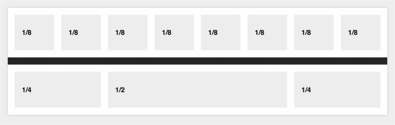
It is very simple:
.col-1-2 { width: 50%; } .col-1-4 { width: 25%; } .col-1-8 { width: 12.5%; } You can do anything with them. Just do not forget that the sum of fractions should not exceed one. For this you have to think about brains, but there is nothing complicated here.
Sass
I don't use it often, but all our code becomes more compact thanks to SCSS / Compass:
* { @include box-sizing(border-box); } $pad: 20px; .grid { background: white; margin: 0 0 $pad 0; &:after { /* Or @extend clearfix */ content: ""; display: table; clear: both; } } [class*='col-'] { float: left; padding-right: $pad; .grid &:last-of-type { padding-right: 0; } } .col-2-3 { width: 66.66%; } .col-1-3 { width: 33.33%; } .col-1-2 { width: 50%; } .col-1-4 { width: 25%; } .col-1-8 { width: 12.5%; } /* Opt-in outside padding */ .grid-pad { padding: $pad 0 $pad $pad; [class*='col-']:last-of-type { padding-right: $pad; } } Modules
When working with such grids, I like to use “modules”.
<div class="grid"> <div class="col-2-3"> <article class="module"> stuff </article> <article class="module"> stuff </article> </div> <div class="col-1-3"> <aside class="module"> Sidebar stuff. Sub modules? </aside> </div> </div> It is very convenient to break content into such pieces. An additional benefit of them is that each module can be indented, which will separate the text from the edges of the columns.
Result
You can see the demonstration of the result here .
Showdowns with browsers
The code works fine in IE 9 version and above, as well as in all other browsers. If you need IE7, do something else.
(It should be noted that in Opera, support for fractional values of percent appeared only in version 12. - approx. Lane.)
By the way, the model of “flexible blocks” (flexbox, flexible box) in the future will simplify the implementation of grid layouts and even improve it (in a variety of ways, including the possibility of rearranging columns on demand). But I think that it will take us about another year to start at least thinking about the use of “flexible blocks”.
Related information
See grids from the OOCSS framework .
Solution for IE8 (added by translator)
In the original article, the author pointed out that this method works fine in Internet Explorer 8 version. But he was wrong, because IE8 does not support the: last-of-type pseudo-class. But he supports the pseudo-class: first-child which will help us solve this problem.
In CSS we change: last-of-type to: first-child and instead of the right indents at the columns, set the left:
[class*='col-'] { padding-left: 20px; } [class*='col-']:first-child { padding-left: 0; } And in the same way, we correct the code for the indentation:
.grid-pad { padding: 20px 20px 20px 0; } .grid-pad > [class*='col-']:first-child { padding-left: 20px; } Source: https://habr.com/ru/post/149816/
All Articles