Data tables in responsive design
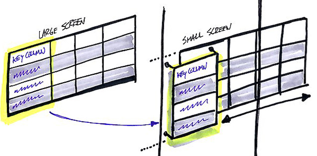
One of the constant problems of designers of adaptive sites is the task of conveniently presenting regular tables on mobile devices. Here is what these tables look like most often:
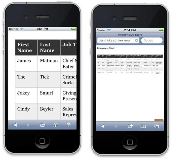
Not very comfortable, right? Fortunately, there are already several tricky ways to solve this problem.
Description and demo in Russian, original and demo in English.
')
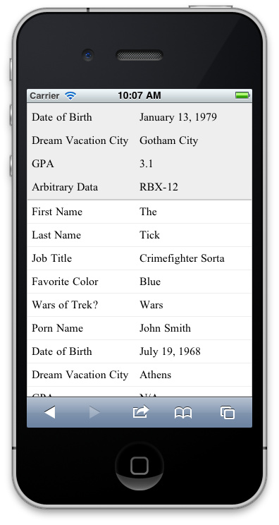
The point is that the table is stretched vertically, in each row there are only two columns left: the header and the data. The disadvantage of this method is that the result is a table that is too long and will have to be scrolled for a long time.
Details and demo in English
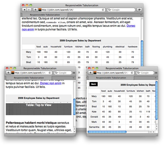
A good way to Javascript / CSS, which adds horizontal scrolling for cells with data, while the headers remain in place, very convenient.
Demo
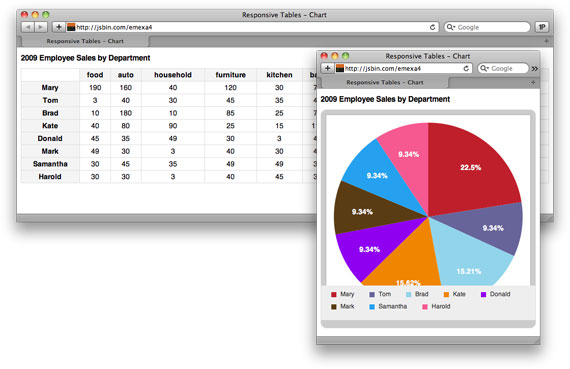
Converts a regular table into a beautiful chart. This method is not suitable for all data, but the result looks very interesting.
Demo
In this way, the table on the small screen just hides under the “spoiler”. As they say, cheap and cheerful.
Not very comfortable, right? Fortunately, there are already several tricky ways to solve this problem.
1. Method by Chris Coyier
Description and demo in Russian, original and demo in English.
')
The point is that the table is stretched vertically, in each row there are only two columns left: the header and the data. The disadvantage of this method is that the result is a table that is too long and will have to be scrolled for a long time.
2. Method from Zurb.com
Details and demo in English
A good way to Javascript / CSS, which adds horizontal scrolling for cells with data, while the headers remain in place, very convenient.
3. Method by Scott Jehl
Demo
Converts a regular table into a beautiful chart. This method is not suitable for all data, but the result looks very interesting.
4. Method from Todd Parker
Demo
In this way, the table on the small screen just hides under the “spoiler”. As they say, cheap and cheerful.
Source: https://habr.com/ru/post/149742/
All Articles