What should Android apps look like?
The Android platform has no hard recommendations on how applications should look and work. From the very beginning, Google made it clear that they have no plans to start dictating what is acceptable and what is not. There is a set of UI recommendations , but they mostly concentrate on little things like icons, widgets and menus.
Since the launch of the platform, there have been hundreds of different ideas of interfaces, and the appearance of applications has been very diverse. Now that the platform has reached maturity and the number of applications has increased dramatically, the Android user interface is forming. Some interface functions have become common, and some of them even found their way into the Android SDK libraries. Soon, users will expect more consistent work from applications. Some controls and interaction models will be integrated into the Android platform.
In this article I want to summarize how Android UIs usually work at a higher level. I used to write about many of the principles of the user interface, but they were isolated from the general scheme. Now I want to bring them together to show what I think about how Android apps should look like.
The latest version of Android (4.0) was released recently. The release brought with it the largest set of custom platform improvements ever. These changes naturally affect how Android apps will look in the future. Some enhancements may be ported back for earlier versions, but not all of them. In this article, I mainly talk about how Android apps look right now. I hope that soon we will see the evolution of the ICS interface, but the fact is that we have about 200.000.000 Android devices with versions from 2.1 to 2.3.
')
The interface principle “control panel” is used in many applications. If your application has more than one primary function, then this can be a very good starting point. The dashboard shows the most important functions of the application and provides easy access to them.
The control panel is well known to users of Android applications. This is a sure way to make the user feel at home on the first screen of your application, if it is used correctly.
In fact, Activity manifests itself in many forms, but some features have become very common and users have learned to understand and expect them. The action bar at the top of the screen is a very common and easy to understand concept.
The ActionBarSherlock (Jake Wharton) project makes it easy to implement action bars.
Lists are one of the most common components of the Android user interface. Lists are very useful when displaying data, especially if it is not known what their volume will be.
Lists have a flaw. Each element of the list should be relatively small, allowing you to conveniently view the contents of the list. On the other hand, a lot of information in a small area can make it very difficult for users to use the list and find the items they want to interact with.
It is good that there are some manuals for the operation of Android lists in general. Users are used to certain elements and functions, and if your list works in this way, then your users are much easier to master.
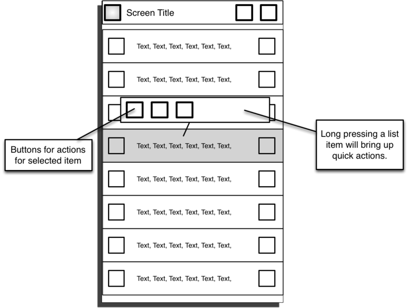
List screens can use an action pane to display actions that are directed to the entire list. Please note that the action panel on the screen for an operation on several elements of the list should be different than when performing an action on one element of the list.
The list of elements, as a rule, contains text and several graphic elements. Very often there are checkboxes on each item that can be used to select one or more list items to perform operations on them.
Placing the checkbox on the left in the list item has the following advantages:
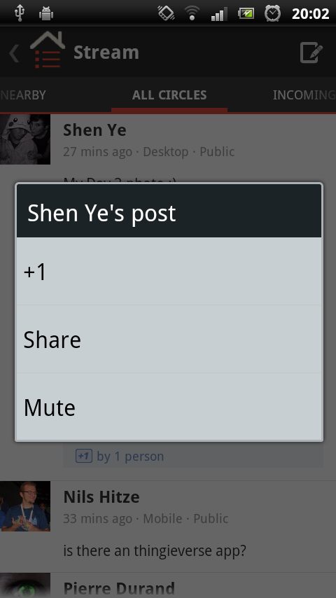
Some elements need more interaction than a simple choice (checkbox) or navigation (click). The most common use of this control is to rank or bookmark an item. The only natural place for a secondary control is the right edge of the element. Any other place can lead to problems with location.
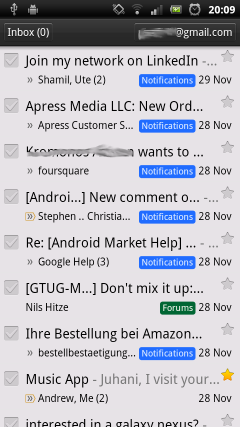
Aldiko and Google Mail are good examples of applications that use nice lists. Aldiko decided to check the boxes on the right, which visually makes the user interface unbalanced.
Many lists contain items that are downloaded over the network. In this situation, the loading process can take a long time, and the list cannot be filled as quickly as the user scrolls through it. In the event that a user reaches the end of the list, the application should automatically start downloading the following items. The indicator tells the user that the following loaded items will be at the end of the list. Including some types of animation downloads, for example, a progress indicator is a good idea. Animation allows users to understand that data is being loaded.
Android Market and Twitter automatically download multiple items when they reach the end of the list.
You need to enable users to perform operations on a single list item without having to move to the top of the screen.
Since phones and tablet computers do not have the function of clicking the right mouse button, the specifics of the "right click" on the touch screens have evolved. With a long press on the element, the user is given to understand that he wants to perform an operation for the current element.
There is a user interface model called “quick action” to display actions on list items. The use of the original graphic approach has largely become extinct, but the essence remains the same. It is a form of menu overlay that displays a very simple list of actions. Usually from three to five. Regardless of how quickly the action is visually realized, keep in mind:
Aldiko, Asto File Manager and Google+ use different visual styles. In all cases, these actions appear with a long press on the screen element.
Aldiko and Astro are examples of good design, but Google + violates the rule about hiding the target element because they use simple pop-up windows. I hope they fix this flaw in future versions.
If the list contains a checkbox control, this allows the user to select multiple items. When selecting multiple items, the user can perform actions for all selected items at once.
A common way to handle the actions of several elements is to add a panel at the bottom of the screen, where buttons for possible actions are located immediately above all selected elements. Animation with good glide adds smoothness and sophistication to the user interface. The panel should automatically hide when the last selection is cleared or the action is completed.

Aldiko and GMail are a good example of how the work with selected elements should be organized. Both applications have a good sliding animation when the bottom panel appears. Aldiko also adds a number on the import button, showing the user how many items he has selected. This is a very nice addition, but not in all cases.
For more information on the technical details of working with lists, see the following two excellent series of articles:
Styling Android's Mark Allison:
ListView - Part 1
ListView - Part 2
ListView - Part 3
ListView - Part 4
AndroidDevBlog's Cyril Mottier:
ListView Tips & Tricks # 1: Handle emptiness
ListView Tips & Tricks # 2: Section your ListView
ListView Tips & Tricks # 3: Create fancy ListViews
ListView Tips & Tricks # 4: Add several clickable areas
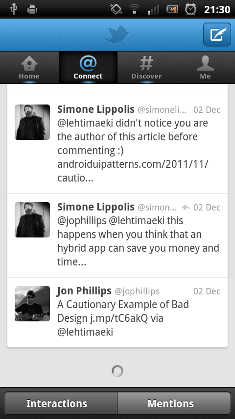
Many applications in one form or another use tabs to help users navigate between pages. Android versions of Honeycomb (3.0) and Ice Cream Sandwich (4.0) slightly changed the way the tabs work and look. My opinion is that we should try to use this innovation in all our applications, regardless of the version on which they work.
I recently wrote about ICS in this article , so I will not repeat the content here. To be brief, the way you move between tabs has changed. If your application uses tabs, then users expect to be able to move between them simply by sliding their finger.
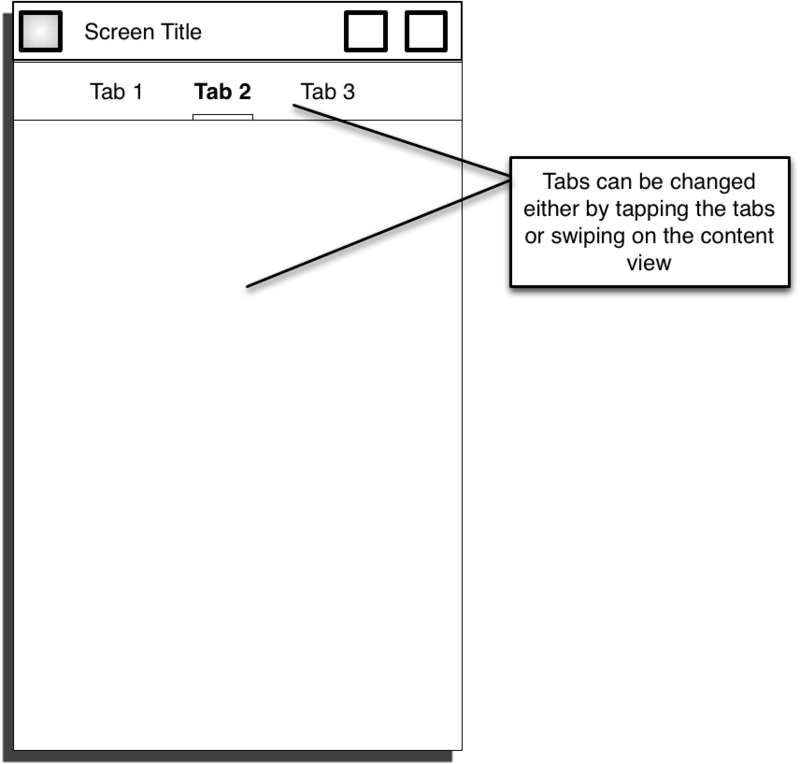
Good examples of apps that use slides to navigate between tabs are the Android Market and Google+.
Mark Allison has written several excellent articles on the technical implementation of this topic:
ViewPager - Part 1
ViewPager - Part 2
ViewPager - Part 3
Jake Wharton's project shows how to work with tabs:
ViewPagerIndicator on github
Android is fast becoming a mature and consistent platform. Appearance and application behavior begin to resemble each other, and users begin to expect a certain interaction with the user interface. While there are no official recommendations, a deeper look at the most well-known applications gives us a good understanding of what we should do.
Ps article a little dusty, but I think it will be useful.
Since the launch of the platform, there have been hundreds of different ideas of interfaces, and the appearance of applications has been very diverse. Now that the platform has reached maturity and the number of applications has increased dramatically, the Android user interface is forming. Some interface functions have become common, and some of them even found their way into the Android SDK libraries. Soon, users will expect more consistent work from applications. Some controls and interaction models will be integrated into the Android platform.
In this article I want to summarize how Android UIs usually work at a higher level. I used to write about many of the principles of the user interface, but they were isolated from the general scheme. Now I want to bring them together to show what I think about how Android apps should look like.
Ice cream sandwich
The latest version of Android (4.0) was released recently. The release brought with it the largest set of custom platform improvements ever. These changes naturally affect how Android apps will look in the future. Some enhancements may be ported back for earlier versions, but not all of them. In this article, I mainly talk about how Android apps look right now. I hope that soon we will see the evolution of the ICS interface, but the fact is that we have about 200.000.000 Android devices with versions from 2.1 to 2.3.
')
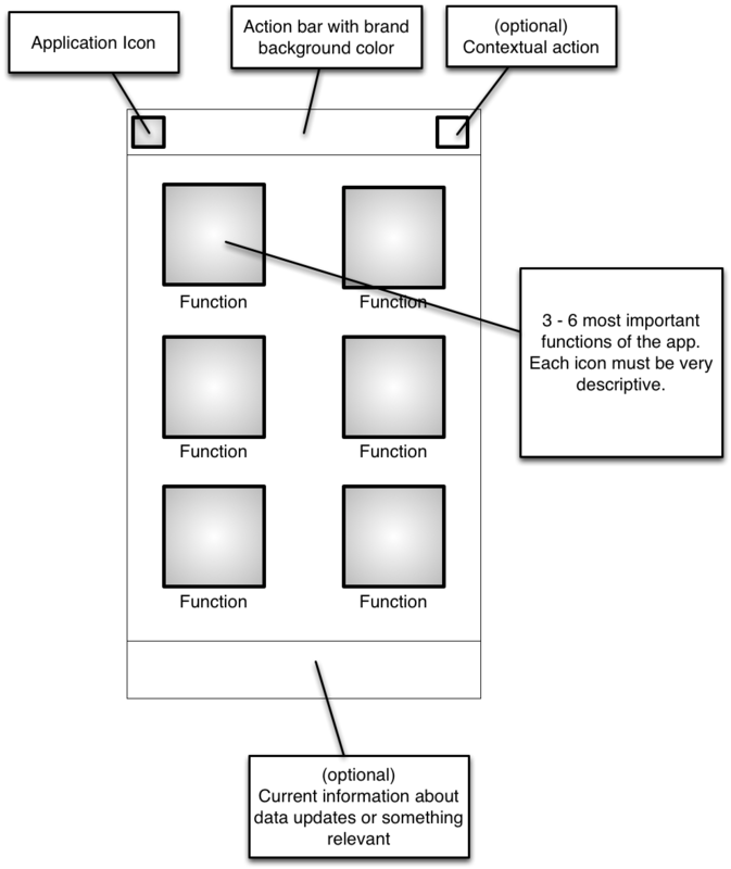
Application main screen
The interface principle “control panel” is used in many applications. If your application has more than one primary function, then this can be a very good starting point. The dashboard shows the most important functions of the application and provides easy access to them.
The control panel is well known to users of Android applications. This is a sure way to make the user feel at home on the first screen of your application, if it is used correctly.
Examples

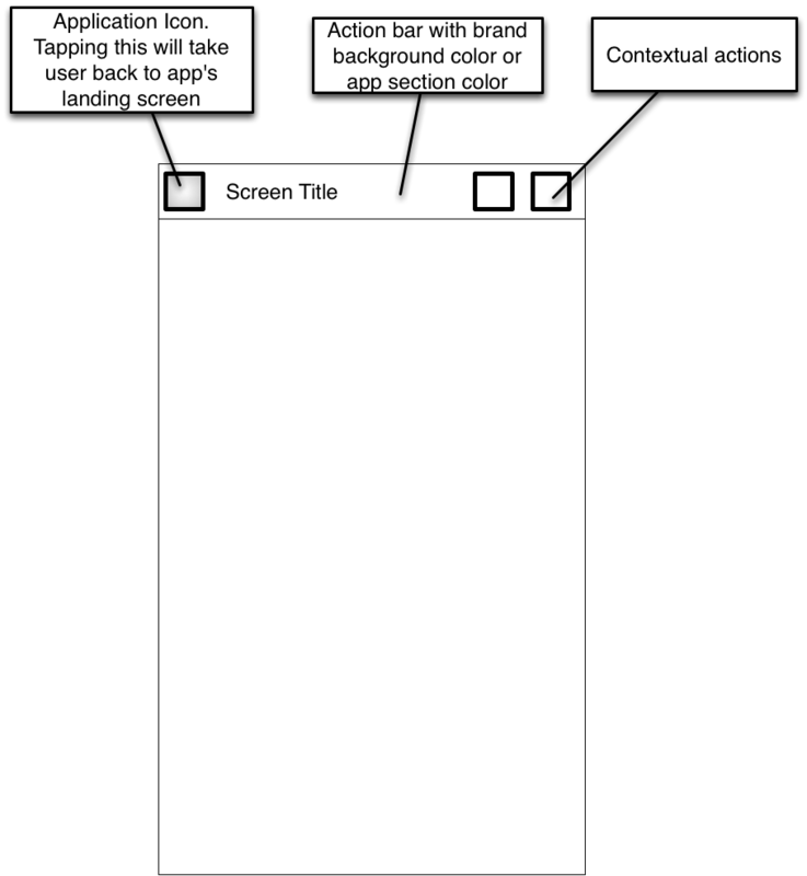
Application General Screen
In fact, Activity manifests itself in many forms, but some features have become very common and users have learned to understand and expect them. The action bar at the top of the screen is a very common and easy to understand concept.
- In the upper left corner is the icon of the application or return to the main screen. When clicked, the user must return to the main page of the application. It is worth noting that the new action bar does not return users to the main page; instead, one goes up one level in the menu hierarchy.
- In the middle of the action pane will be located the screen name and brand colors or colors of the current section of the application.
- Icons are located in the upper right corner of the screen for the most important actions that can be performed on this screen. At the same time, this part of the screen should contain only actions related to the contents of the current screen. The search function was an exception to this rule.
The ActionBarSherlock (Jake Wharton) project makes it easy to implement action bars.
Lists
Lists are one of the most common components of the Android user interface. Lists are very useful when displaying data, especially if it is not known what their volume will be.
Lists have a flaw. Each element of the list should be relatively small, allowing you to conveniently view the contents of the list. On the other hand, a lot of information in a small area can make it very difficult for users to use the list and find the items they want to interact with.
It is good that there are some manuals for the operation of Android lists in general. Users are used to certain elements and functions, and if your list works in this way, then your users are much easier to master.
Action bar on list screens.
List screens can use an action pane to display actions that are directed to the entire list. Please note that the action panel on the screen for an operation on several elements of the list should be different than when performing an action on one element of the list.
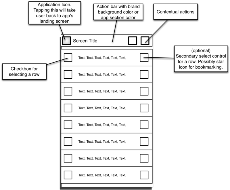
List items and checkboxes
The list of elements, as a rule, contains text and several graphic elements. Very often there are checkboxes on each item that can be used to select one or more list items to perform operations on them.
Placing the checkbox on the left in the list item has the following advantages:
- We are used to seeing checkboxes on the left side of the items we select. This is true for the web, desktop and other mobile applications.
- The checkbox on the edge of the item allows us to create large areas for clicking, which makes it easier for users to distinguish between clicking on list items and selecting one item.
- The graphic component on the left side of the element creates a light visual prompt where one element ends and another begins, which makes it much easier for users to quickly view the list.
Secondary controls
Some elements need more interaction than a simple choice (checkbox) or navigation (click). The most common use of this control is to rank or bookmark an item. The only natural place for a secondary control is the right edge of the element. Any other place can lead to problems with location.
Aldiko and Google Mail are good examples of applications that use nice lists. Aldiko decided to check the boxes on the right, which visually makes the user interface unbalanced.
Examples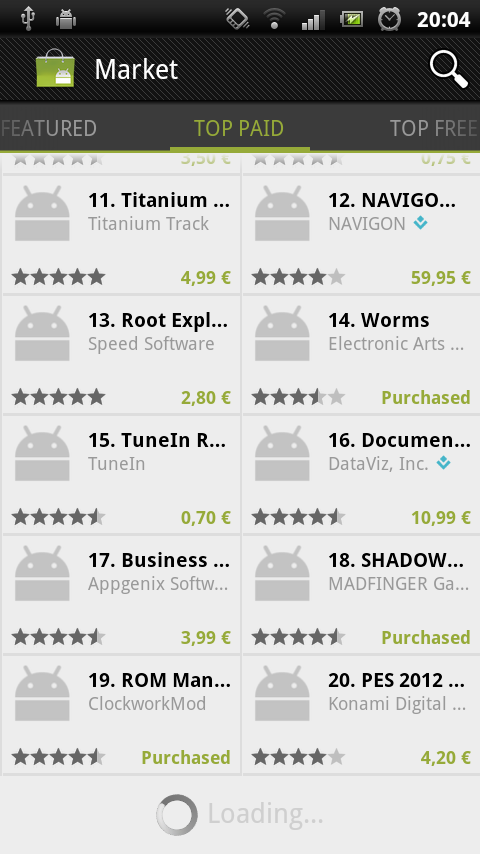
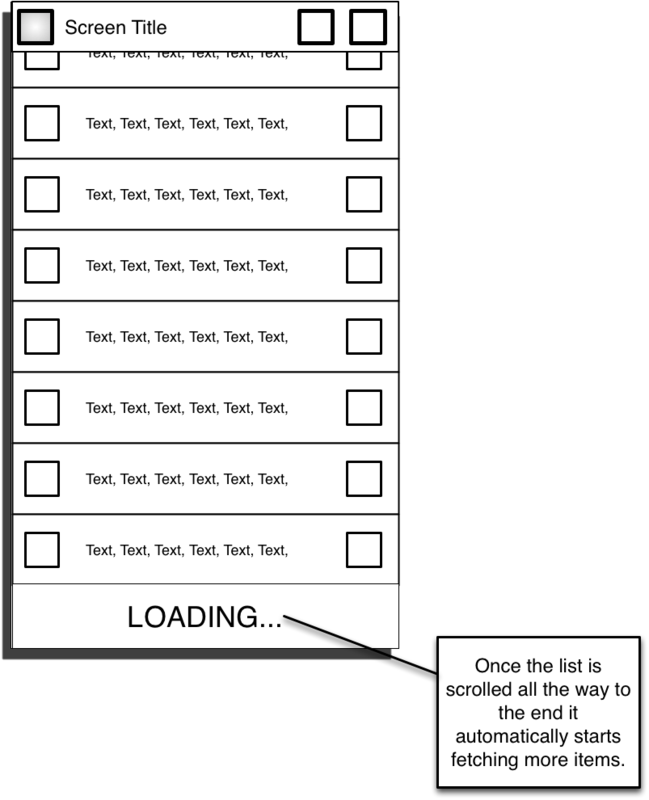
Endless lists
Many lists contain items that are downloaded over the network. In this situation, the loading process can take a long time, and the list cannot be filled as quickly as the user scrolls through it. In the event that a user reaches the end of the list, the application should automatically start downloading the following items. The indicator tells the user that the following loaded items will be at the end of the list. Including some types of animation downloads, for example, a progress indicator is a good idea. Animation allows users to understand that data is being loaded.
Android Market and Twitter automatically download multiple items when they reach the end of the list.
Examples
Actions on elements - Long press - Quick actions
You need to enable users to perform operations on a single list item without having to move to the top of the screen.
Since phones and tablet computers do not have the function of clicking the right mouse button, the specifics of the "right click" on the touch screens have evolved. With a long press on the element, the user is given to understand that he wants to perform an operation for the current element.
There is a user interface model called “quick action” to display actions on list items. The use of the original graphic approach has largely become extinct, but the essence remains the same. It is a form of menu overlay that displays a very simple list of actions. Usually from three to five. Regardless of how quickly the action is visually realized, keep in mind:
- Do not close the selected item! Especially when users perform a delete operation. Users are more confident in their actions if they see an item all the time.
- Show only simple actions. All that requires complex interaction, it is better to handle on a separate screen, rather than in quick action.
Aldiko, Asto File Manager and Google+ use different visual styles. In all cases, these actions appear with a long press on the screen element.
Aldiko and Astro are examples of good design, but Google + violates the rule about hiding the target element because they use simple pop-up windows. I hope they fix this flaw in future versions.
Examples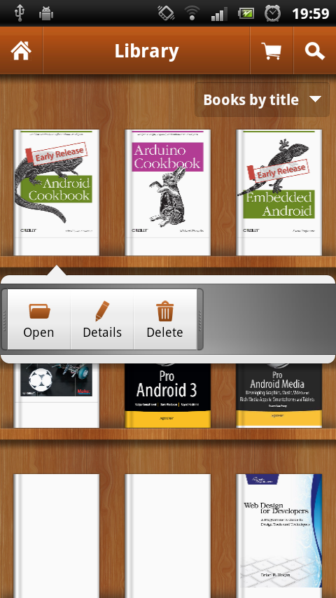

Actions on multiple items
If the list contains a checkbox control, this allows the user to select multiple items. When selecting multiple items, the user can perform actions for all selected items at once.
A common way to handle the actions of several elements is to add a panel at the bottom of the screen, where buttons for possible actions are located immediately above all selected elements. Animation with good glide adds smoothness and sophistication to the user interface. The panel should automatically hide when the last selection is cleared or the action is completed.
Aldiko and GMail are a good example of how the work with selected elements should be organized. Both applications have a good sliding animation when the bottom panel appears. Aldiko also adds a number on the import button, showing the user how many items he has selected. This is a very nice addition, but not in all cases.
Examples

More information on listings
For more information on the technical details of working with lists, see the following two excellent series of articles:
Styling Android's Mark Allison:
ListView - Part 1
ListView - Part 2
ListView - Part 3
ListView - Part 4
AndroidDevBlog's Cyril Mottier:
ListView Tips & Tricks # 1: Handle emptiness
ListView Tips & Tricks # 2: Section your ListView
ListView Tips & Tricks # 3: Create fancy ListViews
ListView Tips & Tricks # 4: Add several clickable areas
Tabs
Many applications in one form or another use tabs to help users navigate between pages. Android versions of Honeycomb (3.0) and Ice Cream Sandwich (4.0) slightly changed the way the tabs work and look. My opinion is that we should try to use this innovation in all our applications, regardless of the version on which they work.
I recently wrote about ICS in this article , so I will not repeat the content here. To be brief, the way you move between tabs has changed. If your application uses tabs, then users expect to be able to move between them simply by sliding their finger.
Good examples of apps that use slides to navigate between tabs are the Android Market and Google+.
Examples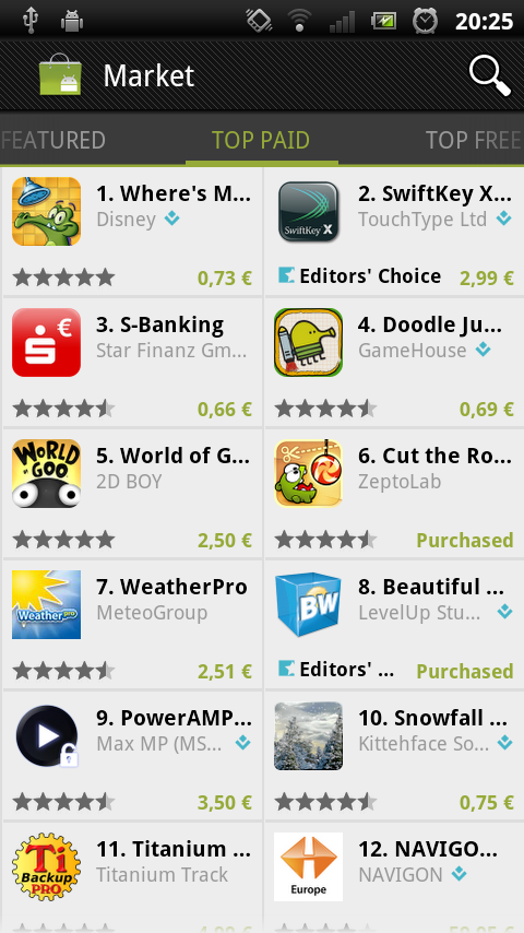

Mark Allison has written several excellent articles on the technical implementation of this topic:
ViewPager - Part 1
ViewPager - Part 2
ViewPager - Part 3
Jake Wharton's project shows how to work with tabs:
ViewPagerIndicator on github
Conclusion
Android is fast becoming a mature and consistent platform. Appearance and application behavior begin to resemble each other, and users begin to expect a certain interaction with the user interface. While there are no official recommendations, a deeper look at the most well-known applications gives us a good understanding of what we should do.
Ps article a little dusty, but I think it will be useful.
Source: https://habr.com/ru/post/149610/
All Articles