Google changed the search favicon

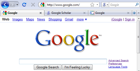
 The search giant replaced the favicon that has lived with him since 2009.
The new icon has doubled and got rid of the fading of colors that many did not like .
Previous attempts by Google to change favicon, commented something like this:
in 2008 - “this crooked little g looked just disgusting”
in 2009 - “colorful bloom”
What do you say now?
In 2012, the new icon brings us back to the “crooked letter g,” but it looks less annoying.
It's funny that Google for some reason persistently tries to write a small letter " g " in the favicon, as if it also suggests that we write the name of a search engine with a small letter.
All previous Google favicons with one picture:
')
Source: https://habr.com/ru/post/149562/
All Articles