Designing interfaces for mobile devices: portrait and landscape orientation
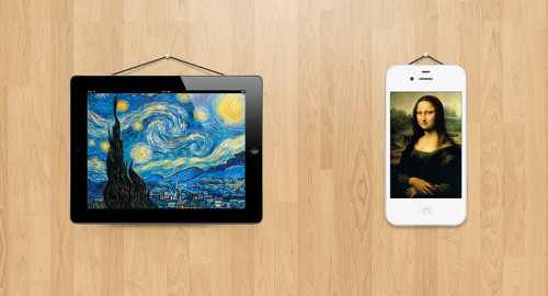
The accelerometer built into your smartphone or tablet is usually used to switch between portrait and landscape modes. This feature provides ample opportunities for more convenient use of the device.
However, developing an application for various orientation modes brings some problems and requires more careful attention. The use of this function should be understandable to the user. And we as developers should understand the context of using this feature.
Almost all mobile and tablet apps use or will use the orientation feature. This article discusses some of the basic concepts that designers and developers can use to properly plan switching between modes.
')
Using an orientation device to activate an additional screen.
YouTube’s mobile app is a good example of targeting. Portrait mode offers a feature-rich interface for opening videos and viewing a user account. Landscape mode provides comfortable viewing and playback control. When the video ends the display automatically switches from landscape to portrait orientation, which forces the user to quickly tilt the device to view and search for new videos.
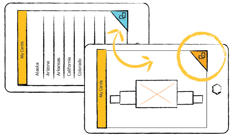
However, the use of orientation to activate an additional screen may, on the contrary, confuse the user. For example, in CardMunch (LinkedIn user business cards) where users can convert business card images made with the camera of a smartphone into contacts in the address book. Rotating CardMunch in landscape mode completely changes the interface for viewing all saved cards.
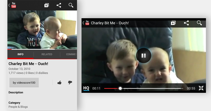 YouTube mobile interface in portrait and landscape modes.
This interface has no visual clues about its orientation and has limited control functions. You cannot add or change business cards, as a result of which this carousel is somewhat annoying and embarrassing, especially if you run the application in landscape mode.
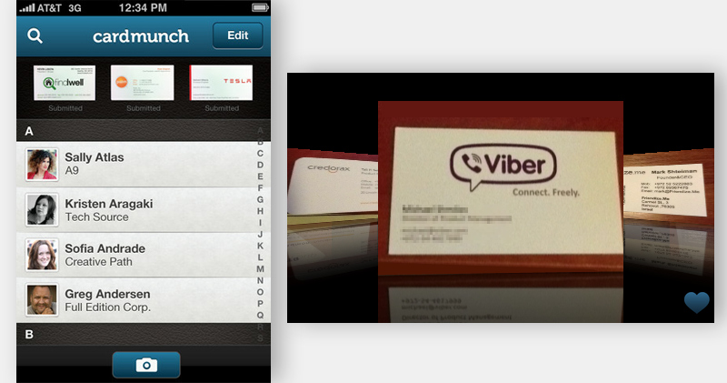 CardMunch on LinkedIn has no visual cues about its additional screen.
Orientation Design Models
To help UX specialists, I identified four basic models for constructing orientations.
Liquid
This interface simply adapts to the size of the screen.
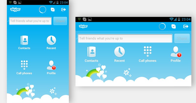 In the Skype mobile interface, icons change position when switching from portrait to landscape.
 Pocket's mobile interface, the same layout only different widths.
Advanced
This interface not only adjusts to the screen size, but also adds or subtracts the location of the components in accordance with the selected orientation mode. For example, IMDb for iPad uses a wide screen in landscape mode to be able to view the filmography on the left. This list is also available in portrait mode, but only after pressing the corresponding button on the right side of the screen.
 IMDb for iPad.
Providing visual elements and functionality in any position ultimately provides convenience to the user. However, not imposing the user to hold the device in a certain way gives a special advantage, especially if the necessary functionality does not appear in the default orientation.
Additional
In this model, an orientation change triggers an auxiliary screen with corresponding additional information. An example would be a financial application that displays data in portrait mode by default, and shows a visual graph when changing orientation.
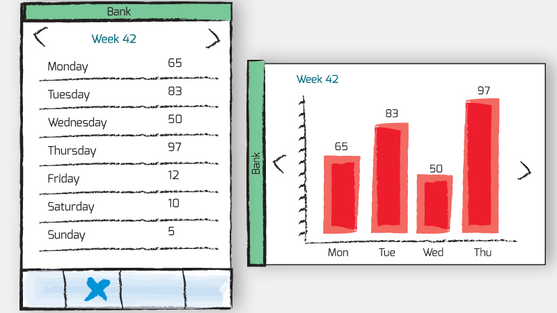 An example of the main and additional windows of the application of finance.
Continuous
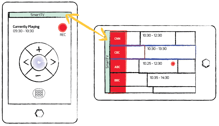
Like YouTube, the continuous design allows the user to access the additional interface by simply rotating the device. As an example, you can use your smartphone as a remote control for smart TV. In landscape mode, the device will open the full program guide, while maintaining the functionality to change channel settings, view and record future programs.
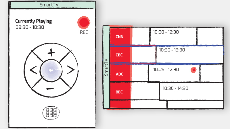 Smart Remote and Program Guide.
Default orientation
Above & Beyond is an interactive iPad book about the life and work of American cartoonist John Kascht. Beautiful art in this book is displayed in both portrait and landscape mode. However, the horizontal mode shows important interactive elements that are not displayed in portrait mode, such as returning to the main menu. Porter orientation is the iPad's default orientation, so transferring this functionality to landscape mode can only confuse users.
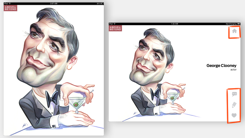 In portrait mode, there are no controls.
Unlike Android devices, Windows 8, Playbook BlackBerry, where the default orientation is landscape. Therefore, it is worth remembering that the default orientation should be used by your users for their intended purpose.
Understanding the context
When developing applications for smart devices, let's consider the context and circumstances under which this application will be used, in particular, when developing an orientation mode. For example: interactive cookbooks have become very popular. Manufacturers of equipment and accessories create a variety of devices to facilitate the use of the iPad in the kitchen , including a washable stylus for use in cooking.
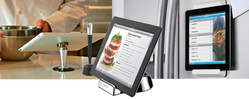
We can use orientation to create a more user-friendly interface. In portrait orientation, users can flip through the list of ingredients in recipes for a particular dish. When switching to landscape mode, the interface will change to a step-by-step instruction with large buttons. This chef-friendly interface will prevent the screen from automatically darkening, and also allow you to switch pages with a wave of your hand in front of the camera to avoid touching your screen with dirty hands during cooking.
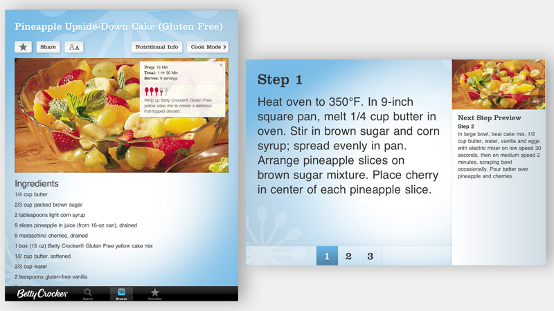 Betty Crocker's Cookbook for iPad is an example of a clear interface.
Visual Tips on Orientation Modes
Additional screen or additional functionality depending on the orientation may not always be clear and logical. Without visual cues in a specific orientation, the user can skip additional functionality. A classic example is the usual calculator built into the iPhone, which as many do not know can be changed to engineering.
Visual clues for orientation as a whole can greatly simplify and make the user experience more intuitive. Below are a few examples of how tips can be used in orientation modes.
Title bar
Specifying a header at the beginning of the application is a thin hint to the user. This method is especially important when using orientation on an additional screen, and serves as a reliable reminder of additional functionality.
Note: This method will not provide 100% efficiency in understanding the user of the orientation mode functionality; a more reliable method can be considered the use of graphic indexes or Coach Marks .
Orientation icon
Many universal icons, such as the universal Share icon or the Action button on Apple, have proven to be a good one, so I suggest a standard icon for orientation. You can download it and use it for free.
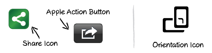
The icon may appear at any time and is used as a switch between the orientations of the display. The user is not required to rotate the screen to view additional information, but the icon will push the user to use the orientation to view the additional screen. Ultimately, the icon will serve as a reminder of additional functionality.
The following are examples of using this orientation icon:
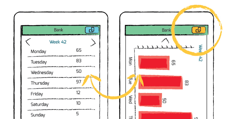
Toggle button in title bar.
Provided that this icon will become the standard, it can serve as a good indicator of orientation.
The orientation of the switch in the corner of the screen.
Note: The orientation icon is not a proven idea, and its big drawback is that the interface is too full. However, in my opinion, the idea is simple and effective and will allow developers to better use the orientation mode and expand its application.
Curtain

Illustration of a work curtain.
The idea is to show some kind of retractable element that will close or open an additional screen like a curtain. Which users will be free to open and close.
Conclusion
Designing interfaces for orientation modes is not something new. For example, when switching to landscape mode, smartphones can open a large virtual keyboard, and email applications on the tabs switch to the Master – detail interface. However, designing for orientation modes is widely regarded as an addition to the main interface. And therefore it often eludes the attention of users who adhere to the default orientation. By adding simple visual cues to the interface, UX specialists can make their products more attractive and user-friendly.
Source: https://habr.com/ru/post/149508/
All Articles