Simultaneously stretching rubber columns
It is inspired by this post, where the answer satisfying the author, apparently has not been found .
... the phrase flashed through my head when I took up the challenge of this simple mockup to find a way out. Still, now under the old version of IE, almost no one impersonates. Some of these guys are confident that in this way they make an invaluable contribution to the development of the web, although there are no problems with IE6 / 7. For others, it’s just convenient to ignore the “old, useless browser”, because they never knew how to typeset them.
I fully support the first, and I grin at the second.
Why? Even now there are customers requiring layout for older browsers. And if the first category, having thought it over, having estimated the pros and cons, finally, having asked for a decent increase in payment, will nevertheless do it and make a quality product, then the second category will, at best, rightly refuse. And it happens even worse. A project for development is taken, but a person cannot be made - and prayers begin in various forums. Feel lucky if prompted.
So, rubber speakers pulling together.
It is based on the principle with a snag background, because ie6 / 7 understands the simultaneous “stretching” of blocks only in the table. But we are cool? On divas we make up.
First of all, you need to understand the main point of the decision, that at the same time the columns will not stretch. But with the help of nesting we will create this appearance.
')
This example was made for just a plain background, but I think it will not be difficult to finish it for “cool” backgrounds. The main thing is to understand how everything works.
html
css
Here we gave a fill to the block and “freed” a place for saidbars.
We set the fill for the content part and provided a layout with the holder, because then we will float the content and the saidbar.
Finally the most interesting. Manipulation with floating blocks.
Let's start with saidbara.
This block is floated to the left with relative width. To “pull out” saidbar from the holder, we use a negative margin (+ a small fix for ie6 / 7).
After these manipulations, we will be able to observe such a picture.
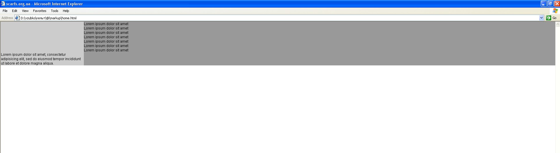
Those. columns "pull"! True, one of the columns is still under the other. But to solve this problem just float content.
Done!
Accordingly, if the saidbar needs to be fixed, then the size of the padding of the mein, the margin and the width of the saidbar are fixed in pixels.
The following is a calculation of the values of indents.
So where does this 17.6% of the 15% indent at the beginning come from?
It's simple. 17.6% is the part that makes up the 15% saybar from the 85% holder.
Those. 15/85 = 0.17647 ...
Accordingly, if the width of the Saidbara X, then the width and the margin is calculated by the formula
X / (100 - X)
To secure:
If the width of the saidbar is 40%, then the css will look like this:
I think you noticed that there are already two fixes for ie6 / 7. And even then, the width of the vryatli can be considered as such a fix.
Everything. I hope someone will come in handy! Good luck to all.
Don't touch the dead
... the phrase flashed through my head when I took up the challenge of this simple mockup to find a way out. Still, now under the old version of IE, almost no one impersonates. Some of these guys are confident that in this way they make an invaluable contribution to the development of the web, although there are no problems with IE6 / 7. For others, it’s just convenient to ignore the “old, useless browser”, because they never knew how to typeset them.
I fully support the first, and I grin at the second.
Why? Even now there are customers requiring layout for older browsers. And if the first category, having thought it over, having estimated the pros and cons, finally, having asked for a decent increase in payment, will nevertheless do it and make a quality product, then the second category will, at best, rightly refuse. And it happens even worse. A project for development is taken, but a person cannot be made - and prayers begin in various forums. Feel lucky if prompted.
And still
So, rubber speakers pulling together.
It is based on the principle with a snag background, because ie6 / 7 understands the simultaneous “stretching” of blocks only in the table. But we are cool? On divas we make up.
First of all, you need to understand the main point of the decision, that at the same time the columns will not stretch. But with the help of nesting we will create this appearance.
')
This example was made for just a plain background, but I think it will not be difficult to finish it for “cool” backgrounds. The main thing is to understand how everything works.
html
<div id="main"> <div class="holder"> <div id="content"> <p>Lorem ipsum dolor sit amet</p> </div> <div id="sidebar"> <p>Lorem ipsum dolor sit amet, consectetur adipisicing elit</p> </div> </div> </div> Step 1
css
#main{ background:#ccc; /* */ padding:0 0 0 15%; /* 15% - */ } Here we gave a fill to the block and “freed” a place for saidbars.
Step 2
.holder{ background:#999; /* */ width:100%; /* ie6/7 layout */ } .holder:after{ clear:both; content:' '; /* layout */ display:block; } We set the fill for the content part and provided a layout with the holder, because then we will float the content and the saidbar.
Step 3
#sidebar{ float:left; margin:0 0 0 -17.6%; position:relative; /* ie6/7 fix */ width:17.6%; } Finally the most interesting. Manipulation with floating blocks.
Let's start with saidbara.
This block is floated to the left with relative width. To “pull out” saidbar from the holder, we use a negative margin (+ a small fix for ie6 / 7).
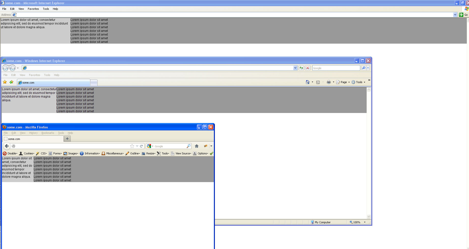
After these manipulations, we will be able to observe such a picture.
Those. columns "pull"! True, one of the columns is still under the other. But to solve this problem just float content.
#content{ float:right; /* , . , ie6 */ width:100%; } Done!
Accordingly, if the saidbar needs to be fixed, then the size of the padding of the mein, the margin and the width of the saidbar are fixed in pixels.
The following is a calculation of the values of indents.
#main{ padding:0 0 0 15%; } #sidebar{ margin:0 0 0 -17.6%; width:17.6%; } So where does this 17.6% of the 15% indent at the beginning come from?
It's simple. 17.6% is the part that makes up the 15% saybar from the 85% holder.
Those. 15/85 = 0.17647 ...
Accordingly, if the width of the Saidbara X, then the width and the margin is calculated by the formula
X / (100 - X)
To secure:
If the width of the saidbar is 40%, then the css will look like this:
#main{ padding:0 0 0 40%; } #sidebar{ margin:0 0 0 -66.7%; width:66.7%; } I think you noticed that there are already two fixes for ie6 / 7. And even then, the width of the vryatli can be considered as such a fix.
Everything. I hope someone will come in handy! Good luck to all.
html + css
HTML
CSS
<div id="main"> <div class="holder"> <div id="content"> <p>Lorem ipsum dolor sit amet</p> </div> <div id="sidebar"> <p>Lorem ipsum dolor sit amet, consectetur adipisicing elit</p> </div> </div> </div> CSS
#main{ background:#ccc; padding:0 0 0 15%; } .holder{ background:#999; width:100%; } .holder:after{ clear:both; content:''; display:block; } #content{ float:right; width:100%; } #sidebar{ float:left; margin:0 0 0 -17.6%; position:relative; width:17.6%; } Source: https://habr.com/ru/post/149382/
All Articles