Hover effects for round elements using CSS Transitions
Today I want to introduce you to the wonderful examples of Mary Lou hover effects. Many people liked her examples with hover-effects for the menu and this time she decided to please us with no less remarkable examples for round elements. Since we now have the opportunity to use the border-radius property, we can create circular shapes, and they are increasingly appearing as design elements on websites. One use case I like the most is round miniatures that look much more interesting than regular, rectangular ones. And now we are going to create some unusual effects when hovering over such elements!
Please note: the result of this tutorial will work as intended only in browsers that support the corresponding CSS properties.
In the code examples in the article, we will omit the browser prefixes, but you can, of course, find them in the source files.
')
So let's get started!
HTML
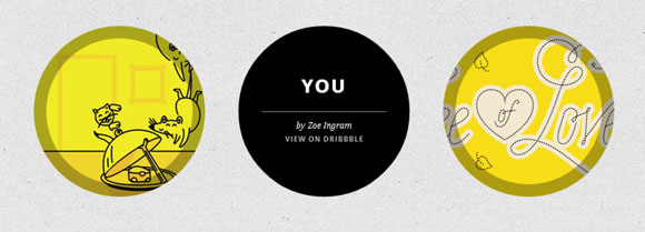
For most examples, we will use the following structure:
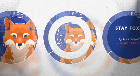
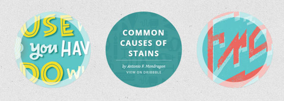
<ul class="ch-grid"> <li> <div class="ch-item ch-img-1"> <div class="ch-info"> <h3>Use what you have</h3> <p>by Angela Duncan <a href="http://drbl.in/eOPF">View on Dribbble</a></p> </div> </div> </li> <li> <div class="ch-item ch-img-2"> <div class="ch-info"> <h3>Common Causes of Stains</h3> <p>by Antonio F. Mondragon <a href="http://drbl.in/eKMi">View on Dribbble</a></p> </div> </div> </li> <li> <div class="ch-item ch-img-3"> <div class="ch-info"> <h3>Pink Lightning</h3> <p>by Charlie Wagers <a href="http://drbl.in/ekhp">View on Dribbble</a></p> </div> </div> </li> </ul> Although we could use the images here, we will give ourselves a little more freedom, and use background images instead of pictures. We will define them in classes that start with "ch-img-". In addition, we will have blocks with descriptions of individual elements, and their name.
Now, let's create some hover effects!
CSS
Let's define common styles for the list and list items:
.ch-grid { margin: 20px 0 0 0; padding: 0; list-style: none; display: block; text-align: center; width: 100%; } .ch-grid:after, .ch-item:before { content: ''; display: table; } .ch-grid:after { clear: both; } .ch-grid li { width: 220px; height: 220px; display: inline-block; margin: 20px; } We can center the list item using display: inline-block and defining the text-align property.
Nicolas Gallagher clearfix hack : nicolasgallagher.com/micro-clearfix-hack
Some of the examples will have a slightly different structure, but we will look at this in each specific example in more detail.
Example 1
In the first example, we will scale the description, increasing it to the size of the element, and we will also animate the inner shadow of the element itself. So let's define the position of the element, the shadow for it, and the transition:
.ch-item { width: 100%; height: 100%; border-radius: 50%; overflow: hidden; position: relative; cursor: default; box-shadow: inset 0 0 0 16px rgba(255,255,255,0.6), 0 1px 2px rgba(0,0,0,0.1); transition: all 0.4s ease-in-out; } We will define two classes for the item: one is the ch-item, and the other will be used to define the background image:
.ch-img-1 { background-image: url(../images/1.jpg); } .ch-img-2 { background-image: url(../images/2.jpg); } .ch-img-3 { background-image: url(../images/3.jpg); } The item description will be positioned absolutely, and we will give it a semi-transparent background by setting the value for RGBA. Its transparency will be equal to 0, and we will reduce its scale also to 0:
.ch-info { position: absolute; background: rgba(63,147,147, 0.8); width: inherit; height: inherit; border-radius: 50%; overflow: hidden; opacity: 0; transition: all 0.4s ease-in-out; transform: scale(0); } The heading of the element will have some padding and smooth text shadows:
.ch-info h3 { color: #fff; text-transform: uppercase; letter-spacing: 2px; font-size: 22px; margin: 0 30px; padding: 45px 0 0 0; height: 140px; font-family: 'Open Sans', Arial, sans-serif; text-shadow: 0 0 1px #fff, 0 1px 2px rgba(0,0,0,0.3); } The P tag has an opacity of 0 and a transition (we want it to appear when you hover the mouse, but with a delay):
.ch-info p { color: #fff; padding: 10px 5px; font-style: italic; margin: 0 30px; font-size: 12px; border-top: 1px solid rgba(255,255,255,0.5); opacity: 0; transition: all 1s ease-in-out 0.4s; } The link will be in upper case, and we will change the color when you hover to yellow:
.ch-info pa { display: block; color: rgba(255,255,255,0.7); font-style: normal; font-weight: 700; text-transform: uppercase; font-size: 9px; letter-spacing: 1px; padding-top: 4px; font-family: 'Open Sans', Arial, sans-serif; } .ch-info pa:hover { color: rgba(255,242,34, 0.8); } And now, the most interesting thing that will happen when you hover the mouse!
This element will be animated, and its shadow will change the radius from 16px to 1px:
.ch-item:hover { box-shadow: inset 0 0 0 1px rgba(255,255,255,0.1), 0 1px 2px rgba(0,0,0,0.1); } The description will smoothly appear and scale to 1:
.ch-item:hover .ch-info { transform: scale(1); opacity: 1; } The paragraph will simply appear (with a delay):
.ch-item:hover .ch-info p { opacity: 1; } We finished with the first example! Let's take a look at the following.
Example 2

The HTML structure in this case is the same as in the first example.
Here we will use the shadow for the element to fill our circle and for the shadow to serve as a background for the description.
So, there is nothing special here, only a shadow has several lines of meanings:
.ch-item { width: 100%; height: 100%; border-radius: 50%; position: relative; cursor: default; box-shadow: inset 0 0 0 0 rgba(200,95,66, 0.4), inset 0 0 0 16px rgba(255,255,255,0.6), 0 1px 2px rgba(0,0,0,0.1); transition: all 0.4s ease-in-out; } Background images:
.ch-img-1 { background-image: url(../images/4.jpg); } .ch-img-2 { background-image: url(../images/5.jpg); } .ch-img-3 { background-image: url(../images/6.jpg); } The description will again be hidden:
.ch-info { position: absolute; width: 100%; height: 100%; border-radius: 50%; overflow: hidden; opacity: 0; transition: all 0.4s ease-in-out; transform: scale(0); backface-visibility: hidden; } Set styles for typographic elements:
.ch-info h3 { color: #fff; text-transform: uppercase; position: relative; letter-spacing: 2px; font-size: 22px; margin: 0 30px; padding: 65px 0 0 0; height: 110px; font-family: 'Open Sans', Arial, sans-serif; text-shadow: 0 0 1px #fff, 0 1px 2px rgba(0,0,0,0.3); } .ch-info p { color: #fff; padding: 10px 5px; font-style: italic; margin: 0 30px; font-size: 12px; border-top: 1px solid rgba(255,255,255,0.5); } .ch-info pa { display: block; color: rgba(255,255,255,0.7); font-style: normal; font-weight: 700; text-transform: uppercase; font-size: 9px; letter-spacing: 1px; padding-top: 4px; font-family: 'Open Sans', Arial, sans-serif; } .ch-info pa:hover { color: rgba(255,242,34, 0.8); } When hovering we animate the inner shadow of the element (it will be reddish here) up to 110px in radius. She will cover the whole circle:
.ch-item:hover { box-shadow: inset 0 0 0 110px rgba(200,95,66, 0.4), inset 0 0 0 16px rgba(255,255,255,0.8), 0 1px 2px rgba(0,0,0,0.1); } We will increase the description so that it appears:
.ch-item:hover .ch-info { opacity: 1; transform: scale(1); } Example 3
In this example we will play with rotation. The structure will be slightly different from the first two examples, since we must add a second block for the sketch. Thus, the item will look like this:
<li> <div class="ch-item"> <div class="ch-info"> <h3>Music poster</h3> <p>by Jonathan Quintin <a href="http://drbl.in/eGjw">View on Dribbble</a></p> </div> <div class="ch-thumb ch-img-1"></div> </div> </li> An element block will have the same styles as before (with a thin shadow):
.ch-item { width: 100%; height: 100%; border-radius: 50%; position: relative; cursor: default; box-shadow: 0 1px 3px rgba(0,0,0,0.2); } For the sketch, we define the transform-origin property and transitions. This will be the element that we want it to turn down when hovering the mouse, while at the same time revealing the description of the elements:
.ch-thumb { width: 100%; height: 100%; border-radius: 50%; overflow: hidden; position: absolute; box-shadow: inset 0 0 0 15px rgba(255,255,255, 0.5); transform-origin: 95% 40%; transition: all 0.3s ease-in-out; } Using the pseudo-class: after, we create a small copper latch with a radial gradient:
.ch-thumb:after { content: ''; width: 8px; height: 8px; position: absolute; border-radius: 50%; top: 40%; left: 95%; margin: -4px 0 0 -4px; background: radial-gradient(ellipse at center, rgba(14,14,14,1) 0%,rgba(125,126,125,1) 100%); box-shadow: 0 0 1px rgba(255,255,255,0.9); } Let's define background images for each element:
.ch-img-1 { background-image: url(../images/7.jpg); z-index: 12; } .ch-img-2 { background-image: url(../images/8.jpg); z-index: 11; } .ch-img-3 { background-image: url(../images/9.jpg); z-index: 10; } The item description will have the following styles:
.ch-info { position: absolute; width: inherit; height: inherit; border-radius: 50%; overflow: hidden; background: #c9512e url(../images/noise.png); box-shadow: inset 0 0 0 5px rgba(0,0,0,0.05); } Typographic elements are stylized as follows:
.ch-info h3 { color: #fff; text-transform: uppercase; position: relative; letter-spacing: 2px; font-size: 18px; margin: 0 60px; padding: 22px 0 0 0; height: 85px; font-family: 'Open Sans', Arial, sans-serif; text-shadow: 0 0 1px #fff, 0 1px 2px rgba(0,0,0,0.3); } .ch-info p { color: #fff; padding: 10px 5px; font-style: italic; margin: 0 30px; font-size: 12px; border-top: 1px solid rgba(255,255,255,0.5); } The link will be in the form of a small circle, which should move to the right when aiming:
.ch-info pa { display: block; color: #333; width: 80px; height: 80px; background: rgba(255,255,255,0.3); border-radius: 50%; color: #fff; font-style: normal; font-weight: 700; text-transform: uppercase; font-size: 9px; letter-spacing: 1px; padding-top: 24px; margin: 7px auto 0; font-family: 'Open Sans', Arial, sans-serif; opacity: 0; transition: transform 0.3s ease-in-out 0.2s, opacity 0.3s ease-in-out 0.2s, background 0.2s linear 0s; transform: translateX(60px) rotate(90deg); } .ch-info pa:hover { background: rgba(255,255,255,0.5); } Since we want the movement and change in transparency to occur with a delay, but the background changes without it, we will separate the transitions.
When hovering, we rotate the thumbnail and move / rotate the link:
.ch-item:hover .ch-thumb { box-shadow: inset 0 0 0 15px rgba(255,255,255, 0.5), 0 1px 3px rgba(0,0,0,0.2); transform: rotate(-110deg); } .ch-item:hover .ch-info pa{ opacity: 1; transform: translateX(0px) rotate(0deg); } Example 4

The fourth example will include 3D elements. Thus, we need to slightly change the structure in order to have a container for the perspective and a front and back side. Thus, the list item will look like this:
<li> <div class="ch-item ch-img-1"> <div class="ch-info-wrap"> <div class="ch-info"> <div class="ch-info-front ch-img-1"></div> <div class="ch-info-back"> <h3>Bears Type</h3> <p>by Josh Schott <a href="http://drbl.in/ewUW">View on Dribbble</a></p> </div> </div> </div> </div> </li> As you can see, we have added a background image for the element block, as well as the front of the rolling element.
The trick is to set the same background for ch-info-wrap as on the rest of the page. This will create the illusion that our element has a hole.
This element will have the usual styles:
.ch-item { width: 100%; height: 100%; border-radius: 50%; position: relative; box-shadow: 0 1px 2px rgba(0,0,0,0.1); cursor: default; } An additional block will be used for the perspective, and we will add a transition for the shadow to it:
.ch-info-wrap{ position: absolute; width: 180px; height: 180px; border-radius: 50%; perspective: 800px; transition: all 0.4s ease-in-out; top: 20px; left: 20px; background: #f9f9f9 url(../images/bg.jpg); box-shadow: 0 0 0 20px rgba(255,255,255,0.2), inset 0 0 3px rgba(115,114, 23, 0.8); } The block with the ch-info class will have the preserve-3d value for the transform-style, and we will give it a transition, since this element will rotate in 3D:
.ch-info{ position: absolute; width: 180px; height: 180px; border-radius: 50%; transition: all 0.4s ease-in-out; transform-style: preserve-3d; } The front and back sides will have the following styles:
.ch-info > div { display: block; position: absolute; width: 100%; height: 100%; border-radius: 50%; background-position: center center; backface-visibility: hidden; } The reverse side will be rotated, so we should not see it initially:
.ch-info .ch-info-back { transform: rotate3d(0,1,0,180deg); background: #000; } And again, the background images:
.ch-img-1 { background-image: url(../images/10.jpg); } .ch-img-2 { background-image: url(../images/11.jpg); } .ch-img-3 { background-image: url(../images/12.jpg); } ... and typographic elements:
.ch-info h3 { color: #fff; text-transform: uppercase; letter-spacing: 2px; font-size: 14px; margin: 0 15px; padding: 40px 0 0 0; height: 90px; font-family: 'Open Sans', Arial, sans-serif; text-shadow: 0 0 1px #fff, 0 1px 2px rgba(0,0,0,0.3); } .ch-info p { color: #fff; padding: 10px 5px; font-style: italic; margin: 0 30px; font-size: 12px; border-top: 1px solid rgba(255,255,255,0.5); } .ch-info pa { display: block; color: rgba(255,255,255,0.7); font-style: normal; font-weight: 700; text-transform: uppercase; font-size: 9px; letter-spacing: 1px; padding-top: 4px; font-family: 'Open Sans', Arial, sans-serif; } .ch-info pa:hover { color: rgba(255,242,34, 0.8); } When hovering, we will change the shadows of the wrapper and turn it so that we see the opposite side:
.ch-item:hover .ch-info-wrap { box-shadow: 0 0 0 0 rgba(255,255,255,0.8), inset 0 0 3px rgba(115,114, 23, 0.8); } .ch-item:hover .ch-info { transform: rotate3d(0,1,0,-180deg); } Example 5

In this example, we want to reduce the inside of the sketch to 0 and have the element description appear and scale to 1.
The structure of the fifth example will be the same as in the previous example.
This element has the usual styles:
.ch-item { width: 100%; height: 100%; border-radius: 50%; position: relative; box-shadow: 0 1px 2px rgba(0,0,0,0.1); cursor: default; } The wrapper and the description block will have the following general styles:
.ch-info-wrap, .ch-info{ position: absolute; width: 180px; height: 180px; border-radius: 50%; } Let's use the trick again, as in the previous example, and set the same background for the wrapper as for the page:
.ch-info-wrap { top: 20px; left: 20px; background: #f9f9f9 url(../images/bg.jpg); box-shadow: 0 0 0 20px rgba(255,255,255,0.2), inset 0 0 3px rgba(115,114, 23, 0.8); } Common styles for the “front” and “back” block:
.ch-info > div { display: block; position: absolute; width: 100%; height: 100%; border-radius: 50%; background-position: center center; } "Front" will have a transition (it will decrease and disappear):
.ch-info .ch-info-front { transition: all 0.6s ease-in-out; } The “back” block that contains the description will initially have transparency equal to 0, and then it will increase to 1.5:
.ch-info .ch-info-back { opacity: 0; background: #223e87; pointer-events: none; transform: scale(1.5); transition: all 0.4s ease-in-out 0.2s; } Background images and typographic elements will have the same styles as in the previous examples, with only a few different colors:
.ch-img-1 { background-image: url(../images/13.jpg); } .ch-img-2 { background-image: url(../images/14.jpg); } .ch-img-3 { background-image: url(../images/15.jpg); } .ch-info h3 { color: #fff; text-transform: uppercase; letter-spacing: 2px; font-size: 18px; margin: 0 15px; padding: 40px 0 0 0; height: 80px; font-family: 'Open Sans', Arial, sans-serif; text-shadow: 0 0 1px #fff, 0 1px 2px rgba(0,0,0,0.3); } .ch-info p { color: #fff; padding: 10px 5px 0; font-style: italic; margin: 0 30px; font-size: 12px; border-top: 1px solid rgba(255,255,255,0.5); } .ch-info pa { display: block; color: #e7615e; font-style: normal; font-weight: 700; text-transform: uppercase; font-size: 9px; letter-spacing: 1px; padding-top: 4px; font-family: 'Open Sans', Arial, sans-serif; } .ch-info pa:hover { color: #fff; } When hovering, we will reduce the inside of the sketch to 0 and set the opacity to 0 for the “front” block.
.ch-item:hover .ch-info-front { transform: scale(0); opacity: 0; } The part that contains the description will be resized and appear on the screen.
.ch-item:hover .ch-info-back { transform: scale(1); opacity: 1; pointer-events: auto; } Example 6
In this example, we want to flip the inside of the thumbnail down to show the description. The HTML code will be the same as in the previous two examples.
The element will have the same styles as before:
.ch-item { width: 100%; height: 100%; border-radius: 50%; position: relative; box-shadow: 0 1px 2px rgba(0,0,0,0.1); cursor: default; } Common styles for wrappers and item with description:
.ch-info-wrap, .ch-info{ position: absolute; width: 180px; height: 180px; border-radius: 50%; transition: all 0.4s ease-in-out; } The shell will have a perspective:
.ch-info-wrap { top: 20px; left: 20px; background: #f9f9f9 url(../images/bg.jpg); box-shadow: 0 0 0 20px rgba(255,255,255,0.2), inset 0 0 3px rgba(115,114, 23, 0.8); perspective: 800px; } The info element will set the following styles for the transformation:
.ch-info { transform-style: preserve-3d; } Front and back sides will have a transition. Notice that this time we will not set backface-visibility: hidden, since we want to show the reverse side of the inside of the sketch when it turns down:
.ch-info > div { display: block; position: absolute; width: 100%; height: 100%; border-radius: 50%; background-position: center center; transition: all 0.6s ease-in-out; } Let's set the correct transform-origin so that we can open it down:
.ch-info .ch-info-front { transform-origin: 50% 100%; z-index: 100; box-shadow: inset 2px 1px 4px rgba(0,0,0,0.1); } We set the RGBA value with opacity to 0 for the background element with the description:
.ch-info .ch-info-back { background: rgba(230,132,107,0); } And the usual styles for other elements:
.ch-img-1 { background-image: url(../images/16.jpg); } .ch-img-2 { background-image: url(../images/17.jpg); } .ch-img-3 { background-image: url(../images/18.jpg); } .ch-info h3 { color: #fff; text-transform: uppercase; letter-spacing: 2px; font-size: 14px; margin: 0 25px; padding: 40px 0 0 0; height: 90px; font-family: 'Open Sans', Arial, sans-serif; text-shadow: 0 0 1px #fff, 0 1px 2px rgba(0,0,0,0.3); } .ch-info p { color: #fff; padding: 10px 5px; font-style: italic; margin: 0 30px; font-size: 12px; border-top: 1px solid rgba(255,255,255,0.5); } .ch-info pa { display: block; color: rgba(255,255,255,0.7); font-style: normal; font-weight: 700; text-transform: uppercase; font-size: 9px; letter-spacing: 1px; padding-top: 4px; font-family: 'Open Sans', Arial, sans-serif; } .ch-info pa:hover { color: rgba(255,242,34, 0.8); } When hovering, we will rotate the front and slightly animate the shadow.
.ch-item:hover .ch-info-front { transform: rotate3d(1,0,0,-180deg); box-shadow: inset 0 0 5px rgba(255,255,255,0.2), inset 0 0 3px rgba(0,0,0,0.3); } .ch-item:hover .ch-info-back { background: rgba(230,132,107,0.6); } Example 7
The last example will be in the form of a rotating cube, where we open the description, turning it on its side. Since we will rotate each of the faces, we do not need an additional shell. So, our HTML code will look like this:
<li> <div class="ch-item"> <div class="ch-info"> <div class="ch-info-front ch-img-1"></div> <div class="ch-info-back"> <h3>Mouse</h3> <p>by Alexander Shumihin <a href="http://drbl.in/eAoj">View on Dribbble</a></p> </div> </div> </div> </li> We define the element's property of a perspective:
.ch-item { width: 100%; height: 100%; border-radius: 50%; position: relative; cursor: default; perspective: 900px; } For an element with the class ch-info, preserve-3d is needed:
.ch-info{ position: absolute; width: 100%; height: 100%; transform-style: preserve-3d; } The front and back sides will have transitions, the transform-origin will be set to 50% 0%:
.ch-info > div { display: block; position: absolute; width: 100%; height: 100%; border-radius: 50%; background-position: center center; transition: all 0.4s linear; transform-origin: 50% 0%; } Let's create a nice shadow for the front end:
.ch-info .ch-info-front { box-shadow: inset 0 0 0 16px rgba(0,0,0,0.3); } The opposite side will be hidden initially:
.ch-info .ch-info-back { transform: translate3d(0,0,-220px) rotate3d(1,0,0,90deg); background: #000; opacity: 0; } Let's set the usual styles for background images and text elements:
.ch-img-1 { background-image: url(../images/19.jpg); } .ch-img-2 { background-image: url(../images/20.jpg); } .ch-img-3 { background-image: url(../images/21.jpg); } .ch-info h3 { color: #fff; text-transform: uppercase; letter-spacing: 2px; font-size: 24px; margin: 0 15px; padding: 60px 0 0 0; height: 110px; font-family: 'Open Sans', Arial, sans-serif; text-shadow: 0 0 1px #fff, 0 1px 2px rgba(0,0,0,0.3); } .ch-info p { color: #fff; padding: 10px 5px; font-style: italic; margin: 0 30px; font-size: 12px; border-top: 1px solid rgba(255,255,255,0.5); } .ch-info pa { display: block; color: rgba(255,255,255,0.7); font-style: normal; font-weight: 700; text-transform: uppercase; font-size: 9px; letter-spacing: 1px; padding-top: 4px; font-family: 'Open Sans', Arial, sans-serif; } .ch-info pa:hover { color: rgba(255,242,34, 0.8); } We will use translate3d to move the front part along the Y axis of our 3D space, and rotate3d to actually rotate it. We will also gradually hide it so that some part is not visible afterwards:
.ch-item:hover .ch-info-front { transform: translate3d(0,280px,0) rotate3d(1,0,0,-90deg); opacity: 0; } The opposite side will turn "back" to 0 degrees (initially it was turned down):
.ch-item:hover .ch-info-back { transform: rotate3d(1,0,0,0deg); opacity: 1; } And that's it!
I hope you enjoyed it, and these effects will be useful to you!
Demonstration
Download source files
Source: https://habr.com/ru/post/149324/
All Articles