Introduction to CSS Regions

With the advent of a large number of mobile devices, websites are becoming more “adaptive”; this requires new, more convenient ways to display content. In the near future, CSS Regions (CSS Regions), the new Adobe Web standard, can help.
Simply put, CSSRegions are designed for smart text wrap around objects. While this standard is not ready for use on live sites, but now you can experiment with the regions.
')
Browser Support
You can check whether your browser supports regions of CSS on caniuse.com . In Chrome, we include support as follows:
- Go to the experimental functions - chrome: // flags
- Find the item “Enable CSS regions” and enable it:
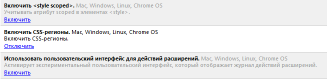
- Restart Chrome
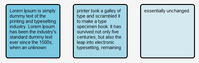
One block of text in several columns ( demo )
This is the simplest example of using CSS regions - one block of text flows into three columns:
HTML is simple:
<p class="example-text">"Lorem ipsum dolor sit amet, consectetur adipisicing elit, sed do eiusmod tempor incididunt ut labore et dolore magna aliqua."</p> <div class="regions"></div> <div class="regions"></div> <div class="regions"></div> CSS is no harder:
.example-text { -webkit-flow-into: example-text-flow; padding: 0; margin: 0; } .regions { -webkit-flow-from: example-text-flow; border: 1px solid black; padding: 2px; margin: 5px; width: 200px; height: 50px; } The result can be seen in the demo , there are a few more complicated examples.
The location of the blocks within the content ( demo )
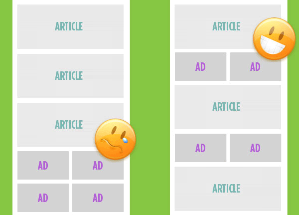
In adaptive layouts, when the width of the browser window is changed, the content usually behaves according to one scenario — the text is compressed into one column, and the sidebars are under it. For more correct arrangement of blocks on the page it will be soon possible to use CSS regions.
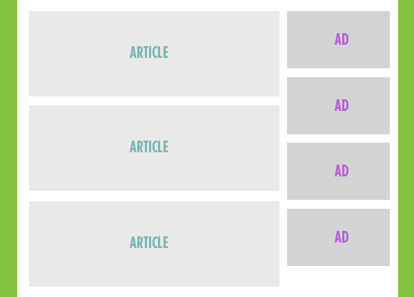
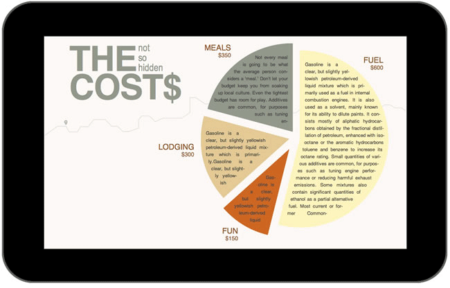
For example, this is the page with content and ad units:
And on the mobile device it is necessary to get the option on the right:
HTML code of construction:
<section class="main-content"> <article> ... </article> <div class="ad-region-1"> <!-- empty, ads flow into here as needed --> </div> <article> ... </article> <div class="ad-region-2"> <!-- empty, ads flow into here as needed --> </div> <article> ... </article> <div class="ad-region-3"> <!-- empty, ads flow into here as needed --> </div> </section> <aside> <!-- Fallback content in this flow region, probably clone #ad-source --> </aside> <!-- Source of flowing content, essentially hidden as an element --> <div id="ad-source"> <a href="#"><img src="ads/1.jpg"></a> <a href="#"><img src="ads/2.jpg"></a> <a href="#"><img src="ads/3.jpg"></a> <a href="#"><img src="ads/4.png"></a> </div> CSS for ad units - “ad-source”:
#ad-source { -webkit-flow-into: ads; -ms-flow-into: ads; } CSS for content:
aside, [class^='ad-region'] { -webkit-flow-from: ads; -ms-flow-from: ads; } CSS for different browser window widths:
[class^='ad-region'] { display: none; height: 155px; width: 100%; /* Weird that this is required */ } @media (max-width: 800px) { [class^='ad-region'] { display: block; } [class^='ad-region']:last-child { height: 300px; /* I wish height auto worked */ } aside { display: none; } } Adobe examples
Excellent examples of using CSS regions were shown by Adobe itself.
You can still do this:
And when using Javascript, you can force the text to wrap objects dynamically:


Documentation
Detailed documentation on CSS regions from Adobe. While still in development and constantly changing.
Used materials and useful links on the topic
- CSS3 regions: Rich page layout with HTML and CSS3 on adobe.com by Arno Gourdol
- Diving Into CSS Regions at tutplus.com, by Umar Hansa
- Content Folding at csstricks.com by Chris Coyier
- CSS Regions: Coming Soon to a Webpage Near You on webmonkey.com, by Scott Gilbertson
- Other new web standards from Adobe
- Paul Irish, Google Chrome developer, talks about CSS regions on Google Developers SXSW (view from 1:50:00):
Source: https://habr.com/ru/post/149040/
All Articles