Five interesting hover effects using multiple background images
Today we will look at all the benefits of using multiple backgrounds. Let's learn the basics and create cool effects when hovering using
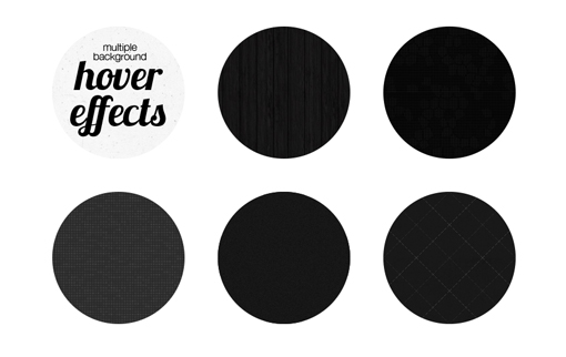
Below are five different examples that you can use to create your own amazing effects.
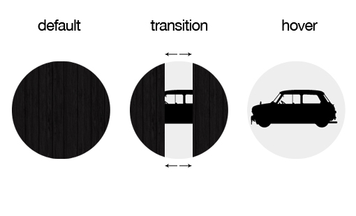
Let's look at what should happen in the end. Consider how you can implement these effects purely on a single CSS.
')
Demonstration
Until recently, I have not used several images as a background. I knew that such a possibility existed, but could not find an interesting use for it. The parallax variant is certainly interesting, but already tired of everyone.
As a result, I thought of using the concept of a multi-phone when pointing to an object. It turned out a kind of animation. This is a very simple trick, but I have never met it before, so I decided to show you how to use it.
In fact, you can come up with a million different examples, but we will consider only five that would understand the essence of the effect.
Basically, when you hover the cursor on objects, the usual animation occurs. For example, one image overlaps another, something rotates or bounces, color fades, and so on.
When using the multifon, many animation options appear. Without much effort, you can create, at first glance, complex animation using only the CSS
Suppose we want to animate the opening doors. To do this, simply make the offset of the two background images in different directions:

Now we have an idea of further work. So let's move on to the most interesting - let's start creating effects.
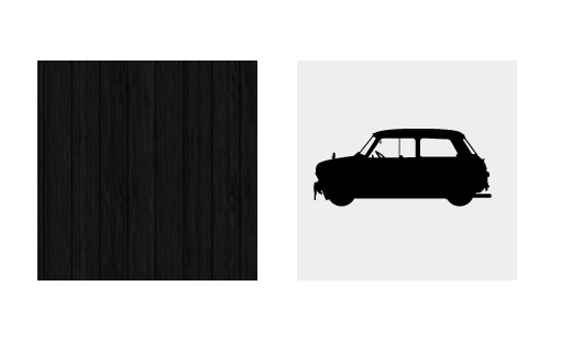
We will try to create the effect described in the previous figure. First, we need two background images.
Since we consider only the idea itself, it does not matter which images we use. I took a dark wood texture and a pictograph of a car from a free font .
Let's create on the page a
All examples will be placed on the same page, so I added styles for positioning elements. But the most important thing is to use the
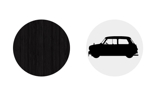
Our background images will be located in the same row, here they are already shown with rounding.
First we use two images as a background. Next, use the trick, which is that the texture of the tree must be used twice. The result will be three images.
In CSS, several images are set up quite simply, just list them separated by commas.
The order of arrangement is logical: the first image will be at the top, the last will be at the bottom, that is, it will be overlapped by all other images.
In the
It is obvious that the given groups of values correspond to the given images. The first value in each group moves the image to the right if the number is positive, or to the left if the number is negative. The second value, respectively, moves the image up with a positive number or down with a negative.
As you can see, I divided the circle with the tree into two parts, and left the car unchanged.

This positioning of the picture with the texture of the tree may seem strange, but it is necessary to obtain the effect of animation.
Now that we can operate with background images independently of each other, we can get an interesting effect due to the
To do this, not forgetting to specify the prefixes for browsers, let's set the animation time with a duration of 1 second. Then, thanks to the
At the same time, we implemented the first example. When you hover the mouse the doors will open in different directions and we will see the car.
Now that we’ve covered the first example, it’s going to be easier. Here we use the same
Let's take it one step further and use 5 images to animate. We need, so that when you hover the cursor over the image, it is divided into 4 parts and the picture with the machine is shown.
We arrange 4 parts of the image so that they are arranged vertically and horizontally directly in the center of the circle. When you hover, they will move to the center.
It will be slightly more difficult to repeat the same effect with a rounded separation, because firstly, you need to use a transparent image, and secondly, you need to make them overlap each other in the designated place. There may be problems due to the use of wood texture. But if you use a simpler texture with noise, there should be no problems.

You can understand the essence of this example by the picture above. In this example, I made the machine rotate before the parts of the image with the texture are opened.
This includes several nuances. The problem is that all background images are rotated, including the image of the machine below them. Given this, I turned the car in the opposite direction in advance, so that when turning it would return to the desired position.
Another interesting thing is the time it takes to animate. Note that for the rotation effect and the movement effect, I have specified different times. Thanks to this you can make an incredibly large number of examples.
Supplement from psywalker
The original article was published in November 2011. A message about the removal of prefixes for many CSS properties, including transition and transform, appeared in IE10 after its release. Therefore, we left in the article the author’s version of the code, but for practical tasks, keep in mind that the prefix is -ms- for the most popular CSS3 properties - such as transition, transform, animation, linear-gradient, etc. - no longer needed.
hover and transition properties using CSS.Below are five different examples that you can use to create your own amazing effects.
What should happen
Let's look at what should happen in the end. Consider how you can implement these effects purely on a single CSS.
')
Demonstration
Multiple backgrounds (multiphone)
Until recently, I have not used several images as a background. I knew that such a possibility existed, but could not find an interesting use for it. The parallax variant is certainly interesting, but already tired of everyone.
As a result, I thought of using the concept of a multi-phone when pointing to an object. It turned out a kind of animation. This is a very simple trick, but I have never met it before, so I decided to show you how to use it.
In fact, you can come up with a million different examples, but we will consider only five that would understand the essence of the effect.
Concept
Basically, when you hover the cursor on objects, the usual animation occurs. For example, one image overlaps another, something rotates or bounces, color fades, and so on.
When using the multifon, many animation options appear. Without much effort, you can create, at first glance, complex animation using only the CSS
transition property, which is currently supported by browsers better than the animate property.Suppose we want to animate the opening doors. To do this, simply make the offset of the two background images in different directions:
Now we have an idea of further work. So let's move on to the most interesting - let's start creating effects.
Animation of horizontally opening doors
We will try to create the effect described in the previous figure. First, we need two background images.
Since we consider only the idea itself, it does not matter which images we use. I took a dark wood texture and a pictograph of a car from a free font .
Basic markup
Let's create on the page a
div block with the class circles . This class also applies to other examples.All examples will be placed on the same page, so I added styles for positioning elements. But the most important thing is to use the
border-radius property to create a circle shape. .circles { float: left; height: 200px; width: 200px; background-color: #eee; margin: 0 50px 50px 0; /* */ -webkit-border-radius: 100px; -moz-border-radius: 100px; border-radius: 100px; } Our background images will be located in the same row, here they are already shown with rounding.
Apply a multi-phone
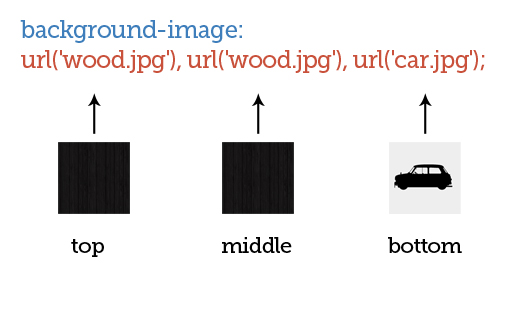
First we use two images as a background. Next, use the trick, which is that the texture of the tree must be used twice. The result will be three images.
In CSS, several images are set up quite simply, just list them separated by commas.
#slidingDoors { /* */ background-image: url('wood.jpg'), url('wood.jpg'), url('car.jpg'); } The order of arrangement is logical: the first image will be at the top, the last will be at the bottom, that is, it will be overlapped by all other images.
In the
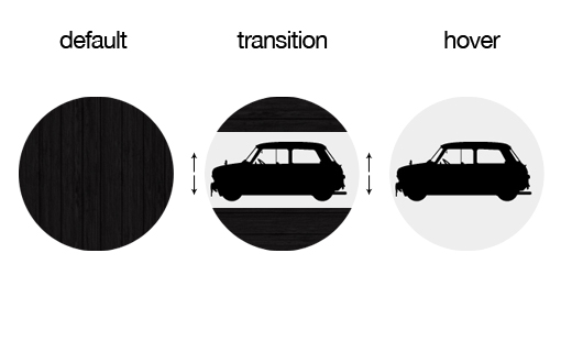
background property you can specify the path to the images and their positioning. But for better perception, we will set these attributes separately, that is, we will use the background-position property to indicate the background-position . /* */ #slidingDoors { background-image: url('wood.jpg'), url('wood.jpg'), url('car.jpg'); background-repeat: no-repeat; /* */ background-position: -100px 0px, 100px 0px, 0px 0px; } It is obvious that the given groups of values correspond to the given images. The first value in each group moves the image to the right if the number is positive, or to the left if the number is negative. The second value, respectively, moves the image up with a positive number or down with a negative.
As you can see, I divided the circle with the tree into two parts, and left the car unchanged.
This positioning of the picture with the texture of the tree may seem strange, but it is necessary to obtain the effect of animation.
Animate images
Now that we can operate with background images independently of each other, we can get an interesting effect due to the
transition property.To do this, not forgetting to specify the prefixes for browsers, let's set the animation time with a duration of 1 second. Then, thanks to the
hover property, we move one part of the texture to the left and the other part to the right. #slidingDoors { /* */ background-image: url('wood.jpg'), url('wood.jpg'), url('car.jpg'); background-repeat: no-repeat; /* */ background-position: -100px 0px, 100px 0px, 0px 0px; /* */ -webkit-transition: all 1s ease-in-out; -moz-transition: all 1s ease-in-out; -o-transition: all 1s ease-in-out; -ms-transition: all 1s ease-in-out; transition: all 1s ease-in-out; } #slidingDoors:hover { background-position: -200px 0px, 200px 0px, 0px 0px; } At the same time, we implemented the first example. When you hover the mouse the doors will open in different directions and we will see the car.
Animation of vertically opening doors
Now that we’ve covered the first example, it’s going to be easier. Here we use the same
transition and background-image properties. Change only the position of the parts of the texture. At this time, when you hover, they will open vertically. #slidingDoorsVert { /* */ background-image: url('wood.jpg'), url('wood.jpg'), url('car.jpg'); background-repeat: no-repeat; /* */ background-position: 0px -100px, 0px 100px, 0px 0px; /* */ -webkit-transition: all 0.7s ease-in-out; -moz-transition: all 0.7s ease-in-out; -o-transition: all 0.7s ease-in-out; -ms-transition: all 0.7s ease-in-out; transition: all 0.7s ease-in-out; } #slidingDoorsVert:hover { background-position: 0px -200px, 0px 200px, 0px 0px; } Square separation of parts
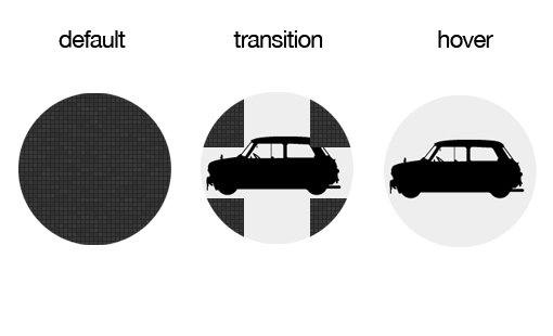
Let's take it one step further and use 5 images to animate. We need, so that when you hover the cursor over the image, it is divided into 4 parts and the picture with the machine is shown.
We arrange 4 parts of the image so that they are arranged vertically and horizontally directly in the center of the circle. When you hover, they will move to the center.
#breakApart { background-image: url('squares.jpg'), url('squares.jpg'), url('squares.jpg'), url('squares.jpg'), url('car.jpg'); background-repeat: no-repeat; background-position: -100px -100px, 100px 100px, -100px 100px, 100px -100px, 0px 0px; /* */ -webkit-transition: all 1s ease-in-out; -moz-transition: all 1s ease-in-out; -o-transition: all 1s ease-in-out; -ms-transition: all 1s ease-in-out; transition: all 1s ease-in-out; } #breakApart:hover { background-position: -200px -200px, 200px 200px, -200px 200px, 200px -200px, 0px 0px; } Rounded separation of parts
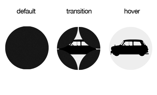
It will be slightly more difficult to repeat the same effect with a rounded separation, because firstly, you need to use a transparent image, and secondly, you need to make them overlap each other in the designated place. There may be problems due to the use of wood texture. But if you use a simpler texture with noise, there should be no problems.
Rotate and Disconnect
You can understand the essence of this example by the picture above. In this example, I made the machine rotate before the parts of the image with the texture are opened.
This includes several nuances. The problem is that all background images are rotated, including the image of the machine below them. Given this, I turned the car in the opposite direction in advance, so that when turning it would return to the desired position.
Another interesting thing is the time it takes to animate. Note that for the rotation effect and the movement effect, I have specified different times. Thanks to this you can make an incredibly large number of examples.
#twistAndShout { background-image: url('crisscross.jpg'), url('crisscross.jpg'), url('crisscross.jpg'), url('crisscross.jpg'), url('car.jpg'); background-repeat: no-repeat; background-position: -100px -100px, 100px 100px, -100px 100px, 100px -100px, 0px 0px; /* */ -webkit-transform:rotate(-90deg); -moz-transform:rotate(-90deg); -o-transform:rotate(-90deg); -ms-transform:rotate(-90deg); transform:rotate(-90deg); /* */ -webkit-transition: background-position .6s ease-in-out, -webkit-transform .3s ease; -moz-transition: background-position .6s ease-in-out, -moz-transform .3s ease; -o-transition: background-position .6s ease-in-out, -o-transform .3s ease; -ms-transition: background-position .6s ease-in-out, -ms-transform .3s ease; transition: background-position .6s ease-in-out, transform .3s ease; } #twistAndShout:hover { background-position: -200px -200px, 200px 200px, -200px 200px, 200px -200px, 0px 0px; /**/ -webkit-transform:rotate(0deg); -moz-transform:rotate(0deg); -o-transform:rotate(0deg); -ms-transform:rotate(0deg); transform:rotate(0deg); } Supplement from psywalker
The original article was published in November 2011. A message about the removal of prefixes for many CSS properties, including transition and transform, appeared in IE10 after its release. Therefore, we left in the article the author’s version of the code, but for practical tasks, keep in mind that the prefix is -ms- for the most popular CSS3 properties - such as transition, transform, animation, linear-gradient, etc. - no longer needed.
Source: https://habr.com/ru/post/148819/
All Articles