Diagnostics in pictures: we understand the state of the product using tables and graphs
A beautiful idea of a product within a large company or a startup almost always inevitably faces a number of difficulties during the implementation phase. It often happens that work is going on, bugs are fixed, the release is approaching, but there is no general understanding of the state of the product. This happens because the own genius of the creators of the software or service (especially when it comes to startups) blinds their eyes, and the problems of the product are understood inadequately. As a result, at best, the team does not fall into the release dates, and at worst, a non-viable product is born that users contemptuously call alpha and send hate rays to creators through a feedback form.
Captain Obvious hints: to prevent this, it is important to be able to understand the state of your product at each stage of its development. In this large article, a method of assessing its state is proposed in the most visual form - in the form of tables and graphs. This is a summary of my experience and the experience of the entire team of the Parallels Novosibirsk office over the past six years. To be clear: we are doing Parallels Plesk Panel - hosting panel, which is used on approximately every second server in the world that provides web hosting services. Applying this technique, we got the following results:
Interested parties please under the cat and in the comments. I will answer any questions.
The article was written based on the speech at the QASib conference in Omsk.
')
By signing an offer to work in a large company or inventing a startup, we expect money, success and recognition from work. At the beginning of the journey it often seems that everything is fine and cloudless, that we are geniuses who have invented cool software or a service with a set of useful functions, we have a team that worked together and a lot of time. The road to success looks simple and hassle-free.
Understanding usually comes at the stage of preparation for release. The problems begin: a third-party team, with which you sponsored a part of the work, dynamite with your deadlines, someone in your team suddenly fell ill, the conceived features during the implementation turned out to be significantly more difficult, the chosen technical solutions do not look very successful. In addition, you are drowning in a sea of bugs, requirements from future users are constantly changing, new super-important features arise, which you definitely need to cram into this release. Against this background, people's motivation is slowly melting. These problems can absorb you and prevent the release to take place. Consequently, the "bag of money" can not be seen. There is not far to panic.
The answer to the well-known questions “Who is to blame?” And “What to do?” Can be obtained on the basis of analyzing the data that will inevitably be collected in your hands. If you somehow and somewhere record your tasks, current progress, results, problems found and other useful information, then it will be easy to track the status of the product. Maintaining a "logbook" project in a barn book has the right to life, but it is better to store the data in some system that has an API or a clear database structure. Using API and / or DB will make information easily accessible and analyzed.
The Parallels Plesk Panel team is working with tasks and bugs in the TargetProcess system. This system has a number of built-in reports that allow us to quickly receive information about the release, the current progress on working on it, the tasks completed and those that are still to be done, the command load and balancing of resources, bugs found, the dynamics of their location, etc. If we need more detailed and diverse information, then we get it directly from the TargetProcess database.
Well, now directly to the data and graphics.
One of the first steps that in the future will allow you to correctly assess the state of your product is to assess whether you have time to do all that you have in mind.
On the one hand, you have a great team, and, on the other hand, a set of features from the customer / product owner / program manager. This is what should be compared.
First you need to figure out how many man-hours (or story points, or “parrots”) your team can digest. For example, the release duration is estimated at three months. In each month there are four weeks, in each week there are 5 days, in each day there are 8 hours (for simplicity, I do not take into account holidays). The team consists of 10 people, where three are megaproductive guys, five are regular employees and two are novices who have worked on the project for a short time. Summing up and multiplying, we get that our team is able to digest the amount of work with a total weight of about 4,000 man-hours in one release.
Now let's estimate what the team will have to do: testing new features - 2,200 hours, verification of bugs - 350 hours, regression testing at the end of release - 600 hours, automation - 500 hours, holidays - 160 hours (you can subtract them from the team capacity, and you can lay here as someone is more convenient), risks - 200 hours (people’s diseases usually come here, new features that come unexpectedly with a “must” note, delays caused by other teams, etc.). Total 3800 hours. It looks like we manage to do everything and ensure the release of proper quality.
Or not?
But what if we have a team performance that is significantly less than the amount of work to be done?
There are several options:
Be sure to ensure that the amount of work that needs to be done is correlated with the amount of work that your team can digest. Well, or you had a clear plan on how to get around this problem.
Your estimates will lay the foundation for a release burn down chart.
Translated into Russian, the burn down will sound like “burn to the ground” - which corresponds well to the meaning of this schedule - to show the amount of work done and the remaining work in relation to time.
Now there will be slides.
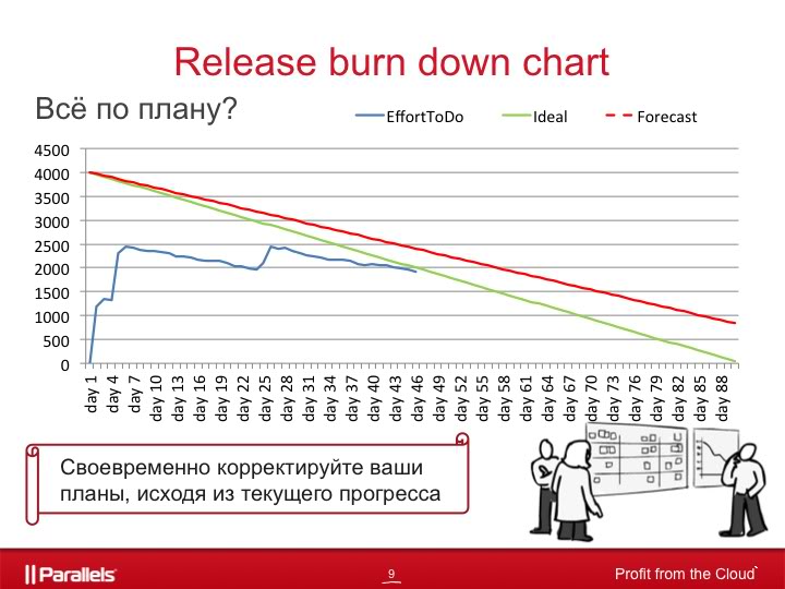
Consider for example the schedule of QA team work for a release lasting three months.
The green line corresponds to the perfect utilization of resources, when each team member performs a fixed amount of work every day, corresponding to his qualifications and performance. The blue line shows the amount of work that needs to be done at each point in time.
From the graph it is clear that:
If it was inherent in risks for us - excellent, if not - then you need to make a decision about what to do to correct the situation.
And one more line on the graph, red dotted, shows when to really expect the release to end, if we continue to work at the same pace as in recent days. It is recalculated every day, based on the actual speed of disposal of tasks in recent days.
The schedule looks simple, but it is very useful for understanding the current situation in your project and allows you to adjust your plans in a timely manner, based on the current situation.
Useful life hack. In addition to the general schedule for the project, it makes sense to have separate graphics for development and for QA. If the teams are large and can be divided into subcommands, then it is better for each of them to keep their schedule. This can be extremely useful in finding bottlenecks in your project. You may even be able to find the team that pulls the whole project down and does not let them fly.
Often we have questions: do we repair it? Do we have time? The answer to us here can give information about the number of open bugs on the release, grouped by priority.
For each bug, we set a priority from p0 to p4, where:
As an example, consider the following graph.

The green line shows the number of open bugs p0-p1, judging by the schedule, we can assume that 4 and 8 weeks are the ends of the iterations, when all the bugs p0-p1 are repaired. This is one of the criteria for closing an iteration.
The red line, respectively, shows the number of open bugs p0-p2, and the blue line - the total number of open bugs in the release.
Therefore, if you see at the beginning and middle of the iteration that the volume of bugs p0-p1 grows so fast that you can’t fix everything and check their fixes until the end of the iteration, then you need to take appropriate decisions: re-prioritize bugs (it’s interesting to reduce the priority for some bugs p0- p1), transfer part of features to the next iteration (free time to spend on bug fixing), extend the iteration until all p0-p1 bugs are fixed, add additional resources to the command, etc.
Toward the end of the release, it makes sense to add another line to the same schedule. The purple line shows the number of bugs that the development team can fix. That is, if we have a release to happen at the beginning of the 19th week, then in the 18th week developers will be able to repair 38 bugs, for the 17th and 18th weeks - 79 bugs, for the 16-17-18th weeks - 147 bugs, and so on.
Such a schedule allows you to predict the situation when a team of developers is not able to fix all the bugs that need to be fixed before the end of the release. This will allow you to take certain actions in advance:
The next thing that makes sense to look at is the number of found and fixed bugs in relation to time.
The picture shows an example of a release of three iterations, where two iterations are the development of new features and one is product stabilization.
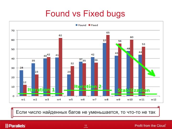
If we look at this chart at the time of working on one of the first iterations, then this allows us to track the quality of the features that we are currently working on. For example, if on the 6th week we received 60 bugs instead of 37, then this would be a signal to us that we need to figure out why we found problems twice as large as usual at this stage of the iteration.
Much the same goes for bugfixing. For example, if on the 4th and 8th week much fewer bugs were fixed than usual, then you need to understand why. Bugs harder? Or is there less time allocated for bugfixing than expected?
If we look at this graph at the stage of stabilization of the product, then it is immediately obvious whether we are bringing the product to the state when it can be given to end users. It seems that the answer is simple: yes, if the number of found bugs falls, and not if it grows. But this is not always the case. This graph gives us only information about how many bugs are found, but does not say what kind of bugs.
If we consider the distribution of found bugs by severity on the same release, it becomes clear that the release does stabilize even though the number of found bugs does not decrease as it approaches the end date.
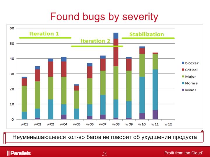
The bugs found on the latest releases are less critical in terms of severity: last week the blockers disappeared completely, the critics almost disappeared, the number of found majors decreased by half, but the number of normals and minors increased.
Consequently, the unchanged number of bugs found does not mean that the product has not been improved.
Another valuable source of information is the distribution of bugs according to the circumstances in which they were found.

For this we have bugs there is a special field “Found under condition”, which can take the following values:
Understanding how the found bugs are distributed over these categories gives us a number of useful information that can be briefly presented in such an easily perceived table.
Another useful source of information is the distribution of bugs by component, it will give us the answer to the question of which component of your product is weak in the knees.

Combining this with the distribution of severity, you can highlight the most problematic components of the current moment and try to understand why this is happening and how to fix it.
If the problematic components do not change from week to week, you can be congratulated: you have found a bottleneck in your product. And if customers also constantly complain about these components, then it makes sense to think about their quality, architecture, the team that is working on them, adding additional resources to them from both development and QA, increasing test coverage and many other things. .
One of the main sources of product information for you, of course, are your users. When you are not working on the first version of the product, then you have a chance to use feedback from them, which you can receive through your support, forum, sales agent, manual, automatic reports built into your product, etc.
This will allow:
Another powerful tool is a comparison of the current situation with previous releases.
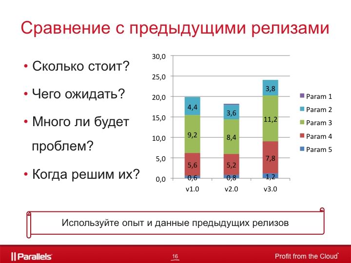
Since we use TargetProcess for several years, the amount of accumulated information is very large, it allows us to predict exactly what to expect from the release, to understand how much we make mistakes in the estimates we give, how many bugs we will find and how much we will fix, what risks usually shoot and how to get around them, how much time we need for certain tasks, etc.
What else is worth paying attention when analyzing the current state of the release:
As you can see, all these graphs and tables are a very powerful and useful tool that will help you correctly and accurately plan your release, taking into account most of the possible problems, predict the problem in advance and help you correct it in time, and, equally important, avoid it in the future.
In particular, they allowed the development of the recent Parallels Plesk Panel 11.
There should be a list of what in QA has become in Plesk 11 a real breakthrough. Of course, if this could be spoken out loud.
But! It is very important to remember that no matter how much data you collect, no matter how many tablets and graphs you build, they will only be useful if you draw useful conclusions based on them and change the product and processes for the better .
Captain Obvious hints: to prevent this, it is important to be able to understand the state of your product at each stage of its development. In this large article, a method of assessing its state is proposed in the most visual form - in the form of tables and graphs. This is a summary of my experience and the experience of the entire team of the Parallels Novosibirsk office over the past six years. To be clear: we are doing Parallels Plesk Panel - hosting panel, which is used on approximately every second server in the world that provides web hosting services. Applying this technique, we got the following results:
- significantly improved the quality of releases (according to the Incident rate);
- releases have become more predictable, the accuracy of our forecasts and estimates has increased significantly;
- there was an understanding of why something was going wrong and how to avoid it in the future.
Interested parties please under the cat and in the comments. I will answer any questions.
The article was written based on the speech at the QASib conference in Omsk.
')
By signing an offer to work in a large company or inventing a startup, we expect money, success and recognition from work. At the beginning of the journey it often seems that everything is fine and cloudless, that we are geniuses who have invented cool software or a service with a set of useful functions, we have a team that worked together and a lot of time. The road to success looks simple and hassle-free.
Understanding usually comes at the stage of preparation for release. The problems begin: a third-party team, with which you sponsored a part of the work, dynamite with your deadlines, someone in your team suddenly fell ill, the conceived features during the implementation turned out to be significantly more difficult, the chosen technical solutions do not look very successful. In addition, you are drowning in a sea of bugs, requirements from future users are constantly changing, new super-important features arise, which you definitely need to cram into this release. Against this background, people's motivation is slowly melting. These problems can absorb you and prevent the release to take place. Consequently, the "bag of money" can not be seen. There is not far to panic.
The answer to the well-known questions “Who is to blame?” And “What to do?” Can be obtained on the basis of analyzing the data that will inevitably be collected in your hands. If you somehow and somewhere record your tasks, current progress, results, problems found and other useful information, then it will be easy to track the status of the product. Maintaining a "logbook" project in a barn book has the right to life, but it is better to store the data in some system that has an API or a clear database structure. Using API and / or DB will make information easily accessible and analyzed.
The Parallels Plesk Panel team is working with tasks and bugs in the TargetProcess system. This system has a number of built-in reports that allow us to quickly receive information about the release, the current progress on working on it, the tasks completed and those that are still to be done, the command load and balancing of resources, bugs found, the dynamics of their location, etc. If we need more detailed and diverse information, then we get it directly from the TargetProcess database.
Well, now directly to the data and graphics.
One of the first steps that in the future will allow you to correctly assess the state of your product is to assess whether you have time to do all that you have in mind.
On the one hand, you have a great team, and, on the other hand, a set of features from the customer / product owner / program manager. This is what should be compared.
First you need to figure out how many man-hours (or story points, or “parrots”) your team can digest. For example, the release duration is estimated at three months. In each month there are four weeks, in each week there are 5 days, in each day there are 8 hours (for simplicity, I do not take into account holidays). The team consists of 10 people, where three are megaproductive guys, five are regular employees and two are novices who have worked on the project for a short time. Summing up and multiplying, we get that our team is able to digest the amount of work with a total weight of about 4,000 man-hours in one release.
Now let's estimate what the team will have to do: testing new features - 2,200 hours, verification of bugs - 350 hours, regression testing at the end of release - 600 hours, automation - 500 hours, holidays - 160 hours (you can subtract them from the team capacity, and you can lay here as someone is more convenient), risks - 200 hours (people’s diseases usually come here, new features that come unexpectedly with a “must” note, delays caused by other teams, etc.). Total 3800 hours. It looks like we manage to do everything and ensure the release of proper quality.
Or not?
But what if we have a team performance that is significantly less than the amount of work to be done?
There are several options:
- To keep silent and leave everything as it is, thinking that later on it will somehow decide by itself, or throw out people's vacations, or automation, or part of testing, which is likely to lead to a decrease in the quality of the product. So what? Fine! Normally, if you are working on a product that you hate, or with a team that you want to destroy ... It is a pity that this approach is so often used in the industry.
- To bring this problem to the limitations of the team's performance to program and project managers and to achieve a decrease in the number of features on the release or a shift in the release date to a later date. It sounds more or less. And you can take this situation as a difficult and interesting challenge and take the third path.
- Come up with a way to do the same thing, but in less time and with less effort. Ideally, use the last two options at the same time.
Be sure to ensure that the amount of work that needs to be done is correlated with the amount of work that your team can digest. Well, or you had a clear plan on how to get around this problem.
Your estimates will lay the foundation for a release burn down chart.
Translated into Russian, the burn down will sound like “burn to the ground” - which corresponds well to the meaning of this schedule - to show the amount of work done and the remaining work in relation to time.
Now there will be slides.
Consider for example the schedule of QA team work for a release lasting three months.
The green line corresponds to the perfect utilization of resources, when each team member performs a fixed amount of work every day, corresponding to his qualifications and performance. The blue line shows the amount of work that needs to be done at each point in time.
From the graph it is clear that:
- the first seven days was the planning and evaluation of tasks for release
- then about three weeks there was work on release (since the blue line is parallel to the green, then, most likely, the tasks were done according to plan, and the initial estimates got to the point)
- a month after the start of the release, we see a jump in the blue line up, most likely due to the addition of new features or a reassessment of labor costs
- then again we see the work on the tasks, which obviously does not go according to plan (it may be caused by the illness of someone from the team, delays on the side of other teams, poor quality features, etc.)
If it was inherent in risks for us - excellent, if not - then you need to make a decision about what to do to correct the situation.
And one more line on the graph, red dotted, shows when to really expect the release to end, if we continue to work at the same pace as in recent days. It is recalculated every day, based on the actual speed of disposal of tasks in recent days.
The schedule looks simple, but it is very useful for understanding the current situation in your project and allows you to adjust your plans in a timely manner, based on the current situation.
Useful life hack. In addition to the general schedule for the project, it makes sense to have separate graphics for development and for QA. If the teams are large and can be divided into subcommands, then it is better for each of them to keep their schedule. This can be extremely useful in finding bottlenecks in your project. You may even be able to find the team that pulls the whole project down and does not let them fly.
Often we have questions: do we repair it? Do we have time? The answer to us here can give information about the number of open bugs on the release, grouped by priority.
For each bug, we set a priority from p0 to p4, where:
- P0 - must be fixed by ASAP
- P1 - must be repaired before the end of the iteration / sprint
- P2 - must be repaired before the end of release.
- P3 - fix if there is time
- P4 - everything else you can live without
As an example, consider the following graph.
The green line shows the number of open bugs p0-p1, judging by the schedule, we can assume that 4 and 8 weeks are the ends of the iterations, when all the bugs p0-p1 are repaired. This is one of the criteria for closing an iteration.
The red line, respectively, shows the number of open bugs p0-p2, and the blue line - the total number of open bugs in the release.
Therefore, if you see at the beginning and middle of the iteration that the volume of bugs p0-p1 grows so fast that you can’t fix everything and check their fixes until the end of the iteration, then you need to take appropriate decisions: re-prioritize bugs (it’s interesting to reduce the priority for some bugs p0- p1), transfer part of features to the next iteration (free time to spend on bug fixing), extend the iteration until all p0-p1 bugs are fixed, add additional resources to the command, etc.
Toward the end of the release, it makes sense to add another line to the same schedule. The purple line shows the number of bugs that the development team can fix. That is, if we have a release to happen at the beginning of the 19th week, then in the 18th week developers will be able to repair 38 bugs, for the 17th and 18th weeks - 79 bugs, for the 16-17-18th weeks - 147 bugs, and so on.
Such a schedule allows you to predict the situation when a team of developers is not able to fix all the bugs that need to be fixed before the end of the release. This will allow you to take certain actions in advance:
- sort the p1-p2 bugs in order to re-prioritize them, the development focus only on those bugs that really need to be repaired, and not waste time on p3-p4 bugs and pseudobags p1-p2
- attract additional resources to bugfix
- move the release date to a later time, etc.
The next thing that makes sense to look at is the number of found and fixed bugs in relation to time.
The picture shows an example of a release of three iterations, where two iterations are the development of new features and one is product stabilization.
If we look at this chart at the time of working on one of the first iterations, then this allows us to track the quality of the features that we are currently working on. For example, if on the 6th week we received 60 bugs instead of 37, then this would be a signal to us that we need to figure out why we found problems twice as large as usual at this stage of the iteration.
Much the same goes for bugfixing. For example, if on the 4th and 8th week much fewer bugs were fixed than usual, then you need to understand why. Bugs harder? Or is there less time allocated for bugfixing than expected?
If we look at this graph at the stage of stabilization of the product, then it is immediately obvious whether we are bringing the product to the state when it can be given to end users. It seems that the answer is simple: yes, if the number of found bugs falls, and not if it grows. But this is not always the case. This graph gives us only information about how many bugs are found, but does not say what kind of bugs.
If we consider the distribution of found bugs by severity on the same release, it becomes clear that the release does stabilize even though the number of found bugs does not decrease as it approaches the end date.
The bugs found on the latest releases are less critical in terms of severity: last week the blockers disappeared completely, the critics almost disappeared, the number of found majors decreased by half, but the number of normals and minors increased.
Consequently, the unchanged number of bugs found does not mean that the product has not been improved.
Another valuable source of information is the distribution of bugs according to the circumstances in which they were found.
For this we have bugs there is a special field “Found under condition”, which can take the following values:
- Customer - we missed a bug in one of the previous versions, and the custom owners found it and reported to us
- Regression - the functionality working in previous versions was broken in the current
- Fresh Look - we became better and more tested and found bugs from previous versions that we missed earlier
- New TC - we found a bug in the new features of the current release
- Other...
Understanding how the found bugs are distributed over these categories gives us a number of useful information that can be briefly presented in such an easily perceived table.
| What happened? | What to do? |
| We find a lot of regression bugs when testing new functionality made in the current iteration | We need to understand the reason why, by doing the new functionality, we break the old one working, talk to the developers of the relevant features, increase the number of unit tests, plan additional regression testing. |
| We find a lot of new TCs bugs | Talk with the developers about the reasons for the poor quality of the features, send them for revision, improve the code review procedures. |
| We find a lot of fresh look bugs | On the one hand, we began to test better, look deeper and wider, on the other hand, why did we not find these problems before? If the deadlines are very tight at the end of the release, then such bugs can be sacrificed, because the product will not get worse, and the found bugs may not interfere with anyone, since no one complains about them from the users. |
Another useful source of information is the distribution of bugs by component, it will give us the answer to the question of which component of your product is weak in the knees.
Combining this with the distribution of severity, you can highlight the most problematic components of the current moment and try to understand why this is happening and how to fix it.
If the problematic components do not change from week to week, you can be congratulated: you have found a bottleneck in your product. And if customers also constantly complain about these components, then it makes sense to think about their quality, architecture, the team that is working on them, adding additional resources to them from both development and QA, increasing test coverage and many other things. .
One of the main sources of product information for you, of course, are your users. When you are not working on the first version of the product, then you have a chance to use feedback from them, which you can receive through your support, forum, sales agent, manual, automatic reports built into your product, etc.
This will allow:
- understand what features are generally in demand, and what is not, what is worth developing, and what is not;
- understand exactly how customers use your product, what scenarios (it often happens that you checked everything before the release, and after the release comes bugs that such a script does not work, and this doesn’t work, and you went completely different trails);
- use risk-based testing (for example, complete testing on the most common configurations and trimmed down on all others).
Another powerful tool is a comparison of the current situation with previous releases.
Since we use TargetProcess for several years, the amount of accumulated information is very large, it allows us to predict exactly what to expect from the release, to understand how much we make mistakes in the estimates we give, how many bugs we will find and how much we will fix, what risks usually shoot and how to get around them, how much time we need for certain tasks, etc.
What else is worth paying attention when analyzing the current state of the release:
- the results of the regular execution of autotests,
- the difference between the initial estimates and the actual time spent
- the quality of the features that is affixed by the people responsible for testing these features,
- number of open bugs on severity-priority,
- number of bugs on the verification regarding the time
- what percentage of bugs found during the release we repair
- density bugs in the code, etc.
As you can see, all these graphs and tables are a very powerful and useful tool that will help you correctly and accurately plan your release, taking into account most of the possible problems, predict the problem in advance and help you correct it in time, and, equally important, avoid it in the future.
In particular, they allowed the development of the recent Parallels Plesk Panel 11.
There should be a list of what in QA has become in Plesk 11 a real breakthrough. Of course, if this could be spoken out loud.
But! It is very important to remember that no matter how much data you collect, no matter how many tablets and graphs you build, they will only be useful if you draw useful conclusions based on them and change the product and processes for the better .
Source: https://habr.com/ru/post/148812/
All Articles