New UI pattern - side navigation
I am engaged in the redesign of the 10tracks application for Android, and decided to borrow a beautiful interface for older brothers - Facebook and others. There was a good article on this topic, the translation of which I hasten to share with you. Meanwhile, this article is more a platform for discussion than unbreakable established rules.
 Over the past year, the Android interface has improved at a phenomenal rate (I picked up a small gallery of apps that I like on Google+). Many changes were only cosmetic (Holo theme in ICS, Roboto font, etc.). We did not see a big qualitative change in the principles of interface design. But perhaps one such thing is happening right now.
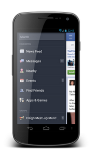
Almost at the same time, several applications implemented side navigation as in the Facebook application. First, we saw how it is used in the new Spotify design, and then almost immediately the decision was adopted by Evernote. Less than a year, a similar pattern was presented in the new design of the Google+ application.
Implemented lateral navigation in each of these applications in different ways. It looks different, the sensations of using it are different, although the fundamental approach is the same. The idea is to provide the user with the fastest way to get to the critical areas of the application without having to leave the current screen.
')
Visual differences in implementations are obvious. For example, in the Google+ application, the menu leaves on top of the current screen, while in other applications the current screen shifts to the side. Google+ uses the up icon, and the Action Bar remains in place, even if the menu is open, while in other applications it is not.
An interesting discussion that took place not so long ago about this pattern can be read in the blog of the author Google+. Link to the discussion (eng.)
Side navigation replaces the much criticized Dashboard pattern in applications. The main argument in the criticism of Dashboard was that it slows down the user's actions on the way to the content of the application. Every time when launching the application, we are forced to first click on the icon, choosing where we want to go .
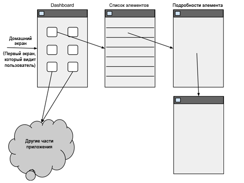
Dashboard also requires you to return to the main screen if you want to go to another part of the application . Here is an abstract sketch of a standard Android application, here is a dashboard and one application section, which is a list of items; clicking on any element of the list leads to the detailed screen of this element (typical structure of a mobile application). In this example, the user first selects an item from the Dashboard, then selects one item from the list and goes to the item itself, and then goes to the next item.
The example shows the difficulty in moving between sections of an application if it is built with the Dashboard principle in place.
Side navigation solves both problems. The user can directly go to any section of the application without having to first return to the home screen. At the same time, when you start the application, one of the main screens opens, on which content is immediately available.
The following sketch is an example of the same application, but built on the principle of side navigation. First, the first screen of the application shows the content and, secondly, the user can go to any other part of the application directly from any screen.

I am sure that the concept of side navigation is superior to the old dashboard principle. There are still cases when you can use the dashboard, but such situations will be much less. In some rare cases, it may not be possible to immediately display any of the content screens. Then the dashboard remains a great solution. Also, very complex applications for the first time can show the user an innocuous simple Dashboard, so as not to dump everything on it right away.
Perhaps it's time to say goodbye to the design pattern, which was a recognizable Android symbol not so long ago.

Unfortunately, implementing side navigation correctly is much more difficult than the concept of a dashboard due to some difficulties.
I have never been a fan of the up button concept in Android. I believe that the user can not understand the difference between the transitions "up" and "back." In addition, Google decided to "help" with the fact that the action "up" denotes an arrow to the left. Every user I talked to speaks about this button "up", like a button "back."
In my opinion, using side navigation makes the up button obsolete and unnecessary. If your application has a good structure, it provides easy access to any application's main screen via side navigation from anywhere - users never get further than a few clicks from any screen. The “back” button of the smartphone will take care of most of the remaining navigation needs.
If you look at the Google+ app and how the side navigation works here, we will see that you first have to go up to one of the category screens to access the side navigation. I think it crosses out its meaning. If, for example, I read one news and I suddenly wanted to start a video conference, why should I get out of the news feed to get to a video call?
Instead, I would be much more pleased to see the left top button of the Action Bar, which opens side navigation, no matter which screen you are on .
If you do decide to use the “up” buttons along with side navigation, you should make sure that the home button, which opens the side navigation, does not look the same as the home button, which performs the upward navigation function. Using the same-looking button violates the fundamental principle of interface design: it should always be clear what action the button performs in the interface. The up button (which is so not always clear what it is doing) will suddenly acquire two different functions, and the user cannot tell what it is performing at a particular moment without pressing it.
It seems to me that we need another icon for side navigation as part of the operating system, which will add sequences to the concept. Here is a raw sketch of what I mean. The first picture shows what the home button looks like when the upward transition functionality is on it (this is how it looks now). The second picture is a sketch of how it might look like if it has the functionality of opening a side menu. This would save users from confusion in applications that use both up navigation and side navigation.


Managing the return stack correctly is very important. Side navigation can complicate the back stack. Alexander Blom has written some pretty good posts about it. I advise you to look:
Android navigation and Spotify (with friends)
Slide-out navigation done better
(eng.)
How will users be able to open side navigation? What gestures and buttons to use?
Side navigation is probably the most important component in any application where you decide to use it. Users will not be able to go anywhere in the application if they do not know how to open it.
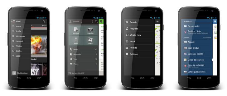
 Having experimented with all the applications that use this pattern, I realized that none of them implemented it perfectly. The closest Prixing app to the ideal. This application rejected the concept of navigation upwards and made the home button of the application opening only side navigation.
This application also added gesture recognition to open this menu. The user can make a “bezel from the screen edge” (bezel swipe) to open the menu. The user will not necessarily find that this gesture leads to the opening of the side menu, but this is not a problem, as there is a home button that opens it. (Article author in English about bezel swipe .).
Only one improvement I would like to see in this application is that the application uses its icon as a home button, but it may be worth adding some additional designation to show that the button has side navigation opening functionality.
Other applications use different methods to open the side menu. Evernote, for example, uses the usual svayp in the interface. This causes an interface consistency problem, since the swipe is already in use when moving between tabs. Evernote uses tabs in some places of the UI, so side navigation is not available for opening with a swipe, unless we are on the leftmost tab.
My recommendations for opening side navigation are to always open it from the home button and keep the svip from the edge. If you are going to use transitions to the top - make sure that the icons of the button with the functionality of the top and the opening of the menu are different.
Before that, I was talking about navigation, but many uses of the pattern are beyond the limits of navigation. It seems logical to me. Action Bar is the place for contextual actions on the screen where it is located. But what if the application has such actions that are so important that they should be accessible from any screen?
Evernote solved this problem by placing actions in the sidebar. I think their solution is excellent. It may seem a little overwhelmed when first used, but a clear visual separation of the navigation and action elements helps the user to easily create in his head a model of where the navigation is and where the action is.

It is very important to call patterns descriptively and consistently. One of the advantages of the patterns is that they can be easily used in the discussion simply by referring to them by name. For established patterns no further explanation is required. “Maybe we should use the Action Bar in the interface?” Or “How about a quick action list?” Are sentences that speak for themselves.
So how do you call this pattern? I referred to it as “side navigation” in this post, but there are many other options:
We can wait until Google calls the pattern before one of the names settles itself. Democracy is probably not going to help. For now I’ll call it side navigation, but I’m ready to accept any other name.
Side navigation (not yet) is not included in the Android SDK. A quick search on github yields one project that applied this pattern:
android-fb-like-slideout-navigation at github
Here is a video showing his work.
Here is another project:
https://github.com/darvds/RibbonMenu
And here are two more:
https://bitbucket.org/jfeinstein10/slidingmenu/overview
https://github.com/Gregadeaux/android-fly-in-app-navigation
Cyril Mottie also wrote about the introduction of this pattern in his blog (English). These posts are worth reading:
The making of Prixing # 1: Fly-in app menu
The making of Prixing # 2: Swiping the fly-in app menu
The making of Prixing # 3: Polishing the sliding app menu
I think this is a big step forward in the design of the Android interface. We must be very careful not to create an uncontrollable zoo of various ways of introduction, which will look the same, but behave differently, confusing users.
Google I | O is just around the corner (at the time of writing in June 2012, it was just around the corner) . We will probably see how they announce the next version of Android. I hope Google will continue to promote more complex components in its OS (as they did with the Action Bar in ICS / Honeycomb). I also hope that we will see the side navigation component as part of the new release contributing to the sequence in applying this pattern.
I'm a fan of the side navigation concept. However, it is very easy to approach her incorrectly. If you decide to include it in your application, be aware of possible problems. Design the reverse stack, gestures and interactions with transitions up and how it looks carefully.
Over the past year, the Android interface has improved at a phenomenal rate (I picked up a small gallery of apps that I like on Google+). Many changes were only cosmetic (Holo theme in ICS, Roboto font, etc.). We did not see a big qualitative change in the principles of interface design. But perhaps one such thing is happening right now.Almost at the same time, several applications implemented side navigation as in the Facebook application. First, we saw how it is used in the new Spotify design, and then almost immediately the decision was adopted by Evernote. Less than a year, a similar pattern was presented in the new design of the Google+ application.
Implemented lateral navigation in each of these applications in different ways. It looks different, the sensations of using it are different, although the fundamental approach is the same. The idea is to provide the user with the fastest way to get to the critical areas of the application without having to leave the current screen.
')
Visual differences in implementations are obvious. For example, in the Google+ application, the menu leaves on top of the current screen, while in other applications the current screen shifts to the side. Google+ uses the up icon, and the Action Bar remains in place, even if the menu is open, while in other applications it is not.
An interesting discussion that took place not so long ago about this pattern can be read in the blog of the author Google+. Link to the discussion (eng.)
Dashboard is dead
Side navigation replaces the much criticized Dashboard pattern in applications. The main argument in the criticism of Dashboard was that it slows down the user's actions on the way to the content of the application. Every time when launching the application, we are forced to first click on the icon, choosing where we want to go .
Dashboard also requires you to return to the main screen if you want to go to another part of the application . Here is an abstract sketch of a standard Android application, here is a dashboard and one application section, which is a list of items; clicking on any element of the list leads to the detailed screen of this element (typical structure of a mobile application). In this example, the user first selects an item from the Dashboard, then selects one item from the list and goes to the item itself, and then goes to the next item.
The example shows the difficulty in moving between sections of an application if it is built with the Dashboard principle in place.
Side navigation solves both problems. The user can directly go to any section of the application without having to first return to the home screen. At the same time, when you start the application, one of the main screens opens, on which content is immediately available.
The following sketch is an example of the same application, but built on the principle of side navigation. First, the first screen of the application shows the content and, secondly, the user can go to any other part of the application directly from any screen.
I am sure that the concept of side navigation is superior to the old dashboard principle. There are still cases when you can use the dashboard, but such situations will be much less. In some rare cases, it may not be possible to immediately display any of the content screens. Then the dashboard remains a great solution. Also, very complex applications for the first time can show the user an innocuous simple Dashboard, so as not to dump everything on it right away.
Perhaps it's time to say goodbye to the design pattern, which was a recognizable Android symbol not so long ago.
A little more after the break ...
Side navigation problems
Unfortunately, implementing side navigation correctly is much more difficult than the concept of a dashboard due to some difficulties.
Up?
I have never been a fan of the up button concept in Android. I believe that the user can not understand the difference between the transitions "up" and "back." In addition, Google decided to "help" with the fact that the action "up" denotes an arrow to the left. Every user I talked to speaks about this button "up", like a button "back."
In my opinion, using side navigation makes the up button obsolete and unnecessary. If your application has a good structure, it provides easy access to any application's main screen via side navigation from anywhere - users never get further than a few clicks from any screen. The “back” button of the smartphone will take care of most of the remaining navigation needs.
If you look at the Google+ app and how the side navigation works here, we will see that you first have to go up to one of the category screens to access the side navigation. I think it crosses out its meaning. If, for example, I read one news and I suddenly wanted to start a video conference, why should I get out of the news feed to get to a video call?
Instead, I would be much more pleased to see the left top button of the Action Bar, which opens side navigation, no matter which screen you are on .
If you do decide to use the “up” buttons along with side navigation, you should make sure that the home button, which opens the side navigation, does not look the same as the home button, which performs the upward navigation function. Using the same-looking button violates the fundamental principle of interface design: it should always be clear what action the button performs in the interface. The up button (which is so not always clear what it is doing) will suddenly acquire two different functions, and the user cannot tell what it is performing at a particular moment without pressing it.
It seems to me that we need another icon for side navigation as part of the operating system, which will add sequences to the concept. Here is a raw sketch of what I mean. The first picture shows what the home button looks like when the upward transition functionality is on it (this is how it looks now). The second picture is a sketch of how it might look like if it has the functionality of opening a side menu. This would save users from confusion in applications that use both up navigation and side navigation.
Back stack problems
Managing the return stack correctly is very important. Side navigation can complicate the back stack. Alexander Blom has written some pretty good posts about it. I advise you to look:
Android navigation and Spotify (with friends)
Slide-out navigation done better
(eng.)
What opens up the side navigation?
How will users be able to open side navigation? What gestures and buttons to use?
Side navigation is probably the most important component in any application where you decide to use it. Users will not be able to go anywhere in the application if they do not know how to open it.
Having experimented with all the applications that use this pattern, I realized that none of them implemented it perfectly. The closest Prixing app to the ideal. This application rejected the concept of navigation upwards and made the home button of the application opening only side navigation.This application also added gesture recognition to open this menu. The user can make a “bezel from the screen edge” (bezel swipe) to open the menu. The user will not necessarily find that this gesture leads to the opening of the side menu, but this is not a problem, as there is a home button that opens it. (Article author in English about bezel swipe .).
Only one improvement I would like to see in this application is that the application uses its icon as a home button, but it may be worth adding some additional designation to show that the button has side navigation opening functionality.
Other applications use different methods to open the side menu. Evernote, for example, uses the usual svayp in the interface. This causes an interface consistency problem, since the swipe is already in use when moving between tabs. Evernote uses tabs in some places of the UI, so side navigation is not available for opening with a swipe, unless we are on the leftmost tab.
My recommendations for opening side navigation are to always open it from the home button and keep the svip from the edge. If you are going to use transitions to the top - make sure that the icons of the button with the functionality of the top and the opening of the menu are different.
Side navigation actions
Before that, I was talking about navigation, but many uses of the pattern are beyond the limits of navigation. It seems logical to me. Action Bar is the place for contextual actions on the screen where it is located. But what if the application has such actions that are so important that they should be accessible from any screen?
Evernote solved this problem by placing actions in the sidebar. I think their solution is excellent. It may seem a little overwhelmed when first used, but a clear visual separation of the navigation and action elements helps the user to easily create in his head a model of where the navigation is and where the action is.
How to call it?
It is very important to call patterns descriptively and consistently. One of the advantages of the patterns is that they can be easily used in the discussion simply by referring to them by name. For established patterns no further explanation is required. “Maybe we should use the Action Bar in the interface?” Or “How about a quick action list?” Are sentences that speak for themselves.
So how do you call this pattern? I referred to it as “side navigation” in this post, but there are many other options:
- Side navigation
- Fly-in menu (Fly-in app menu)
- Slide out navigation
- Sliding navigation bar
- Slide menu
- ...
We can wait until Google calls the pattern before one of the names settles itself. Democracy is probably not going to help. For now I’ll call it side navigation, but I’m ready to accept any other name.
Technical solutions
Side navigation (not yet) is not included in the Android SDK. A quick search on github yields one project that applied this pattern:
android-fb-like-slideout-navigation at github
Here is a video showing his work.
Here is another project:
https://github.com/darvds/RibbonMenu
And here are two more:
https://bitbucket.org/jfeinstein10/slidingmenu/overview
https://github.com/Gregadeaux/android-fly-in-app-navigation
Cyril Mottie also wrote about the introduction of this pattern in his blog (English). These posts are worth reading:
The making of Prixing # 1: Fly-in app menu
The making of Prixing # 2: Swiping the fly-in app menu
The making of Prixing # 3: Polishing the sliding app menu
Future
I think this is a big step forward in the design of the Android interface. We must be very careful not to create an uncontrollable zoo of various ways of introduction, which will look the same, but behave differently, confusing users.
Google I | O is just around the corner (at the time of writing in June 2012, it was just around the corner) . We will probably see how they announce the next version of Android. I hope Google will continue to promote more complex components in its OS (as they did with the Action Bar in ICS / Honeycomb). I also hope that we will see the side navigation component as part of the new release contributing to the sequence in applying this pattern.
Conclusion
I'm a fan of the side navigation concept. However, it is very easy to approach her incorrectly. If you decide to include it in your application, be aware of possible problems. Design the reverse stack, gestures and interactions with transitions up and how it looks carefully.
Source: https://habr.com/ru/post/148730/
All Articles