Pure CSS principle of cicada
 The principle of cicada allows you to build very long non-repeating backgrounds of web pages from several simple images. It was first described by Alex Walker in April 2011 and quickly gained popularity. The site designfestival.com has a whole gallery of backgrounds made according to this principle.
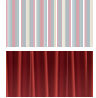
In many cases, you can save even more using gradients. Even taking into account the fact that so far almost all browsers support the
linear-gradient property only with prefixes, the total amount of CSS code needed to create the background is several times smaller than the size of several PNGs with fragments, and more importantly, it does not require extra requests to the server. So, Eric Meyer recently gave an example of the implementation of the first two backgrounds from Walker's original article on pure CSS. For simple colored stripes (above), it took 2.66 Kb of CSS code (with prefixes, without minification and compression). In the future, when all popular browsers get rid of prefixes, 0.59 KB of code will suffice. In the original example, the images weighed about 6 Kb + 3 requests to the server. The second example with a curtain (below) is even more impressive. Even with prefixes, a tenfold gain is obtained.The code of examples is quite straightforward and simple. I did not give the full version with all the prefixes, so as not to clutter the article. Here is the top example:
/* */ background-image: linear-gradient( /* */ 0deg, rgba(171,191,196,0.6), rgba(171,191,196,8) 50%, rgba(255,0,0,0) 50%, rgba(255,0,0,0) ) , linear-gradient( /* */ 0deg, rgba(203,138,153,0.7), rgba(203,138,153,0.7) 49%, rgba(203,138,153,0.5) 50%, rgba(255,0,0,0) 50%, rgba(255,0,0,0) ) , linear-gradient( /* */ 0deg, rgba(220,209,185,0) 0%, rgba(220,209,185,0) 20%, rgba(220,209,185,0.4) 20%, rgba(220,209,185,0.8) 80%, rgba(255,0,0,0) 80%, rgba(255,0,0,0) ) ; background-size: 29px 100%, 37px 100%, 53px 100% ; background-repeat: repeat-x; height: 200px; Here is the bottom:
')
/* */ background-image: linear-gradient( /* */ 90deg, rgba(255,128,128,0.25), rgba(255,128,128,0) 75% ) , linear-gradient( /* */ -1deg, transparent, transparent 30%, #510A0E 35%, #510A0E 40%, #61100F 43%, #B93F3A 50%, #4B0408 55%, #6A0F18 60%, #651015 65%, #510A0E 70%, #510A0E 75%, rgba(255,128,128,0) 80%, transparent ) , linear-gradient( /* */ 2deg, #510A0E, #510A0E 20%, #61100F 25%, #B93F3A 40%, #4B0408 50%, #6A0F18 70%, #651015 80%, #510A0E 90%, #510A0E ) ; /* :( */ background-size: auto, 300px 100%, 109px 100%; background-position: background-repeat: repeat-x; height: 400px; For the first time, Randy Merrill invented the combination of linear gradients and the principle of cicada in June 2011. Before that, there was a not very successful attempt to use radial gradients to generate pseudo-random noise. So far, the backwardness of browsers hinders the widespread use of such a technique — to make gradients work, you will have to pile mountains of the same code with different prefixes, and to support IE under the 10th version, use
DXImageTransform.Microsoft.gradient() in generalHowever, if you want to experiment with “cicadiators”, here are some useful links:
- Table support gradients in different browsers.
- A collection of patterns on CSS3 .
- Visual gradient generator .
Source: https://habr.com/ru/post/148639/
All Articles