Testing the order form in the online store
This article will be about my interesting experience A / B testing the order form.
Entrance:
Statement: a good order form is a form with two fields: a name and a phone.
And this statement is only partially true.
Usability experts often talk about changes that will increase conversion and which seem very logical and correct. Very often, these arguments concern the process of placing an order. However, there is always the question of measuring the effectiveness of certain changes. Measurements are influenced by a lot of factors, for example, it is not always correct to compare the first and second week of a month, because people often make a purchase immediately after receiving a salary. I see it quite well in the online store for which I am responsible. Measurements should be carried out at the same time. A / B testing helps best in analyzing the implemented changes. With the help of such testing, I have repeatedly improved KPI online store .
So. What was and what they did.
')
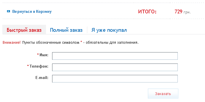
We had such a big form (without a “quick order” tab):

And it has been simplified to this type (without a “full order” tab):
The first result. After the order form was simplified at the store, managers for processing “basket” orders began to spend more time, and the number of errors increased. The reason was one change: all orders began to be formalized orally, and there, either the manager didn’t hear, or the client didn’t say ... For the same reason, the time for order approval increases. Managers were asked to return, as it was.
The result of the second. Nobody wanted to return as it was with the full form and decided to do A / B testing. And test two forms. The main goal of the experiment was to check the% exit from the checkout page, i.e. those who began to make an order, but did not finish.
The result of the experiment : nothing has changed. The percentage of users leaving fluctuated within the normal range (± 5%).
The third result. Further decided to change a minor nuance. The first experiment proposed to show either a large form or a small one. The second experiment offered to include both large and small forms in tabs, and the experiment was that some users showed a small form first and active, and a large form first and active to other users.
The result I was very surprised: the outputs decreased by 15% (percentage points, to be precise). But this is not the most amazing.
Because these were tabs, then buyers could, seeing the short form, switch to full, and vice versa. Total of those who participated in the A / V testing and made an order (!):

As a result, the simplified form is shown to everyone, and those who wish can switch to the full form and fill it out.
Having made a small selective survey after the complete checkout and delivery by the client. It turned out that most do not mind filling out the full form. The course of their thoughts is this: “the store must bring the goods, I must write the address; the store needs to call me, I must leave the phone; the store will send it to me through the mail, so you need to write your full name correctly and completely ”... etc.
It seems to me that the “one button” ideology does not quite work. As the experiment and a small survey showed, people use what is understandable. Otherwise it is scary and it is necessary to step over the barrier of the unknown.
Entrance:
- Internet shop of equipment, Ukraine. We are based in Kiev, we deliver throughout the country;
- A / B testing took place only for traffic from price aggregators;
- The test period is 3 weeks.
Statement: a good order form is a form with two fields: a name and a phone.
And this statement is only partially true.
Usability experts often talk about changes that will increase conversion and which seem very logical and correct. Very often, these arguments concern the process of placing an order. However, there is always the question of measuring the effectiveness of certain changes. Measurements are influenced by a lot of factors, for example, it is not always correct to compare the first and second week of a month, because people often make a purchase immediately after receiving a salary. I see it quite well in the online store for which I am responsible. Measurements should be carried out at the same time. A / B testing helps best in analyzing the implemented changes. With the help of such testing, I have repeatedly improved KPI online store .
So. What was and what they did.
')
We had such a big form (without a “quick order” tab):
And it has been simplified to this type (without a “full order” tab):
The first result. After the order form was simplified at the store, managers for processing “basket” orders began to spend more time, and the number of errors increased. The reason was one change: all orders began to be formalized orally, and there, either the manager didn’t hear, or the client didn’t say ... For the same reason, the time for order approval increases. Managers were asked to return, as it was.
The result of the second. Nobody wanted to return as it was with the full form and decided to do A / B testing. And test two forms. The main goal of the experiment was to check the% exit from the checkout page, i.e. those who began to make an order, but did not finish.
The result of the experiment : nothing has changed. The percentage of users leaving fluctuated within the normal range (± 5%).
The third result. Further decided to change a minor nuance. The first experiment proposed to show either a large form or a small one. The second experiment offered to include both large and small forms in tabs, and the experiment was that some users showed a small form first and active, and a large form first and active to other users.
The result I was very surprised: the outputs decreased by 15% (percentage points, to be precise). But this is not the most amazing.
Because these were tabs, then buyers could, seeing the short form, switch to full, and vice versa. Total of those who participated in the A / V testing and made an order (!):
As a result, the simplified form is shown to everyone, and those who wish can switch to the full form and fill it out.
Having made a small selective survey after the complete checkout and delivery by the client. It turned out that most do not mind filling out the full form. The course of their thoughts is this: “the store must bring the goods, I must write the address; the store needs to call me, I must leave the phone; the store will send it to me through the mail, so you need to write your full name correctly and completely ”... etc.
It seems to me that the “one button” ideology does not quite work. As the experiment and a small survey showed, people use what is understandable. Otherwise it is scary and it is necessary to step over the barrier of the unknown.
Source: https://habr.com/ru/post/148506/
All Articles