Custom ExpandableListView in Android
In this article I want to give a small example of working with customization ExpandableListView - a two-level list.
What should be the result
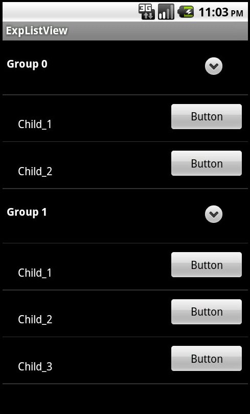
')
Let's start, create a project and add this code to the activation.
Add to main.xml ExpandableListView
Now create an adapter class
The names of the methods and parameters are quite informative. The getGroupView and getChildView methods return a View for “parents” and “children”, respectively. Using the isExpanded parameter in the getGroupView method, you can, for example, change the background of a group under different states. Using LayoutInflater we use custom layout for our list.
group_view.xml
child_view.xml
A button has been added to the child_view.xml , and the button has been processed in the getChildView method in the adapter. In the same way, you can add buttons and other elements to group_view.xml.
The same list can "hang" listeners:
Now consider groupIndicator - group status indicator. Its position is specified in main.xml by the parameters indicatorLeft and indicatorRight , respectively, the left and right borders. By default, the indicator is located on the left, which is not very familiar. You can also substitute your images, for this you need to create indicator.xml in the drawable folder with this code
Where imageOpen - will be displayed when the group is opened, and imageClose - closed. Next in main.xml you need to add a line to the parameters of our list android: groupIndicator = "@ drawable / indicator" . When preparing images, it is necessary to take into account that they will be stretched across the entire height of the group_view layout. So if you need a custom indicator icon, it is better to use a couple of images and control their appearance in the getView method. This article describes well the nuances of working with adapters, and also wants to draw your attention to using the ViewHolder class.
Well, that's all, I hope that the post will help novice developers.
What should be the result
')
Let's start, create a project and add this code to the activation.
public class ExpActivity extends Activity { @Override public void onCreate(Bundle savedInstanceState) { super.onCreate(savedInstanceState); setContentView(R.layout.main); // list ExpandableListView listView = (ExpandableListView)findViewById(R.id.exListView); // ArrayList<ArrayList<String>> groups = new ArrayList<ArrayList<String>>(); ArrayList<String> children1 = new ArrayList<String>(); ArrayList<String> children2 = new ArrayList<String>(); children1.add("Child_1"); children1.add("Child_2"); groups.add(children1); children2.add("Child_1"); children2.add("Child_2"); children2.add("Child_3"); groups.add(children2); // context ExpListAdapter adapter = new ExpListAdapter(getApplicationContext(), groups); listView.setAdapter(adapter); } } Add to main.xml ExpandableListView
<?xml version="1.0" encoding="utf-8"?> <LinearLayout xmlns:android="http://schemas.android.com/apk/res/android" android:orientation="vertical" android:layout_width="fill_parent" android:layout_height="fill_parent" > <ExpandableListView android:id="@+id/exListView" android:layout_width="match_parent" android:layout_height="match_parent" android:indicatorLeft="250dp" android:indicatorRight="300dp" /> </LinearLayout> Now create an adapter class
public class ExpListAdapter extends BaseExpandableListAdapter { private ArrayList<ArrayList<String>> mGroups; private Context mContext; public ExpListAdapter (Context context,ArrayList<ArrayList<String>> groups){ mContext = context; mGroups = groups; } @Override public int getGroupCount() { return mGroups.size(); } @Override public int getChildrenCount(int groupPosition) { return mGroups.get(groupPosition).size(); } @Override public Object getGroup(int groupPosition) { return mGroups.get(groupPosition); } @Override public Object getChild(int groupPosition, int childPosition) { return mGroups.get(groupPosition).get(childPosition); } @Override public long getGroupId(int groupPosition) { return groupPosition; } @Override public long getChildId(int groupPosition, int childPosition) { return childPosition; } @Override public boolean hasStableIds() { return true; } @Override public View getGroupView(int groupPosition, boolean isExpanded, View convertView, ViewGroup parent) { if (convertView == null) { LayoutInflater inflater = (LayoutInflater) mContext.getSystemService(Context.LAYOUT_INFLATER_SERVICE); convertView = inflater.inflate(R.layout.group_view, null); } if (isExpanded){ // -, Group } else{ // -, Group } TextView textGroup = (TextView) convertView.findViewById(R.id.textGroup); textGroup.setText("Group " + Integer.toString(groupPosition)); return convertView; } @Override public View getChildView(int groupPosition, int childPosition, boolean isLastChild, View convertView, ViewGroup parent) { if (convertView == null) { LayoutInflater inflater = (LayoutInflater) mContext.getSystemService(Context.LAYOUT_INFLATER_SERVICE); convertView = inflater.inflate(R.layout.child_view, null); } TextView textChild = (TextView) convertView.findViewById(R.id.textChild); textChild.setText(mGroups.get(groupPosition).get(childPosition)); Button button = (Button)convertView.findViewById(R.id.buttonChild); button.setOnClickListener(new View.OnClickListener() { @Override public void onClick(View view) { Toast.makeText(mContext,"button is pressed",5000).show(); } }); return convertView; } @Override public boolean isChildSelectable(int groupPosition, int childPosition) { return true; } } The names of the methods and parameters are quite informative. The getGroupView and getChildView methods return a View for “parents” and “children”, respectively. Using the isExpanded parameter in the getGroupView method, you can, for example, change the background of a group under different states. Using LayoutInflater we use custom layout for our list.
group_view.xml
<?xml version="1.0" encoding="utf-8"?> <LinearLayout xmlns:android="http://schemas.android.com/apk/res/android" android:layout_width="match_parent" android:layout_height="match_parent"> <TextView android:id="@+id/textGroup" android:layout_width="wrap_content" android:layout_height="50dp" android:layout_marginLeft="5dp" android:layout_marginTop="20dp" android:textColor="@android:color/white" android:textStyle="bold" /> </LinearLayout> child_view.xml
<?xml version="1.0" encoding="utf-8"?> <LinearLayout xmlns:android="http://schemas.android.com/apk/res/android" android:layout_width="match_parent" android:layout_height="match_parent"> <TextView android:id="@+id/textChild" android:layout_width="wrap_content" android:layout_height="40dp" android:layout_marginLeft="20dp" android:layout_marginTop="20dp" android:textColor="@android:color/white" /> <Button android:id="@+id/buttonChild" android:layout_width="100dp" android:layout_height="40dp" android:layout_marginLeft="150dp" android:layout_marginTop="10dp" android:text="Button" android:focusable="false" /> </LinearLayout> A button has been added to the child_view.xml , and the button has been processed in the getChildView method in the adapter. In the same way, you can add buttons and other elements to group_view.xml.
The same list can "hang" listeners:
- OnChildClickListener - click on an item
- OnGroupCollapseListener - group folding
- OnGroupExpandListener - Group Expansion
- OnGroupClickListener - click on a group
Now consider groupIndicator - group status indicator. Its position is specified in main.xml by the parameters indicatorLeft and indicatorRight , respectively, the left and right borders. By default, the indicator is located on the left, which is not very familiar. You can also substitute your images, for this you need to create indicator.xml in the drawable folder with this code
<?xml version="1.0" encoding="utf-8"?> <selector xmlns:android="http://schemas.android.com/apk/res/android"> <item android:state_expanded="true" android:drawable="@drawable/imageOpen"> </item> <item android:state_empty="true" android:drawable="@drawable/imageClose"> </item> </selector> Where imageOpen - will be displayed when the group is opened, and imageClose - closed. Next in main.xml you need to add a line to the parameters of our list android: groupIndicator = "@ drawable / indicator" . When preparing images, it is necessary to take into account that they will be stretched across the entire height of the group_view layout. So if you need a custom indicator icon, it is better to use a couple of images and control their appearance in the getView method. This article describes well the nuances of working with adapters, and also wants to draw your attention to using the ViewHolder class.
Well, that's all, I hope that the post will help novice developers.
Source: https://habr.com/ru/post/147546/
All Articles