Charts and graphs: understanding Taffy
At work, I occasionally have to visualize numerical data — in the form of tables, charts, or graphs. From the last reading on the topic, the most interesting was the well-known book of Taffets The Visual Display of Quantitative Information . I decided to make short extracts from it on questions relating to my tasks. The key word here is brief. Maximum useful information on a text minimum (even the style of presentation will be underlined by lapidary). Additional information and my own thoughts will hide under the spoiler. I hope my summary will be useful for the habrasoobschestvu; I also propose to share my insights and useful links.
1. Drawings, three-dimensional images, massive elements of diagrams that carry an exclusively decorating function.
Examples:
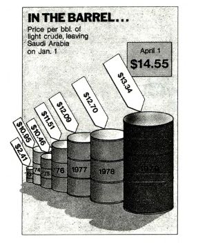
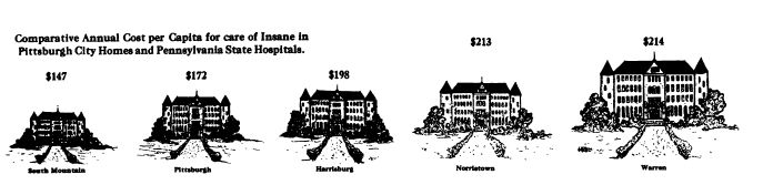
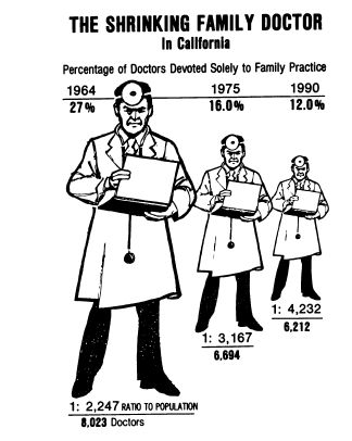
Causes: It is difficult to keep the correct proportions between the numbers and the corresponding figures (cf. figures of doctors and barrels with numerical data). Even if the proportions are met, psychological studies show that people do not operate well with the ratios of the areas and volumes of the depicted figures.
Note. Hereinafter we do not discuss the scenario of the intentional desire of the author to distort the picture.
')
2. Data views out of context.
Example. Below is the same fact (reduction in mortality in 1956 compared with 1955) (a) in itself; (b) in the context of a longer period of time); (c) also in comparison with indicators of neighboring territories:
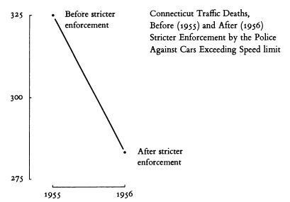


Causes: Visualization is a data analysis tool. Without an appropriate context, analysis is impossible.
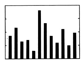
3. Hatching.
Examples:

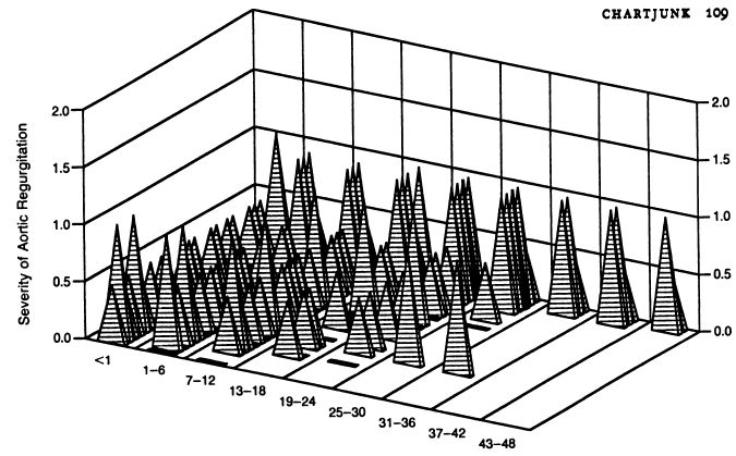
Causes: Moire effect, rippling in the eyes, making analysis difficult.
Note. The problem is proposed to be solved not by using colors (even if it is technically possible), but by simplifying the graphics itself.
4. Decoration for decorations, flowers for flowers (degenerate case of point 1)
Example:
The reasons are obvious.
Note. The table is also a visualization tool. Not all data needs to be presented graphically. (It is also argued that the authors tend to oversimplify graphics: for example, the barrel histogram given above may illustrate a complex economic text that requires a certain educational level to be understood. The complexity of the graphics must match the complexity of the rest of the text).
5. Color coding.
Example:

Causes: The color scale is poorly perceived. The reader is forced to constantly return to the "legend". It is argued that even color transitions in the form of a rainbow are poorly interpreted. The only easily caught indicator is saturation (i.e., for example, shades of gray are permissible).
6. Pie charts.
Example:

Causes: It is proved that people do not perceive the quantitative ratio between sectors of the circle. If the data is complex, analyzing with a pie chart is not possible. If the data is simple, it is better to bring them in the table.
1. The introduction of numerical information in the schedule.
If numerical information (geographic location, traffic flow, point on an object) can be displayed in the figure, it makes sense to do so.
Examples:
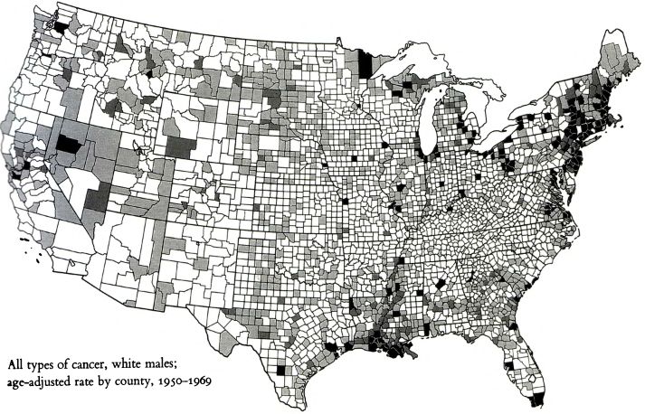
(Incidence of cancer by region of the USA)
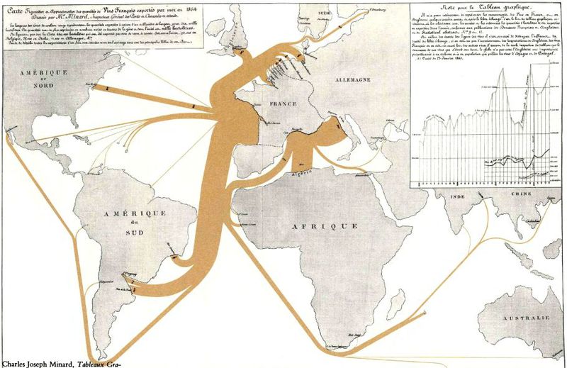
(Exports of wine from France to various countries of the world)
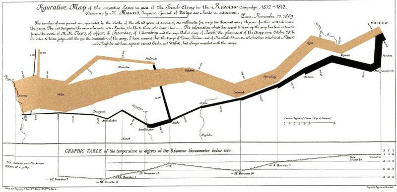
(Movement and strength of Napoleon’s army during the Russian campaign)
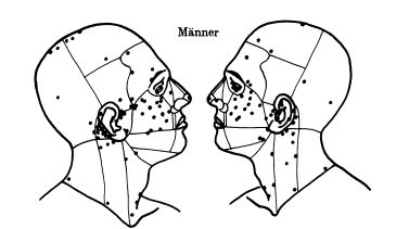
(The most frequent foci of melanoma on the face of a person)
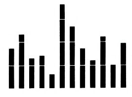
2. Increase data-to-ink ratio.
Elements that do not carry a semantic load should be disposed of, thereby facilitating the drawing.
Examples:


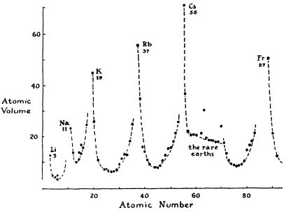
(Purpose: to show the periodic dependence of the atomic volume on the atomic number. In the revised figure, elements that do not correspond to the goal are excluded, explanations are also added for atoms at the edges and for atoms that do not fit into the overall picture.)
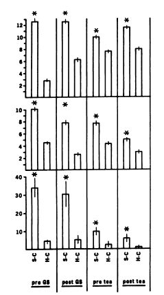
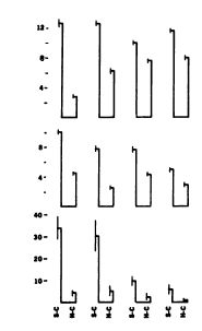
(Purpose: showing that in each set of two columns the left column is always higher; the length of the vertical stroke crossing the column also matters. In the revised version, only significant elements are stored.)
3. Redesign of existing standard chart elements (special case of point 2).
Examples:
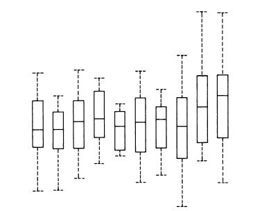
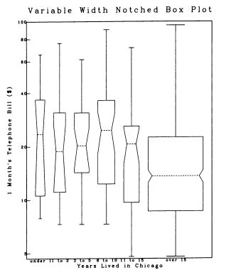
(“Tukey Chart”) The dotted line represents a range. The boundaries of the rectangle indicate the first and third quartile range, the horizontal line inside the rectangle - the median of the range.

The usual histogram. Removed the "box"; strokes, previously marked on the y-axis, are highlighted using the columns themselves. (Tufty, however, recognizes the horizontal line of the base as a possible visual “anchor”).
Tukey chart with variable width rectangle.

A regular graph with selected range boundaries. The line of the axis of ordinates covers only the part of the range actually present on the graph (thereby visualizing the minimum and maximum values).

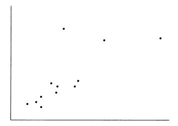
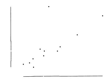
Scatterplot. On both axes, the quartiles and the median are separated by an offset line. Instead of a displaced line, you can use a thickening. Also, axes cover only a portion of the diagram from the minimum to the maximum.
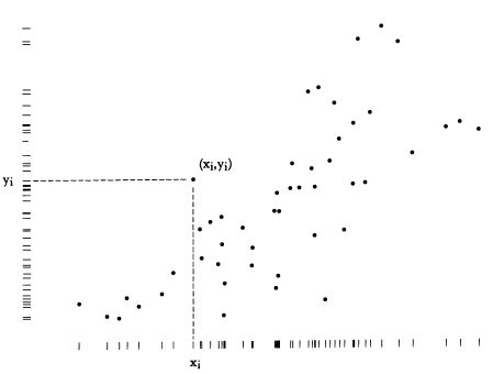
Dot-dash-plot: variation of the scatter diagram with the ability to analyze the distribution of values along each axis.
4. Using data as design elements
A graph in which data signatures replace the abscissa and ordinate axes. Only the values actually encountered in the graph are displayed.
The life cycle of the Japanese beetle:
Mimicry of an animal depending on the situation:

In general, ideas of Taffy boil down to fairly simple recommendations:
What to avoid
1. Drawings, three-dimensional images, massive elements of diagrams that carry an exclusively decorating function.
Examples:
Causes: It is difficult to keep the correct proportions between the numbers and the corresponding figures (cf. figures of doctors and barrels with numerical data). Even if the proportions are met, psychological studies show that people do not operate well with the ratios of the areas and volumes of the depicted figures.
Note. Hereinafter we do not discuss the scenario of the intentional desire of the author to distort the picture.
')
2. Data views out of context.
Example. Below is the same fact (reduction in mortality in 1956 compared with 1955) (a) in itself; (b) in the context of a longer period of time); (c) also in comparison with indicators of neighboring territories:
Causes: Visualization is a data analysis tool. Without an appropriate context, analysis is impossible.
3. Hatching.
Examples:
Causes: Moire effect, rippling in the eyes, making analysis difficult.
Note. The problem is proposed to be solved not by using colors (even if it is technically possible), but by simplifying the graphics itself.
4. Decoration for decorations, flowers for flowers (degenerate case of point 1)
Example:
The reasons are obvious.
Note. The table is also a visualization tool. Not all data needs to be presented graphically. (It is also argued that the authors tend to oversimplify graphics: for example, the barrel histogram given above may illustrate a complex economic text that requires a certain educational level to be understood. The complexity of the graphics must match the complexity of the rest of the text).
5. Color coding.
Example:
Causes: The color scale is poorly perceived. The reader is forced to constantly return to the "legend". It is argued that even color transitions in the form of a rainbow are poorly interpreted. The only easily caught indicator is saturation (i.e., for example, shades of gray are permissible).
6. Pie charts.
Example:
Causes: It is proved that people do not perceive the quantitative ratio between sectors of the circle. If the data is complex, analyzing with a pie chart is not possible. If the data is simple, it is better to bring them in the table.
Addition
It seems to me that simple “cakes”, showing the contribution of the parts to the whole, have the right to life as a visualization tool:

A multi-layered cake for analyzing the contents of the disk is generally a wonderful interface element:
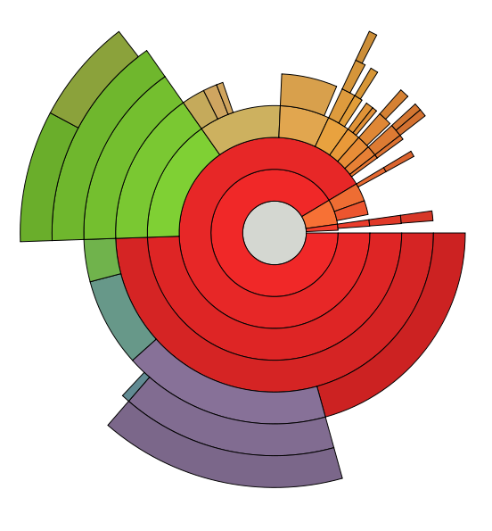
A multi-layered cake for analyzing the contents of the disk is generally a wonderful interface element:
Visualization enhancement methods
1. The introduction of numerical information in the schedule.
If numerical information (geographic location, traffic flow, point on an object) can be displayed in the figure, it makes sense to do so.
Examples:
(Incidence of cancer by region of the USA)
(Exports of wine from France to various countries of the world)
(Movement and strength of Napoleon’s army during the Russian campaign)
(The most frequent foci of melanoma on the face of a person)
2. Increase data-to-ink ratio.
Elements that do not carry a semantic load should be disposed of, thereby facilitating the drawing.
Examples:
(Purpose: to show the periodic dependence of the atomic volume on the atomic number. In the revised figure, elements that do not correspond to the goal are excluded, explanations are also added for atoms at the edges and for atoms that do not fit into the overall picture.)
(Purpose: showing that in each set of two columns the left column is always higher; the length of the vertical stroke crossing the column also matters. In the revised version, only significant elements are stored.)
3. Redesign of existing standard chart elements (special case of point 2).
Note
I think this is one of the most important and controversial ideas of Tufti. Above, we have already seen how a two-column histogram turns into strokes connected by “sausage”. Tufty suggests continuing to modify other popular types of diagrams in the same vein. Here I see several problems at once.
First, it is not always the new solution that seems to me more readable than the old one. The same “sausage” looks exactly like a combination of two elements, although in fact two independent elements are visualized.
Secondly, by minimizing redundant graphics, Taffy very much relies on the quality of printing. Massive blocks are replaced by dots and strokes. In some places the reader is asked to evaluate the value by the end of the stroke, not decorated with any visual “anchor” (bold dot perpendicular to the line). Very controversial, in my opinion.
Third, existing solutions are patterns. For example, the same table of the sequence of numbers can be displayed both in the form of a histogram and in the form of a graph. The semantics of these decisions, however, are different. The graph displays the continuous change of any parameter of one. The histogram is used for discrete values, as well as for displaying values of different parameters (in this case, each column corresponds to its own parameter). Thus, it is necessary to get used to the graphical solutions of Taffy again. He believes that this is not a problem, since all the old solutions were once new too.
Fourth, the use of new elements is difficult because they are poorly supported. If you do the drawing by hand, there is no difference what to display. If you use tools like Excel, you have to choose from the available types of diagrams. Well, or modify the drawing in the graphical editor.
Examples:
(“Tukey Chart”) The dotted line represents a range. The boundaries of the rectangle indicate the first and third quartile range, the horizontal line inside the rectangle - the median of the range.
Note
This kind of chart is useful, for example, in economic statistics. Say, the boundaries of the range can show the dispersion of income, and the three horizontal lines of the rectangle represent the income level above which the welfare of three quarters, half and quarter of the population is, respectively.
The usual histogram. Removed the "box"; strokes, previously marked on the y-axis, are highlighted using the columns themselves. (Tufty, however, recognizes the horizontal line of the base as a possible visual “anchor”).
Tukey chart with variable width rectangle.
A regular graph with selected range boundaries. The line of the axis of ordinates covers only the part of the range actually present on the graph (thereby visualizing the minimum and maximum values).
Scatterplot. On both axes, the quartiles and the median are separated by an offset line. Instead of a displaced line, you can use a thickening. Also, axes cover only a portion of the diagram from the minimum to the maximum.
Dot-dash-plot: variation of the scatter diagram with the ability to analyze the distribution of values along each axis.
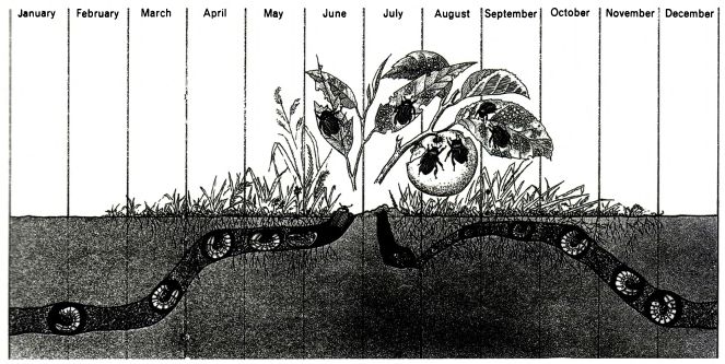
4. Using data as design elements
Note
Tafti has many examples of good visualizations, but these are all solutions of a “special kind”. It is useful to study them as samples, but it is unlikely to be applied automatically in another task. Therefore, we confine ourselves to the simplest examples.
A graph in which data signatures replace the abscissa and ordinate axes. Only the values actually encountered in the graph are displayed.
The life cycle of the Japanese beetle:
Mimicry of an animal depending on the situation:
Conclusion
In general, ideas of Taffy boil down to fairly simple recommendations:
- do not engage in the visualization of trivial data;
- get rid of elements that carry only a decorative function;
- get rid of elements that impede data analysis;
- maximize data-to-ink ratio;
- if possible, turn design elements (axes, points) into data elements;
- whenever possible use data elements as design elements;
- in figures, if possible, display numerical data in graphical form.
Source: https://habr.com/ru/post/146866/
All Articles