Touch-lynch. Mascotte iPhone
We are opening a new educational initiative “Touch-Lynch”. Periodically, we will disassemble the bones of mobile applications. Only Russian, not games, and preferably about business (we don’t understand others :).
 The first pancake will be Mascotte - the iPhone application of the popular chain of boutiques of shoes and accessories.
To be honest, the whole article could be put in one sentence “ Do you make a mobile clothing store? Do as ASOS and do not do as Mascotte . ” But I will try to explain to you why.
')
With the question of who I did not fully understand. I hope for your help in the comments.
Have an idea about two characters:
- a young girl of 25 years old from Voronezh. The local Mascotte store has a small assortment and she often orders her shoes and bags through the app.
- a woman of 30 years old, a fan of the brand, lives in Petersburg, a successful realtor. Constantly orders shoes and bags in Mascotte. She has very little time, so she chooses clothes in traffic through a mobile app.
Both of these characters are a big question. Mascotte is a monobrand, and only sells shoes. To him at least you need to put an application with the rest of the clothes.
With the question of what tasks everything is much easier.
Mobile online stores solve two problems for users: selection and purchase . Most likely the buyer away from the computer.
The flow is when our girl does not need specific clothes now. She is bored and she chooses clothes for her: shoes or a dress.
She wants to endlessly flipping through big beautiful pictures and studying what she likes. Does Mascotte meet its needs?
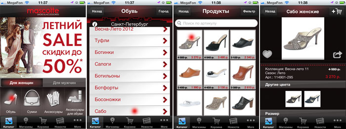
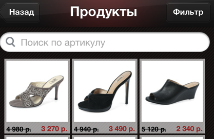
In general, no. For two reasons. First, girls do not choose between "sabot", "sandals", "sandals" and "shoes". In most cases, they choose their own summer shoes. You can not take a catalog of 1C and thoughtlessly shove in the application.
Secondly. Clothes choose by pictures. The better and more pictures, the easier the choice and more sales. I understand that the customer had pictures only on a white background. But this does not mean that we can make a black background and draw ugly gray frames. See how much space it takes on the screens the most important - the photo of the goods.
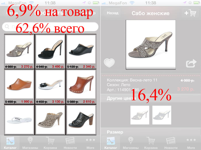
On the list screen, the usable area is not even as important as the fact that it is impossible to make a choice on such small pictures. Our girl has to go to the item card and tap it again to see a normal photo.
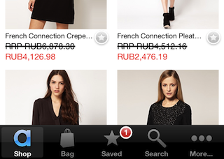
Let's see how this is done in ASOS:
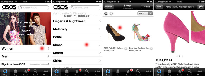
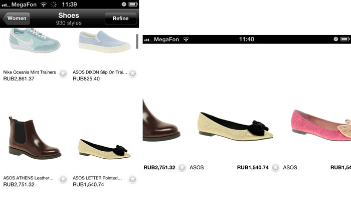
And now a little magic! If you start to scroll through the list of products - all unnecessary disappears. When the device is turned over, we get a shopaholic's paradise - an endless belt of clothing.
Two more selection criteria for buyers are sales and new items.
Does our application satisfy them? Tries Through the incomprehensible essence of magazines. Let's count the tapas:
- Tap on the banner
- Tap on "Download Journal"
- tap on "open journal"
- Tap on the product picture (sometimes marked with a plus sign), ops and there are no product pictures! What discounts?
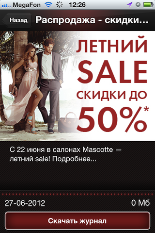
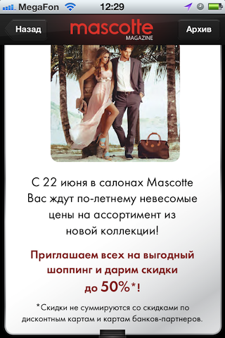
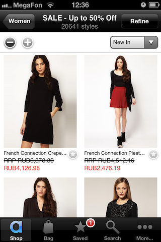
Moreover, the correct solution is simple. Banners on the main should lead immediately to the usual list of goods. As you may have guessed, look ASOS.

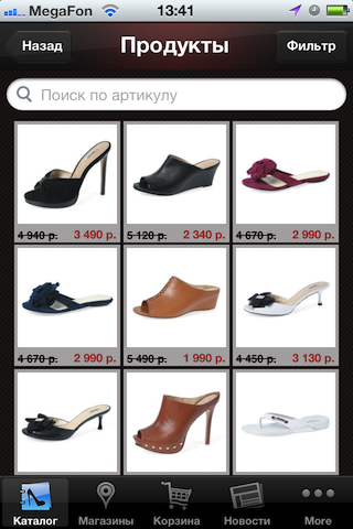
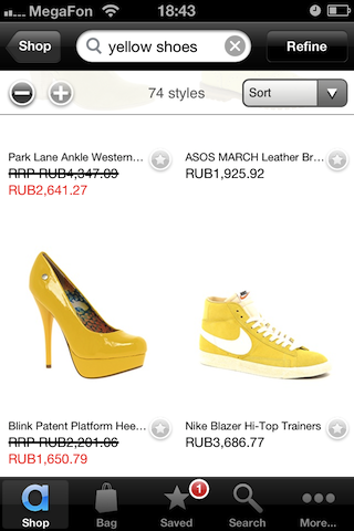
And the last scenario of the choice of goods. Our girl is looking for summer shoes for a yellow dress. I see here two options filter by color and search. Let's look at the search.
You can search in Mascotte only by the article number (032222-766) of the product and only on the category list (“shoes”, “sandals”). I bet that nobody will ever use this opportunity. Although oddly enough, the search for violation of all the guides and common sense is looking for the entire base.
Compare with the search in Asos, it is located on the main screen and easily searches for “yellow shoes”:
I see four possible buying scenarios:
As it is not funny, Mascotte does not cope with the simplest scenario number 1 . In general, everything is fine, I chose a wallet, found out that it is in Mega-Parnas, arrived there and ... did not find the Mascotte store. It would be nice to indicate in the text description how to find a boutique in a large shopping center.
Consider the remaining options. Unlike the web, shopping cart is not the most important element of a mobile store. Filling in 20 fields and not mistaken when ordering on a small iPhone screen is not an easy task. It is much easier to complete an order from a large computer on the site, this helps the "favorites".
"Favorites" in addition to transferring the order to the computer, also serves as a kind of buffer. Our girl seems to work in other modes: 1. choose everything that you like indiscriminately 2. more picky choice, comparing models, ordering what you need now.
In the application Mascotte the idea of the favorites was destroyed. Every product has “hearts”, but in order to use them you need to register. Favorites can not be viewed from the application. And on the site it is hidden deep enough.
As usual, we are looking for the right solutions in ASOS. This product is added to favorites directly from the list. Asterisks work locally, at the request of the user synchronized with the site at any time. The list of the elect occupies his honorary tab and the standard red number indicates the number of points in it. Hinting to the hostess, review the list and buy something.
That's all. Boldly, you need to throw out from the application: magazines, news, QR-scanning (why it’s interesting, didn’t see barcodes in boutiques), general list of stocks and profile. The new correct order tabs "Catalog", "Favorites", "Cart", "Shops". Unfortunately, using the Mascotte application is not possible. Probably less than 1,000 installations of proof.
Very upset with the speed of the application. Transitions in the catalog, for example, in the category "Shoes" can take up to 10 (!) Seconds. At the same time, after pressing, there are no changes on the screen. It seems to the user that he did not hit the button. He taps again and again and again, while irritation accumulates. The correct solution is instant feedback on all user actions.
While I was writing this review, the good app ate the entire iPhone battery. GPS is constantly active. Honestly, I can't understand why. Why did the tester and project manager miss it?
Separately, I want to scold the promotion of the application. The only thing buyers will learn about it is a strange disappearing banner on the store's website, open from the iPhone and a modest link below. Everything.
I would at least do the following:
Having considered the important points that affect the success of the application, I will allow myself to go over the trifles.
Thank you for your attention :) I would be grateful for your constructive opinion in the comments.
If you want advice on your application, feel free to write to review@touchin.ru . Not the game, the Russian market, business.
UPD: a large online clothing store has confirmed that there are much more transitions to shoes / shoes than to a specific category.
The first pancake will be Mascotte - the iPhone application of the popular chain of boutiques of shoes and accessories.To be honest, the whole article could be put in one sentence “ Do you make a mobile clothing store? Do as ASOS and do not do as Mascotte . ” But I will try to explain to you why.
')
Who and what tasks solves using the Mascotte application?
With the question of who I did not fully understand. I hope for your help in the comments.
Have an idea about two characters:
- a young girl of 25 years old from Voronezh. The local Mascotte store has a small assortment and she often orders her shoes and bags through the app.
- a woman of 30 years old, a fan of the brand, lives in Petersburg, a successful realtor. Constantly orders shoes and bags in Mascotte. She has very little time, so she chooses clothes in traffic through a mobile app.
Both of these characters are a big question. Mascotte is a monobrand, and only sells shoes. To him at least you need to put an application with the rest of the clothes.
With the question of what tasks everything is much easier.
Mobile online stores solve two problems for users: selection and purchase . Most likely the buyer away from the computer.
Possible choice scenarios
Flow
The flow is when our girl does not need specific clothes now. She is bored and she chooses clothes for her: shoes or a dress.
She wants to endlessly flipping through big beautiful pictures and studying what she likes. Does Mascotte meet its needs?
In general, no. For two reasons. First, girls do not choose between "sabot", "sandals", "sandals" and "shoes". In most cases, they choose their own summer shoes. You can not take a catalog of 1C and thoughtlessly shove in the application.
Secondly. Clothes choose by pictures. The better and more pictures, the easier the choice and more sales. I understand that the customer had pictures only on a white background. But this does not mean that we can make a black background and draw ugly gray frames. See how much space it takes on the screens the most important - the photo of the goods.
On the list screen, the usable area is not even as important as the fact that it is impossible to make a choice on such small pictures. Our girl has to go to the item card and tap it again to see a normal photo.
Let's see how this is done in ASOS:
And now a little magic! If you start to scroll through the list of products - all unnecessary disappears. When the device is turned over, we get a shopaholic's paradise - an endless belt of clothing.
Discounts, New
Two more selection criteria for buyers are sales and new items.
Does our application satisfy them? Tries Through the incomprehensible essence of magazines. Let's count the tapas:
- Tap on the banner
- Tap on "Download Journal"
- tap on "open journal"
- Tap on the product picture (sometimes marked with a plus sign), ops and there are no product pictures! What discounts?
Moreover, the correct solution is simple. Banners on the main should lead immediately to the usual list of goods. As you may have guessed, look ASOS.
"Yellow ballet flats"
And the last scenario of the choice of goods. Our girl is looking for summer shoes for a yellow dress. I see here two options filter by color and search. Let's look at the search.
You can search in Mascotte only by the article number (032222-766) of the product and only on the category list (“shoes”, “sandals”). I bet that nobody will ever use this opportunity. Although oddly enough, the search for violation of all the guides and common sense is looking for the entire base.
Compare with the search in Asos, it is located on the main screen and easily searches for “yellow shoes”:
Purchase
I see four possible buying scenarios:
- choose a specific product → see availability in stores → we go and buy;
- collect goods in the cart → order;
- select interesting products (selected) → complete the selection on the site → order;
- we select all interesting products (favorites) → from favorites we fill the basket, leaving the rest for later → order.
As it is not funny, Mascotte does not cope with the simplest scenario number 1 . In general, everything is fine, I chose a wallet, found out that it is in Mega-Parnas, arrived there and ... did not find the Mascotte store. It would be nice to indicate in the text description how to find a boutique in a large shopping center.
Consider the remaining options. Unlike the web, shopping cart is not the most important element of a mobile store. Filling in 20 fields and not mistaken when ordering on a small iPhone screen is not an easy task. It is much easier to complete an order from a large computer on the site, this helps the "favorites".
"Favorites" in addition to transferring the order to the computer, also serves as a kind of buffer. Our girl seems to work in other modes: 1. choose everything that you like indiscriminately 2. more picky choice, comparing models, ordering what you need now.
In the application Mascotte the idea of the favorites was destroyed. Every product has “hearts”, but in order to use them you need to register. Favorites can not be viewed from the application. And on the site it is hidden deep enough.
As usual, we are looking for the right solutions in ASOS. This product is added to favorites directly from the list. Asterisks work locally, at the request of the user synchronized with the site at any time. The list of the elect occupies his honorary tab and the standard red number indicates the number of points in it. Hinting to the hostess, review the list and buy something.
That's all. Boldly, you need to throw out from the application: magazines, news, QR-scanning (why it’s interesting, didn’t see barcodes in boutiques), general list of stocks and profile. The new correct order tabs "Catalog", "Favorites", "Cart", "Shops". Unfortunately, using the Mascotte application is not possible. Probably less than 1,000 installations of proof.
Work speed
Very upset with the speed of the application. Transitions in the catalog, for example, in the category "Shoes" can take up to 10 (!) Seconds. At the same time, after pressing, there are no changes on the screen. It seems to the user that he did not hit the button. He taps again and again and again, while irritation accumulates. The correct solution is instant feedback on all user actions.
Constantly active GPS
While I was writing this review, the good app ate the entire iPhone battery. GPS is constantly active. Honestly, I can't understand why. Why did the tester and project manager miss it?
Marketing
Separately, I want to scold the promotion of the application. The only thing buyers will learn about it is a strange disappearing banner on the store's website, open from the iPhone and a modest link below. Everything.
I would at least do the following:
- Constant banners on the pages in the social. networks ( VK , FB ), I'm sure the groups have such functionality.
- POS materials in stores, now in boutiques there is not even a hint of the application.
- Sending a press release on review and clothing sites. While the Internet is silent .
- Interesting discounts and promotions available only from the application.
- SEO in the AppStore for "shoes", "bags", "clogs", etc. It feels like keywords are empty.
Taste
Having considered the important points that affect the success of the application, I will allow myself to go over the trifles.
- White bar. Replacing it with black will make the design more holistic and will stop distracting the user.
- Pictures of magazines on the main page are not optimized for Retina (!).
- Date format “06/27/2012” is not accepted in Russia.
- Animation "coup" out of place almost anywhere in the application, although it is actively used.
- Dots of magazine banners on the main one are not visible on a white background.
- If you manually magazine banners, the automatic list does not stop anyway, it is almost impossible to choose a specific banner.
- Heading inside the types of shoes "Products" O_o
- On the Apple Guide on the button back you do not need to write "Back"
- Jamb on buttons on iPhone 3G

- Switch "For women" "For men" does not change the banners at the top. I do not need new women's shoes, honestly.
- The switches "For women" "For men" is very difficult to get. The finger falls either on the banner or on the types of clothing.
- The overall design style is more appropriate for an online vampire game than a clothing boutique. Especially a die with the name of the city, eating off to the same place on the screen.
Finita la
Thank you for your attention :) I would be grateful for your constructive opinion in the comments.
If you want advice on your application, feel free to write to review@touchin.ru . Not the game, the Russian market, business.
UPD: a large online clothing store has confirmed that there are much more transitions to shoes / shoes than to a specific category.
Source: https://habr.com/ru/post/146719/
All Articles