Express audit of hosting sites
Recently I was puzzled by the search for successful corporate websites of SEO agencies. This is just a holiday of some kind! In the sense that most of the resources are similar to a New Year tree, or confetti, ejected from crackers, or a blanket made from flaps. In general, from the TOP-20 , according to CMSmagazine, this picture is observed on about 80% of the sites, despite the fact that each first company separately announces the “Usability Analysis” service. I don’t know how customers feel at such sites who have no idea about search engine optimization, but I, frankly, was lost among many pictures, asterisks, arrows, and even spread across the entire screen.
It would be possible to arrange here an exemplary analysis for SEO-agencies, but this will be in some sense “politically incorrect”, so I propose to practice at my favorite data centers. They earn their bread by another craft, so from them I expect only thanks for my little work. As subjects, consider the top five data centers, which have already been described in a different context .
')
The screen is not very indicative, but the sensation of space is transmitted perfectly. You feel in zero gravity and do not know where to poke, to finally start reading about the data center and services (this information is somehow shadowed in favor of the news). By the way, on the screenshot you do not see what I saw when I scrolled to the end ... the studio that developed the design ( guess which one? ), But it's too late to retreat from the idea. I get to the page with the description of the data center - it's much nicer here. Attention is focused on the main characteristics, literate text, concise description.
Little kosyachok - vague link to the gallery, there is a feeling that the thumbnail "left" for the screen. The page with services is all OK, but why is the entire list revealed? It is more logical to leave the list of “Accommodation and equipment rental” disclosed, and “Information security” and “Additional services” to disclose by click. And yes, there is no information on the cost within the section. Why force a client to make an extra click? Otherwise, IMHO - all, of course, very well, if you do not take into account the constant transitions between the patterns ( 1 , 2 ).
Here, too, creative designers clearly worked, but, in my opinion, even here the “concept” interferes with functionality, and the main task - to sell. On the main there is no information at all about where the visitor went. Moreover, the lack of content is the impossibility of promotion in search engines. “Comfort and safety of your business” - somehow about anything, “Checking a domain name” is why? The place is not spent rationally, but the helmet is cool, yes. In general, the site is not bad, clear navigation and intelligent optimization.
Description of the data center - I liked it. Available, expanded, with explanatory links to rates, photos, reviews, but the right menu needs something to fill out. A similar jamb is observed on most internal pages - a long footcloth on the left and a void on the right. Pages with basic services - the accompanying text obscures the main - tariffs (see. «Server rental» )! With a resolution of 1280x1024, I don’t even see the top price column. Tabs "How to order" and "Leave a request" can be combined, and "Info" removed from the submenu. The latter, of course, was done for SEO, but this should be hidden deep.
E-Style continues the theme of space, but the concept looks unintelligible. Where is the further development of the idea? In general, the main page looks quite informative, but the impression is spoiled by additional blocks. "IT News" - why is that? "Company News" - you should not make home, if they are so rarely updated, "Tag Cloud" is still for blogs. The slider fits well with the design, but the banners themselves are not clickable, in the sense that they do not cause the desire to go over them.
Internal pages are neat and informative. A little confused by the content - the one at the bottom of the pages (yes, some read to the end). The desire for optimization is great, but the promotion of typos (“data cent”) is probably not the best solution for a commercial site. Navigation will note implicit links in the sections. For example, with the “Data Center” section open, finding information about the data center itself is quite problematic (the section name does not look clickable). In general, everything is very worthy.
I like the “muzzle” the most - there is nothing superfluous on the first screen, but contacts for communication in a more explicit form would not hurt either. The logic in the menu is somewhat broken: Services –Data Center Services - Description of the data center . At the same time: Services - Server rental . There is a lack of the top navigation menu, the menu on the left is overloaded with subsections. The "News" section is stretched in width, due to the insignificant amount of content, the materials themselves are enough for 2 lines - it turns out completely unreadable.
There are some comments on the internal pages too. Key claims to order forms ( 1 , 2 ). In case No. 1 we have a bulletproof captcha, and in case No. 2 there is a multi- line lower-case order form even for individuals (including a mandatory item for sending a scan of a passport), only when looking at it, it becomes scary. Let this information be used to automatically form a contract, but why immediately force the client to enter all the data. After all, the server before the payment, he still will not receive. On the page with the rental of equipment, again, the question of the lack of tariffs.
MSM is quite versatile and the data center is just one of the directions, but even considering this, navigation on the main one leaves much to be desired - the accents are not set, some links are duplicated, different fonts are used in the plates, there is no standardization. The subtitles are too often used on the data center tab - it cuts the eye, the style is also, let's be honest, specific to the corporate site. When switching to “Payment methods”, go back to the services through the menu, you can only returning to the main one.
URL paths are configured against logic, for example, the page “Renting and hosting servers” http://msm.ru/collocation/colocation/ , and “ Hosting servers” msm.ru/collocation/colocation or even more interesting, “Renting servers” http : //msm.ru/collocation/dedicated/ . If you go to the menu for some link, then go back to http://msm.ru/collocation/ now you can only through the main page. The “Service Agreement” page does not work, although the link to it is present in the main menu. Conclusion - with navigation you need to do something.
PS In general, everything is very good and I have already managed to regret several times when I took up this review. The whole paradox is that the same professional optimizers work with many hosts ... True, those who “themselves with the mustache” do a very good job.
It would be possible to arrange here an exemplary analysis for SEO-agencies, but this will be in some sense “politically incorrect”, so I propose to practice at my favorite data centers. They earn their bread by another craft, so from them I expect only thanks for my little work. As subjects, consider the top five data centers, which have already been described in a different context .
Participants of the "competition":
- Oversun http://www.oversunmercury.ru
- TEL Hosting http://www.hosting.tel.ru
- E-Style http://www.estt.ru
- Agava http://servers.agava.ru
- MSM http://msm.ru
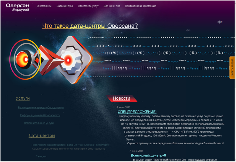
Oversan
')
The screen is not very indicative, but the sensation of space is transmitted perfectly. You feel in zero gravity and do not know where to poke, to finally start reading about the data center and services (this information is somehow shadowed in favor of the news). By the way, on the screenshot you do not see what I saw when I scrolled to the end ... the studio that developed the design ( guess which one? ), But it's too late to retreat from the idea. I get to the page with the description of the data center - it's much nicer here. Attention is focused on the main characteristics, literate text, concise description.
Little kosyachok - vague link to the gallery, there is a feeling that the thumbnail "left" for the screen. The page with services is all OK, but why is the entire list revealed? It is more logical to leave the list of “Accommodation and equipment rental” disclosed, and “Information security” and “Additional services” to disclose by click. And yes, there is no information on the cost within the section. Why force a client to make an extra click? Otherwise, IMHO - all, of course, very well, if you do not take into account the constant transitions between the patterns ( 1 , 2 ).
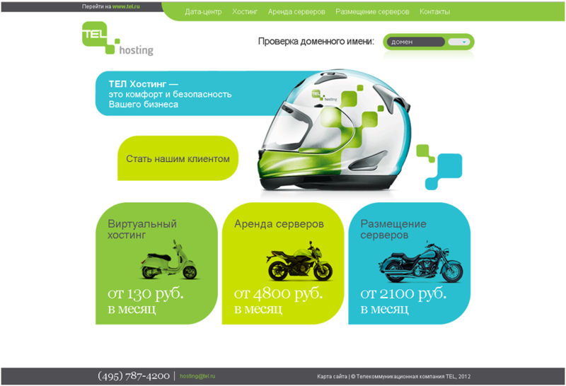
TEL Hosting
Here, too, creative designers clearly worked, but, in my opinion, even here the “concept” interferes with functionality, and the main task - to sell. On the main there is no information at all about where the visitor went. Moreover, the lack of content is the impossibility of promotion in search engines. “Comfort and safety of your business” - somehow about anything, “Checking a domain name” is why? The place is not spent rationally, but the helmet is cool, yes. In general, the site is not bad, clear navigation and intelligent optimization.
Description of the data center - I liked it. Available, expanded, with explanatory links to rates, photos, reviews, but the right menu needs something to fill out. A similar jamb is observed on most internal pages - a long footcloth on the left and a void on the right. Pages with basic services - the accompanying text obscures the main - tariffs (see. «Server rental» )! With a resolution of 1280x1024, I don’t even see the top price column. Tabs "How to order" and "Leave a request" can be combined, and "Info" removed from the submenu. The latter, of course, was done for SEO, but this should be hidden deep.
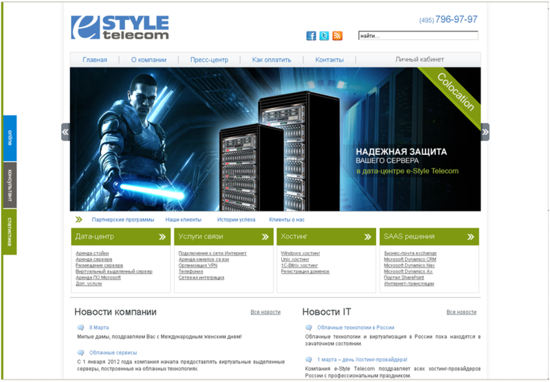
E-style
E-Style continues the theme of space, but the concept looks unintelligible. Where is the further development of the idea? In general, the main page looks quite informative, but the impression is spoiled by additional blocks. "IT News" - why is that? "Company News" - you should not make home, if they are so rarely updated, "Tag Cloud" is still for blogs. The slider fits well with the design, but the banners themselves are not clickable, in the sense that they do not cause the desire to go over them.
Internal pages are neat and informative. A little confused by the content - the one at the bottom of the pages (yes, some read to the end). The desire for optimization is great, but the promotion of typos (“data cent”) is probably not the best solution for a commercial site. Navigation will note implicit links in the sections. For example, with the “Data Center” section open, finding information about the data center itself is quite problematic (the section name does not look clickable). In general, everything is very worthy.
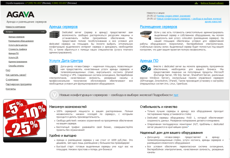
Agava
I like the “muzzle” the most - there is nothing superfluous on the first screen, but contacts for communication in a more explicit form would not hurt either. The logic in the menu is somewhat broken: Services –Data Center Services - Description of the data center . At the same time: Services - Server rental . There is a lack of the top navigation menu, the menu on the left is overloaded with subsections. The "News" section is stretched in width, due to the insignificant amount of content, the materials themselves are enough for 2 lines - it turns out completely unreadable.
There are some comments on the internal pages too. Key claims to order forms ( 1 , 2 ). In case No. 1 we have a bulletproof captcha, and in case No. 2 there is a multi- line lower-case order form even for individuals (including a mandatory item for sending a scan of a passport), only when looking at it, it becomes scary. Let this information be used to automatically form a contract, but why immediately force the client to enter all the data. After all, the server before the payment, he still will not receive. On the page with the rental of equipment, again, the question of the lack of tariffs.
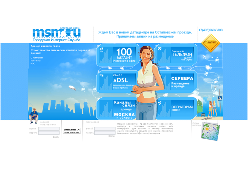
MSM
MSM is quite versatile and the data center is just one of the directions, but even considering this, navigation on the main one leaves much to be desired - the accents are not set, some links are duplicated, different fonts are used in the plates, there is no standardization. The subtitles are too often used on the data center tab - it cuts the eye, the style is also, let's be honest, specific to the corporate site. When switching to “Payment methods”, go back to the services through the menu, you can only returning to the main one.
URL paths are configured against logic, for example, the page “Renting and hosting servers” http://msm.ru/collocation/colocation/ , and “ Hosting servers” msm.ru/collocation/colocation or even more interesting, “Renting servers” http : //msm.ru/collocation/dedicated/ . If you go to the menu for some link, then go back to http://msm.ru/collocation/ now you can only through the main page. The “Service Agreement” page does not work, although the link to it is present in the main menu. Conclusion - with navigation you need to do something.
PS In general, everything is very good and I have already managed to regret several times when I took up this review. The whole paradox is that the same professional optimizers work with many hosts ... True, those who “themselves with the mustache” do a very good job.
Source: https://habr.com/ru/post/146623/
All Articles