Visualizer summary "Talent Map" - adventures on the way to release
Hello!
We recently passed a large and interesting project “Talent Map”, a resume visualizer. We want to tell about it. Probably the last of our wards of projects of this magnitude was Restlook, the author of which even wrote a post on Habr about how everything was .
So to the point.
')
The Monster Russia recruitment agency has a CEO, Anton Nadya. A person has been looking for highly qualified personnel for 30 years and, as can be judged by his track record, he does it very successfully.
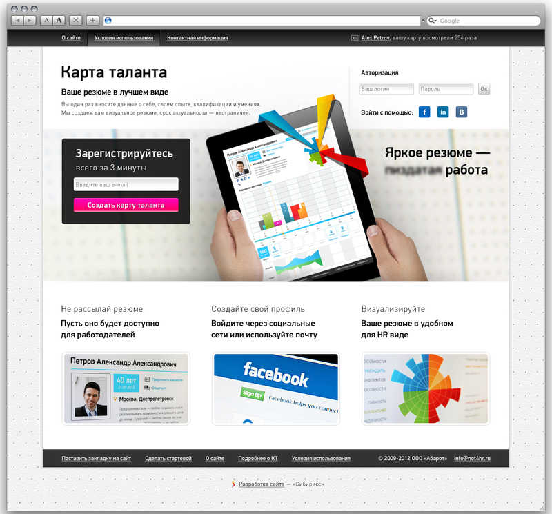
Anton Nadey had a good idea in his head - to make the process of interaction between the applicant and the employer more effective. How? Allow the job seeker to convert personal data from boring text summaries into beautiful graphical ones. About how on the screen of this tablet:
Benefit for the applicant? His profile compares favorably with that of competitors in the labor market.
Benefits for the employer / recruiter? Information submitted in this form is better perceived, which allows you to handle a larger number of resumes.
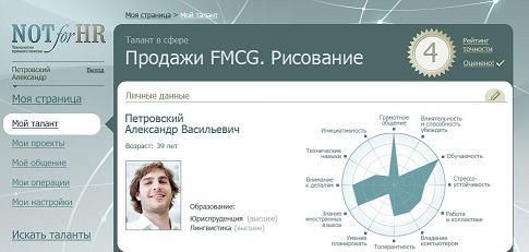
Anton took steps to implement the idea back in 2009. Then without a hint of resume visualizer - it was just a career profile page within the site for HR-s.
Here is a fragment, do not beat for the quality of the picture:
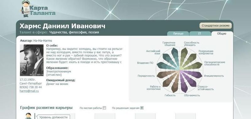
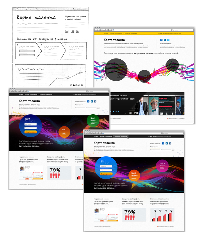
Then there was the idea to make a separate project, already with a full-fledged visualizer. At the end of 2010, the “progenitor” of the current Talent Card was created. Outwardly, not much different from the previous attempt:
As Anton says, “In 2011, several similar services appeared at once, and suddenly it became clear that a visual summary should be not only informative, but also beautiful.”
In March 2012, the project is restarted, a detailed design is being designed and the graphical concept is refined.
Unapproved sketches:
The project implements the import of data from Facebook, LinkedIn and Headhunter and - most importantly - the generation of interactive graphs (used Raphaël.js, if it is not interesting to whom).
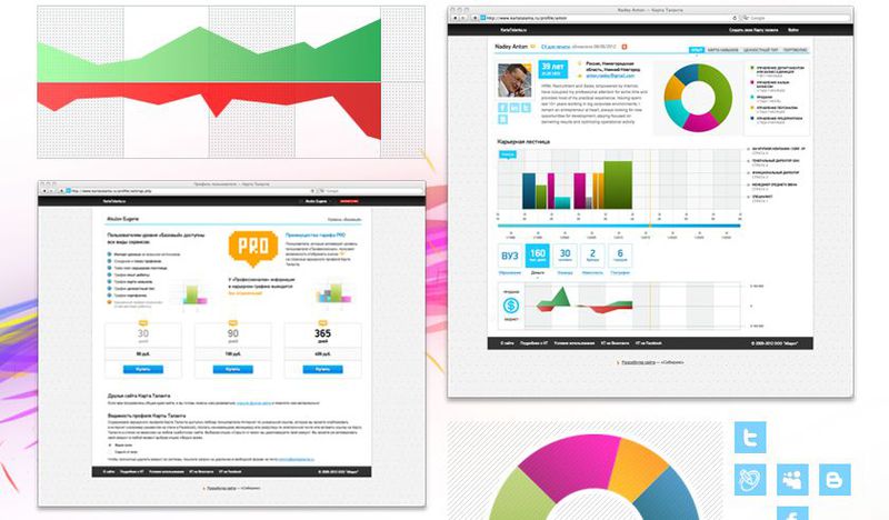
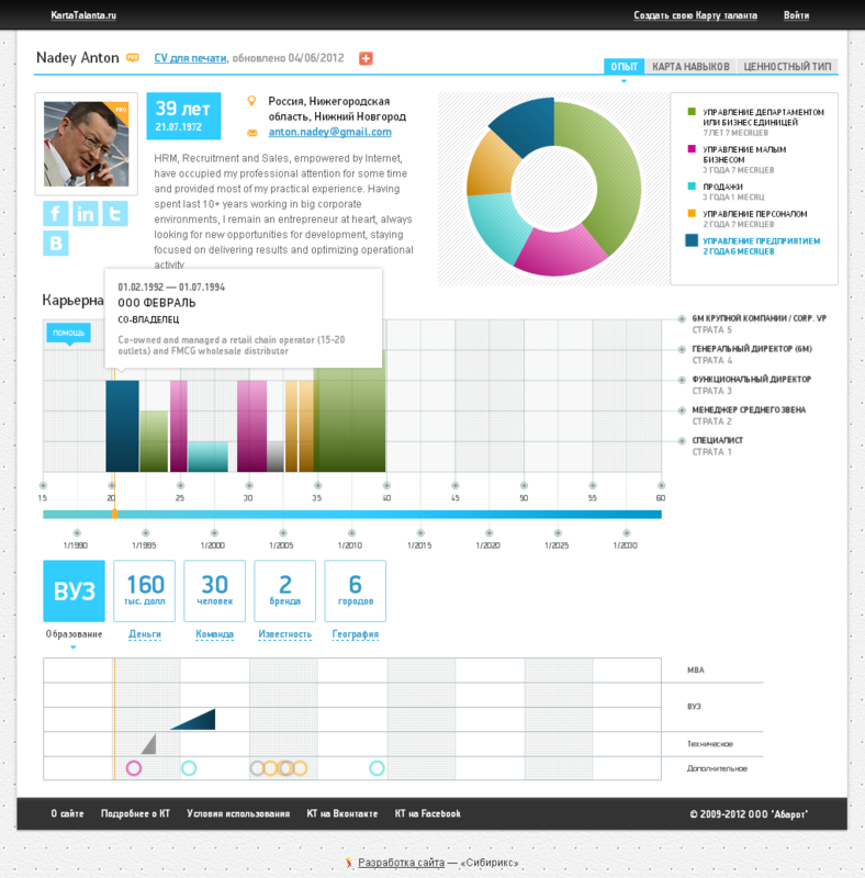
Now, after filling out the questionnaire, the user receives just such a personal page .
And a bit of perspective.
Now everything is working, you can follow the example of many and generate your visual resume. Small parts are doped and trimmed, and the news in the Facebook group is updated.
In general, the patient behaves as alive and healthy: www.kartatalanta.ru .
What do you think?
We recently passed a large and interesting project “Talent Map”, a resume visualizer. We want to tell about it. Probably the last of our wards of projects of this magnitude was Restlook, the author of which even wrote a post on Habr about how everything was .
So to the point.
')
The Monster Russia recruitment agency has a CEO, Anton Nadya. A person has been looking for highly qualified personnel for 30 years and, as can be judged by his track record, he does it very successfully.
Anton Nadey had a good idea in his head - to make the process of interaction between the applicant and the employer more effective. How? Allow the job seeker to convert personal data from boring text summaries into beautiful graphical ones. About how on the screen of this tablet:
Benefit for the applicant? His profile compares favorably with that of competitors in the labor market.
Benefits for the employer / recruiter? Information submitted in this form is better perceived, which allows you to handle a larger number of resumes.
“At the end of the 90s, you could count on the employer's additional attention to your resume, if it was properly written and received by e-mail.
In the middle of the “zero” most of the summaries were sent as a response on the “working” site, and the exclusiveness of the summaries was underlined by the presence of a link to a personal web page.
Now high-level professionals and job seekers with long-term work experience have the opportunity to visualize the contents of a text resume. ”
Project Past
Anton took steps to implement the idea back in 2009. Then without a hint of resume visualizer - it was just a career profile page within the site for HR-s.
Here is a fragment, do not beat for the quality of the picture:
Then there was the idea to make a separate project, already with a full-fledged visualizer. At the end of 2010, the “progenitor” of the current Talent Card was created. Outwardly, not much different from the previous attempt:
As Anton says, “In 2011, several similar services appeared at once, and suddenly it became clear that a visual summary should be not only informative, but also beautiful.”
Present project
In March 2012, the project is restarted, a detailed design is being designed and the graphical concept is refined.
Unapproved sketches:
The project implements the import of data from Facebook, LinkedIn and Headhunter and - most importantly - the generation of interactive graphs (used Raphaël.js, if it is not interesting to whom).
Now, after filling out the questionnaire, the user receives just such a personal page .
And a bit of perspective.
Future of the project
Now everything is working, you can follow the example of many and generate your visual resume. Small parts are doped and trimmed, and the news in the Facebook group is updated.
In general, the patient behaves as alive and healthy: www.kartatalanta.ru .
What do you think?
Source: https://habr.com/ru/post/146152/
All Articles