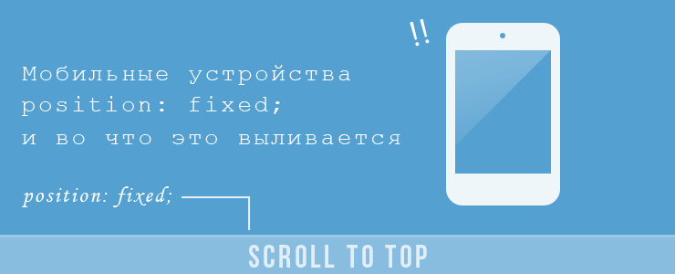
Mobile devices, position: fixed; and what it pours out
In the course of blog redesign, there was a desire to create a 'Scroll to Top' function not only for the desktop, but also for mobile devices. Due to the small free space on the smartphone screen, it was decided to make the return button on the top in the form of a 20px strip attached to the bottom edge of the screen. The code is pretty simple:
$('body').append("<div class='scroll-to-top-mobile'>Scroll To Top</div>"); // $(window).scroll( function() { if ( $(this).scrollTop() > $(window).height() ) { // , ... $('.scroll-to-top-mobile').fadeIn(); // } else { // , ... $('.scroll-to-top-mobile').fadeOut(); // } }); $('.scroll-to-top-mobile').on('click', function() { $('html, body').animate({scrollTop : 0}, 800); // return false; }); ')
.scroll-to-top-mobile { width: 100%; height: 20px; background: #e6e6e6; border-top: 1px solid #ddd; position: fixed; /* , */ bottom: 0; /* */ z-index: 9999; /* */ text-align: center; display: none; /* */ cursor: pointer; font-size: 12px; } It works fine on the desktop, but during testing on Android 2.3 it turned out that position: fixed; does not work, the element is positioned absolutely. After a bit of searching, it turned out that fixed positioning is not supported in iOS up to version 5 and in Android until version 3. Support for other browsers is written here .
They also say that Android 2.3 can be taught to understand this property using a media query:
@viewport { user-zoom: fixed; } Or using a meta tag:
<meta name=”viewport” content=”user-scalable=no” /> This feature disables page scaling.
Now, without the possibility of a document zoom, the question of the readability of the text on the smartphone screen becomes relevant. The visual size of the text on the desktop screen is different from the size on the smartphone screen, more about it here . Because the blog is completely built on the RWD technique, then it makes no sense to make a separate version for the phones. Mobile device identification with device-aspect-ratio media query can help here. This feature allows you to apply the contained CSS only on devices with a given aspect ratio. On the iPhone, this figure is 1.5, on Android 1.3 - 1.5. Thus, we can determine the devices we need and set the optimal font size for them on the page:
@media all and (max-device-aspect-ratio: 1.5) { body { font-size: 16px; line-height: 1.4em; } } Or using a meta tag:
<link rel=”stylesheet” href=”css/mobile.css” type=”text/css” media=”all and (max-device-pixel-ratio: 1.5)” /> Having tested the new settings on my Android 2.3, I found that the parameters set using the media query take effect only after reloading the page, and sometimes not one. This is where a great solution costing a few lines of JS code came to the rescue. We can define a mobile device using a simple script :
// var mobile = (/iphone|ipad|ipod|android|blackberry|mini|windows\sce|palm/i.test(navigator.userAgent.toLowerCase())); if(mobile){ // CSS var cssLink = document.createElement("link"); cssLink.setAttribute("type", "text/css"); cssLink.setAttribute("rel", "stylesheet"); cssLink.setAttribute("href", "css/mobile.css"); document.head.appendChild(cssLink); } navigator.userAgent returns the User-Agent string, then we search for the name of one of the specified devices. If there is one, then we create for it a link to a CSS file containing the parameters we need to adapt the text to the mobile screen. True, due to the fact that the script is triggered only after the document is loaded, the parameters from the connected CSS take effect after 1 - 1.5 seconds.
So, the simple function 'Scroll to Top' pulls along a series of problems, the benefit of which is a solution for each of them.
Links
Source: https://habr.com/ru/post/146049/
All Articles