Circos Review: The Circle Is Good
Circos is an open source software package for visualizing data and information. It visualizes the data in the form of a circle, which is ideal for studying the connections between objects. Also, it's just beautiful.
Surely, each of you at least once had to present information in a graphical form. And it seemed that there was too little information placed on a regular graph or chart, and I wanted to tell and show so much. Especially this problem (lack of space) is manifested at the moment when it is necessary to show the connections of one object with another, their similarities and differences. And here we come to the aid ... circle.
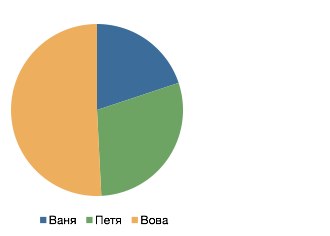
Many of you have probably used pie charts. But even if not, then you will surely agree that of the following ways to convey information, the presence of Vova’s controlling interest is most clearly shown by the pie chart:
')
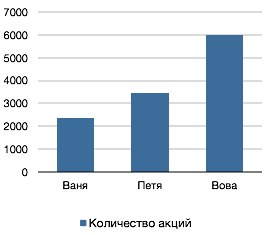
However, standard pie charts have a very narrow scope and adding another column to the table makes using them in this example impossible.
Circos, on the other hand, easily handles this task. I will demonstrate the advantages of their “circular” approach on the following simple example - suppose we have three types of cars (Small, Medium, Executive) and three countries where they were sold (A, B, C). The number of cars sold, depending on the country, can be described, for example, with the following table:
But in such a colorful picture you can automatically turn these numbers with the help of Circos:

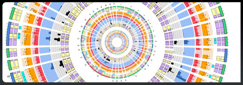
Along the perimeter of the circle are the labels of our columns and rows. On the left we see the countries, and on the right the classes of cars. The color tied to each of the labels is depicted on the inner (thickest) circle, for example, country A corresponds to red and the Small class corresponds to purple. The circumference is proportional to the share of a given country among all countries or the share of a given class of machines among all. The strips going through the center of the circle show the proportions of the cars of a certain class bought in which country, so on the purple stripes it is clear that small class cars are almost equally popular in countries B and C, and in country A they are bought in less than two times.
For convenience, all the bands in the right semicircle begin with a small section, painted in the color where these bands lead. The diagram shows both the absolute (in pieces of machines, the inner circumference) and the relative (in percent, outer circumference) scales, which make it possible to understand both the share of different classes of cars in a country and the distribution of each class across all countries.
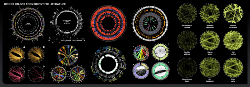
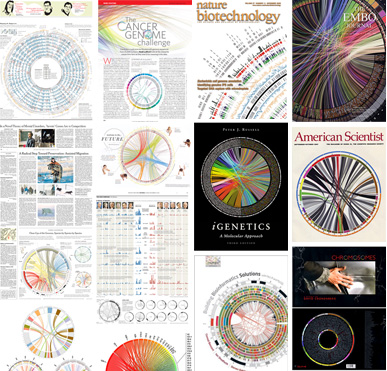 Of course, the considered example is artificial and it may seem that Circos was created solely for entertainment purposes, however it is not. Circos was created as a visualizer for complex data in bioinformatics, in particular from the field of comparative genomics. It was the need to explore the structural differences between the genomes that inspired Martin ( Martin Krzywinski ) from Canada’s Michael Smith Genome Sciences Center to create this tool in 2004. Since then, Circos has been used in a variety of bioinformatics ( and not only ) projects, and the graphics created with it have been on the covers of major scientific journals.
To create an illustration from this article, I used the online version of the visualizer , but Circos can be installed by downloading the distribution locally from the official site .
The article was written by my colleague AlexeyGurevich , but due to the lack of an invitation he could not publish.
UPD: Below, SergeiStartsev mentioned the D3 JavaScript library, which also knows how to make such diagrams, and also with dynamics for the web.
Surely, each of you at least once had to present information in a graphical form. And it seemed that there was too little information placed on a regular graph or chart, and I wanted to tell and show so much. Especially this problem (lack of space) is manifested at the moment when it is necessary to show the connections of one object with another, their similarities and differences. And here we come to the aid ... circle.
Pie chart
Many of you have probably used pie charts. But even if not, then you will surely agree that of the following ways to convey information, the presence of Vova’s controlling interest is most clearly shown by the pie chart:
')
| Name | Number of shares |
|---|---|
| Vania | 2345 |
| Petya | 3454 |
| Vova | 5989 |
However, standard pie charts have a very narrow scope and adding another column to the table makes using them in this example impossible.
Circos
Circos, on the other hand, easily handles this task. I will demonstrate the advantages of their “circular” approach on the following simple example - suppose we have three types of cars (Small, Medium, Executive) and three countries where they were sold (A, B, C). The number of cars sold, depending on the country, can be described, for example, with the following table:
| Car type \ Country | A | B | C |
|---|---|---|---|
| Small | 120 | 300 | 340 |
| Medium | 150 | 100 | 45 |
| Executive | thirty | 15 | 25 |
But in such a colorful picture you can automatically turn these numbers with the help of Circos:
Along the perimeter of the circle are the labels of our columns and rows. On the left we see the countries, and on the right the classes of cars. The color tied to each of the labels is depicted on the inner (thickest) circle, for example, country A corresponds to red and the Small class corresponds to purple. The circumference is proportional to the share of a given country among all countries or the share of a given class of machines among all. The strips going through the center of the circle show the proportions of the cars of a certain class bought in which country, so on the purple stripes it is clear that small class cars are almost equally popular in countries B and C, and in country A they are bought in less than two times.
For convenience, all the bands in the right semicircle begin with a small section, painted in the color where these bands lead. The diagram shows both the absolute (in pieces of machines, the inner circumference) and the relative (in percent, outer circumference) scales, which make it possible to understand both the share of different classes of cars in a country and the distribution of each class across all countries.
Of course, the considered example is artificial and it may seem that Circos was created solely for entertainment purposes, however it is not. Circos was created as a visualizer for complex data in bioinformatics, in particular from the field of comparative genomics. It was the need to explore the structural differences between the genomes that inspired Martin ( Martin Krzywinski ) from Canada’s Michael Smith Genome Sciences Center to create this tool in 2004. Since then, Circos has been used in a variety of bioinformatics ( and not only ) projects, and the graphics created with it have been on the covers of major scientific journals.To create an illustration from this article, I used the online version of the visualizer , but Circos can be installed by downloading the distribution locally from the official site .
The article was written by my colleague AlexeyGurevich , but due to the lack of an invitation he could not publish.
UPD: Below, SergeiStartsev mentioned the D3 JavaScript library, which also knows how to make such diagrams, and also with dynamics for the web.
Source: https://habr.com/ru/post/145971/
All Articles