Create a website with the effect of Parallax using Stellar.js
One of the most popular trends in modern web design is the Parallax effect. In this tutorial, I will show you how to create a similar effect on your website using imagination and Stellar.js.
Download source | Demo
The popularity of the parallax effect originates from Nike's Better World website, which was introduced several years ago. The parallax effect was used as early as the 1980s in game interfaces: first in the headers, and then in the games themselves .
Take a look at some examples that demonstrate the parallax effect in all its glory.
')


To demonstrate how the parallax effect works, I decided to show you a simple 4-way website using various backgrounds and pictures. I also added a navigation to the upper left corner that will scroll the page to a specific slide.
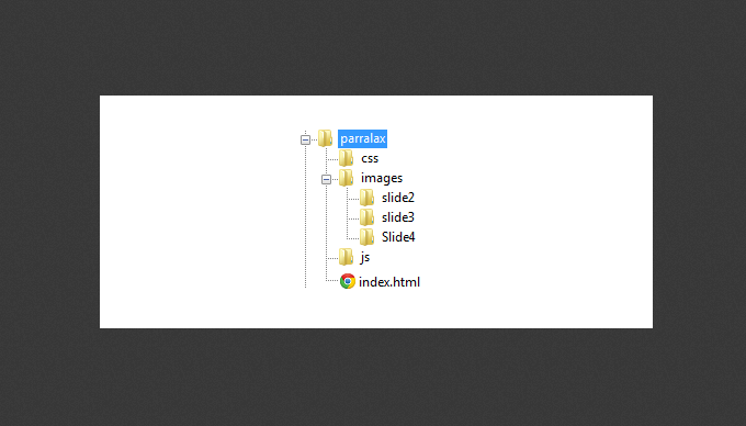
Here is the structure of the site folder:
First of all, in the index.html file we have to register the HTML5 doctype and create a section. It will contain a CSS Reset and a 'styles.css' file. We will also add the jQuery library along with the jQuery custom library 'js.js'. Finally, there are three plugins: 'jquery.stellar.min.js', 'waypoints.min.js' and 'jquery.easing.1.3.js'.
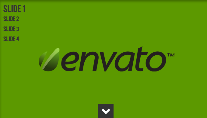
The next markup element will be the Envato logo, which will be in a locked position. For it we will add the class 'envatologo', so that later we can determine the position of the logo in CSS.
Slides will have four identical markup:
We use the class 'slide', which will set the style for all slides. Then each slide is given its own ordinal id. We use the HTML5 data attribute and name it 'data-slide'. Add another data attribute - the 'data-stellar-background-ratio'.
All slides, except the last, will have a button that will allow us to go to the next slide. To do this, we will add the attribute 'data-slide' with the value of the next slide ..
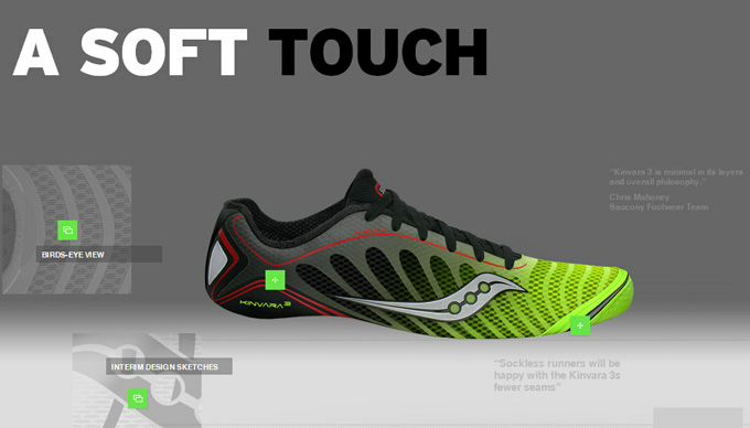
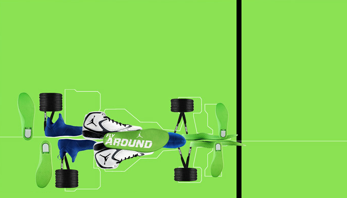
On the third and fourth slides, we will add some images to the 'slide' diva. These pictures will give the effect of immersion in parallax. We need to make sure that the images will be displayed correctly on screens of all sizes.
Fortunately for us, we don’t need to linger on CSS. Basically, we will assign the main styles to several elements.
The first thing we need to do with CSS is to attach the BEBAS font using @ font-face. Then we have to assign the width and height of html and body to 100%.
We assigned the 'fixed' position to the main navigation panel so that it “stood” in one place. We pushed it 20px down and set the z-index to 1 to make sure that this panel would be on top of everything else.
We have assigned such rules to the envato logo so that it is centered on the screen and on top of the entire site.
We now turn directly to the slides themselves. Assign the background-attachment 'fixed' parameter. We used Philipp Seiffert wallpaper, which can be downloaded here .
The .button class is needed for the button at the bottom of the page, which allows you to go to the next slide. We placed the bottom of the center of each slide and used the arrow image as a pointer.
The style rules for each slide are relatively simple and similar to each other. Images of the second slide will be denoted by CSS selector
We set the rules for each image as they appear on the screen.
The third slide has the same structure as the second one.
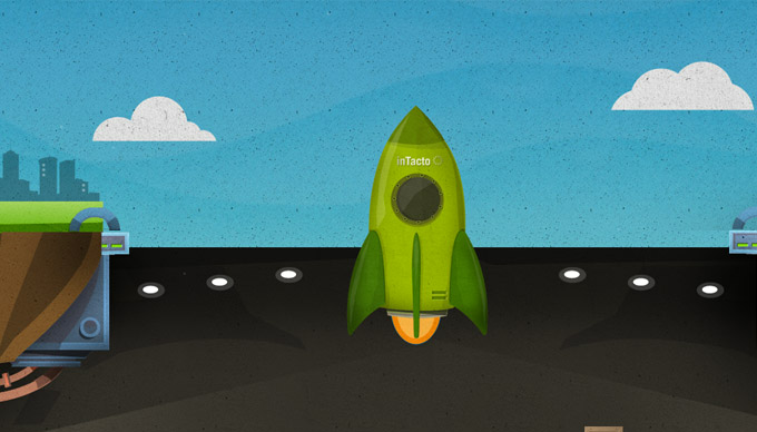
The fourth slide is different from the previous two, as it does not contain any images other than the background one. We will set the 'background-size: cover' parameter. It will cover the entire screen with a background image.
jQuery is where things come to life. I commented on the code so that you understand what's what.

If you look at the second slide, you will see volumetric balls. I added a bit of Gaussian blur to them, especially to those that are a little further than the rest. This gives the site a "depth."
PS All comments on the translation, spelling, etc. happy to take in a personal. Thank!
Download source | Demo
Introduction
The popularity of the parallax effect originates from Nike's Better World website, which was introduced several years ago. The parallax effect was used as early as the 1980s in game interfaces: first in the headers, and then in the games themselves .
Parallax in action
Take a look at some examples that demonstrate the parallax effect in all its glory.
')
How our website will work
To demonstrate how the parallax effect works, I decided to show you a simple 4-way website using various backgrounds and pictures. I also added a navigation to the upper left corner that will scroll the page to a specific slide.
Here is the structure of the site folder:
Plugins used
Stellar.js
Waypoints
jQuery Easing
HTML markup
First of all, in the index.html file we have to register the HTML5 doctype and create a section. It will contain a CSS Reset and a 'styles.css' file. We will also add the jQuery library along with the jQuery custom library 'js.js'. Finally, there are three plugins: 'jquery.stellar.min.js', 'waypoints.min.js' and 'jquery.easing.1.3.js'.
<!DOCTYPE HTML> <html> <head> <meta charset="utf-8"> <title>Create a parallax Website using Stellar.js</title> <link rel="stylesheet" type="text/css" href="http://yui.yahooapis.com/3.3.0/build/cssreset/reset-min.css"> <link rel="stylesheet" type="text/css" href="css/style.css"> <script type="text/javascript" src="http://ajax.googleapis.com/ajax/libs/jquery/1.7.2/jquery.min.js"></script> <script type="text/javascript" src="js/js.js"></script> <script type="text/javascript" src="js/jquery.stellar.min.js"></script> <script type="text/javascript" src="js/waypoints.min.js"></script> <script type="text/javascript" src="js/jquery.easing.1.3.js"></script> </head> The next markup element will be the Envato logo, which will be in a locked position. For it we will add the class 'envatologo', so that later we can determine the position of the logo in CSS.
<img class="envatologo" src=""> Slides
Slides will have four identical markup:
<div class="slide" id="slide1" data-slide="1" data-stellar-background-ratio="0.5"> <a class="button" data-slide="2" title=""></a> </div><!--End Slide 1--> We use the class 'slide', which will set the style for all slides. Then each slide is given its own ordinal id. We use the HTML5 data attribute and name it 'data-slide'. Add another data attribute - the 'data-stellar-background-ratio'.
All slides, except the last, will have a button that will allow us to go to the next slide. To do this, we will add the attribute 'data-slide' with the value of the next slide ..
<span class="slideno">Slide 1</span> On the third and fourth slides, we will add some images to the 'slide' diva. These pictures will give the effect of immersion in parallax. We need to make sure that the images will be displayed correctly on screens of all sizes.
<div class="wrapper"> <img src="" data-stellar-ratio="1.4" data-stellar-vertical-offset="-102"alt=""> <img src="" data-stellar-ratio="1.5" data-stellar-vertical-offset="-53"alt=""> <img src="" data-stellar-ratio="2.7" data-stellar-vertical-offset="-200"alt=""> <img src="" data-stellar-ratio="3" data-stellar-vertical-offset="-200"alt=""> <img src="" data-stellar-ratio="1" data-stellar-vertical-offset="-200"alt=""> <img src="" data-stellar-ratio="1.5" data-stellar-vertical-offset="-200"alt=""> </div> CSS
Fortunately for us, we don’t need to linger on CSS. Basically, we will assign the main styles to several elements.
The first thing we need to do with CSS is to attach the BEBAS font using @ font-face. Then we have to assign the width and height of html and body to 100%.
// There should be @ font-face. Bug Habra?
@font-face { font-family: 'BebasRegular'; src: url('font/BEBAS___-webfont.eot'); src: url('font/BEBAS___-webfont.eot?#iefix') format('embedded-opentype'), url('font/BEBAS___-webfont.woff') format('woff'), url('font/BEBAS___-webfont.ttf') format('truetype'), url('font/BEBAS___-webfont.svg#BebasRegular') format('svg'); font-weight: normal; font-style: normal; } html,body{ font-family: 'BebasRegular'; width:100%; height:100%; } Navigation
We assigned the 'fixed' position to the main navigation panel so that it “stood” in one place. We pushed it 20px down and set the z-index to 1 to make sure that this panel would be on top of everything else.
.navigation { position:fixed; z-index:1; top:20px; } .navigation li { color:#333333; display:block; padding: 0 10px; line-height:30px; margin-bottom:2px; font-weight:bold; -webkit-transition: all .2s ease-in-out; border-bottom:1px solid black; text-align:left; width:53px; } .navigation li:hover, .active { font-size:25px; cursor:pointer; width:100px!important; } We have assigned such rules to the envato logo so that it is centered on the screen and on top of the entire site.
.envatologo { position:fixed; top:50%; left:50%; width:446px; margin-top:-41px; margin-left:-223px; z-index:1; } We now turn directly to the slides themselves. Assign the background-attachment 'fixed' parameter. We used Philipp Seiffert wallpaper, which can be downloaded here .
.slide { background-attachment: fixed; width:100%; height:100%; position: relative; box-shadow:inset 0px 10px 10px rgba(0,0,0,0.3); } .wrapper { width:960px; height:200px; margin:0 auto; position:relative; } .slideno { position:absolute; bottom:0px; left:0px; font-size:100px; font-weight:bold; color:rgba(255,255,255,0.3); } The .button class is needed for the button at the bottom of the page, which allows you to go to the next slide. We placed the bottom of the center of each slide and used the arrow image as a pointer.
.button{ display:block; width:50px; height:50px; position:absolute; bottom:0px; left:50%; background-color:#333333; background-image:url(../images/arrow.png); background-repeat:no-repeat; } .button:hover{ background-color:#494949; cursor:pointer; } The style rules for each slide are relatively simple and similar to each other. Images of the second slide will be denoted by CSS selector
nth-child(n) .We set the rules for each image as they appear on the screen.
/****************************** SLIDE 1 *******************************/ #slide1{ background-color:#5c9900; } /****************************** SLIDE 2 *******************************/ #slide2{ background-color:#005c99; } #slide2 img:first-child{ position:absolute; top: 700px; left: -150px; } #slide2 img:nth-child(2){ position:absolute; top:300px; left:100px; } #slide2 img:nth-child(3){ position:absolute; top:600px; left:300px; } #slide2 img:nth-child(4){ position:absolute; top:400px; left:300px; } #slide2 img:nth-child(5){ position:absolute; top:600px; right:300px; } #slide2 img:nth-child(6){ position:absolute; top:600px; right:300px; } #slide2 img:nth-child(7){ position:absolute; top:400px; right:100px; } #slide2 img:nth-child(8){ position:absolute; top:100px; right:300px; } The third slide has the same structure as the second one.
/****************************** SLIDE 3 *******************************/ #slide3 { background-color:#b6c10b; } #slide3 img:first-child { position:absolute; top: 700px; left: 300px; } #slide3 img:nth-child(2){ position:absolute; top:100px; left:100px; } #slide3 img:nth-child(3){ position:absolute; top:150px; left:300px; } #slide3 img:nth-child(4){ position:absolute; top:450px; left:300px; } #slide3 img:nth-child(5){ position:absolute; top:200px; right:300px; } #slide3 img:nth-child(6){ position:absolute; top:100px; right:300px; } The fourth slide is different from the previous two, as it does not contain any images other than the background one. We will set the 'background-size: cover' parameter. It will cover the entire screen with a background image.
/****************************** SLIDE 4 *******************************/ #slide4{ background-image:url(../images/Slide4/desktop4.jpg); -webkit-background-size: cover; -moz-background-size: cover; -o-background-size: cover; background-size: cover; } #slide4 .parallaxbg{ position:absolute; right:40px; top:40px; font-size:28px; color:rgba(51,51,51,0.3); } jQuery
jQuery is where things come to life. I commented on the code so that you understand what's what.
jQuery(document).ready(function ($) { // Stellar.js $(window).stellar(); // var links = $('.navigation').find('li'); slide = $('.slide'); button = $('.button'); mywindow = $(window); htmlbody = $('html,body'); // waypoints slide.waypoint(function (event, direction) { // data-slide dataslide = $(this).attr('data-slide'); // , if (direction === 'down') { $('.navigation li[data-slide="' + dataslide + '"]').addClass('active').prev().removeClass('active'); } // else , and else { $('.navigation li[data-slide="' + dataslide + '"]').addClass('active').next().removeClass('active'); } }); // waypoints mywindow.scroll(function () { if (mywindow.scrollTop() == 0) { $('.navigation li[data-slide="1"]').addClass('active'); $('.navigation li[data-slide="2"]').removeClass('active'); } }); // function goToByScroll(dataslide) { htmlbody.animate({ scrollTop: $('.slide[data-slide="' + dataslide + '"]').offset().top }, 2000, 'easeInOutQuint'); } // , data-slide goToByScroll links.click(function (e) { e.preventDefault(); dataslide = $(this).attr('data-slide'); goToByScroll(dataslide); }); // , data-slide goToByScroll button.click(function (e) { e.preventDefault(); dataslide = $(this).attr('data-slide'); goToByScroll(dataslide); }); }); A bit more
If you look at the second slide, you will see volumetric balls. I added a bit of Gaussian blur to them, especially to those that are a little further than the rest. This gives the site a "depth."
What to read
- Behind the Scenes at Nikes Better World.
- 21 sample websites from Parallax.
- Scrollorama The parallax plugin with a wide range of functions.
- Create a site header using jQuery Waypoints
PS All comments on the translation, spelling, etc. happy to take in a personal. Thank!
Source: https://habr.com/ru/post/145772/
All Articles