Website development with responsive design
Translation of the article “Responsive workflow” by the Finnish web designer and developer Viljami Salminen.
Last week I was at the Webshaped conference, where Stephen Hay talked about the process of developing responsive design. This post is not exactly about the same thing, but Stephen’s approach reminded me of my own, so I decided to state some thoughts on this, describe how my work evolved over the past two or three years, and how it might change in the future.
Three or four years ago, when I developed mostly fixed-width websites, my projects went through the stages illustrated below, similar to the usual waterfall process. Then there was not too much time for intermediate revisions: usually clients saw either sketches or an almost finished design in Photoshop.
')

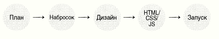
This scheme worked before, but now there is one problem: the waterfall model does not fit well with adaptive design. In fact, this approach was never optimal, but everyone was so used to it that they never questioned it.
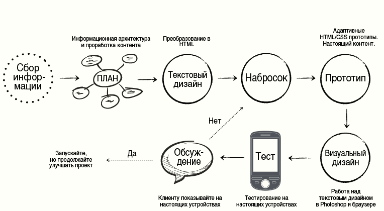
So I develop websites with responsive design now (in the image below). I used the article by Mark Boulton and the presentation of Stephen Hay in writing this post. My current approach is more like agile than the waterfall model. Next, I will explain in more detail each stage.
In short. Development begins with the content, thinking about which is given a lot of time. I convert the finished content drafts into HTML prototypes and open them in a mobile browser to evaluate the order and logic of the presentation. Usually I make sketches before, and design after prototypes. After the first sketches, I quickly return to the HTML prototype and add CSS styles to evaluate my ideas. All work consists of iterations: sketch - prototype - design - testing - discussion, until the result is achieved. The order may not be so linear in reality, but for this article I wanted to simplify the scheme.
The first stage is to collect information about the client. The main goal here is to better understand the client’s business, its competitors, and the main goals of the project. Without sufficient knowledge it is almost impossible to understand what the client really needs / wants.
At this stage, I ask questions such as: “Why do people have to go to your site?”, “What is the main goal you want to achieve?”, “Who are your main competitors?”, Etc. You can look at the ideas of questions in the materials of other design firms.
Planning is based on the information collected at the previous stage. I usually start by reworking the concept, working on user stories and information architecture . I create and describe content elements, distribute them according to the level of importance, on the basis of which you can make rough HTML sketches. There are similar steps in the “Content List” and “Content Content Framework” steps in Stephen’s work.
“Text Design” means that we record all the contents of the site in a simple form. This is one of the most important stages of development, but also the most undervalued. In my opinion, it makes no sense to move on without having real content in hand. People come to the site in search of information and the whole process should begin with it.
I often use HTML without styles at this stage. So you can immediately see how the content looks like in one narrow column and how correct its order is. This is also the main way to understand how a site will be perceived by a screen reader.
It is important to remember that it is not necessary to approve the final version of the content at this stage. Everything can be changed later by making prototypes. As a tool, you can use any text editor - they all cope equally well.
I constantly draw my ideas, but this is especially important before starting work in the browser. I usually check my sketches using previously created HTML text. This basically means that I add some CSS styles to them.
Prototyping with HTML / CSS is the only reliable way to see how your markup reacts to different sizes of the scope. It also allows you to show the client the site at an early stage and promptly react to the comments that have arisen.
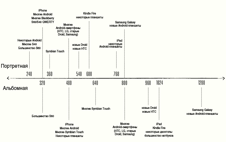
Unlike Stephen, I do not work with a “schedule of permissions used”. It is useful to be aware of the main screen sizes and be able to explain to the client what landscape orientation is, but be guided primarily by the content.
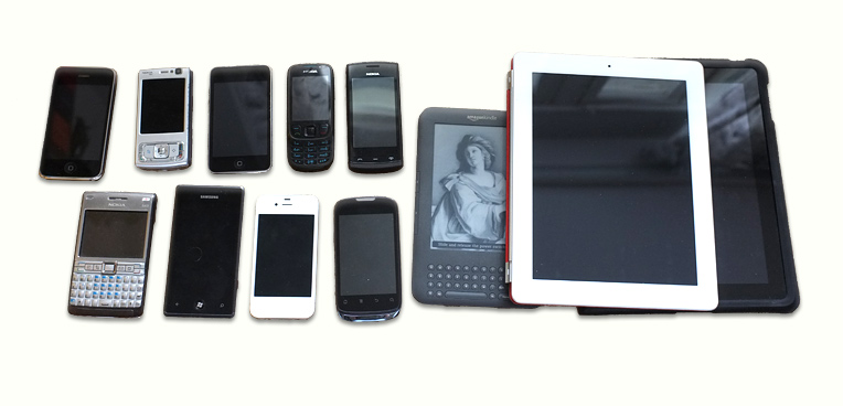
Below is a graph of the permissions that I used based on Stephanie Rieger's “Pragmatic Adaptive Design” and the Metal Toad “Simple Device Diagram” . I did this because one scheme seemed outdated to me, while in the other, the quite popular Symbian devices were completely absent. The picture is clickable (PDF, Eng).
This stage in the iteration follows the prototypes. I still use Photoshop for most of the work, but gradually I tend to design in the browser. Typography is especially difficult to deal with somewhere other than the browser (nevertheless, I noticed that if I turn to work in the browser too early, the result looks flat, boring and sloppy).
It is especially important to use a tool that does not limit you in your work: browser, Photoshop, Fireworks, InDesign, or something else.
Testing in the early stages will avoid many problems in the future. Just look at the “graph of used permissions” , take into account all the features of browsers and you will understand why it is almost impossible to create a responsive website without testing on several real devices. User testing should also be carried out to identify usability issues.
Usually I test on the devices that I have, but sometimes I have to get new ones or even go to the store and test there. In the end, while it is free.
Discuss with the client each iteration. Show HTML prototypes and their work on real devices. Mark Boulton advises : “Avoid Big Exposure.”
Sketch - prototype - design - testing - discussion. Repeat until ready.
There is no perfect work process. What suits me may not suit another designer. Moreover, I am just starting to change my approach. Described here is best for creating websites (large or small), but it may be necessary to change when creating web applications (of course, depending on the application).
Last week I was at the Webshaped conference, where Stephen Hay talked about the process of developing responsive design. This post is not exactly about the same thing, but Stephen’s approach reminded me of my own, so I decided to state some thoughts on this, describe how my work evolved over the past two or three years, and how it might change in the future.
Three or four years ago, when I developed mostly fixed-width websites, my projects went through the stages illustrated below, similar to the usual waterfall process. Then there was not too much time for intermediate revisions: usually clients saw either sketches or an almost finished design in Photoshop.
')
This scheme worked before, but now there is one problem: the waterfall model does not fit well with adaptive design. In fact, this approach was never optimal, but everyone was so used to it that they never questioned it.
New way
So I develop websites with responsive design now (in the image below). I used the article by Mark Boulton and the presentation of Stephen Hay in writing this post. My current approach is more like agile than the waterfall model. Next, I will explain in more detail each stage.
In short. Development begins with the content, thinking about which is given a lot of time. I convert the finished content drafts into HTML prototypes and open them in a mobile browser to evaluate the order and logic of the presentation. Usually I make sketches before, and design after prototypes. After the first sketches, I quickly return to the HTML prototype and add CSS styles to evaluate my ideas. All work consists of iterations: sketch - prototype - design - testing - discussion, until the result is achieved. The order may not be so linear in reality, but for this article I wanted to simplify the scheme.
Studying customer's business
The first stage is to collect information about the client. The main goal here is to better understand the client’s business, its competitors, and the main goals of the project. Without sufficient knowledge it is almost impossible to understand what the client really needs / wants.
At this stage, I ask questions such as: “Why do people have to go to your site?”, “What is the main goal you want to achieve?”, “Who are your main competitors?”, Etc. You can look at the ideas of questions in the materials of other design firms.
- Clearleft's Client Ideas Sheet
- 45royale Inc's Project Planner
- Mark Boulton Design's Project Planner
- Web Design Questionnaires, Project Sheets and Work Sheets
Plan
Planning is based on the information collected at the previous stage. I usually start by reworking the concept, working on user stories and information architecture . I create and describe content elements, distribute them according to the level of importance, on the basis of which you can make rough HTML sketches. There are similar steps in the “Content List” and “Content Content Framework” steps in Stephen’s work.
Text design
“Text Design” means that we record all the contents of the site in a simple form. This is one of the most important stages of development, but also the most undervalued. In my opinion, it makes no sense to move on without having real content in hand. People come to the site in search of information and the whole process should begin with it.
I often use HTML without styles at this stage. So you can immediately see how the content looks like in one narrow column and how correct its order is. This is also the main way to understand how a site will be perceived by a screen reader.
It is important to remember that it is not necessary to approve the final version of the content at this stage. Everything can be changed later by making prototypes. As a tool, you can use any text editor - they all cope equally well.
Sketches
I constantly draw my ideas, but this is especially important before starting work in the browser. I usually check my sketches using previously created HTML text. This basically means that I add some CSS styles to them.
“By spending a little time on the sketches, you will save yourself a watch in front of the monitor. Moreover, you will find peace of mind. Every time a “creative crisis” creeps in, it inevitably leaves behind itself destructive self-doubt. I urge you to include sketches in your work. You will see how much less often you will rest against an imaginary wall of creative emptiness ”
- Tara Roskell
Prototypes
Prototyping with HTML / CSS is the only reliable way to see how your markup reacts to different sizes of the scope. It also allows you to show the client the site at an early stage and promptly react to the comments that have arisen.
Unlike Stephen, I do not work with a “schedule of permissions used”. It is useful to be aware of the main screen sizes and be able to explain to the client what landscape orientation is, but be guided primarily by the content.
Below is a graph of the permissions that I used based on Stephanie Rieger's “Pragmatic Adaptive Design” and the Metal Toad “Simple Device Diagram” . I did this because one scheme seemed outdated to me, while in the other, the quite popular Symbian devices were completely absent. The picture is clickable (PDF, Eng).
Visual design
This stage in the iteration follows the prototypes. I still use Photoshop for most of the work, but gradually I tend to design in the browser. Typography is especially difficult to deal with somewhere other than the browser (nevertheless, I noticed that if I turn to work in the browser too early, the result looks flat, boring and sloppy).
It is especially important to use a tool that does not limit you in your work: browser, Photoshop, Fireworks, InDesign, or something else.
Testing
Testing in the early stages will avoid many problems in the future. Just look at the “graph of used permissions” , take into account all the features of browsers and you will understand why it is almost impossible to create a responsive website without testing on several real devices. User testing should also be carried out to identify usability issues.
Usually I test on the devices that I have, but sometimes I have to get new ones or even go to the store and test there. In the end, while it is free.
Discussion
Discuss with the client each iteration. Show HTML prototypes and their work on real devices. Mark Boulton advises : “Avoid Big Exposure.”
Iteration
Sketch - prototype - design - testing - discussion. Repeat until ready.
Conclusion
There is no perfect work process. What suits me may not suit another designer. Moreover, I am just starting to change my approach. Described here is best for creating websites (large or small), but it may be necessary to change when creating web applications (of course, depending on the application).
Used materials
Source: https://habr.com/ru/post/145680/
All Articles