GPU acceleration of CSS filters in Chromium
One of the innovations in Chromium 19 - CSS filters with hardware graphic acceleration. Using the
Combining different parameters in the line, you can come up with original effects.

Filter options: sepia, saturation, transparency, blur, brightness, inversion, contrast, shadow creation and others. This is a great way to improve the design of the page, as well as create web applications and games with new features.
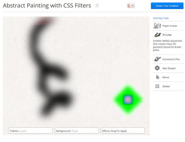
In the presence of a normal GPU card, the effects work completely without slowdowns and even allow you to run a graphics editor in a browser, fully implemented in CSS, and even using the
')
For more information about using CSS filters, see the HTML5Rocks Filter Reference ( translated into Russian ).
Add that in the future, web designers will have the opportunity to create their own filters to apply them exclusively on your website.
filter property, pixel-by-pixel processing of any visible element on the page is done with just one line of CSS.Combining different parameters in the line, you can come up with original effects.
img { -webkit-filter: sepia(100%) contrast(200%) blur(5px) }Filter options: sepia, saturation, transparency, blur, brightness, inversion, contrast, shadow creation and others. This is a great way to improve the design of the page, as well as create web applications and games with new features.
In the presence of a normal GPU card, the effects work completely without slowdowns and even allow you to run a graphics editor in a browser, fully implemented in CSS, and even using the
-webkit-transition animation.')
For more information about using CSS filters, see the HTML5Rocks Filter Reference ( translated into Russian ).
Add that in the future, web designers will have the opportunity to create their own filters to apply them exclusively on your website.
Source: https://habr.com/ru/post/145666/
All Articles