Pixel identity crisis
Pixel has always been the smallest unit in digital design. This is an invisible measurement value for designers. The phrase “pixel pixel pixel” was adopted to help print designers to understand the concept of fixed screen density. Web designers, in turn, took the pixels instead of points.
Now, when the technology is rapidly improving and ppi is constantly growing, there is a need to find some relative value that would always be stable. This value was once a pixel. Browser page scalability is another thing, read on QuirksMode . What is a pixel on a high resolution screen? Why is a picture with a resolution of 640px × 960px on iPhone 4 displayed in the browser as 320px × 480px? The truth is that there are two notions of pixels: they can be the smallest physical units on the screen (hardware pixels), and they can be an optical unit - the reference pixel.
')
Hardware pixel
Most of us are familiar with the hardware pixel. This is the smallest physical point on the screen that contains the red, green, and blue subpixels. The light of these subpixels is mixed and we see a picture built of pixels. Since the hardware pixel is a physical element of the screen, we can neither stretch it nor divide it. These properties make a pixel something like an atom: a design unit on which everything is built.
Reference Pixel and Splitting Atoms
Now everything has changed a bit. Currently, the W3C is considering the possibility of adopting a reference pixel as a standard unit of measurement . All hardware based pixel measurement systems will now be based on a reference, which is approximately twice the size of the hardware. Such a pixel will have the same size on any screen, with any density. The beauty of it is that it takes into account the proximity to the screen. Holding the phone close to the face, the reference pixel will be smaller than the projection that you see from a greater distance. If you place the phone on the same level with the projection, then the size of the pixels must match, regardless of the ppi or resolution of the display device. With proper implementation, the new standard will provide unprecedented stability on all devices and platforms, regardless of the viewing distance and the density of pixels on the screen.
The reference pixels are amazing, but now we have two conflicting definitions. Devices on Android have their own value , which is called “density independent pixel” (density independent pixel, dip). Developers use this value to determine the number of optical pixels occupied by the element on the screen. It allows you to use hardware pixels to create correctly displayed graphics using px and a relative value to set text sizes. These universal values work for all devices, regardless of the parameters of their displays. Android arrived intelligently by dividing the definition of “pixel” into two others, but the web has been dealing with content over the years created on the basis of a hardware pixel. It would be great to be armed with similar values for web designers. But without a complete revision of the pixel as a definition, the web based on it can fall. Mobile devices typically compress the width of websites to the width of the screen, so the text becomes completely unreadable. Sites blocking the zoom immediately become useless.
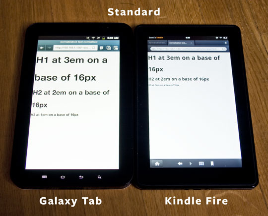
Standard pixel sizes on the Galaxy Tab and Kindle Fire.
We also do not know what each device counts as a pixel and this is a problem. For example, the Galaxy Tab and Kindle Fire have the same screen size and resolution; but the pixels on the Tab, corrected by the reference pixel, are 1.5 times larger than the hardware ones on the Kindle Fire. It is impossible to develop anything for a specific device without having it on hand for testing, because at the moment there is only one standardized specification of the unit of measurement on the screen - the hardware pixel. Looking at these two devices and knowing that the parameters of their displays are identical, and both are using Webkit for rendering, the web developer will think that his web site will look the same on both. Unfortunately, this is not the case.
Defining break points and moving forward
It's safe to say that the pixels are not in the best position right now. But we can use Media Queries to identify inconsistencies and correct them. With the help of media query device-pixel-ratio it is possible to identify a device with “non-standard” pixels. You can also combine this property with certain permissions for a more precise definition. iPhone 4 has a device-pixel-ratio equal to two, that is, its pixels are twice the number of hardware pixels. Most Android devices have pixels 1.5 times the size of the hardware. How many times the "imaginary" pixels are more hardware, the image on the screen will be so many times more. Specificity is a key factor in determining the class of devices. But it is not necessary to be so specific as to set the device definition parameters for each of them. Most devices have similar problems. With the help of Media Queries, we can determine devices by the size of “imaginary” pixels, the width and height of the screen, etc. You can also determine the current orientation of the device (portrait or landscape):
@media screen and (device-pixel-ratio: 1.5)
and (device-width: 683px)
and (orientation: landscape),
screen and (device-pixel-ratio: 1.5)
and (device-width: 400px)
and (orientation: portrait)
Please note that media query device-pixel-ratio still requires the use of vendor prefixes.
Now let's look at the Kindle Fire, which has the same screen resolution as the Galaxy Tab, but unlike the second, hardware pixels are used. Dealing with such devices makes the task a bit more difficult, the high probability that netbooks and tablets fall under the specified parameters. Using media queries orientation and max-device-height we will determine the device we need. Usually, the returned screen height is slightly lower than the actual one, in order to weed out tablets with a resolution of 1024 x 768 and set the height to 600px. It will look like this:
@media screen and (device-pixel-ratio: 1)
and (device-width: 1024px)
and (max-device-height: 600px)
and (orientation: landscape),
screen and (device-pixel-ratio: 1)
and (device-width: 600px)
and (max-device-height: 1024px)
and (orientation: portrait)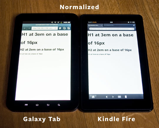
Normalized pixels on the Galaxy Tab and Kindle Fire.
For more control over the resizing of your website, you can use em as a measure, this applies not only to text, but to everything that is measured in px . Now you need to set the font size. In the media query for Kindle Fire, let's set the size 1.5 times the current size. If you want to force the Galaxy Tab to display in hardware pixels, then multiply the text size by 2/3 and record the result in the media query for the Tab. An example of the code can be found here .
As you can see, adjusting several “types” of pixels is not so easy. Pixel is the most basic unit and moving to an optical pixel will cause a lot of strange changes. Mobile device manufacturers do a good job of identifying and solving these problems, but something is always wrong. Fortunately, we have the tools that can and should be used to solve the leaked problems.
Source: https://habr.com/ru/post/145619/
All Articles